This content originally appeared on DEV Community and was authored by Diana Le
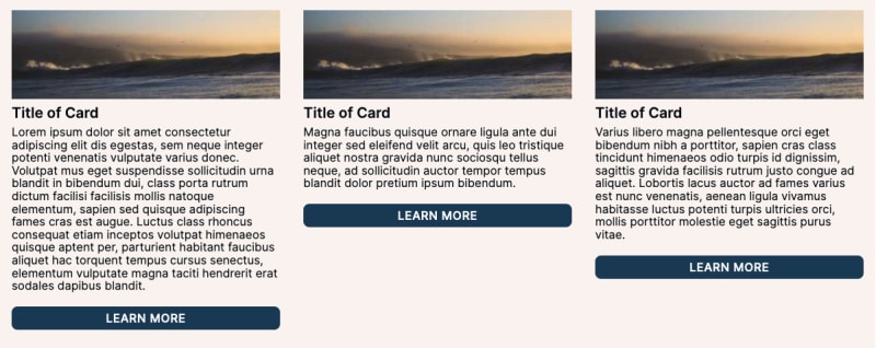
I've built dozens of web sites, and by far one of the most common components that required multiple edits was the card component. The design was always fine due to standardized placeholder content, but when the actual content came in, the cards would wind up looking like this:
If you were a developer during the era of CSS float layouts, this was incredibly annoying to deal with. Cards would stack under shorter cards instead of filling out the row. Thankfully with flex/grid, we don't have that problem anymore, but even now within the card itself, you can still get these alignment issues if you don't prepare for this beforehand. It's a good idea to be proactive and to account for these types of scenarios in order to build more resilient sites.
Make the Cards "Even"
Make sure you confirm with someone on your project on what this means. Generally I'm not a fan of hiding content just to make something prettier; if the content was intentional, then value is lost by hiding it or cutting it off. The first solution would be to review and see whether the content can be standardized so we don't have such huge differences. Once you have that answer, then proceed with either of the following options:
- Use Line-Clamp to Hide Text
- Use Flex-Grow to Stretch Cards
Demo Showing both Line-Clamp and Flex-Grow
Use Line-Clamp for Exact Heights
Let's say the stakeholder is fine with only showing the first X lines in the card description. This is where line-clamp makes things incredibly easy. Here is the HTML structure of the card:
<article>
  <h3>Title of Card</h3>
  <p>Lorem ipsum dolor sit amet consectetur adipiscing elit dis egestas, sem neque integer potenti venenatis vulputate varius donec. Volutpat mus eget suspendisse sollicitudin urna blandit in bibendum dui, class porta rutrum dictum facilisi facilisis mollis natoque elementum, sapien sed quisque adipiscing fames cras est augue. Luctus class rhoncus consequat etiam inceptos volutpat himenaeos quisque aptent per, parturient habitant faucibus aliquet hac torquent tempus cursus senectus, elementum vulputate magna taciti hendrerit erat sodales dapibus blandit.</p>
  <a href="#">Learn More</a>
  <img src="https://picsum.photos/300/100" alt="">
</article>
The <p> tag is what we need to "clamp" to make it consistent across all cards. This is how to cut off the text after 3 lines:
p {
  display: -webkit-box;
  -webkit-box-orient: vertical;
  -webkit-line-clamp: 3; /* Adjust the number of lines here */
  overflow: hidden;
}
But this is using webkit properties. Is it compatible across all browsers?
Yep, it is compatible enough (sorry, Internet Explorer). Even Tailwind has implemented it by default now.
You MUST use the webkit properties to get this working. Ellipses will always show by default on the last line if the content is longer than the -webkit-line-clamp value. If you don't use overflow: hidden, the ellipses still display, but the content still shows underneath. So at minimum, you will need all 4 rules.
This used to be much more difficult with CSS, and sometimes you'd have to resort to JavaScript. But now we have fully working CSS, if a little weird that it still relies on browser prefixes.
Make the Cards Equal by using Flex-Grow
Let's say the stakeholder wants all the content in the card to be visible. This means we'll have to adjust the height of the entire card. This is what I would normally do to account for possible varying content. It's easy to forget to do, especially if you're looking at a design where all the text is the same length. Even as I'm writing this post, I realize that the heading <h3> is something you'd want to apply the same changes to as well.
Here's our card HTML again:
<article>
  <h3>Title of Card</h3>
  <p>Lorem ipsum dolor sit amet consectetur adipiscing elit dis egestas, sem neque integer potenti venenatis vulputate varius donec. Volutpat mus eget suspendisse sollicitudin urna blandit in bibendum dui, class porta rutrum dictum facilisi facilisis mollis natoque elementum, sapien sed quisque adipiscing fames cras est augue. Luctus class rhoncus consequat etiam inceptos volutpat himenaeos quisque aptent per, parturient habitant faucibus aliquet hac torquent tempus cursus senectus, elementum vulputate magna taciti hendrerit erat sodales dapibus blandit.</p>
  <a href="#">Learn More</a>
  <img src="https://picsum.photos/300/100" alt="">
</article>
We need to use Flex on the card (which is already put to use by ordering the image at the top of the card). Then we need to tell the <p> tag to grow if needed:
article {
  display: flex;
  flex-direction: column;
}

p {
  flex: 1 1 auto;
  /* could also use flex-grow: 1 */
}
Because the paragraph is now growing, all the "Learn More" buttons will be aligned with each other at the bottom across the entire row. However, if you have multiple rows, while the "Learn More" will always be aligned, the height of the cards between rows will not necessarily match because the height of the <p> tag can vary.
Flex is one-dimensional, meaning it will only care about one row or one direction at a time. In this instance, all the cards in the same row (which will change depending on screen size) will be the same height, but flex will not enforce the same height across every row in this section.
Conclusion
Line-clamp is a very simple solution to the common problem of uneven heights of content when building web sites. Just make sure that it's not automatically your first solution since it hides content, and know what the other options are as well.
This content originally appeared on DEV Community and was authored by Diana Le
Diana Le | Sciencx (2023-04-26T16:00:00+00:00) CSS Typography: Create exact heights with line-clamp. Retrieved from https://www.scien.cx/2023/04/26/css-typography-create-exact-heights-with-line-clamp/
Please log in to upload a file.
There are no updates yet.
Click the Upload button above to add an update.

