This content originally appeared on
A List Apart: The Full Feed and was authored by The fine folks at A List Apart
Humility, a designer’s essential value—that has a nice ring to it. What about humility, an office manager’s essential value? Or a dentist’s? Or a librarian’s? They all sound great. When humility is our guiding light, the path is always open for fulfillment, evolution, connection, and engagement. In this chapter, we’re going to talk about why.
That said, this is a book for designers, and to that end, I’d like to start with a story—well, a journey, really. It’s a personal one, and I’m going to make myself a bit vulnerable along the way. I call it:
The Tale of Justin’s Preposterous Pate
When I was coming out of art school, a long-haired, goateed neophyte, print was a known quantity to me; design on the web, however, was rife with complexities to navigate and discover, a problem to be solved. Though I had been formally trained in graphic design, typography, and layout, what fascinated me was how these traditional skills might be applied to a fledgling digital landscape. This theme would ultimately shape the rest of my career.
So rather than graduate and go into print like many of my friends, I devoured HTML and JavaScript books into the wee hours of the morning and taught myself how to code during my senior year. I wanted—nay, needed—to better understand the underlying implications of what my design decisions would mean once rendered in a browser.
The late ’90s and early 2000s were the so-called “Wild West” of web design. Designers at the time were all figuring out how to apply design and visual communication to the digital landscape. What were the rules? How could we break them and still engage, entertain, and convey information? At a more macro level, how could my values, inclusive of humility, respect, and connection, align in tandem with that? I was hungry to find out.
Though I’m talking about a different era, those are timeless considerations between non-career interactions and the world of design. What are your core passions, or values, that transcend medium? It’s essentially the same concept we discussed earlier on the direct parallels between what fulfills you, agnostic of the tangible or digital realms; the core themes are all the same.
First within tables, animated GIFs, Flash, then with Web Standards, divs, and CSS, there was personality, raw unbridled creativity, and unique means of presentment that often defied any semblance of a visible grid. Splash screens and “browser requirement” pages aplenty. Usability and accessibility were typically victims of such a creation, but such paramount facets of any digital design were largely (and, in hindsight, unfairly) disregarded at the expense of experimentation.
For example, this iteration of my personal portfolio site (“the pseudoroom”) from that era was experimental, if not a bit heavy- handed, in the visual communication of the concept of a living sketchbook. Very skeuomorphic. I collaborated with fellow designer and dear friend Marc Clancy (now a co-founder of the creative project organizing app Milanote) on this one, where we’d first sketch and then pass a Photoshop file back and forth to trick things out and play with varied user interactions. Then, I’d break it down and code it into a digital layout.
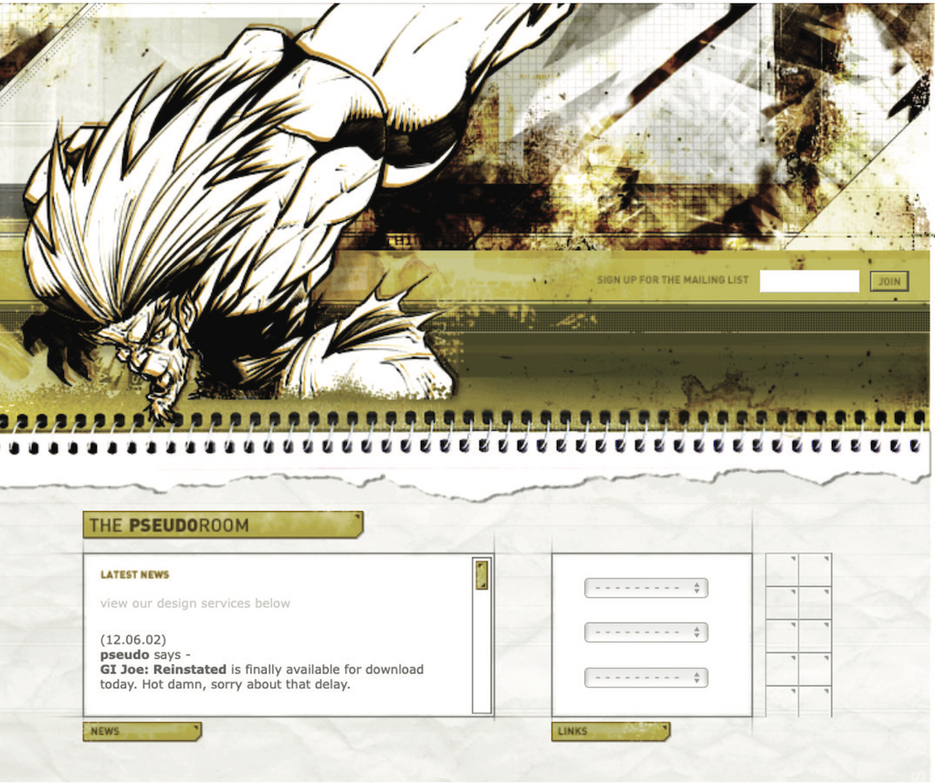
Along with design folio pieces, the site also offered free downloads for Mac OS customizations: desktop wallpapers that were effectively design experimentation, custom-designed typefaces, and desktop icons.
From around the same time, GUI Galaxy was a design, pixel art, and Mac-centric news portal some graphic designer friends and I conceived, designed, developed, and deployed.
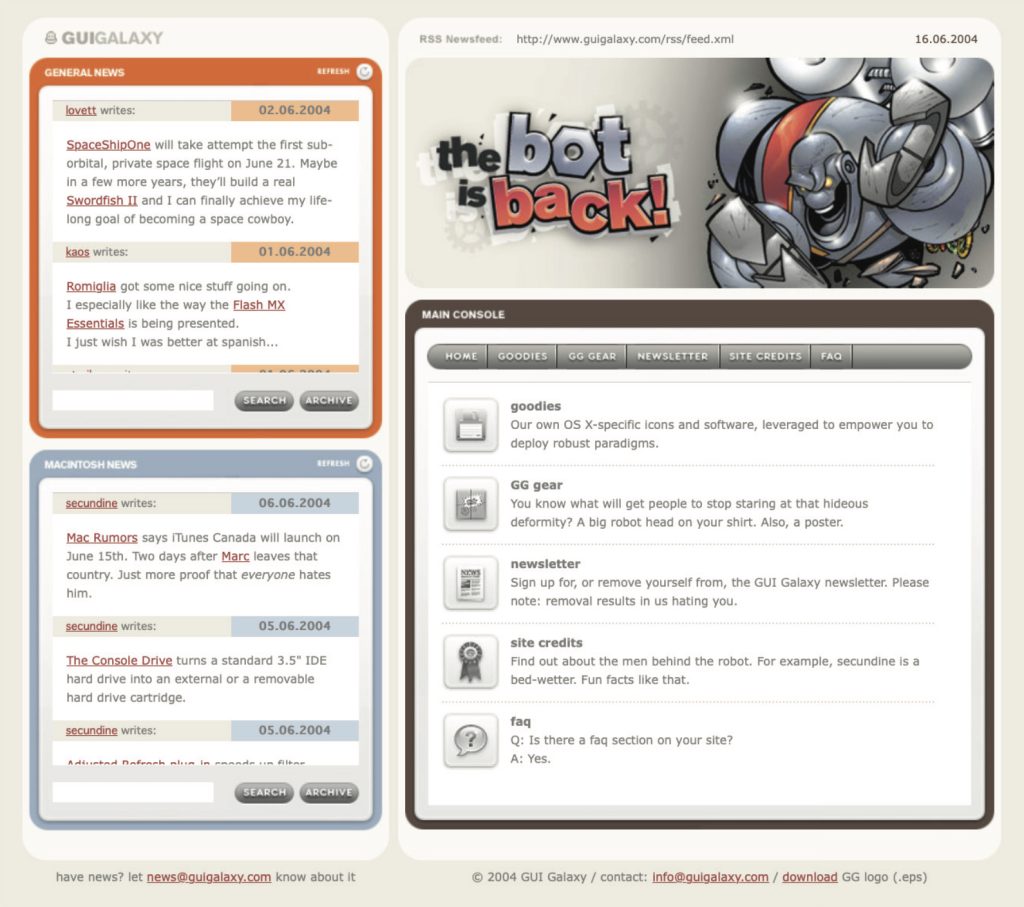
Design news portals were incredibly popular during this period, featuring (what would now be considered) Tweet-size, small-format snippets of pertinent news from the categories I previously mentioned. If you took Twitter, curated it to a few categories, and wrapped it in a custom-branded experience, you’d have a design news portal from the late 90s / early 2000s.
We as designers had evolved and created a bandwidth-sensitive, web standards award-winning, much more accessibility-conscious website. Still ripe with experimentation, yet more mindful of equitable engagement. You can see a couple of content panes here, noting general news (tech, design) and Mac-centric news below. We also offered many of the custom downloads I cited before as present on my folio site but branded and themed to GUI Galaxy.
The site’s backbone was a homegrown CMS, with the presentation layer consisting of global design + illustration + news author collaboration. And the collaboration effort here, in addition to experimentation on a ‘brand’ and content delivery, was hitting my core. We were designing something bigger than any single one of us and connecting with a global audience.
Collaboration and connection transcend medium in their impact, immensely fulfilling me as a designer.
Now, why am I taking you down this trip of design memory lane? Two reasons.
First, there’s a reason for the nostalgia for that design era (the “Wild West” era, as I called it earlier): the inherent exploration, personality, and creativity that saturated many design portals and personal portfolio sites. Ultra-finely detailed pixel art UI, custom illustration, bespoke vector graphics, all underpinned by a strong design community.
Today’s web design has been in a period of stagnation. I suspect there’s a strong chance you’ve seen a site whose structure looks something like this: a hero image / banner with text overlaid, perhaps with a lovely rotating carousel of images (laying the snark on heavy there), a call to action, and three columns of sub-content directly beneath. Maybe an icon library is employed with selections that vaguely relate to their respective content.
Design, as it’s applied to the digital landscape, is in dire need of thoughtful layout, typography, and visual engagement that goes hand-in-hand with all the modern considerations we now know are paramount: usability. Accessibility. Load times and bandwidth- sensitive content delivery. A responsive presentation that meets human beings wherever they’re engaging from. We must be mindful of, and respectful toward, those concerns—but not at the expense of creativity of visual communication or via replicating cookie-cutter layouts.
Pixel Problems
Websites during this period were often designed and built on Macs whose OS and desktops looked something like this. This is Mac OS 7.5, but 8 and 9 weren’t that different.
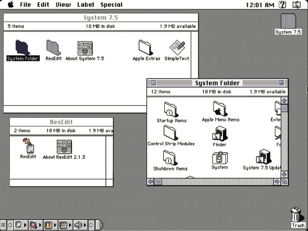
Desktop icons fascinated me: how could any single one, at any given point, stand out to get my attention? In this example, the user’s desktop is tidy, but think of a more realistic example with icon pandemonium. Or, say an icon was part of a larger system grouping (fonts, extensions, control panels)—how did it also maintain cohesion amongst a group?
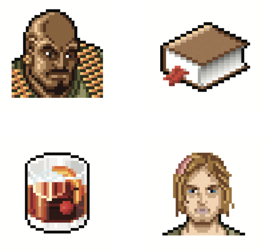
These were 32 x 32 pixel creations, utilizing a 256-color palette, designed pixel-by-pixel as mini mosaics. To me, this was the embodiment of digital visual communication under such ridiculous constraints. And often, ridiculous restrictions can yield the purification of concept and theme.
So I began to research and do my homework. I was a student of this new medium, hungry to dissect, process, discover, and make it my own.
Expanding upon the notion of exploration, I wanted to see how I could push the limits of a 32x32 pixel grid with that 256-color palette. Those ridiculous constraints forced a clarity of concept and presentation that I found incredibly appealing. The digital gauntlet had been tossed, and that challenge fueled me. And so, in my dorm room into the wee hours of the morning, I toiled away, bringing conceptual sketches into mini mosaic fruition.
These are some of my creations, utilizing the only tool available at the time to create icons called ResEdit. ResEdit was a clunky, built-in Mac OS utility not really made for exactly what we were using it for. At the core of all of this work: Research. Challenge. Problem- solving. Again, these core connection-based values are agnostic of medium.
There’s one more design portal I want to talk about, which also serves as the second reason for my story to bring this all together.
This is K10k, short for Kaliber 1000. K10k was founded in 1998 by Michael Schmidt and Toke Nygaard, and was the design news portal on the web during this period. With its pixel art-fueled presentation, ultra-focused care given to every facet and detail, and with many of the more influential designers of the time who were invited to be news authors on the site, well... it was the place to be, my friend. With respect where respect is due, GUI Galaxy’s concept was inspired by what these folks were doing.
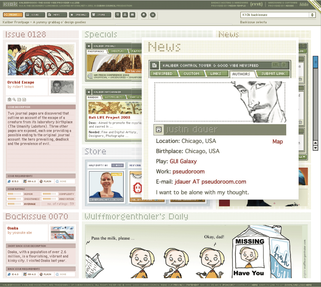
For my part, the combination of my web design work and pixel art exploration began to get me some notoriety in the design scene. Eventually, K10k noticed and added me as one of their very select group of news authors to contribute content to the site.
Amongst my personal work and side projects—and now with this inclusion—in the design community, this put me on the map. My design work also began to be published in various printed collections, in magazines domestically and overseas, and featured on other design news portals. With that degree of success while in my early twenties, something else happened:
I evolved—devolved, really—into a colossal asshole (and in just about a year out of art school, no less). The press and the praise became what fulfilled me, and they went straight to my head. They inflated my ego. I actually felt somewhat superior to my fellow designers.
The casualties? My design stagnated. Its evolution—my evolution— stagnated.
I felt so supremely confident in my abilities that I effectively stopped researching and discovering. When previously sketching concepts or iterating ideas in lead was my automatic step one, I instead leaped right into Photoshop. I drew my inspiration from the smallest of sources (and with blinders on). Any critique of my work from my peers was often vehemently dismissed. The most tragic loss: I had lost touch with my values.
My ego almost cost me some of my friendships and burgeoning professional relationships. I was toxic in talking about design and in collaboration. But thankfully, those same friends gave me a priceless gift: candor. They called me out on my unhealthy behavior.
Admittedly, it was a gift I initially did not accept but ultimately was able to deeply reflect upon. I was soon able to accept, and process, and course correct. The realization laid me low, but the re-awakening was essential. I let go of the “reward” of adulation and re-centered upon what stoked the fire for me in art school. Most importantly: I got back to my core values.
Always Students
Following that short-term regression, I was able to push forward in my personal design and career. And I could self-reflect as I got older to facilitate further growth and course correction as needed.
As an example, let’s talk about the Large Hadron Collider. The LHC was designed “to help answer some of the fundamental open questions in physics, which concern the basic laws governing the interactions and forces among the elementary objects, the deep structure of space and time, and in particular the interrelation between quantum mechanics and general relativity.” Thanks, Wikipedia.
Around fifteen years ago, in one of my earlier professional roles, I designed the interface for the application that generated the LHC’s particle collision diagrams. These diagrams are the rendering of what’s actually happening inside the Collider during any given particle collision event and are often considered works of art unto themselves.
Designing the interface for this application was a fascinating process for me, in that I worked with Fermilab physicists to understand what the application was trying to achieve, but also how the physicists themselves would be using it. To that end, in this role,
I cut my teeth on usability testing, working with the Fermilab team to iterate and improve the interface. How they spoke and what they spoke about was like an alien language to me. And by making myself humble and working under the mindset that I was but a student, I made myself available to be a part of their world to generate that vital connection.
I also had my first ethnographic observation experience: going to the Fermilab location and observing how the physicists used the tool in their actual environment, on their actual terminals. For example, one takeaway was that due to the level of ambient light-driven contrast within the facility, the data columns ended up using white text on a dark gray background instead of black text-on-white. This enabled them to pore over reams of data during the day and ease their eye strain. And Fermilab and CERN are government entities with rigorous accessibility standards, so my knowledge in that realm also grew. The barrier-free design was another essential form of connection.
So to those core drivers of my visual problem-solving soul and ultimate fulfillment: discovery, exposure to new media, observation, human connection, and evolution. What opened the door for those values was me checking my ego before I walked through it.
An evergreen willingness to listen, learn, understand, grow, evolve, and connect yields our best work. In particular, I want to focus on the words ‘grow’ and ‘evolve’ in that statement. If we are always students of our craft, we are also continually making ourselves available to evolve. Yes, we have years of applicable design study under our belt. Or the focused lab sessions from a UX bootcamp. Or the monogrammed portfolio of our work. Or, ultimately, decades of a career behind us.
But all that said: experience does not equal “expert.”
As soon as we close our minds via an inner monologue of ‘knowing it all’ or branding ourselves a “#thoughtleader” on social media, the designer we are is our final form. The designer we can be will never exist.
This content originally appeared on
A List Apart: The Full Feed and was authored by The fine folks at A List Apart
The fine folks at A List Apart | Sciencx (2023-06-22T13:00:00+00:00) Humility: An Essential Value. Retrieved from https://www.scien.cx/2023/06/22/humility-an-essential-value-1143/
Please log in to upload a file.
There are no updates yet.
Click the Upload button above to add an update.
