
This content originally appeared on Adam Silver and was authored by Adam Silver
My friend Victor shared this design tip on Twitter last week:
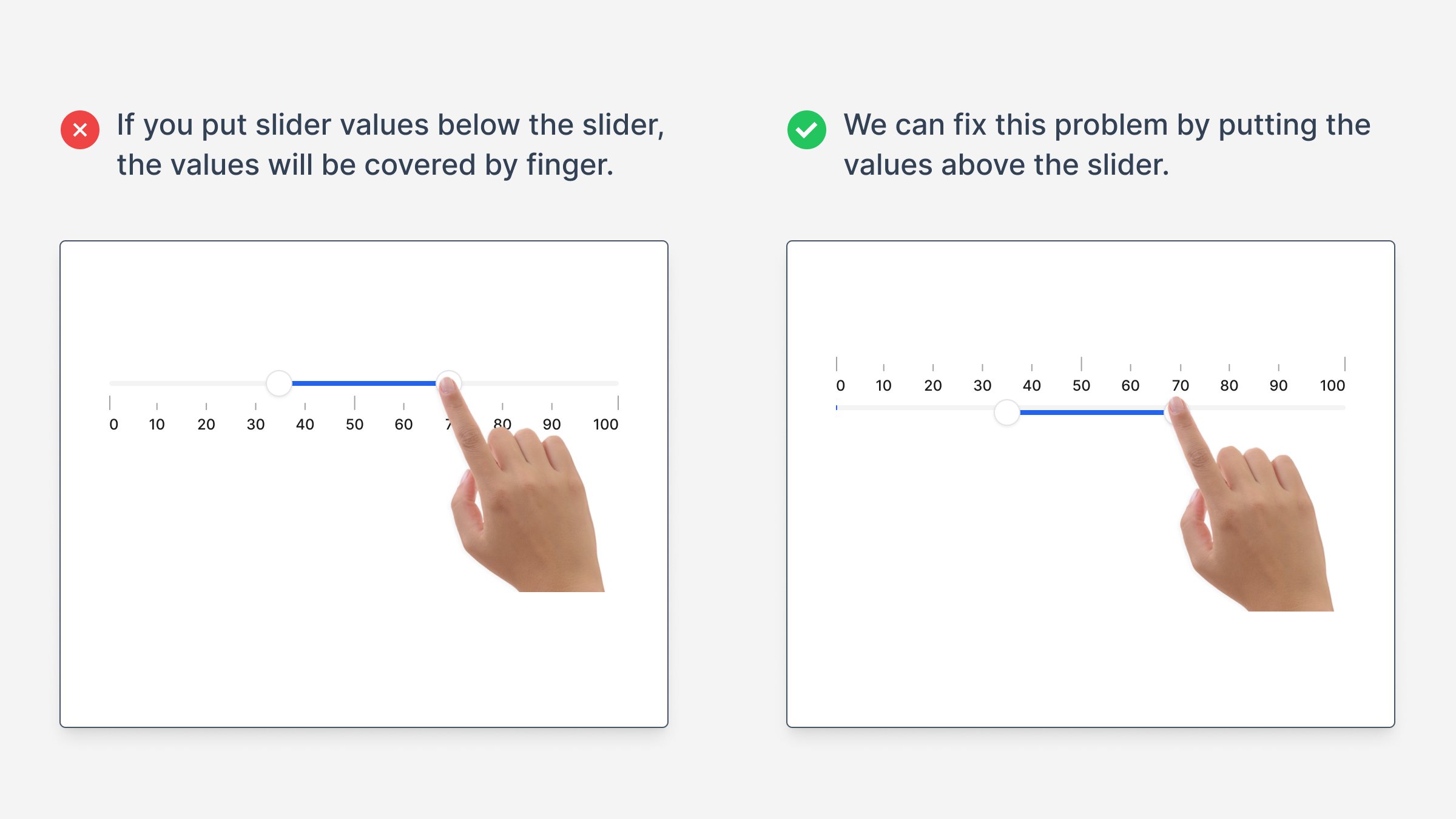
He said that if you put the slider values on top, your finger won’t cover them up.
It’s a useful tip.
But sliders aren’t just bad UX because your finger covers up the values. This is the least of your worries.
Here I’ll share why that is (plus what to do instead):
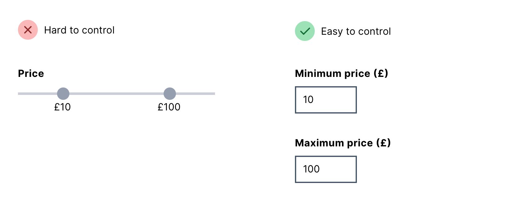
Reason 1: They’re hard to control
This is because it takes a lot of effort to move the slider into the position. This is even harder if you:
- need to be precise
- have motor impairments
- have ridiculously long purple nails (like my friend Rach)

Reason 2: The values cannot be clearly labelled
This is because there’s limited space to fit labels in.
So you end up with gaps or line markers which are ambiguous and make users work harder.
Reason 3: They’re hard to fit on small screens
Sliders need to be big enough to interact with properly.
Squeezing the slider into a small space makes it even harder to use.
Reason 4: They have an upper limit
Sliders have an upper limit which is fine when it’s a percentage value.
But it doesn’t work well for values like price.
Do this instead
If the user needs to be precise, use two inputs:
If the user does not need to be precise, use checkboxes:
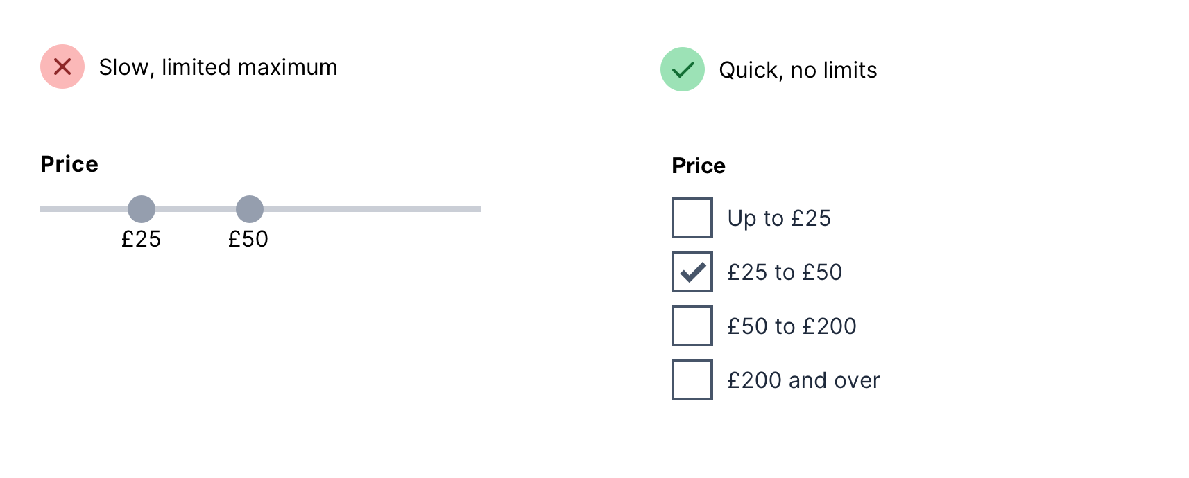
Both patterns are easy to use and work on mobile.
But there’s an even more important lesson here.
Because Victor was thoughtful, no doubt. He looked at the slider, spotted an issue and came up with better UX.
But improving a bad pattern doesn’t make it good. You’re usually better off finding another pattern altogether.
If you’d like instant access to every bad form design pattern I know and the replacement for each one, you might like my course, Form Design Mastery:
This content originally appeared on Adam Silver and was authored by Adam Silver
Adam Silver | Sciencx (2024-02-18T00:00:00+00:00) Sliders degrade UX (so do this instead). Retrieved from https://www.scien.cx/2024/02/18/sliders-degrade-ux-so-do-this-instead/
Please log in to upload a file.
There are no updates yet.
Click the Upload button above to add an update.