This content originally appeared on DEV Community and was authored by Bobby Iliev
Vertical alignment can often be a challenge in web design, but with Tailwind CSS, you can easily align elements in the center of the screen.
This quick guide will walk you through the steps to vertically align content within a full-screen div using Tailwind CSS, complete with nicely styled examples.
Step 1: Setting Up Tailwind CSS
First, make sure you have Tailwind CSS set up in your project. If you're starting from scratch, you can use the following CDN link in your HTML file:
<!DOCTYPE html>
<html lang="en">
<head>
    <meta charset="UTF-8">
    <meta name="viewport" content="width=device-width, initial-scale=1.0">
    <title>Vertical Alignment with Tailwind CSS</title>
    <link href="https://cdn.jsdelivr.net/npm/tailwindcss@2.2.19/dist/tailwind.min.css" rel="stylesheet">
</head>
<body>
    <!-- Your content will go here -->
</body>
</html>
If you're using a build tool like Webpack or a framework like Next.js, refer to the Tailwind CSS installation guide for the appropriate setup.
Step 2: Creating the Full-Screen Div
To create a full-screen div, we'll use Tailwind's utility classes. We'll start by creating a div that spans the full viewport height and width. Here's a simple example:
<div class="min-h-screen flex items-center justify-center bg-gray-100">
    <!-- Content goes here -->
</div>
-
min-h-screen: This class sets the minimum height of the div to the full height of the viewport. -
flex: This makes the div a flex container. -
items-center: This vertically centers the content inside the flex container. -
justify-center: This horizontally centers the content inside the flex container. -
bg-gray-100: This adds a light gray background color to the div.
Step 3: Adding Content
Now, let's add some content inside our full-screen div. We'll use a simple card component as our example:
<div class="min-h-screen flex items-center justify-center bg-gray-100">
    <div class="bg-white p-8 rounded-lg shadow-lg">
        <h1 class="text-2xl font-bold mb-4">Vertically Aligned Content</h1>
        <p class="text-gray-700">This content is centered both vertically and horizontally using Tailwind CSS.</p>
    </div>
</div>
-
bg-white: This sets the background color of the card to white. -
p-8: This adds padding to the card. -
rounded-lg: This rounds the corners of the card. -
shadow-lg: This adds a large shadow to the card. -
text-2xl: This sets the font size of the heading to 2xl. -
font-bold: This makes the heading bold. -
mb-4: This adds a bottom margin to the heading. -
text-gray-700: This sets the color of the paragraph text to a dark gray.
Step 4: Styling the Content
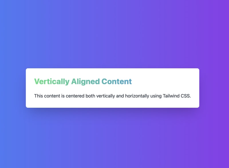
To make our example more visually appealing, we can add some additional styling. Let's enhance the card with a more polished look:
<div class="min-h-screen flex items-center justify-center bg-gradient-to-r from-blue-500 to-purple-600">
    <div class="bg-white p-8 rounded-lg shadow-2xl transform hover:scale-105 transition-transform duration-300">
        <h1 class="text-3xl font-extrabold mb-6 text-transparent bg-clip-text bg-gradient-to-r from-green-400 to-blue-500">
            Vertically Aligned Content
        </h1>
        <p class="text-gray-800 text-lg">
            This content is centered both vertically and horizontally using Tailwind CSS.
        </p>
    </div>
</div>
-
bg-gradient-to-r from-blue-500 to-purple-600: This creates a background gradient for the full-screen div. -
shadow-2xl: This adds a larger shadow to the card. -
transform hover:scale-105 transition-transform duration-300: This adds a scaling effect when the card is hovered over, with a smooth transition. -
text-3xl: This sets the font size of the heading to 3xl. -
font-extrabold: This makes the heading extra bold. -
text-transparent bg-clip-text bg-gradient-to-r from-green-400 to-blue-500: This creates a gradient text effect for the heading. -
text-lg: This sets the font size of the paragraph text to large.
Conclusion
By using Tailwind CSS's utility classes, you can easily vertically align content within a full-screen div. The flexbox utilities provided by Tailwind make it simple to center content both vertically and horizontally with just a few classes.
For even more styling options and to create beautiful designs effortlessly, check out the DevDojo Tails Tailwind CSS builder. It's a fantastic tool to help you with your workflow and create stunning designs with Tailwind CSS.
This content originally appeared on DEV Community and was authored by Bobby Iliev
Bobby Iliev | Sciencx (2024-06-30T21:00:00+00:00) How to Vertically Align Content with Tailwind CSS Across a Full-Screen Div. Retrieved from https://www.scien.cx/2024/06/30/how-to-vertically-align-content-with-tailwind-css-across-a-full-screen-div/
Please log in to upload a file.
There are no updates yet.
Click the Upload button above to add an update.


