This content originally appeared on Bits and Pieces - Medium and was authored by Ashan Fernando
Architecting micro frontends in React brings in unique challenges. Making it composable makes a huge difference.

Composability is no longer new. Over the last decade, many tools, techniques, and patterns have emerged to build composable architectures. In the grand scheme of things, SOA, EDA, microservices, and microfrontends are driving towards composability.
One common property of these architectural styles is that they all aim to break down the system into modules where teams can work with more autonomy. Reducing the dependency between teams was the key to achieving this. Most of this was achievable due to the advancements of distributed systems, where isolation is possible at different levels. Reusing code between teams was kept to a minimum to avoid coupling.
Drive for Composability
However, when it comes to frontends, reuse becomes essential to providing a consistent look and feel across the entire application. So, many frontend libraries and frameworks encourage the reuse of design by allowing the building of applications as a collection of components.
If we look at React, this library was one of the pioneers that drove the revolution of building web applications using components. If we look at a simple React component, you will understand why it's so elegant.
import type { ReactNode } from 'react';

export type MyButtonProps = {
  /**
   * sets the component children.
   */
  children?: ReactNode;
};

export function MyButton({ children }: MyButtonProps) {
  return (
    <button style={{ padding: '10px 20px', cursor: 'pointer' }}>
      {children}
    </button>
  );
}
Imagine you can develop any number of components as you like, and then when using them, it's a matter of composing them, more like directly adding them to the DOM.
import React from 'react';
import ReactDOM from 'react-dom/client';
import { MyButton } from './MyButton';

function App() {
  return (
    <div>
      <h1>Welcome to My App</h1>
      <MyButton>Click Me!</MyButton>
    </div>
  );
}

const rootElement = document.getElementById('root');
const root = ReactDOM.createRoot(rootElement);
root.render(<App />);
The best thing is that we can compose different components together.
function App() {
  // ...
  return (
    <div>
      <h1>Welcome to My App</h1>
      <Panel title="User Actions">
        <MyButton>
          <span role="img" aria-label="star">⭐</span> Click Me!
        </MyButton>
      </Panel>
    </div>
  );
}
And using these components inside a single project and a codebase was pretty straightforward. And, if we take components like <MyButton>, it’s possible to package it along with other UI components as an NPM library to reuse across microfrontends or multiple applications.
However it is not possible to do it for all the components. But Why?
Composability using Libraries
If we look at components like <MyButton> and <Panel>, they are part of the design system and become fundamental building blocks for any application. As a result, their interfaces become rock solid and won’t change much over time.
This is completely different from higher-order components developed to fulfil business functionality. These components are subject to modification due to changes to the market, user behaviour, and business model. However, if we try to create libraries for these components individually or as groups, things become much more difficult due to dependencies.
Suppose you have NPM dependencies like below;
 Home Page (Application Pages)
    |
    +--> Uses: Widgets Library NPM
    |        |
    |        +--> Contains: Login Menu Button
    |                    |
    |                    +--> Uses: MyButton (from Design System Library NPM)
    |
    +--> Uses: MyButton (from Design System Library NPM)
And if we need to modify the widget, I need to modify and publish it first, then use the newer version inside the Home Page to test it. Just imagine doing this with thousands of components. With each library, more bottlenecks are created that impact developer productivity.
One workaround to address this is to use Bit to edit multiple NPM libraries simultaneously without the need to publish them first before testing their dependent components. For more information, you can refer to the article;
How To Update Multiple NPM Packages Effectively?
Yet, there is a better way of achieving uniform composability, from small buttons to higher-order components that scale well with micro frontends (MFEs). You will also get the UI to develop and preview these components locally, which aids the development.

Composability in Microfrontends
So, you might be wondering how to create micro frontends in React. There are many patterns to it. One popular pattern is using a shell app that composes other MFEs. The ownership of the shell app is typically handled by the core frontend team (or the platform team). Each micro frontend team can work with business components within their boundary.
However, the main challenge is setting up a proper structure using monorepo or libraries with multiple repositories or finding a universal approach that natively allows composability.
It is challenging to create a universal approach from the ground up that allows composability from the small button to higher-order components to the react app root. The main challenge comes with the dependencies of each component.
As we all know, in a typical react project, all the dependencies of components are defined in the package.json file at the root of the project. Instead, we need to implement dependency management for each component (like each component is an NPM package) to make them individually composable. This is achievable using Bit components for React.
/* @filename: welcome.tsx */

import type { ReactNode, HTMLAttributes } from 'react';

export type WelcomeProps = {
  children?: ReactNode;
  className?: string;
} & HTMLAttributes<HTMLDivElement>;

export function Welcome({ children, className, ...rest }: WelcomeProps) {
  return (
    <div {...rest} className={`welcome ${className}}`}>
      {children}
    </div>
  );
}
If you look at the Bit components, you won’t find a difference compared to a typical React component. The main difference is that the Bit toolchain can manage its lifecycle from development to exporting into a bit.cloud for component storage.

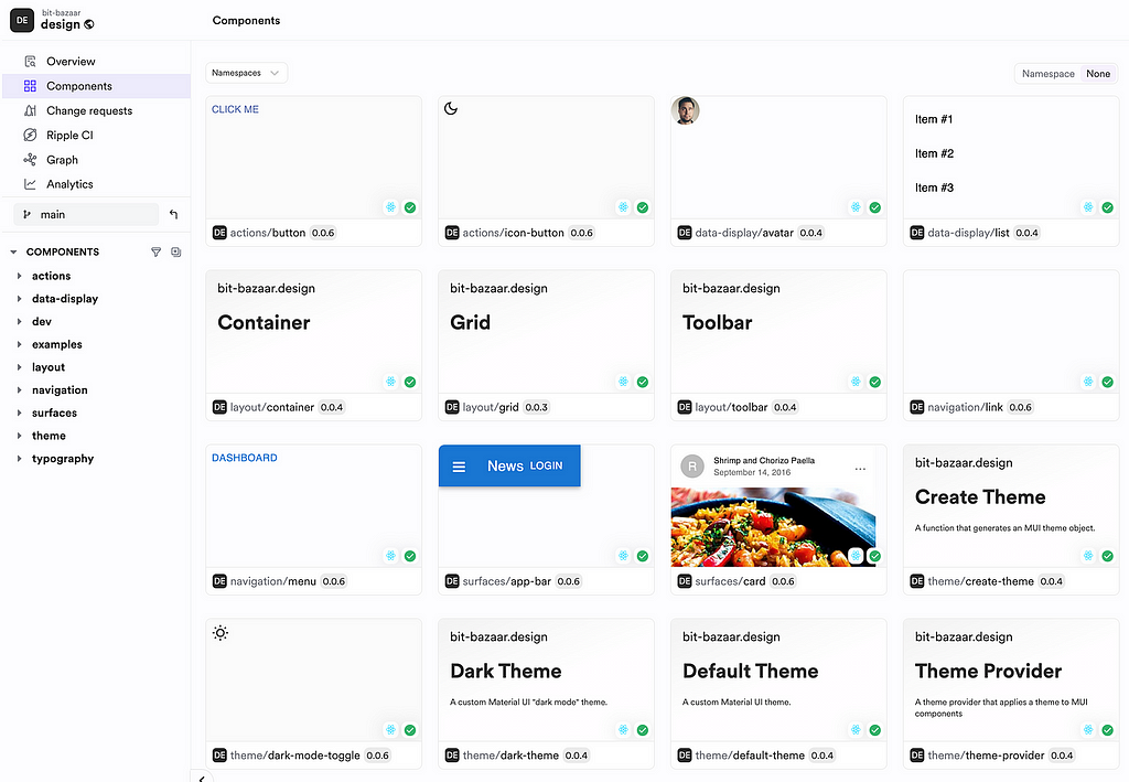
Each component refers to components from bit.cloud instead of using local paths. As you can see in the following example, the Link button @bit-bazzar/design.navigation.link is imported from bit.cloud, but you can use Bit CLI to import them locally, next to your other components, if you need to modify it along with <AboutPage>.
import { Link } from '@bit-bazaar/design.navigation.link';
import Paper from '@mui/material/Paper';
/**
 * import the custom typography component that extends the MUI Typography component
 */
import { Typography } from '@bit-bazaar/design.typography.typography';
// import { Button } from '@bit-bazaar/design.actions.button';

export const AboutPage = () => {
  return (
    <>
      <Typography variant="h1">About</Typography>
      <Paper
        sx={{
          p: 2,
          my: 2,
        }}
      >
        {/* use a cusotm typography variant */}
        <Typography fontSize={20} variant="handwriting">
          This paragraph is styled using a custom typography variant called
          "handwriting"
        </Typography>
      </Paper>
      <Link to="/">
        Route back home using the routing system defined in the custom theme
      </Link>
    </>
  );
};
To understand this, read more about Bit Workspace and how components can be imported to work on them more like a monorepo. The most important thing is that you can decide on the structure of your repositories.
You can create multiple repositories where each MFE code will be stored in individual repositories or create a monorepo to store all. Since we track each component outside the code repository and import them from bit.cloud, keeping components available in the same code base is not a must. To understand this further, you can refer to the article;
Monorepos: Why it’s Difficult to Break Free
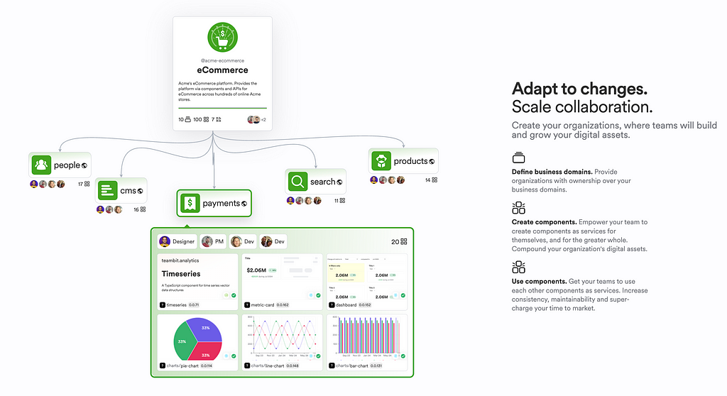
The MFE team can use Scopes to group components. This is useful for providing access control and governance when changing components within an MFE team.
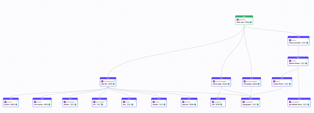
You can also visualize the component dependencies using the dependency graph.

This helps us understand the big picture of how components depend on each other. Once a component is modified, Ripple CI can build only the path in the dependency graph to ensure the unit tests of each dependent component are successful.
This is super useful for efficiency and reduces iteration time since the number of components your CI has to build doesn't grow with the number of components you added to the project.
Conclusion
Architecting micro frontends in React brings unique challenges, but making them composable makes a significant difference. React pioneered in promoting component-based architecture, making building, reusing, and composing UI elements easier.
However, achieving universal composability, from small buttons to higher-order components, is still challenging, and tools like Bit help bridge the gap. Bit components for React facilitate this, allowing developers to manage each component’s lifecycle and dependencies independently. This approach supports the creation of scalable, composable micro frontends, enhancing developer productivity and project maintainability.
In summary, making React micro frontends composable is crucial for building efficient, scalable, and maintainable applications, overcoming architectural challenges, and delivering high-quality user experiences.
Thanks for Reading! Cheers!
Learn More
- Building a UI Library for Your Micro Frontends and Apps
- 5 Patterns for Microfrontends
- Differences in Code Sharing Between Microservices & Microfrontends
- How to Develop Microfrontends Using React: Step by Step Guide
React Micro Frontend: Why Composability Matter? was originally published in Bits and Pieces on Medium, where people are continuing the conversation by highlighting and responding to this story.
This content originally appeared on Bits and Pieces - Medium and was authored by Ashan Fernando
Ashan Fernando | Sciencx (2024-07-01T09:25:56+00:00) React Micro Frontend: Why Composability Matter?. Retrieved from https://www.scien.cx/2024/07/01/react-micro-frontend-why-composability-matter-2/
Please log in to upload a file.
There are no updates yet.
Click the Upload button above to add an update.
