This content originally appeared on HackerNoon and was authored by Yuliia Nikitina
Why it Matters
Contrary to the belief of many, disabled people are not rare. One billion people, or about 15% of the world’s population, experience some form of disability. Also, it’s not just about life-long disabilities. Sometimes, everyone might need extra assistance, for example, in case of a broken arm or eye infection. Plus, disabilities will likely catch up with most of us as we age.
\ There’s a lot of information on making reports more accessible and creating user-friendly visualizations but little on how to introduce accessibility to the reporting software. Like any other software, it should be equally accessible to users with different abilities.
\ Even non-disabled people can benefit from improved accessibility in reporting software in numerous cases. For example, closed captioning can be conveniently used in environments where you cannot hear or play the audio.
\ Moreover, people of all backgrounds sometimes need to use reporting software. It’s not just limited to data analysts and other professionals who use it for a living. Therefore, not all might be familiar with the technicalities of reporting. So, improving the software’s usability and minimizing the learning curve would also mean improving its accessibility.
Credibility
Most of the accessibility standards come from WCAG 2.1. These are web accessibility guidelines published by the Web Accessibility Initiative (WAI) of the World Wide Web Consortium (W3C), the main international standards organization for the Internet. WCAG is a set of rules to achieve maximum accessibility of web content. So, for this article, they are the primary basis for judgment on the topic.
\ On the other hand, when the issue’s more about universal design than accessibility, meaning that it’s not particularly made for users with disabilities, the judgment will be based on other, less formal criteria.
Disclaimer
To make the article more practical, I will use real examples of reporting software. Both good and bad. But keep in mind that reviewing the accessibility of a particular tool doesn’t reflect the software itself and its other qualities. Saying that some software does not meet specific criteria does not mean it’s inherently bad. The goal is not to portray it negatively but rather to educate the public and bring to light the aspects in which we, as a community, could do better by our disabled peers.
\ Now, let’s review particular ways in which accessibility can be improved in reporting software.
Vision disabilities
People with vision impairments often have difficulty using regular software, which heavily relies on visual elements. Although pretty to a fully-seeing person, intricate graphics and complex design choices might pose some challenges to others. To make data visualization tools accessible, you can improve the following things:
Sufficient contrast
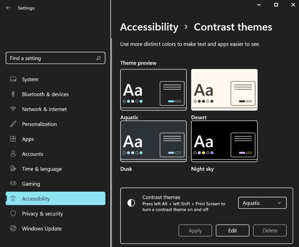
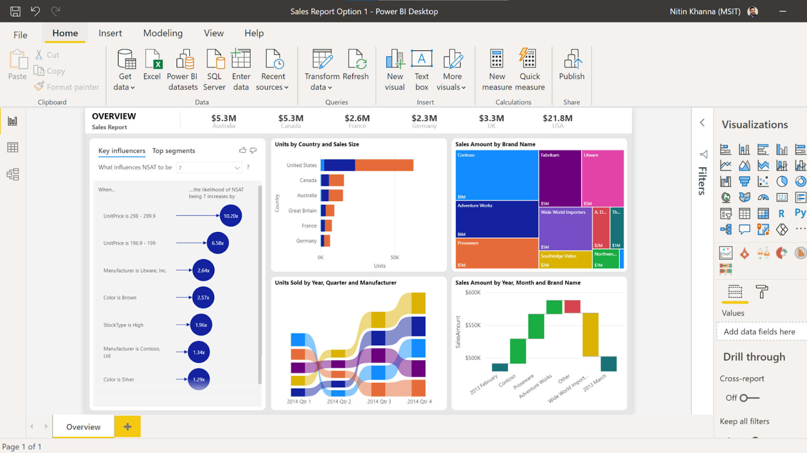
For people with low vision, similar colors and tones often blur together, making it hard to distinguish different UI elements. One way to combat this is to provide the interface with sufficient contrast or implement separate high-contrast themes for improved readability. An excellent example of such implementation would be Microsoft’s PowerBI Desktop. It has several high-contrast themes to choose from that apply both to the interface and to the reports you make. Plus, if you already use a high-contrast theme on Windows, it will automatically detect and apply it to PowerBI. The ease of use and availability of several options is what makes it stand out.
\
\ Another example of a good high-contrast setting comes from a web-based reporting component, Flexmonster Pivot Table & Charts. Their high-contrast theme satisfies the requirements and can be accessed simply through a combination of keys on the keyboard. The setting is not as extensive as PowerBI’s, but this is probably the first time I’ve seen something similar implemented in a web component, especially with such ease of use. It’s very refreshing to see because, as you will see next, even bigger and more established companies sometimes neglect accessibility standards.
\
\ On the contrary, we have, for example, Tableau users who have been reporting insufficient interface contrast for quite some time. So far, no suitable options have yet been presented over the years, which is quite sad. No hate to the developer team, but I hope that in future releases, more effort will be made to accommodate people with vision disabilities.
Make the important elements stand out
It’s good to make the essential elements visible at first glance so users don’t have to search for them. Having action buttons stand out would be especially helpful to users with vision impairment. This can be done using colors, shapes, font sizes, styles, etc.
\
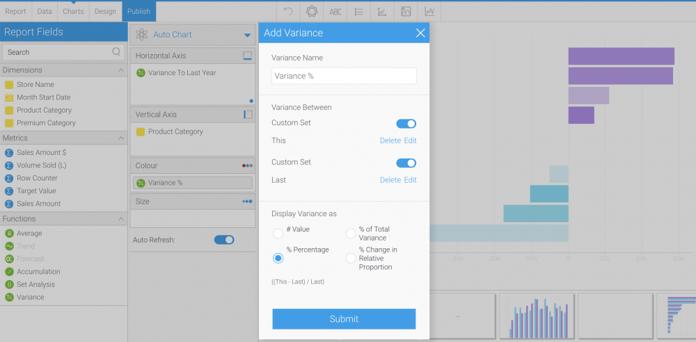
\ Here’s, for example, one of the editing views in Yellowfin BI. The ‘Submit’ button and the switch controls are clearly different from the rest of the layout, which makes them more visible to the user.
Enlarge UI elements
Making sure that UI elements are big enough for the user to see can be done in 2 main ways:
- either design them that way from the beginning,
- or provide functionality to enlarge the application on the user end.
\ First, let’s consider the design option.
\ Large applications often cannot afford to make UI elements big as they have a lot of functionality to fit on screen. But even when it’s possible, developers do not always choose to adhere to standards.
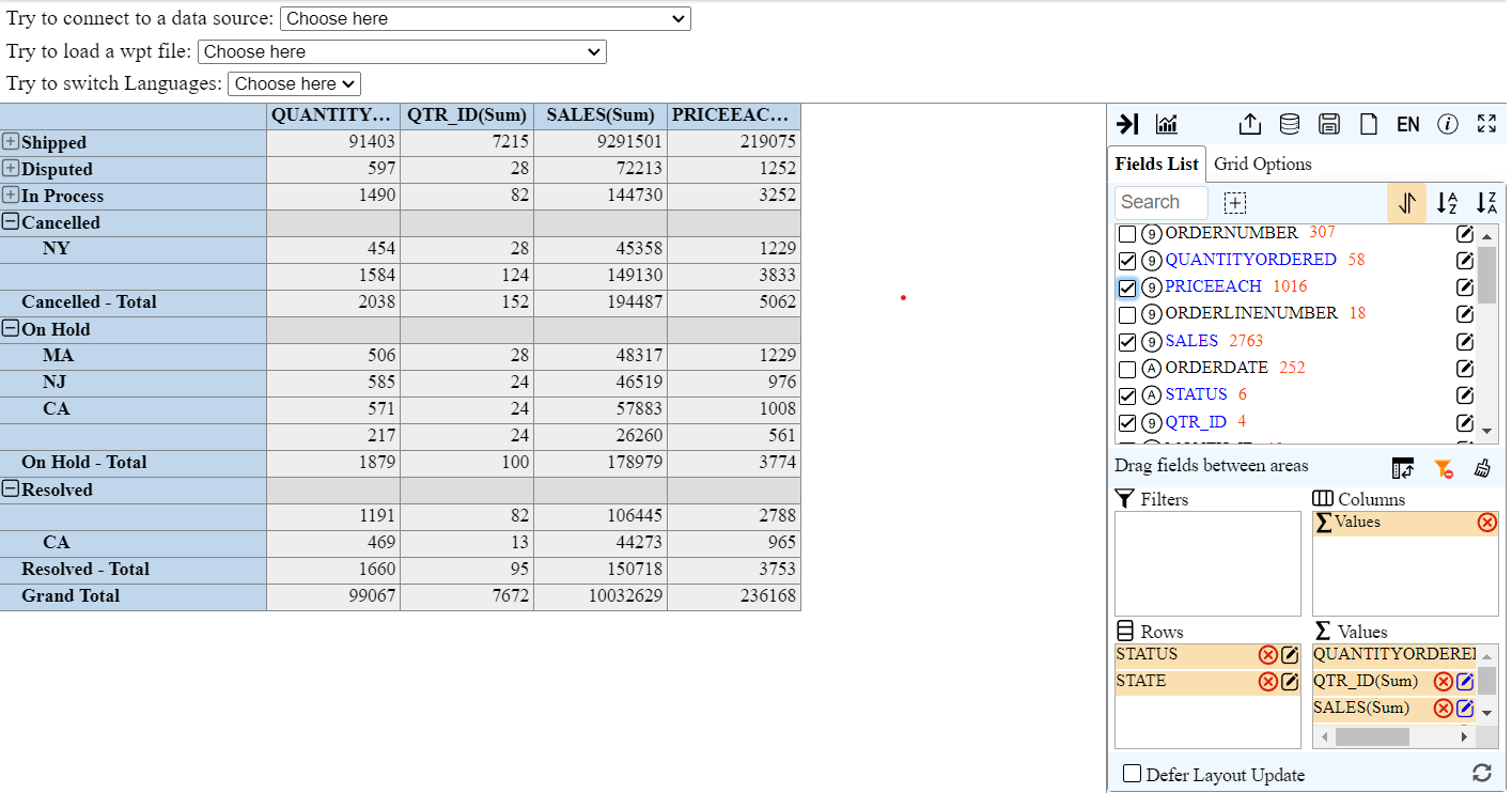
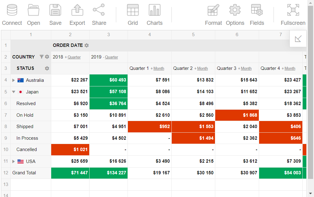
\ For example, here’s the interface of WebPivotTable, which is, as the name suggests, a pivot component for the web.
\
\ Even though there is still enough free space left on the canvas, the buttons are small and hard to see and point to for someone with low vision. Not quite accessible.
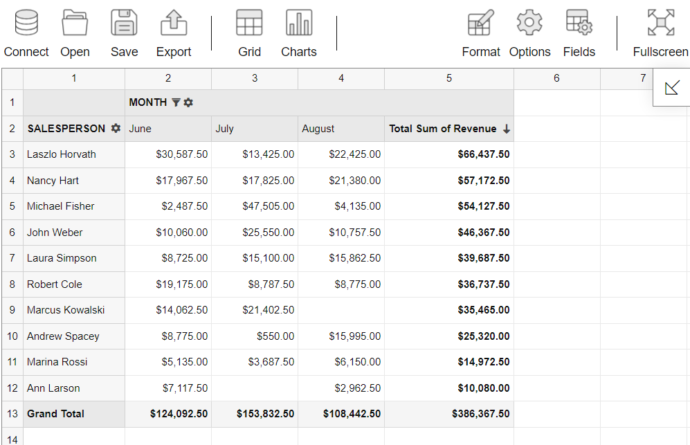
\ On the contrary, we have Flexmonster, which is quite similar in functionality to WebPivotTable. Here, the buttons are bigger and more visible, which makes it much more accessible for users with low vision.
\
\
\ Even for large, functionality-rich applications, there is often a solution. Take, for example, PowerBI Desktop or virtually any Microsoft desktop product with a similar design.
\
\ The UI is organized to allow the elements to remain sufficiently large while still providing the same functionality range. This is done by implementing table and drop-down lists instead of trying to fit everything into a single page. This way, you might have to do 1 or 2 more clicks to find the exact button, but at least now you can see it.
Implementing zoom
As the second option for providing a sufficiently big UI, we have the functionality for the user to enlarge the application.
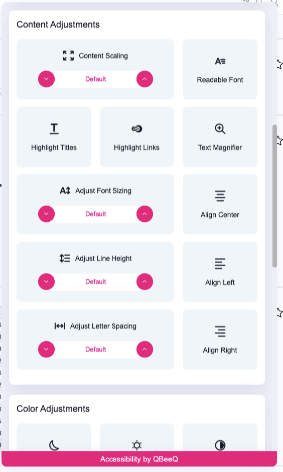
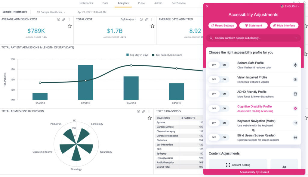
I like how Sisense implements it, for example. In their accessibility adjustments, users can alter content scaling, font size, spacing between elements, and more.
\
\ Plus, a text magnifier option allows users with impaired vision to work even more freely by enlarging a specific area.
\
\ Plus, all the adjustments for vision impairments can be turned on by a single switch, which is extremely useful.
Color blindness accessibility features
Color blindness is a condition where people cannot differentiate specific colors. There are different types of it, although for now, the green-red colorblindness remains the most dominant, so you might often see recommendations not to use this color combination in charts. Ways you can accommodate color-blind people include not relying on color to convey the meaning and implementing color-blind themes for users to use in reporting.
\ One of the tools that has implemented special themes for color blindness is PowerBI.
\
\
\ The provided accessibility support includes selecting hues that provide enough contrast between content, the background, and adjacent colors so that text and graphics are more legible. More on PowerBI’s accessibility themes here.
\ Also, sometimes, when the company fails to provide such options, users take matters into their own hands and try to come up with solutions. For example, here, you can find accessibility themes for Tableau that a community member uploaded. The palette is selected to adhere to accessibility standards for color blindness and passes the Color Contrast Analyzer.
Screen reader compatibility
A screen reader that reads what’s on the screen out loud can dramatically benefit people with blindness and low vision. However, the software’s screen compatibility needs to be ensured.
\ Thankfully, I noticed that more and more companies implement screen readers in their products. This includes Tableau, Zoho Projects, Sisense, and PowerBI. Even web reporting tools, like, for example, Highcharts and Flexmonster, provide screen reader compatibility, which sets a good example for other software in the field.
Motor impairments
Users with motor impairments can have trouble using regular software because it often requires precise movements for input. However, there are ways to accommodate this.
Support for different input modalities
Using a mouse can be a pretty big challenge for those with motor impairments. Even having a broken arm would be a big enough obstacle for this. One way to battle it would be for the software to have support for other input modalities, such as speech recognition or keyboard navigation.
\ The most common modality that is usually implemented besides mouse input is keyboard navigation. It is supported by a lot of software, although not all of it, sadly. For example, platforms like QlikSense, Tableau, or Sisense have keyboard navigation, and Zoho Analytics, on the contrary, doesn’t. The last one actually kind of surprised me because other Zoho products seem to have keyboard navigation available. Even web components and tools are picking up on keyboard accessibility. Highcharts and Flexmonster, mentioned before, have it available with clear instructions.
\ With other input modalities, things are a bit more complicated since allowing voice input from the software is hard. A way to get around it would be to implement integration with third-party speech recognition software. Examples of such include Dragon, Microsoft Azure speech service, and others.
\
General principles
Some accessibility guidelines are not related to accommodating a specific disability because they can help a wide range of people. Struggles with using the software can arise not only for people with visual and motor impairments but also for those with cognitive disabilities. A general lack of experience in using reporting software can also play a big role. In developing applications or tools, we should consider all of them to make the design as universal as possible.
Having a clear, uncomplicated layout
Having a clear and fairly simple layout means ease of navigation within it for users of all abilities. Not overcomplicating the design would also help those who have limited experience with reporting software, as this way, they will likely grasp how to use it quickly.
\ One of the possible ways to achieve clear UI is through Gestalt design principles. They are principles of design based on the Gestalt theory, which talks about simplification in human perception of complex concepts and designs. The exact principles may vary as some new ones have emerged in recent years, but the common ones include similarity, continuity, proximity, closure, figure/ground, symmetry, and order. It wouldn’t be possible to cover them all here, so if you want to know more, you can check out this article by Lyssna. You see a lot of examples of the application of those principles. For instance, in almost every interface, related features are grouped together.
\
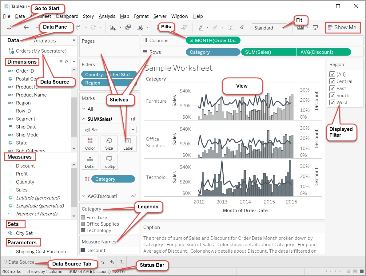
\ For example, here’s Tableau’s interface. What you can see here is a direct implementation of the proximity law. And the fact that buttons for similar functions look similar in the UI is the application of the similarity principle.
\ Another thing to consider when designing for accessibility is affordance. Affordance refers to the perceived usability of an object. In the context of user interfaces, all important buttons should call for action. This speeds up the process of guessing the UI's functionality and simplifies the overall perception. Increasing affordance can be achieved through color, shape, size, or special icons.
\ For example, icons in Flexmonster, which I took as a ‘good’ example for the size of UI elements, increase the affordance of the buttons because they convey the meaning of what that button does. You might be incredibly familiar with pictures used for ‘save’ and ‘options‘, but the rest are also pretty intuitive.
\
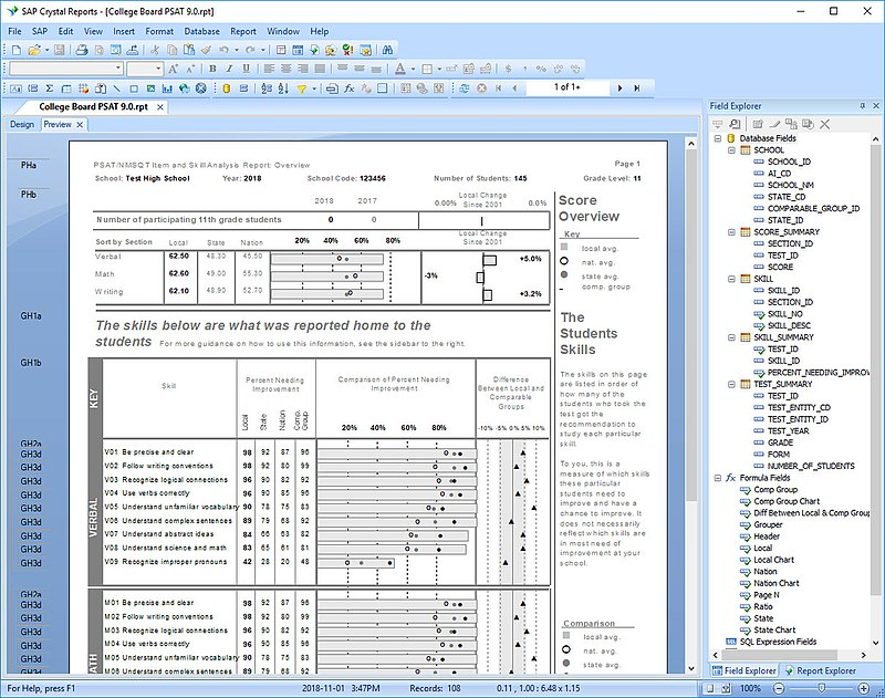
\ There are many more practices for UI/UX design on this topic. It doesn’t matter which ones you use as long as you reach your goal. Here’s, for example, an objectively complex interface design by SAP Crystal Reports:
\
\ The buttons are tiny, and even though they have icons, they require some guessing. Plus, the icon acts as the only way to convey the meaning here, and since they’re pretty small, I wouldn’t consider it a good practice. So, to make the software more accessible, I would try to avoid such situations.
Tolerance for error
No matter how much time you spend implementing all accessibility principles, users might still make mistakes with it sometimes. A good practice would be to have some sort of error correction method. Whether it’s some chart setting or data source configuration, every input and action in the software should be reversible. One of the ways to implement this is undo/redo options, or at least the first one. For example, here’s the information for Tableau on these features. But if you want to determine if the specific tool has those features, you must check out its documentation. This brings us to the next and last tip of this article.
Have accessible documentation
Accessible documentation means that the necessary information is readily available and detailed. While looking for example references for this article, finding the information I needed was sometimes very hard. Sometimes, the accessibility details were missing completely, and sometimes, the docs only mentioned the implemented accessibility features without actually explaining how to use them. Plus, to ensure the people looking for that documentation can read it, implement the same principles we’ve talked about here into the docs, such as integration with screen readers, zoom functionality, etc.
\ Examples of good documentation among the software products mentioned in this article include Sisense, PowerBI, and Flexmonster.
Last Words
Improving accessibility in business intelligence is an essential aspect, as it determines whether a certain, quite large, portion of users can use it. Fortunately, things have been getting better over the last few years as accessibility advocates have spoken up. But there’s still room for improvement, at least in reporting software, and I hope that everyone who reads this article will take more notice of those with disabilities. Choose WCAG-compliant reporting tools and software that accommodates all users and speaks up when it doesn’t. Let’s make data analytics and reporting more accessible together!
\
This content originally appeared on HackerNoon and was authored by Yuliia Nikitina
Yuliia Nikitina | Sciencx (2024-07-17T13:49:23+00:00) Is Your Reporting Software WCAG Compliant? Make Data Accessible to Everyone with Practical Steps. Retrieved from https://www.scien.cx/2024/07/17/is-your-reporting-software-wcag-compliant-make-data-accessible-to-everyone-with-practical-steps/
Please log in to upload a file.
There are no updates yet.
Click the Upload button above to add an update.

