This content originally appeared on HackerNoon and was authored by Judith Awino
Your CTA is the second most important element right after your headline.
\ Just like coming up with a winning headline is an art, the same holds true for your CTAs.
\ If you can just spend the same time writing your CTA as your headline, you’ll see an improvement in conversions depending on the traffic you’re already receiving.
\ If you could just walk away with one lesson, then it’s that your CTA deserves attention just as your headline.
\ Think about it, without your CTA, there are no clicks and, therefore no purchase. Therefore no revenue.
\ Here’s the kicker; you need more than just simple words like “Get Started” or “Sign Up.”
\ In this guide, you’ll learn how to transform your CTA from a bland afterthought to an actual conversion-boosting element.
\ Here’s a quick overview:
\
How to make your CTA more clickable
8 CTA conversion Killers
7 click trigger to neutralize click anxiety
Free downloadable CTA checklist to use before you hit publish
\
Let’s get started.
Make Your CTA More Clickable
Let’s reset time and imagine the life of a caveman.
\ Life for the caveman was a perpetual dance between survival and adaptation in a harsh and unpredictable environment.
\ Their brains were finely tuned instruments, honed by evolution to ensure constant alertness and quick responses to threats.
\ Every day was a battle against formidable predators, harsh climates, and the challenges of finding food and shelter.
\ Senses were heightened to detect even the faintest rustle or distant growl.
\ In this primal landscape, the brain's innate mechanisms for alertness—triggering adrenaline, sharpening senses, and prioritizing survival—were not just survival tools but the very essence of daily existence.
\ We might have evolved and do things better than the caveman but our brains are still wired pretty much just as the caveman.
\ You pay more attention to something that stands out in any environment.
\ That includes a website page.
\ This is why your CTA needs to draw attention to itself and stand out.
\ Here’s how:
1. Use a Color That's a Complete Contrast to Your Website Color
Using bright and contrasting colors triggers your lizard brain response quickly because they stand out against the background and other elements on the page.
\ For example, a red or orange CTA button on a predominantly white or blue page will be immediately noticeable.
\ If you are unsure which color to use for your CTA, depending on your website palette, the Figma color wheel can help you.
\ \
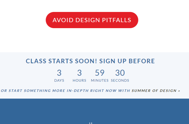
See it in Action (Design for Hackers)
This is a screenshot for a free course that that teaches you how to avoid the most common mistakes beginning designers make.
\ Notice how the CTA color automatically attracts your attention because it’s a complete deviation from the website theme.
\
\ \ \ \ \ \ \ \ \ \ \ \ \ \ It’s also important to choose a CTA color that aligns with or complements your scheme and can feel more intuitive without feeling out of place.
2. Small CTA vs Big CTA
The size of a CTA button significantly influences conversions by tapping into the primal aspects of the human brain.
\ Just as our ancestors relied on heightened senses and immediate reactions to survive, modern consumers are instinctively drawn to prominent visual cues that stand out.
\ Larger CTAs are more effective because they trigger the brain's natural alertness to significant stimuli.
\ Studies from CXL, Unbounce, and WebFX show that noticeable but not overwhelming CTAs can increase click-through rates and conversions.
\ Examples
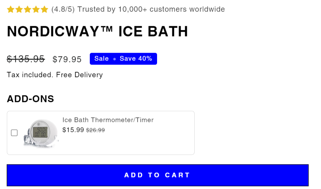
\ Note, that all the CTAs are big and draw attention to themselves using color and size at the same time.
\
Nordicway Ice Bath
\n
\ \n
\ \ \ \ \ \ \ \ \
- Entry Level.Net
\

\ \ \ \ \ \ \ \ \ \ \ \ \ \ \
3. Avoid Micro-Copy for Your Website Page CTA
How you write copy for web pages CTAs isn’t the same as your in-app messaging CTA or online ads you might be running.
\ Ads and in-app messaging go well with microcopy which really doesn’t work for website pages.
\ Here’s an example of the same product but different channels.
\
\

\ \ \ \ \ \ \ \ \ \ \ Here are the key reasons why microcopy might not be ideal for CTAs:
\
Clarity and Directness
\
CTAs need to convey exactly what the user should do in as few words as possible.
\ Microcopy can sometimes be too brief, leading to ambiguity or confusion.
\ Users should instantly understand the action they are being asked to take.
\
Impact and Persuasion
\
A CTA should motivate and persuade the user to take action.
\ Longer, more descriptive phrases often do a better job of conveying the benefits or urgency of the action.
\ Microcopy might lack the necessary persuasive elements to encourage a click.
\
Context and Information
\
Users need to know what will happen when they click a CTA.
\ Microcopy can sometimes fail to provide enough context or information, leaving users uncertain about the next steps or the value they will receive.
\
Emotional Appeal
\
Effective CTAs often tap into the user’s emotions, such as excitement, urgency, or curiosity.
\ Microcopy might not provide enough space to evoke these emotions or create a strong emotional connection with the user.
\
Avoiding Over-Simplicity
\
While simplicity is important, overly simplistic micro-copy can undermine the CTA’s effectiveness.
\ For example, a button that simply says “Click” doesn’t provide enough information or incentive.
\ A more detailed CTA like “Get Your Free Guide” is both simple and informative.
\ Examples
\ Micro Copy: “Submit”
Lacks clarity about what is being submitted or the benefit of submitting.
\
Improved CTA “Get Your Free eBook”
Clearly indicates what the user will receive and adds an element of value.
\ Micro Copy: “Sign Up”
Vague and does not specify what the user is signing up for.
\
Improved CTA: “Join Our Newsletter for Exclusive Offers”
Provides context and highlights the benefit of signing up.
\
Remember, brevity is important in CTAs but avoid overly brief micro-copy when creating your webpages.
4. Include Directional Cues
Adding directional cues when writing CTA (Call to Action) copy is important because these cues guide the user's attention, making it easier for them to notice and understand what action they should take.
\ They are beneficial because:
\
Drawing Attention
\
Directional cues, such as arrows or visual elements pointing towards the CTA, naturally attract the user’s gaze.
\ This helps in ensuring that the CTA stands out on the page and isn’t missed among other content.
\
Guiding the User’s Eye Path
\
Web pages can be busy with various elements.
\ Directional cues help guide the user's eye through the page, creating a clear path to the CTA.
\ This reduces cognitive load and makes the user journey more intuitive.
\
Enhancing Visibility
\
Especially in cases where the CTA might be surrounded by other elements, directional cues help in highlighting the CTA, ensuring it doesn’t get lost in the clutter.
\ This is crucial for mobile designs where screen space is limited.
\ SEE IT IN ACTION
\
Arrows
\
Arrows pointing toward the CTA button can effectively draw attention and indicate the next step.
\ Example: Stephanie Kase Free Reels Masterclass
https://youtu.be/qxEVPQjemVw?si=7KDndW3YNOYfhktm&embedable=true
\ \
- Lines or Pathways
\ Visual pathways or lines leading to the CTA can subtly guide the user's eye toward the action point.
\ Example: Headlime
https://youtu.be/ECNVbkLPw0o?embedable=true
\
- Emoji and Icons
\ Shapes like pointing fingers or icons that direct attention can also serve as effective directional cues.
\ SEE IT IN ACTION (PetsMont Buddy Guard)
\ Petsmont uses a pointing finger emoji as a cue for the visitor to order the product.
\
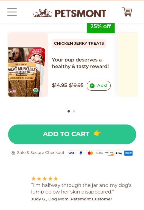
\ \ \ \ \ \ \ \ \ \ \ \ \ \ \ \ \ \ \ \ \ Adding directional cues to CTA copy enhances the user experience by making CTAs more noticeable, guiding user behavior, and ultimately increasing the likelihood of conversions.
Call to Action Conversion Killers
Your website visitors have fears.
\ A thousand what-ifs because perhaps their past experiences with other sites haven’t been great.
\
\

\ \ \ \ \ \ \ \ \ \ \ \ \ That’s why you need to act as a guide and neutralize their anxieties.
\ Here are several reasons somebody might dread clicking your CTA:
\
Fear of Commitment
"Does clicking this mean I'm locked into something I can't easily get out of? What if I'm not ready to commit to this purchase or sign up yet?"
\
Privacy Concerns
\
"Is my personal information safe here? Will I start getting spam or have my data misused if I enter my details?"
\
- Lack of Trust
"Can I trust this website? It looks a bit unprofessional.
How do I know this isn't a scam or that my information is safe?"
\
- Fear of Scams or Fraud
"What if this is a scam? The offer seems too good to be true.
Are there credible endorsements that I can rely on?"
\
- Indecision:
"Is this really the right product or service for me?
I don’t have enough information to make a confident decision."
\
- Overwhelm
"Does clicking this mean I have to go through a long or complicated process?
I’m worried about the time and effort it will take."
\
- Previous Negative Experiences
"What if I encounter hidden fees or poor customer service again?
My past experiences with similar actions were negative."
\
- Cost Concerns
"How much will this actually cost me?
Are there hidden charges I should be aware of?
Will I get good value for my money?"
\
Understanding these reasons can help in designing CTAs and overall user experiences that reduce anxiety and build trust.
\ So, what do you do to ensure these factors don’t kill your conversions?
\ Add click triggers next to your call to action.
7 Click Triggers Guaranteed to Neutralize Anxiety
Imagine walking into a boutique where a salesperson greets you warmly and immediately points out a new collection that perfectly matches your style.
\ They are psychology masters so they highlight the unique features and benefits of each item.
\ Perfect environment to prompt you (the unsuspecting customer) to buy, right?
\ Just by your body language, they can anticipate any objections you may have and they already have an answer without batting an eye.
\ They are fully aware if they don’t get a sale, that means no money, which also means being late on bills.
\ So, they have to do everything in their power to convince you to buy.
\ Click triggers act the same except it’s not an actual human being persuading you to buy.
\ They are elements or features on a website that are strategically designed to encourage users to click on a Call to Action (CTA), buy, sign-up, or take any desired action.
\ REALLY FAST!
\ They aim to reduce friction, alleviate concerns, and increase the likelihood of conversion by addressing potential anxieties and motivating the user.
\ Here are examples of click triggers:
\
Social Proof
\
Robert Cialdini, in his book "Influence: The Psychology of Persuasion," discusses social proof as a powerful principle of influence.
\ He explains that people tend to look to others to determine what is correct or appropriate behavior in a given situation, especially when they are uncertain.
\ Social proof suggests that we are more likely to conform to a behavior if we see others, especially similar others, engaging in that behavior.
\ It’s simply intertwined in our nature, so why not use it to influence more clicks on your page?
\ Testimonials, reviews, ratings, and case studies are examples of social proof to help you reduce anxiety around your CTAs.
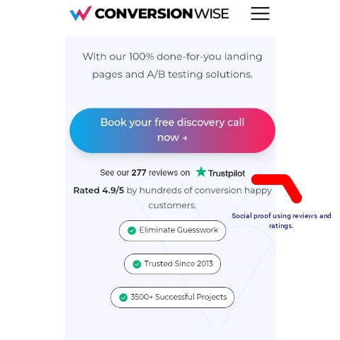
\ SEE IT IN ACTION (Conversionwise.com)
\ Conversion wise is a CRO agency that helps boost brands’ landing page conversions.
\ They anchor their homepage CTA with verified reviews and high ratings.
\
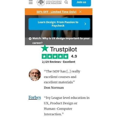
\ \ \ \ \ \ \ \ \ \ \ \ \ \ \ \ \ \ SEE IT IN ACTION (Interactiondesign.org)
\ Interaction design anchors their CTA with both reviews and testimonials from authoritative figures.
\
\ \ \ \ \ \ \ \ \ \ \ \ \ \ \ \ \ \ Remember, there’s no harm in using two-click triggers as long as they don’t feel cluttered around the CTA.
\ If you are not sure, use one that directly addresses your customer’s biggest objection.
2. Guarantees
Money-back guarantees, free trial periods, or satisfaction guarantees reduce the perceived risk, and make users feel more comfortable with their decision.
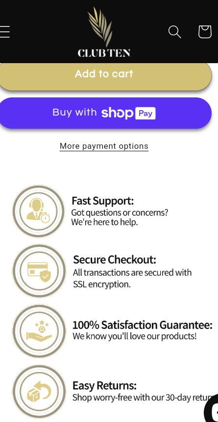
\ SEE IT IN ACTION (Club Ten Gradual Tan Lotion )
\ Club Ten anchors its CTA with a 100% satisfaction guarantee, fast support, and a free 30-day return policy.
\
\ \ \ \ \ \ \ \ \ \ \ \ \ \ \ \ \ \ \ \ \ SEE IT IN ACTION (Entrylevel.Net)
Entry level offers a full refund if you aren’t satisfied with your purchase within 14 days.
\

\ \ \ \ \ \ \ \ \
3. Clear Benefits
Highlighting the benefits and value propositions of the offer close to the CTA can make the decision to click more appealing.
\ Example: Entry Level
\

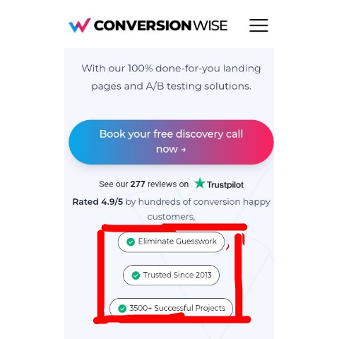
\ \ \ \ \ \ \ \ \ \ \ \ \ \ \ \ SEE IT IN ACTION (Conversion Wise)
\ Conversion Wise highlights their benefits below the CTA and takes it a step further to address objections such as how long they’ve been in business and the number of projects they’ve worked on.
\
\ \ \ \ \ \ \ \ \ \ \ \ \ \ \ \ \ \
4. Trust Badges
\ Payment seals, SSL certificates, and other trust badges reassure users that their information is safe and the site is legitimate.
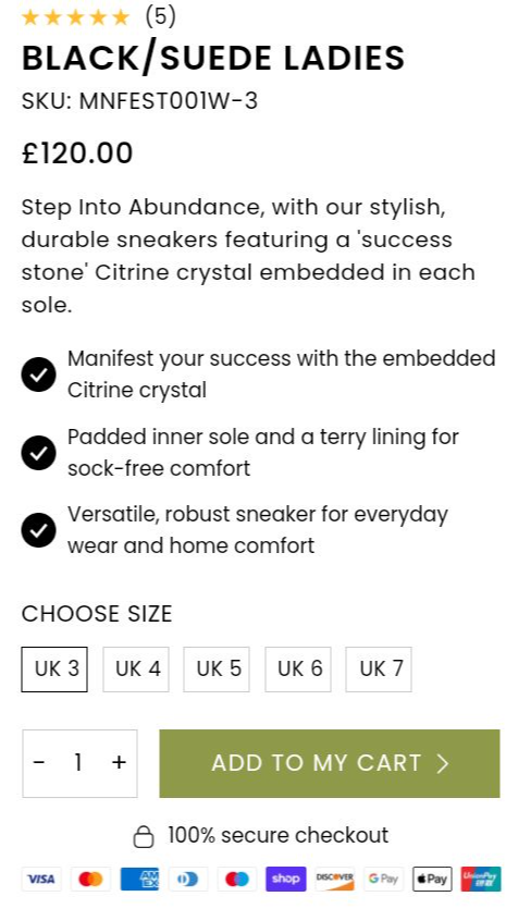
\ SEE IT IN ACTION: CTRNE
\ CTRNE places payment seals close to their CTA and also guarantees a secure checkout.
\
\ \ \ \ \ \ \ \ \ \ \ \ \ \ \ \ \ \
5. Strong, Actionable Language
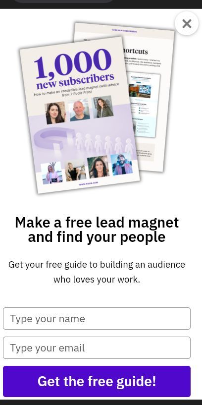
\ Using persuasive and clear language that tells users exactly what they will get and what they need to do (e.g., "Get Your Free Trial Now" or "Download Your Free Guide").
\ Use less than 10 words but still communicate what your customer gets or amplify their dream state.
\ SEE IT IN ACTION: Podia
\
\
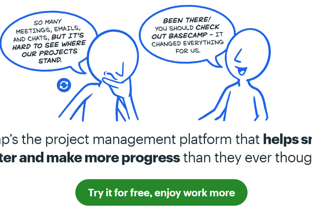
\ \ \ \ \ \ \ \ \ \ \ \ \ \ \ \ \ \ SEE IT IN ACTION (Base Camp)
\ Basecamp doesn’t use a simple submit your email or get started.
\ Instead, the CTA mentions it’s free to get started and a clear benefit (work more).
\
\ \ \ \ \ \ \ \ \ \ \ \ \ \ \
6. Friction Reduction
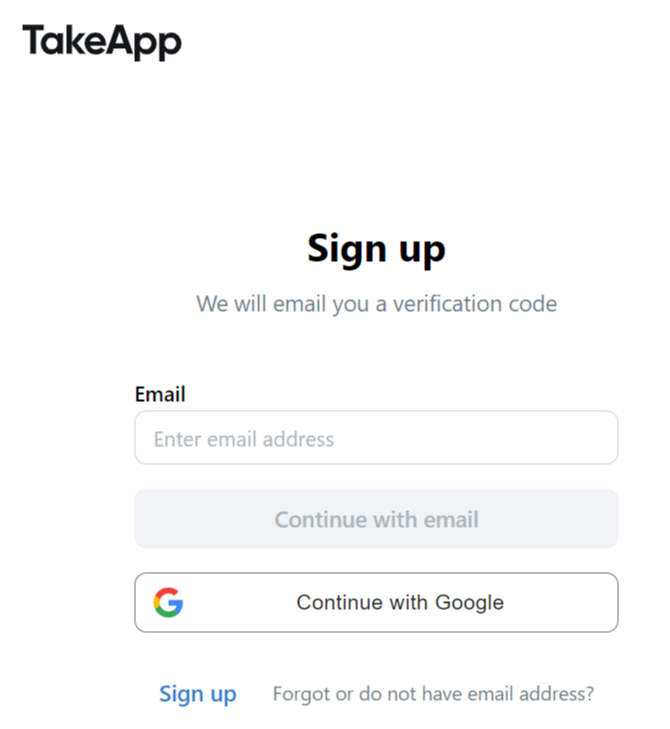
Simplifying forms, reducing the number of steps required, and providing autofill options can lower the barrier to clicking the CTA.
\ Example: TakeApp
\ TakeApp only requires an email when signing up for their software which motivates the user to proceed to the next step.
\
\ \ \ \ \ \ \ \ \ \ \ \ \ \ \ \ \
7. Visual Storytelling
\ Using images or videos that evoke emotion and clearly demonstrate the value or outcome of clicking the CTA can be very effective.
\ Example: Headlime
\ Headlime places a video close to the CTA that shows you how to use their software to write marketing copy faster.
https://youtu.be/RWpc_JQHUk0?embedable=true
\ These 7 click triggers work together to create a seamless and compelling user experience that guides users toward taking the desired action.
\ Also note, that your click trigger will depend on your customer’s needs and objections.
\ Therefore conducting voice-of-customer research is important before writing copy.
A Little Note About Headlines and CTAs
While this is a post about CTAs and not headlines, it’s worth noting that your headline and CTA should mirror each other.
Headlines and CTAs work perfectly together like butter and chocolate.
\ Both your headline and CTA need to be clear and concise.
\ A headline that aligns well with the CTA ensures a cohesive message and reduces any potential confusion.
\ That means your headline should first be so good to draw people in that it naturally compels visitors to click on your CTA.
\ The relationship between a headline and a CTA (Call to Action) is crucial for driving conversions and ensuring a seamless user experience.
\ Here are the key aspects of this relationship:
\
- The headline should be directly relevant to the CTA. It sets the stage for what the user can expect if they proceed with the CTA.
\
- It should therefore provide a clear indication of the benefit or value they will receive, which the CTA then delivers on.
\
- For example, if the headline mentions a free guide, the CTA should prompt users to download that guide.
\
- The headline should clearly convey what the page is about, and the CTA should clearly state the action the user needs to take. This clarity helps reduce hesitation and anxiety.
\ SEE IT IN ACTION
RocketHub.Com
\
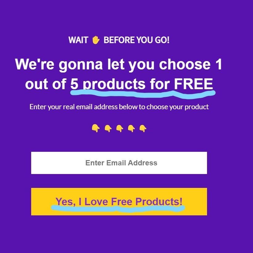
\ \ \ \ \ \ \ \ \ \ \ \ \ \ \ \ \ \ Rocket Hub does a great job of ensuring the headline and CTA mirror each other.
\ The headline and CTA have a symbiotic relationship where the headline draws in the user, sets expectations, and engages them, while the CTA provides a clear benefit that matches the same headline.
Call to Action Checklist
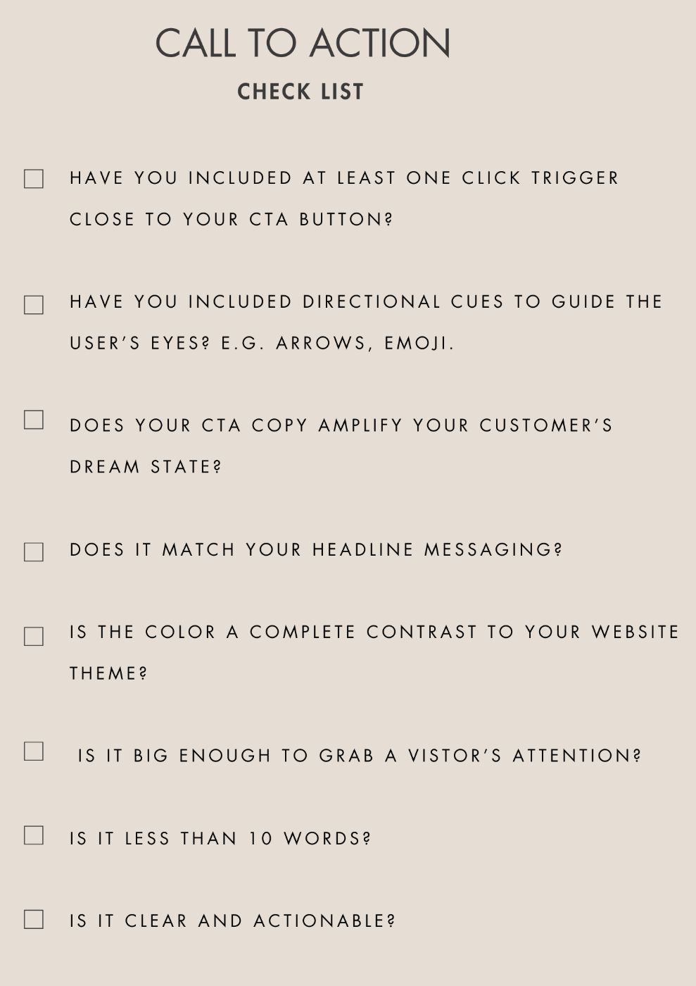
Here’s a checklist to guide you when creating your CTA before you hit that publish button.
\ Is it clear and actionable?
\ Is the color a complete contrast to your website theme?
\ Is it big enough for your users?
\ Does it match your headline?
\ Have you included directional cues to guide the user?
\ Have you included at least one click trigger close to your CTA button?
\ Is it less than 10 words?
\ Does your CTA copy communicate your customer’s dream state?
\ And if you’d like to print it out, download it below.👇
\
\ \ \ \ \ \ \ \ \ \ \ \ \ \ \ \ \ \ That’s it for today. In case you have any questions or tips that I didn’t cover, leave a comment below.
This content originally appeared on HackerNoon and was authored by Judith Awino
Judith Awino | Sciencx (2024-07-19T01:36:17+00:00) Creating High-Performing CTA’s: The Ultimate Guide. Retrieved from https://www.scien.cx/2024/07/19/creating-high-performing-ctas-the-ultimate-guide/
Please log in to upload a file.
There are no updates yet.
Click the Upload button above to add an update.
