This content originally appeared on HackerNoon and was authored by Vladimir Filipchenko
\
Who wants to get a nice and shiny infrastructure diagram?
We are!
Who wants to maintain it?
…
Intro
That’s right. You work at a company with a lot of infrastructure to manage. There are many services, complex networking, multi-cloud setups, and several CI/CD tools. You have a lot of code written. Maybe with comments. Perhaps even some documentation. Eventually, you start creating diagrams to show your infrastructure at a glance. Everybody loves diagrams!
\ But as soon as you press ‘Save’ button the clock starts ticking, showing how outdated your diagram is. Unfortunately, no one loves outdated stuff. And no one has time to update it.
\ You spent a lot of time being an ==infrastructure-as-a-code== gitops hero. Everything is already here, in the code! There are plenty of tools that transform code into UML diagrams. Is there anything for infrastructure, please?
\ And there is! Let’s take a closer look
\
What’s in the review
To make it more practical we are going to use a real repo. The repo has a minimalistic Dockerfile for a simple Spring Boot app. A pinch of Terraform, and a GitHub Actions workflow to glue everything together. It builds the app with Gradle, creates a Docker image, and deploys it to AWS Elastic Container Service.
\
Tools under review
- Terraform graph
- Inframap
- Rover
- NoReDraw
- Others
\
Terraform graph
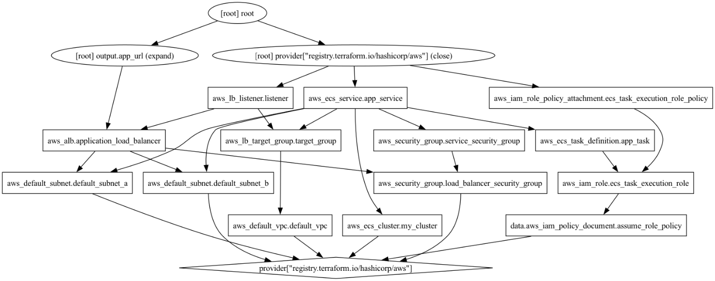
First, let's start with Terraform graph. Terraform provides an embedded option for making a diagram. It creates a Graphviz .dot file. To see a diagram as an image you have to install Graphviz.
\
terraform graph | dot -Tpng > /tmp/graph.png
\ This gives you next diagram
\

\
Looks acceptable for an out-of-the-box solution. It’s hardly readable, has no coloring scheme and has no icons. I’m not sure if it provides a better sense of architecture than the actual code. Yet, it could be a nice addition to a pull request analysis by demonstrating the actual plan (specify -plan=plan.out).
\
Inframap
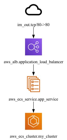
If the Terraform graph is too basic for your needs, let's move on to Inframap. This tool reads your tfstate or HCL to generate a graph specific to each provider. Instead of showing everything, the tool shows the most important resources. Developers of Inframap created a human-readable version of terraform graph.
\
inframap generate . | dot -Tpng > inframap.png
\ This gives the next diagram
\

\
Well, that’s way more readable. If you want more app-centric representation that’s the way to go. It doesn't have too much detail (subnets, security groups, IAM roles, etc) and looks more concise. We have all main components like the load balancer, ECS service, and the cluster. A few nitpicks: I would put client instead of im_out. And make the ECS cluster a container (rectangle) with the service inside. Anyway, it’s pretty decent.
\
Rover
Next up is Rover, another Terraform visualizer. There are several options for how to run Rover. Unfortunately, I wasn’t able to make Rover run terraform under the hood. Image generation with the specified plan didn’t work for me either. So I had to run Rover in standalone mode and explicitly specify previously generated TF plan:
\
terraform plan -out=plan.out
terraform show -json plan.out > plan.json

docker run --rm -it -p 9000:9000 -v $(pwd):/src im2nguyen/rover:latest -planJSONPath=/src/plan.json
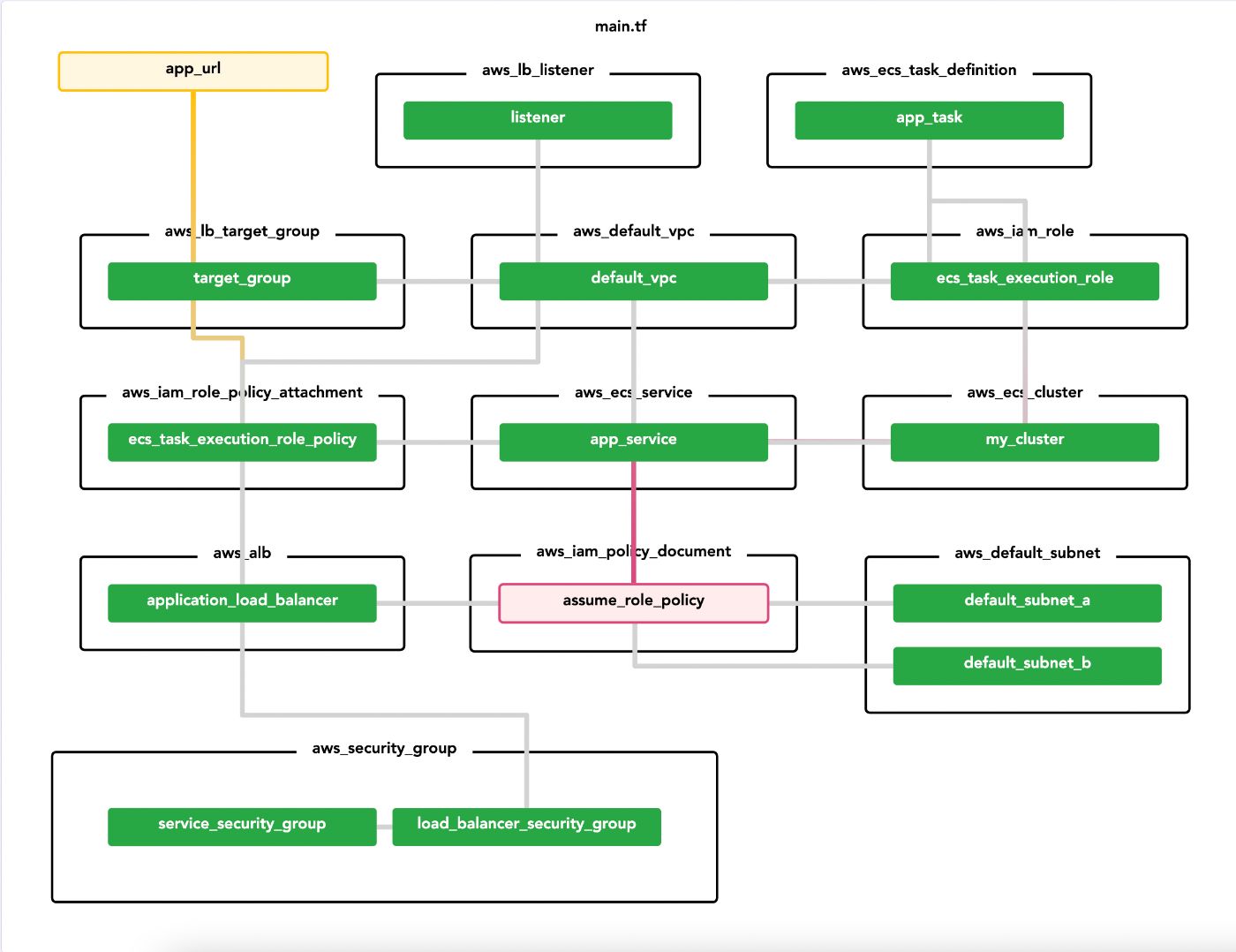
\ The UI on http://localhost:9000/ appeared to be pretty nice. It might be helpful to click around to get more details on what’s going on. Again, mostly for PRs and a general understanding of resources.
\ This is how generated diagram looks like
\

\ I'm pleased with the color legend and grouping. The information seems to be excessive for the needs of an architecture diagram. Again, it’s a terraform visualizer, it shows everything defined in the plan, with no surprises.
\
\ Alright, you’ve got the idea of terraform visualizers. They try to represent the state of resources defined in .tf files. Is there anything else left overboard? Right, the applications. The whole point of infrastructure is to serve a set of applications. Without showing the apps it all doesn’t make a lot of sense. Inframap did a great job with its app-centric approach. Are Terraform files not enough for the big picture? Let’s fall down the rabbit hole.
\
NoReDraw
This tool takes a step further. Instead of dealing with Terraform, NoReDraw focuses on… everything. Well, currently Gradle, Docker, GitHub Action, and Terraform AWS resources are supported. And ‘supported’ is a bit of a strong word as the project is still in beta.
\
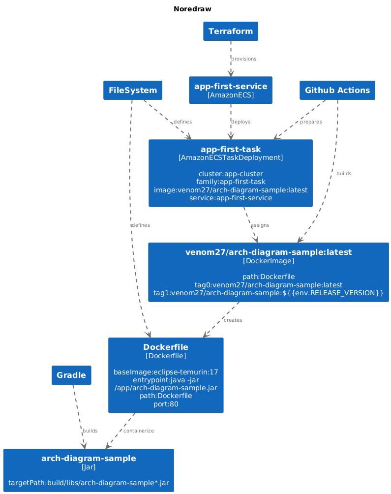
NoReDraw takes a source folder or git repo URL as an input. Then parses and cross-matches everything it can. Want to add more? Implement your own provider as the tool is highly customizable. Don’t like how components are linked together? Create your own LinkStrategy. Another cool benefit is that you can generate a diagram in Plant UML or Mermaid. This gives you an option to embed the drawing directly into your docs as text.
\
wget https://github.com/uladzimirFilipchanka/noredraw/raw/main/noredraw.sh && chmod +x noredraw.sh

./noredraw.sh \
--source . \
--export PNG \
--output noredraw.png
\

\ Let’s see, from bottom to top. Gradle builds a Jar named arch-diagram-sample. Then it gets containerized by Docker and ends up being a Docker image. The image is assigned to the task which is deployed into Amazon ECS via a GitHub Actions workflow. All correct!
The diagram definitely lacks in style, but if you plan to embed it you’ll have to ~~suffer~~ enjoy it anyway. At least some extra coloring wouldn’t hurt. The attributes in blocks nicely describe each artifact and are very handy. I really hope NoReDraw gets more traction in the near future. More providers and features can make it production-ready.
Others
Finally, let's look at some other tools and services. They didn’t make it to the shortlist but are worth mentioning.
Pluralith
This service helps to visualize and manage cloud infrastructure by parsing Terraform code. Pluralith goes beyond 'regular' visualizers and offers real-time updates. With nicely done CI/CD integrations (GitHub and GitLab as of now).
Lucidscale
The older sibling of Lucidchart. It’s a super-powerful tool for managing cloud infrastructure. Lucidscale offers automated and detailed visualizations but works another way. It connects to your cloud account and generates diagrams of the architecture. Currently, AWS, Azure, and GCP are supported. In this case, you don’t even need to adhere to infrastructure-as-a-code. Lucidscale provides all that you may or may not need. Including live sync, filtering, customization, and collaboration.
Cloudcraft
Like Lucidscale it connects to your cloud account. It offers deep integration with AWS (and now Azure), but focuses on simplicity. Cloudcraft has a minimalistic and user-friendly interface. It allows you to quickly create cloud architecture diagrams. You might miss some minor features in Cloudcraft, but the beauty of diagrams compensates for it.
Outro
Yes, there are definitely more tools available on the market (let me know about your favorite ones in the comments). Maintaining up-to-date infrastructure diagrams can be a challenge. But with the right tools, it becomes much more manageable. The key is to find the one that best fits your needs and workflow.
This content originally appeared on HackerNoon and was authored by Vladimir Filipchenko
Vladimir Filipchenko | Sciencx (2024-07-24T09:56:22+00:00) Say Goodbye to Outdated Diagrams: Automate Your Infrastructure Visualization. Retrieved from https://www.scien.cx/2024/07/24/say-goodbye-to-outdated-diagrams-automate-your-infrastructure-visualization/
Please log in to upload a file.
There are no updates yet.
Click the Upload button above to add an update.
