This content originally appeared on Telerik Blogs and was authored by Jonathan Gamble
Angular Material can get you a long way in your development… but when you’re building something complex or for enterprise, consider Kendo UI for Angular.
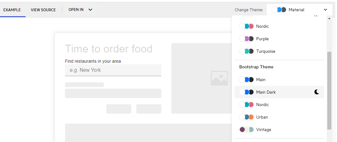
Angular Material has recently been upgraded to align with Material Design 3. It is a beautiful UI framework and contains the principal UI tools for Angular. There are 36 components, four main design themes and 21 CDK primitives to build custom components. It is feature-rich and has existed since the first version of Angular 2. It is classy and elegant, integrating into Angular like a glove. But is that enough?
TL;DR
Angular Material UI is the component library you should start building your app with. It strictly follows Material Design 3, and has a lot of customizable features. However, Progress Kendo UI for Angular gives you more power and flexibility to create custom components in whatever theme you desire. Once your Angular app gets large enough, Kendo UI should be at the top of your list.
Choosing Autocomplete
I researched this problem by testing one Angular Material component and one Kendo UI for Angular component. Why not just start with A… the Autocomplete.
Foundation Component
The Autocomplete component is not really a foundational component, as you need to start with an Input Field and then a Dropdown Menu. However, this works perfectly for the sake of testing. I want something complex.
Installation
- Create a new Angular app.
ng new kendo-angular
I set it up with these responses to the prompts:
- CSS
- SSR optional (not necessary for this app, so I skipped it)
- Disable Angular analytics (doesn’t matter either way for this example)
- Install Angular Material.
ng add @angular/material
- Choose a theme
- Global typography styles not necessary for this
- Include Angular animations just in case, but not necessary
- Generate a new component.
Using the CLI, let’s generate a component two new components:
ng generate component autocomplete
ng generate component kendo-autocomplete
- Display the app in the main app component.
// app.component.html
<div class="container">
  <app-autocomplete />
  <app-kendo-autocomplete />
</div>

<router-outlet />
- Make sure to import them.
// app.component.ts
...
@Component({
  selector: 'app-root',
  standalone: true,
  imports: [
    RouterOutlet,
    AutocompleteComponent,
    KendoAutocompleteComponent
  ],
  templateUrl: './app.component.html',
  styleUrl: './app.component.css'
})
...
- Style the Container for better display.
// app.component.css

.container {
  margin-top: 5rem;
  display: flex;
  flex-direction: column;
  align-items: center;
  justify-content: center;
  gap: 5rem;
}
Kendo UI Installation
[If you plan to take this project live to production at some point, this step is useful to perform now—though you can skip to Step 3 if you’re just kicking the tires and don’t mind a watermark.] Get a license key and copy
kendo-ui-license.txtto your root Angular folder. Remember to put this in your environment variable for production.Install License NPM Module.
npm i @progress/kendo-licensing
Reference the setup instructions for more details.
- Add Kendo Dropdown.
ng add @progress/kendo-angular-dropdowns
- Add the Material Nova theme to your
index.htmlfile in the header.
<link rel="stylesheet" href="https://kendo.cdn.telerik.com/themes/8.0.1/material/material-nova.css" />
All code setup can be found:
Material Autocomplete
To get us started with the Autocomplete more swiftly, I used the default example template and simplified it.
// autocomplete.component.html

<form class="example-form">
    <mat-form-field class="example-full-width">
        <mat-label>Assignee</mat-label>
        <input type="text" matInput [formControl]="myControl" [matAutocomplete]="auto">
        <mat-autocomplete #auto="matAutocomplete" [displayWith]="displayFn">
            @for (option of filteredOptions | async; track option) {
            <mat-option [value]="option">{{option.name}}</mat-option>
            }
        </mat-autocomplete>
    </mat-form-field>
</form>
I didn’t change the component file.
import { Component, OnInit } from '@angular/core';
import { FormControl, FormsModule, ReactiveFormsModule } from '@angular/forms';
import { Observable } from 'rxjs';
import { map, startWith } from 'rxjs/operators';
import { AsyncPipe } from '@angular/common';
import { MatAutocompleteModule } from '@angular/material/autocomplete';
import { MatInputModule } from '@angular/material/input';
import { MatFormFieldModule } from '@angular/material/form-field';

export interface User {
  name: string;
}

/**
 * @title Display value autocomplete
 */
@Component({
  selector: 'app-autocomplete',
  templateUrl: './autocomplete.component.html',
  styleUrl: './autocomplete.component.css',
  standalone: true,
  imports: [
    FormsModule,
    MatFormFieldModule,
    MatInputModule,
    MatAutocompleteModule,
    ReactiveFormsModule,
    AsyncPipe,
  ],
})
export class AutocompleteComponent implements OnInit {
  myControl = new FormControl<string | User>('');
  options: User[] = [{ name: 'Mary' }, { name: 'Shelley' }, { name: 'Igor' }];
  filteredOptions!: Observable<User[]>;

  ngOnInit() {
    this.filteredOptions = this.myControl.valueChanges.pipe(
      startWith(''),
      map(value => {
        const name = typeof value === 'string' ? value : value?.name;
        return name ? this._filter(name as string) : this.options.slice();
      }),
    );
  }

  displayFn(user: User): string {
    return user && user.name ? user.name : '';
  }

  private _filter(name: string): User[] {
    const filterValue = name.toLowerCase();

    return this.options.filter(option => option.name.toLowerCase().includes(filterValue));
  }
}
Kendo UI Autocomplete
- Now let’s populate the kendo-autocomplete component.
We are going to use the Kendo UI Autocomplete, along with a Kendo UI label here. Notice we are plugging in areaList as the data for the kendo-autocomplete component and giving it a placeholder to display by default, as well. In the next step, we will populate areaList and import the Kendo UI packages into this component.
<kendo-label text="Find restaurants in your area">
    <kendo-autocomplete [data]="areaList" placeholder="e.g. New York"></kendo-autocomplete>
</kendo-label>
- Create some data for the autocomplete to use & import Kendo UI component packages
In the component’s TypeScript file, let’s create that areaList array we just used in the template and give it some data. Notice I also imported the DropDownsModule, InputsModule and ButtonsModule from kendo-angular packages. Our kendo-autocomplete component that uses the Kendo UI Autocomplete should be ready to use now!
kendo-autocomplete.component.ts
import { Component } from '@angular/core';
import { FormsModule, ReactiveFormsModule } from '@angular/forms';
import { LabelModule } from '@progress/kendo-angular-label';
import { DropDownsModule } from '@progress/kendo-angular-dropdowns';
import { InputsModule } from '@progress/kendo-angular-inputs';
import { ButtonsModule } from '@progress/kendo-angular-buttons';

@Component({
  selector: 'app-kendo-autocomplete',
  standalone: true,
  imports: [
    LabelModule,
    FormsModule,
    InputsModule,
    ReactiveFormsModule,
    DropDownsModule,
    ButtonsModule
  ],
  templateUrl: './kendo-autocomplete.component.html',
  styleUrl: './kendo-autocomplete.component.css'
})
export class KendoAutocompleteComponent {
  public areaList: Array<string> = [
    "Amsterdam",
    "Athens",
    "Barcelona",
    "Berlin",
    "Brussels",
    "Chicago",
    "Copenhagen",
    "Dublin",
    "Helsinki",
    "Houston",
    "Lisbon",
    "London",
    "Los Angeles",
    "Madrid",
    "Miami",
    "Montreal",
    "New York",
    "Paris",
    "Philadelphia",
    "Prague",
    "Rome",
    "Sao Paulo",
    "Seattle",
    "Stockholm",
    "Toronto",
    "Vancouver",
    "Vienna",
    "Vienna",
    "Warsaw",
  ];
}
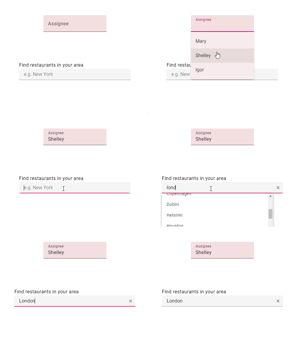
Both versions have a Material look and feel and options for complex components.
When to Use Material
- You like one of the four main themes.
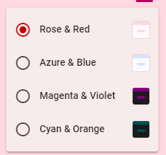
- You are good at building your own theme with the Angular Theming Guide.
- You only need basic autocomplete features.
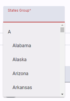
Don’t get me wrong, you can customize Angular Material with a lot of hard work, but it requires manual customization. That may be OK for your use case.
When to Use Kendo UI
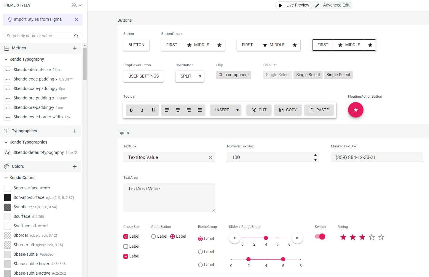
Out of the 46 main categories, there are countless subcategories of components with 18 default themes based on Material Design and Bootstrap. More importantly, you can build your own themes from Figma or using the ThemeBuilder UI. You don’t have to do these things programmatically.
Thoughts
This was my first try at Kendo UI for Angular. I believe you should use Material UI for your Angular website needs. However, once those needs become enterprise needs, you want common design patterns and you don’t want to programmatically alter Material UI components, Kendo UI for Angular is pretty sweet.
Don’t forget: Kendo UI for Angular comes with a free 30-day trial. Try it today!
This content originally appeared on Telerik Blogs and was authored by Jonathan Gamble
Jonathan Gamble | Sciencx (2024-08-13T08:42:23+00:00) When to Use Kendo UI for Angular Instead of Angular Material. Retrieved from https://www.scien.cx/2024/08/13/when-to-use-kendo-ui-for-angular-instead-of-angular-material/
Please log in to upload a file.
There are no updates yet.
Click the Upload button above to add an update.
