This content originally appeared on Level Up Coding - Medium and was authored by Itsuki
I think the title is pretty self-explanatory but just for clarification, what we are trying to achieve in this article here is making two (or more) elements of type display:inline-block to have the same height.
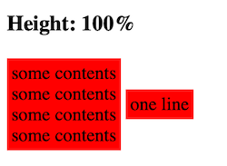
You might think we can simply set height:100%, but unfortunately that will not work. Here is a short snippet denominating it.
/* css */
.container {
  display: block;
}

.col {
  display: inline-block;
  background: red;
  padding: 4px;
  height: 100%;
  vertical-align: middle;
}


<!-- HTML -->
<h3> Height: 100% </h3>
<div class="container">
  <div class="col">
    some contents<br>
    some contents<br>
    some contents<br>
    some contents
  </div>

  <div class="col">
    one line
  </div>
</div>
And here is the result.
There are many online solutions suggesting using flex or float, but unfortunately I need to keep mine as inline-blocks.
Let’s see how we can make multiple inline-blocks to have the same height, of course, without Javascript!
You can find all the code snippets we use in this article in my codepen.
Basic Approach
Three steps. Simple Solution.
- Add an almost infinite padding
- Add a minus margin (balancing out the padding)
- Hide overflow
We will be checking out three different use cases: align top, middle, and bottom.
Align Top
/* css */
.container {
  display: block;
  overflow: hidden;
}

.colAlignTop {
  display: inline-block;
  background: red;
  padding: 4px;
  padding-bottom: 1000%;
  margin-bottom: -1000%;
  vertical-align: top;
}

<!-- HTML -->
<h3> Same Height: Align Top </h3>
<div class="container">
  <div class="colAlignTop">
    some contents<br>
    some contents<br>
    some contents<br>
    some contents
  </div>

  <div class="colAlignTop">
    one line
  </div>
</div>
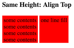
I have use 1000% and -1000% here for padding and margin, but depending on your use case, you might be fine with a smaller value or you might need an even larger one.
Here is the result.
Align Middle
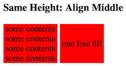
Exact the same idea.
/* css */
.container {
  display: block;
  overflow: hidden;
}

.colAlignMiddle {
  display: inline-block;
  background: red;
  padding: 4px;
  padding-bottom: 1000%;
  margin-bottom: -1000%;
  padding-top: 1000%;
  margin-top: -1000%;
  vertical-align: middle;
}


<!-- HTML -->
<h3> Same Height: Align Middle </h3>
<div class="container">
  <div class="colAlignMiddle">
    some contents<br>
    some contents<br>
    some contents<br>
    some contents
  </div>

  <div class="colAlignMiddle">
    one line fill
  </div>
</div>
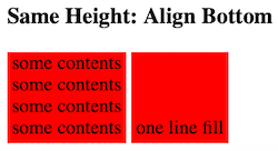
Align Bottom
/* css */
.container {
  display: block;
  overflow: hidden;
}

.colAlignBottom {
  display: inline-block;
  background: red;
  padding: 4px;
  padding-top: 1000%;
  margin-top: -1000%;
  vertical-align: bottom;
}


<!-- HTML -->
<h3> Same Height: Align Bottom </h3>
<div class="container">
  <div class="colAlignBottom">
    some contents<br>
    some contents<br>
    some contents<br>
    some contents
  </div>

  <div class="colAlignBottom">
    one line fill
  </div>
</div>
A Little Bonus
If you want to force multiple inline-blocks to stay in the same line, all we have to do is to add text-wrap: nowrap to the container like following.
.container {
  display: block;
  overflow: hidden;
  text-wrap: nowrap;
}
Thank you for reading!
That’s all I have for today!
Happy aligning!
HTML/CSS: Two Inline-Block Same Height was originally published in Level Up Coding on Medium, where people are continuing the conversation by highlighting and responding to this story.
This content originally appeared on Level Up Coding - Medium and was authored by Itsuki
Itsuki | Sciencx (2024-08-25T15:16:39+00:00) HTML/CSS: Two Inline-Block Same Height. Retrieved from https://www.scien.cx/2024/08/25/html-css-two-inline-block-same-height/
Please log in to upload a file.
There are no updates yet.
Click the Upload button above to add an update.
