This content originally appeared on Telerik Blogs and was authored by Suzanne Scacca
Data visualizations can make your financial services app look better and easier to use. But which data viz formats should you use? Does every data set need to be visualized? And how much data should you include in each? This post will dig into these answers and more.
From investment apps that show how stocks are performing to money management apps that offer spending insights, data visualizations make it easier for consumers to understand what’s going on with their finances. In addition, data visualizations can make an app look more attractive than one that relies on words and numbers alone.
To use data visualizations that actually help improve the user experience, there are certain things to keep in mind when designing them. In this post, we’ll look at some questions you should consider whenever you’re creating visualized data for fintech apps.
Decisions You Need to Make When Designing Data for Fintech
One of the problems with financial services, in general, is that not everyone is good with numbers. Or they feel intimidated or nervous when managing anything related to their finances.
In order to get over that hurdle in the fintech space, you need to design products that are user-friendly, engaging and useful. The overall design of your product will help with that as will the way the content is written. But data visualizations are going to be a big help, too.
Before adding any to your app, consider the following:
What Is the Best Format for Each Segment of Data?
To keep things visually interesting in your design, you may want to create different styles of data visualizations for your app. That’s not the only reason to mix up the formats. Certain types of data are easier to understand in different presentations.
For example, the FICO credit score by Experian is represented using a speedometer gauge chart.
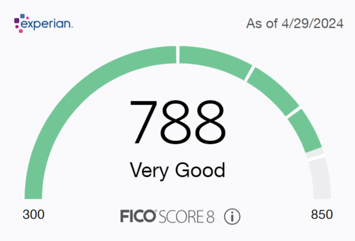
The large score and overall rating (e.g., “Very Good”) could suffice. However, the speedometer makes this data more visually attractive. It also communicates more about the score than just the number itself. The color that fills the chart changes depending on what range the score falls within. So, green is good, orange and yellow are so-so, and red is bad.
This type of data visualization is effective for a single data point. Experian can’t use a gauge chart to display all of its data though.
Case in point: The Score Tracker tool displays the user’s data in a line chart.
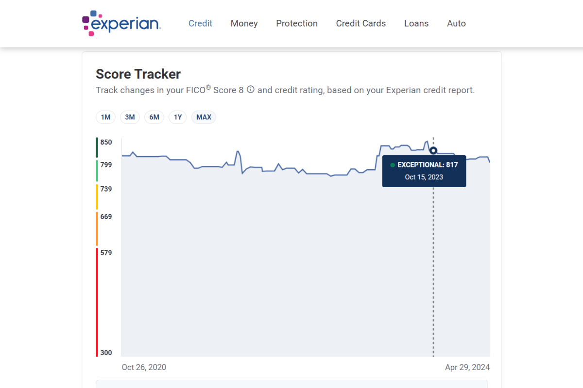
Users select the time frame they want to view from the top—1 month, 3 months, 6 months, 1 year or max. The line graph then plots out the history of their FICO score over that time frame.
The peaks and valleys at the top make it easy for users to visualize major fluctuations in their score. They’re also able to hover over the line to see more details about the score and the date they received it.
When adding data visualizations to your app, you’re going to need to find the right format for each data set. Or to decide if it belongs in a visualized format at all.
Here are some tips for when to use the most common types:
- Use bar charts when presenting and comparing categorized data.
- Use line charts to display data over a time period.
- Use pie charts to show how different segments add up to a whole.
- Use bubble charts to plot out three contributing variables.
- Use scatter plots to demonstrate patterns or correlation among related variables.
- Use heatmaps to demonstrate patterns or correlation when you have a larger data set.
- Use progress bars to convey how far or close the user is from their goal.
- Use gauge charts when you want to convey more than distance from a goal.
There are other types of data visualization formats you can use in fintech. Before settling on one, take a look around the web to see how others have handled it. You might find that a less common format is the right one for the data set you’re working with.
What Is the Most Important Data to Your Users?
Just because your app collects or produces loads of data, that doesn’t mean your users want to see data visualizations for all of it or even all at once.
Think of a dashboard with block after block of charts and graphs. Chances are good that you as a user would be interested in some of that data. But all of it? Probably not.
There are usually a few key performance indicators (or other metrics) that will be of interest and value to you over and over again. Being forced to sift through irrelevant or unhelpful data sets will likely cause undue aggravation.
So as you lay out the screens of your fintech solution, you need to figure out which data belongs on each screen (if any at all).
Then, you need to determine what is the best way to present that data. Will a big number summarizing the account balance suffice? Or do you need a data visualization to simplify a complex data set?
Next, figure out what are the most important metrics in your users’ eyes. The order in which they appear on the screen should reflect this.
For example, TurboTax has a section within the app where users can compare different historical data sets.
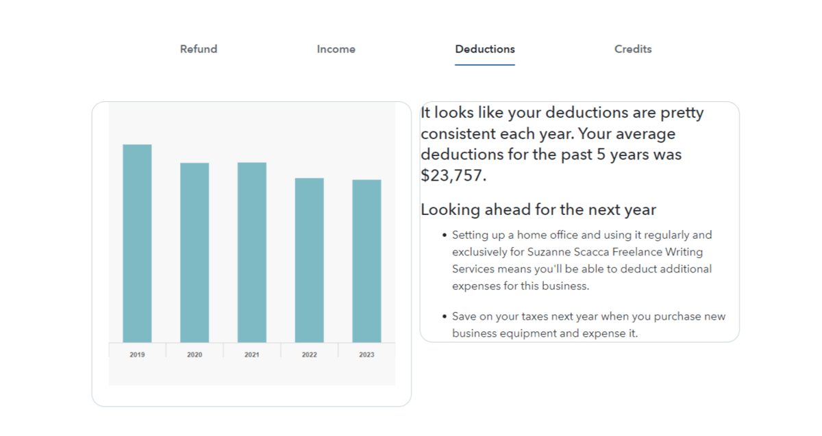
This section contains four tabs of data visualizations with companion descriptions for:
- Refund
- Income
- Deductions
- Credits
The tabs, I suspect, are ordered in relation to their importance and usefulness to users. When you compare something like tax refunds to credits (the latter of which not everyone has), it seems to make the most sense.
Bank of America is another example of how to pick and choose which data sets to prioritize and which ones to use data visualizations for.
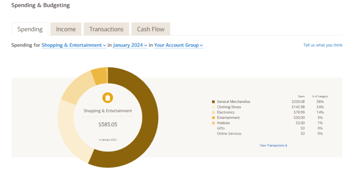
For example, the majority of the data in the Bank of America app is presented in a table format. That’s fine for tracking individual expenses and income, but it’s not ideal for analyzing large sets of data.
In the case of the Spending & Budgeting tool, each tab contains an interactive and customizable visualization.
Customization can be a really useful tool when designing data visualizations. For starters, it allows you to show off a ton of data in a small space. So if 90% of your users find overall spending trends to be most valuable, but the remaining 10% want to see the data based on segments (like Shopping & Entertainment) or from a specific time frame, they can reconfigure the data visualization themselves.
How Much Information Is Necessary for Each Data Visualization?
One of the nice things about data visualizations is that we can include relatively large data sets and numerous variables within a small segment of the screen. But we can’t use data visualizations simply as space savers—we also need them to be usable.
So, how much data can you fit into a single visualization without going overboard?
It really depends on the purpose of the graphic.
For example, Experian’s Score Tracker that we saw earlier contained nearly four years’ worth of data. That might seem like a lot. The graphic, at first glance, doesn’t appear all that complex though. The y-axis shows FICO scores from 300 to 850. The x-axis shows only a start and end date.
However, the chart contains a bit more information within it. It’s hidden within the user’s interactions. Only when they hover over the line do they see the specific score, rating and the date it occurred on.
That’s a common and very user-friendly way to simplify the appearance of your data visualizations while not having to compromise how much data to include within them.
Coinbase does this as well.
![]()
Users are able to track the progress of each stock’s value over a given time frame. The line charts here are even more simplified than the one on the Experian site. There is no visible y-axis, just an x-axis with time markers.
While the line itself tells us a lot about the highs and lows of the stock, the user can find out more about the stock’s changing value by hovering over the line.
Wave uses interactivity to hide extra details as well.
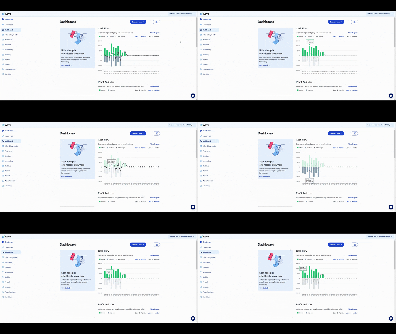
Just looking at this bar graph, we see the contrast of the user’s inflow and outflow of cash. There’s also a line chart laid atop it that shows the cash flow net change.
Users could probably eyeball the y-axis to figure out what each of the values are. However, the hover-revealed tooltip clearly spells out each value so there can be no mistaking what they’re seeing.
You’ll need to decide how much data your users need in each data visualization. If it’s too complex, then you may need to break it up into multiple data visualizations. However, if the data is all related (like in the case of Wave), you may want to get creative in how you bring the data together.
Just make sure that the data along the axes are easy to read and understand as is any data displayed within the graphic. It’s not just fonts and sizes that will affect the readability of this data, but also color and contract, too.
Do Your Data Visualizations Need to Be Interactive?
Let’s hone in a bit more on the interactivity of data visualizations. Unlike static images found in infographics and white papers, we have the ability to bring app-based data visualizations to life.
The question is: Does every data visualization need to be interactive?
They don’t all need to be. Simpler data visualizations—like the Experian speedometer—need no further context.
That said, even data visualizations with a good amount of data don’t necessarily need to be interactive. For example, Acorns has a doughnut chart showing the breakdown of the user’s investments.
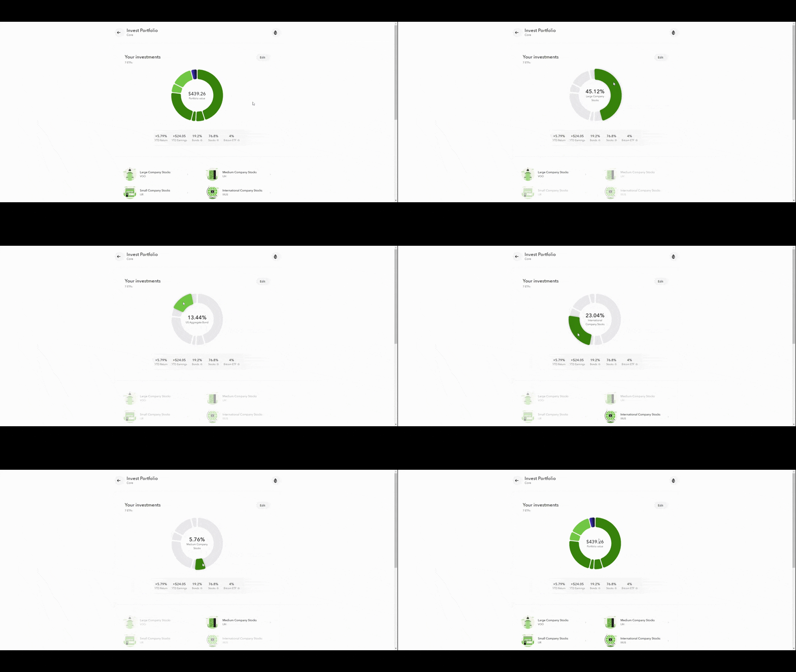
The way this is currently designed, the interactivity is needed. The donut chart is carved up into different pieces. The only way to know which category of stocks the slices represent is to hover over them.
Users then see the stock type and percentage allocation. At the same time, the stock category name is highlighted below.
Another way this could’ve been done is to place a key alongside or below it. The key would assign a unique color to each stock category. The user could then see for themselves what percentage of the chart is devoted to those stocks.
Probably the ideal way to handle this type of charting is a combination of both. The visual key would provide a quick summary of how the stocks are distributed. The interactivity would also allow users to engage with the visualization to gain a deeper understanding of their investment profile.
Interactivity isn’t just useful for revealing more data.
In Acorns, there’s a tool users can use to find out what their investment profile will be worth over time.
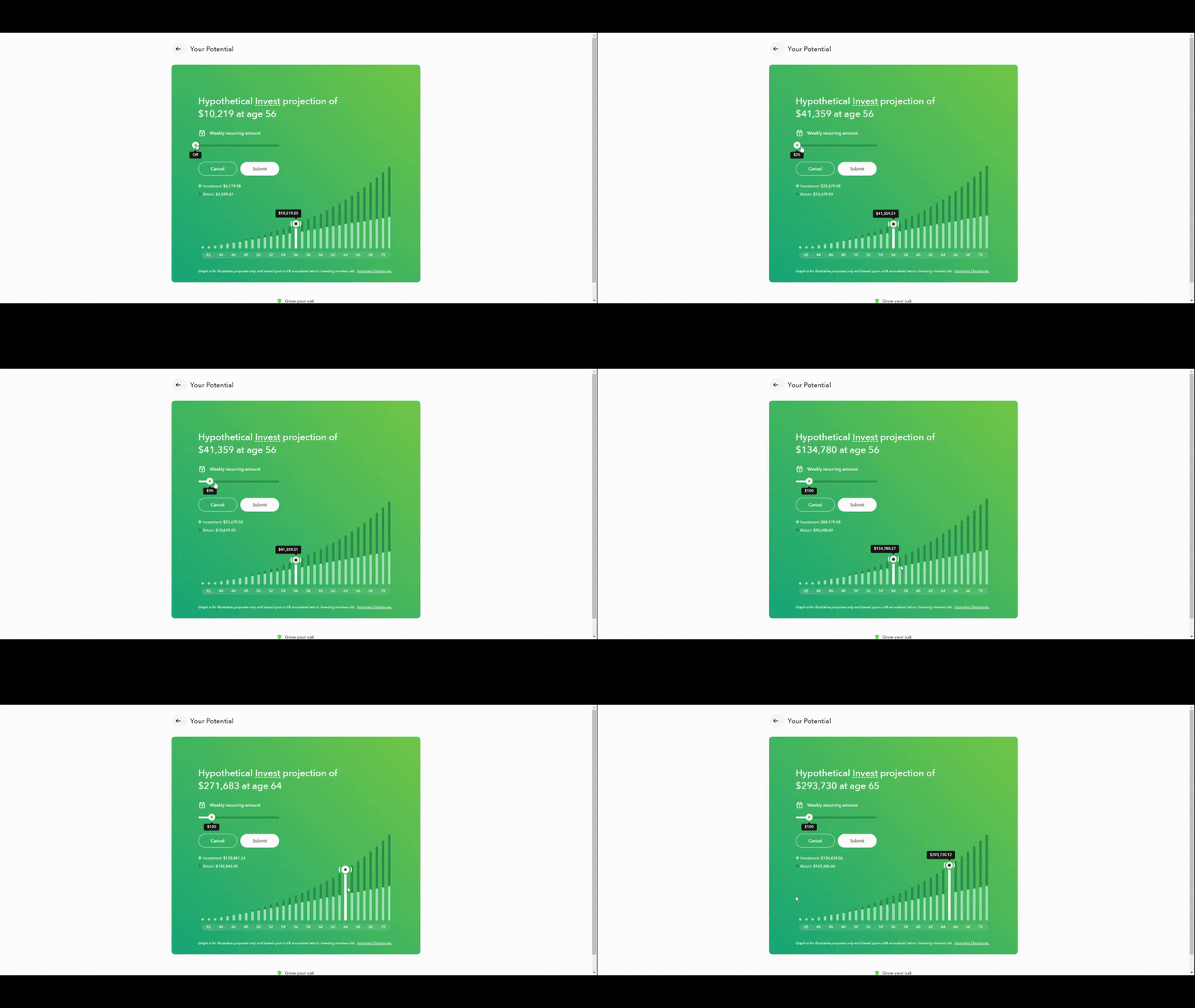
Now, this tool could have been presented as an interactive bar graph or line chart. They could’ve added a filter or dropdown that allowed users to select the time frame to chart the progress of their investment over—e.g., 5 years, 10 years, 50 years, etc.
However, the designers created this data visualization so that the user could first personalize the size of their weekly recurring investment. Then to see the changing value and return on their investment over time.
Unlike the more traditional way of using interactivity, this creates a more active user. Instead of just viewing the historical record or predicted future of their finances, they can play around with the numbers to see how their changing contribution affects their outcomes.
Wrapping Up
There are numerous benefits to using data visualizations in fintech:
For starters, they’re more visually interesting than plain text and numbers, which will get more users to focus on their data. This is important. Because if a user doesn’t understand what’s going on with their finances, they might not see the value in the app or service to begin with.
Also, data visualizations tend to simplify even the most complex of data sets for users. If you can help them better understand their finances, your users will become more confident and it’ll improve their decision-making when it comes to their money.
What’s more, by infusing the fintech experience with interactive data sets, you’ll increase user engagement. The hands-on usage of the app and its valuable features will make the experience more memorable, which should encourage users to log in more frequently.
In order to reap these benefits, you need to design these data visualizations using the right formats, with just the right amount of data and with the necessary functionality. The questions above will help you get clear on what’s needed for each visualization you add to your app.
This content originally appeared on Telerik Blogs and was authored by Suzanne Scacca
Suzanne Scacca | Sciencx (2024-08-28T08:21:55+00:00) Data Visualization Design Tips for Fintech Products. Retrieved from https://www.scien.cx/2024/08/28/data-visualization-design-tips-for-fintech-products/
Please log in to upload a file.
There are no updates yet.
Click the Upload button above to add an update.
