This content originally appeared on Level Up Coding - Medium and was authored by Ilias Machairas
Interactive Visualizations for HEC-RAS outputs and Well-Formatted Reports via Python and streamlit


In the world of hydraulic modeling, HEC-RAS (Hydrologic Engineering Center’s River Analysis System) is a cornerstone tool for analyzing river systems and floodplains. However, extracting meaningful insights from its outputs often requires a bit of post-processing. In this article, we delve into a Python-based solution that streamlines this process, transforming raw HEC-RAS text outputs into interactive visualizations and professionally formatted Excel reports.
The Challenge
HEC-RAS outputs are typically generated as text files, which can be unwieldy for analysis and presentation. These files contain detailed hydraulic data, but to make them useful, they need to be cleaned, visualized, and formatted in a way that is both insightful and easy to interpret. The solution? A custom Python application leveraging Streamlit, Plotly, and OpenPyXL libraries to achieve just that.
Solution Overview
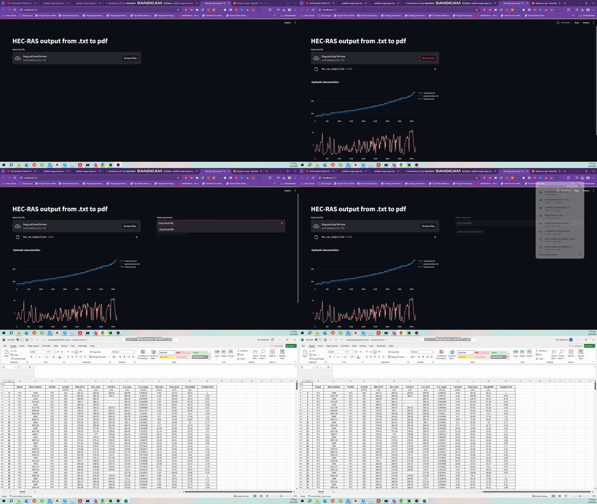
- Upload and Process Data: The application starts by allowing users to upload a HEC-RAS text file. This file is then read and parsed using pandas to structure the data into a DataFrame.
- Generate Interactive Visualizations: Using Plotly, the application generates interactive plots that help visualize key hydraulic parameters such as water level, ground surface elevation, and velocity. This visualization aids in quickly identifying trends and anomalies in the data.
- Export and Format Excel Reports: The processed data is saved into an Excel file, which is then formatted for clarity and professionalism. This includes adjusting column widths, setting borders, and aligning text to ensure that the report is both readable and visually appealing.
- Download and Share: Finally, users can download the formatted Excel report directly from the web application, making it easy to share and present findings.
Deep Dive into the Code
Before we get started, we need to import the packages required.
Let’s break down the code and its components:
1. Data Upload and Processing
The Streamlit file uploader widget allows users to select a HEC-RAS text file. The file is then read into a pandas DataFrame with appropriate column names.
2. Interactive Plots
Plotly is used to create interactive plots that provide a visual summary of the hydraulic data. The function create_plots constructs a subplot figure with water levels, ground surface elevation, and velocity.
3. Excel Report Formatting
The format_excel function enhances the generated Excel file by adjusting column widths, applying borders, and aligning text. This ensures the final report is both aesthetically pleasing and easy to read.
I will explain the above-mentioned code
Adjusting Column Widths
The function begins by adjusting the widths of the columns to fit the contents more appropriately. It does so by iterating through each row in the worksheet and calculating the maximum width required for each column based on the length of the cell values. This is done using a list named column_widths that keeps track of the maximum length for each column. The width for each column is then set with a slight padding (adding 5 units) to ensure that the data is comfortably visible.
Inserting Rows and Adding Units
Next, the function inserts two rows at the top of the sheet. This creates space for headers and unit labels. The units for each column are specified and added to the third row. These units are critical for clarifying the type of data in each column, helping users understand the measurement units (e.g., cubic meters per second, meters, square meters).
Centering Text and Adding Borders
To improve readability, all cell contents from row 2 onwards are centered horizontally. Additionally, thin borders are applied around each cell to create a clean and organized look. Borders help in distinguishing different sections of the data and enhance the overall presentation of the spreadsheet.
Handling Superscripts and Print Settings
The function then adjusts specific cell values to include superscripts for units like cubic meters per second and square meters. This ensures that the units are correctly represented, enhancing the accuracy of the report. Finally, it configures the print settings to ensure the sheet fits on a page when printed and designates the first three rows as print titles, making them appear at the top of each page in the printout.
4. Download Option
The final step allows users to download the formatted Excel file directly from the web application, making it convenient to access and share the report.
Conclusion
This Python application offers a powerful way to transform raw HEC-RAS outputs into valuable insights. By leveraging Streamlit for the web interface, Plotly for interactive visualizations, and OpenPyXL for Excel formatting, it simplifies the process of analyzing and presenting hydraulic data. Whether you’re an engineer, researcher, or data analyst, this tool can save time and enhance your workflow, making it easier to derive actionable insights from complex hydraulic models.
Feel free to adapt and extend this solution to fit your specific needs and workflows. Happy data analyzing!
The code can be found at Github:
Tutorials_twd/HEC-RAS_tutorials/output_transformation at main · iliasmachairas/Tutorials_twd
Transforming HEC-RAS Output via Python was originally published in Level Up Coding on Medium, where people are continuing the conversation by highlighting and responding to this story.
This content originally appeared on Level Up Coding - Medium and was authored by Ilias Machairas
Ilias Machairas | Sciencx (2024-08-29T12:25:47+00:00) Transforming HEC-RAS Output via Python. Retrieved from https://www.scien.cx/2024/08/29/transforming-hec-ras-output-via-python/
Please log in to upload a file.
There are no updates yet.
Click the Upload button above to add an update.
