This content originally appeared on HackerNoon and was authored by Anastasia Mironova
Did you know that by 2023, the average consumer owned around six connected devices? This number is expected to continue growing as technology advances. With users frequently switching between their smartphones, tablets, laptops, and smart TVs throughout the day, creating a seamless experience across all these devices has never been more critical.
\ As UX designers, our challenge is to ensure that regardless of which device a user is on, they feel a consistent and intuitive connection to the products we design. This is the essence of cross-platform design. With this article, I’d like to help you achieve that consistency, and share an approach that has saved me countless hours of work.
\
It’s not just about resizing screens. It’s about deeply understanding what users expect from an app in each context and on each device.
\ In cross-platform design, our mission is to create experiences that are intuitive and familiar. It’s not just about resizing screens. It’s about deeply understanding what users expect from an app in each context and on each device, and then making those tasks achievable by thoughtfully designing the application.
\ You might have heard the saying, “If something looks very simple, it means a lot of research went into it.” UX is all about this. The best designs are invisible, the ones you don’t notice — they seamlessly guide the user through the experience without drawing too much attention.
\ Yet, you are not working in a vacuum – and that is why this process becomes exponentially more challenging along the way. All designs need to be applicable to and implementable with current technology and resources. ==Adding new features should neither require a complete redesign nor should it turn your app into a Frankenstein of mismatched elements.== Designs also have to be systematic! That makes sure they can be efficiently handed off to development or easily picked up by other designers.
\ And, let’s not forget that the current landscape requires app services to be not just highly technical – but also a pleasure to use. They have to be delightful in one way or the other. If your app can create an emotional bond between the user and your product, you're already halfway to creating something great.
\ Sounds like a challenge, right?
\ Even the most experienced senior designers can find themselves lost in this myriad of complexities. That’s why I’ve outlined a fundamental approach to cross-platform design — one that has helped me navigate all the intricacies of designing for large screens in WhatsApp.
\ I know how challenging this process can be, and that is why I want to share this approach in a series of articles on cross-platform design to strengthen the global UX community in facing these challenges.
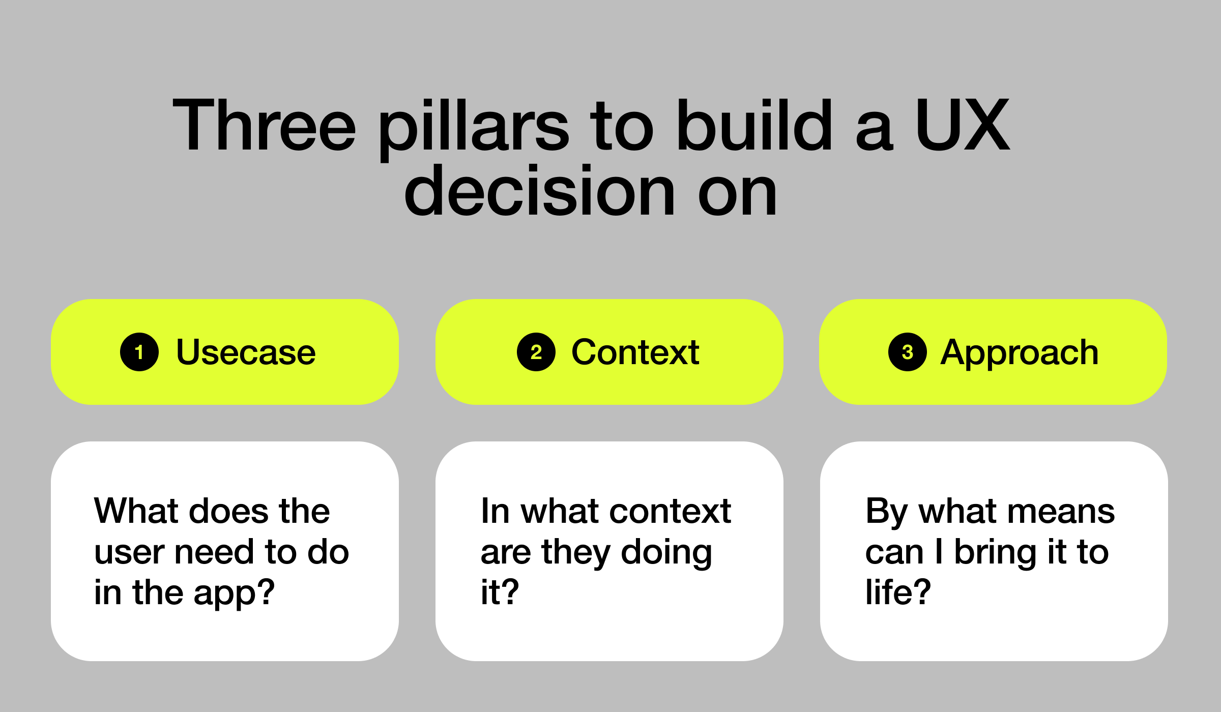
\ This article kicks off the series – we’ll be focusing on three key principles every designer should consider and keep in mind when making UX decisions. Let’s get into it! 💪
Three Pillars to Build Every UX Decision On
\
1. Usecase
The usecase is the starting point for every UX decision — it’s about understanding what specific action or goal the user is trying to accomplish in your product. Be it sending a message, booking a ticket, or making a purchase, the use case defines the user’s primary intent and the steps they need to take to achieve it.
\ Take the action of adding a song to a playlist on Spotify. The core use case remains consistent across platforms: the user wants to choose a song and add it to their playlist for later listening or sharing with friends. The focus here is on understanding what the user's needs and expectations are during this process, regardless of the device.
\
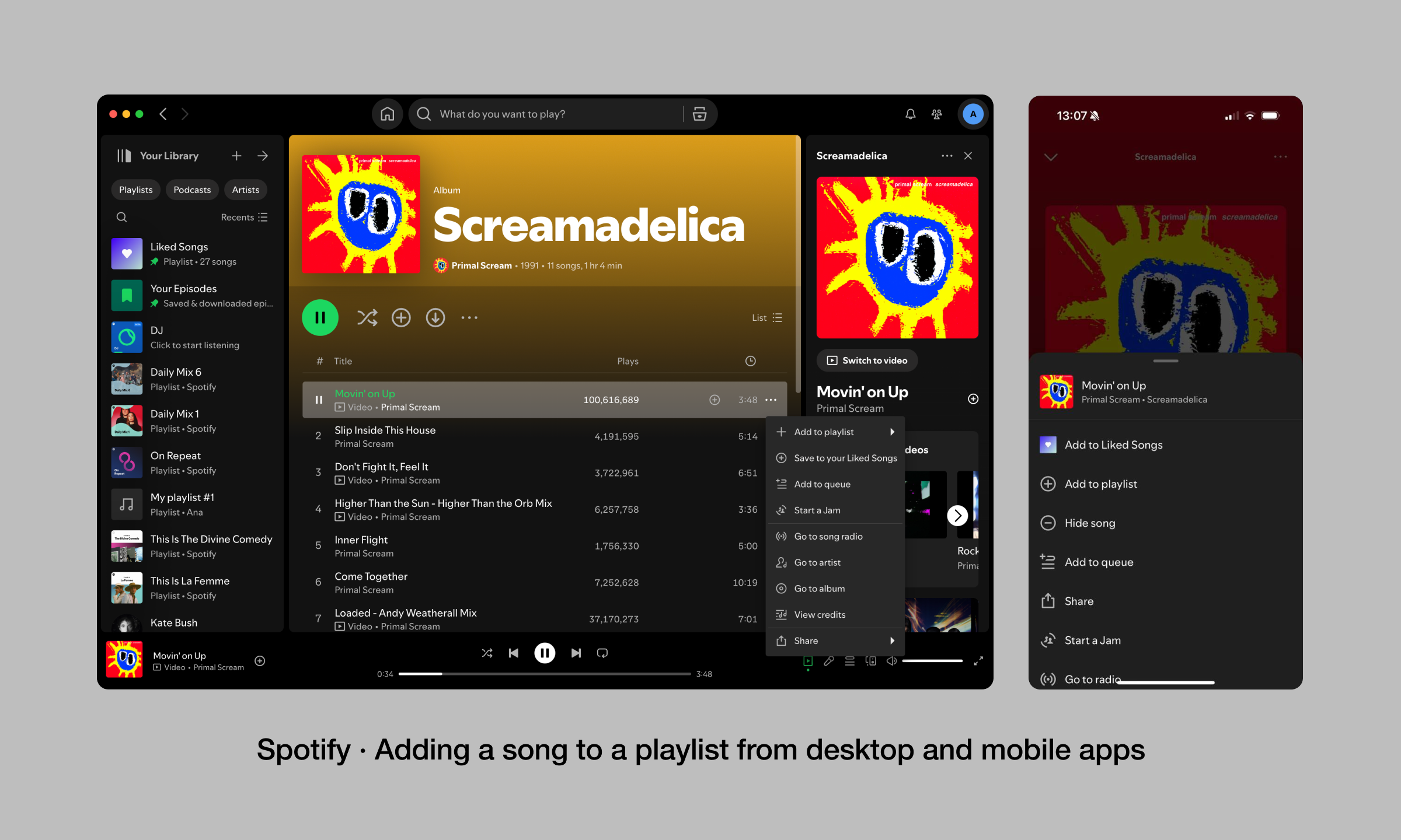
\ Here, key considerations are:
How easily the user can find the song;
The simplicity of adding it to the playlist;
How clear and immediate the feedback is after the action.
\
The design should facilitate a smooth journey from searching for the song to adding it to the playlist, making sure that the user's goal is met with minimal friction. Whether you're on the go using your mobile device or working from home and vibing while working from your computer, the experience should be effortless.
\ By zeroing in on the use case, you can make design decisions that will directly support the user's intent, so that every step of the interaction feels natural and fulfills expectations.
2. Context of Use
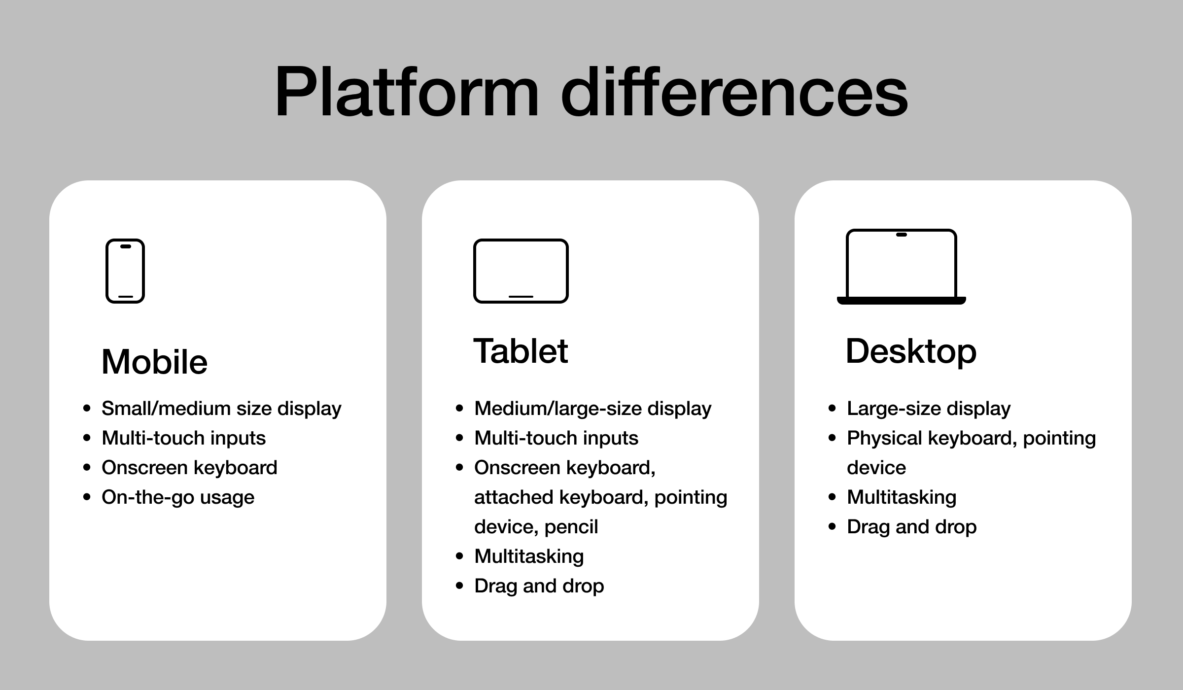
\ Designing for different platforms goes beyond adjusting for screen sizes; it involves a deep understanding of the unique challenges posed by each environment.
\ ==On mobile,== users often engage with their devices in quite brief, even distracted moments. The challenge here lies in creating interfaces that are immediately clear and accessible to the user, with essential information prioritized all within the constraints of limited screen space and varying connectivity.
\ ==Tablets== bring a different set of complexities. These devices serve diverse purposes, from casual browsing to more focused work tasks. Flexibility becomes key and makes sure that the interface adapts seamlessly to various input methods — whether a user is drawing with a stylus, typing on a keyboard, or navigating with touch. The design has to anticipate fluid transitions between activities, such as moving from reading to note-taking, without introducing friction.
\ ==Desktop== environments offer the opportunity for more detailed interactions. Plus, this is accompanied by the need for precision. Supporting complex workflows that may span multiple screens and applications, all while managing cognitive load – that is the challenge with desktop apps. The design needs to accommodate specific, task-oriented demands.
\ Coding, data analysis, or creative work, would be some examples. As a UX designer, you have to do all of that without overwhelming the user.
\ As technology progresses, relatively newer platforms like smartwatches, smart TVs, AR, and VR introduce entirely new interaction models. On smartwatches, the focus goes to distilling information to its most essential form, catering to quick interactions that can be made at a glance.
\ Smart TVs need interfaces that function effectively from a distance, often better navigated through voice or remote control. In AR and VR, the design challenge revolves around creating immersive experiences that feel intuitive and comfortable, which minimizes the risk of disorientation in three-dimensional spaces.
\ Every platform most likely caters to different use cases, and understanding these is crucial. For example, Netflix is a great example of an app that was designed for entertainment across multiple devices. You can quickly browse and save movies or shows for an evening watch while commuting from work. Later, you might use a tablet to watch some trailers or explore the reviews to pick the best option.
\ And when it comes time to watch a movie or binge a series, you’d probably prefer the desktop or a smart TV where you can really get the most out of the content in full resolution for a truly immersive experience.
\ Each of these use cases required a tailored design that considers both the device’s capabilities and the user's expectations in that specific context simultaneously. The goal is still the same – making a coherent user experience, no matter how or where the app is being used.
\
\n 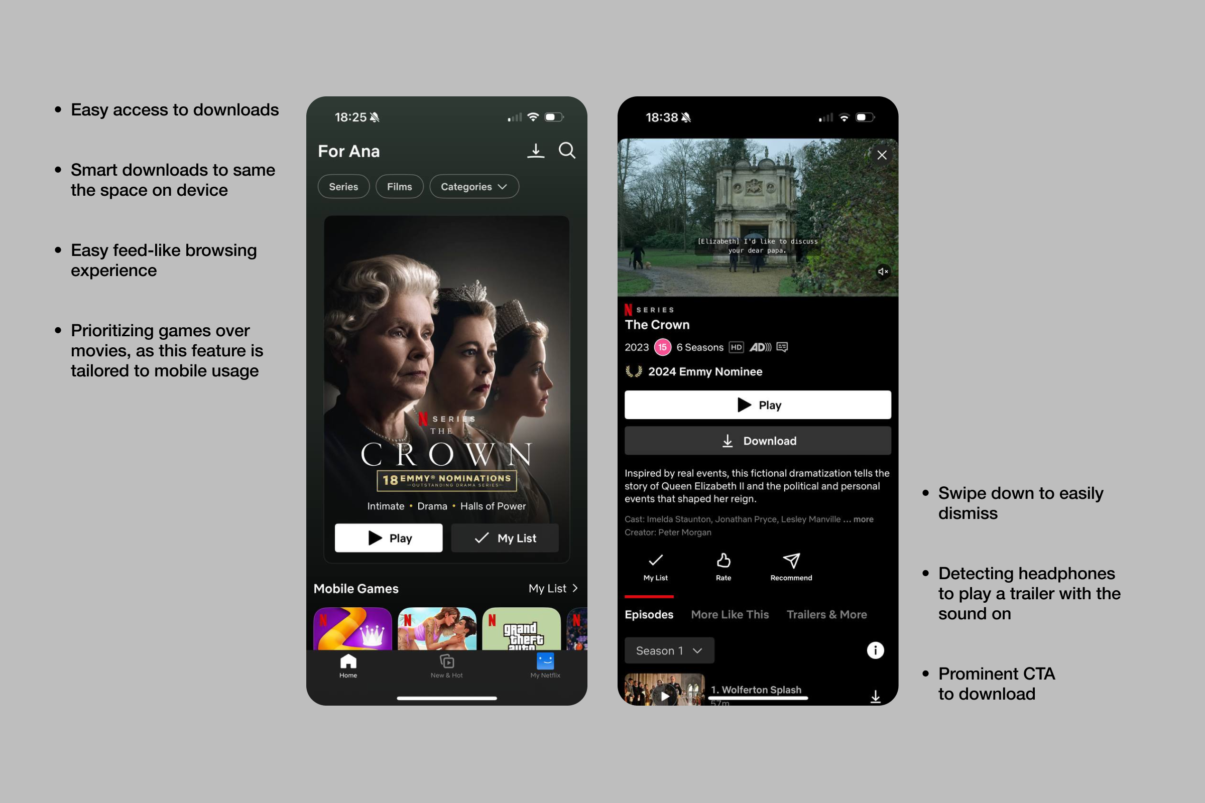
The Netflix app on mobile devices is optimized for on-the-go access and convenience. The interface is designed for one-handed use, with key features like search, downloads, and playback controls easily reachable. Users can quickly download episodes or movies over Wi-Fi before they leave home, ensuring they have access to their content even without an internet connection.
\ The mobile app also includes features like smart downloads, which automatically deletes watched episodes and downloads the next one, saving space and reducing the need for manual management. This design considers the mobile user's need for efficiency and accessibility, making it easy to enjoy entertainment anytime, anywhere.
\
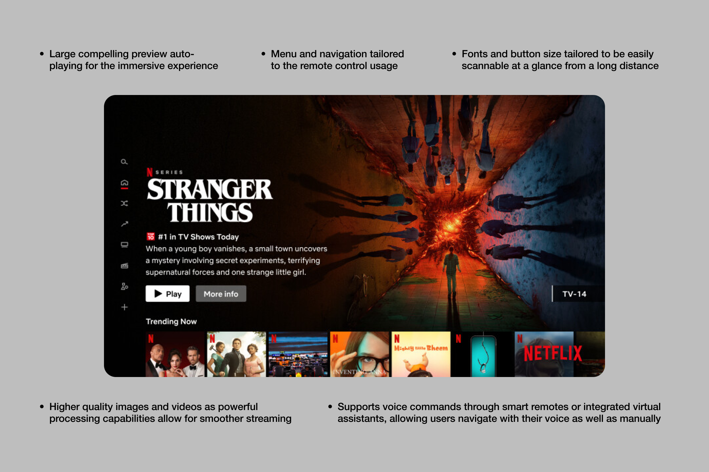
\ On larger screens, such as laptops or smart TVs, Netflix offers a comprehensive and detailed interface. The design utilizes the larger screen space to display high-quality images and videos, and the more powerful processing capabilities allow for smoother streaming and richer interactive elements. Navigation is simplified, utilizing the TV remote's directional pad, making it easy for users to scroll through categories and select content. The interface supports voice commands, allowing users to search for shows, control playback, and more without needing to navigate menus manually.
3. The Approach (Platform-Specific (Native) vs Custom Design)
As I mentioned right at the start of the article, in cross-platform design, you never work in a vacuum. Every design decision has to be aligned with the broader strategy of the product and also be realistically implementable across various platforms with the resources and technology you have. It’s not just about what works best for a single feature, but how that feature integrates into the overall system.
\ One of the critical questions or decisions to make in cross-platform design is the option to adhere to platform-native design patterns or maintain a unique, consistent design across all platforms.
Platform-Specific (Native)
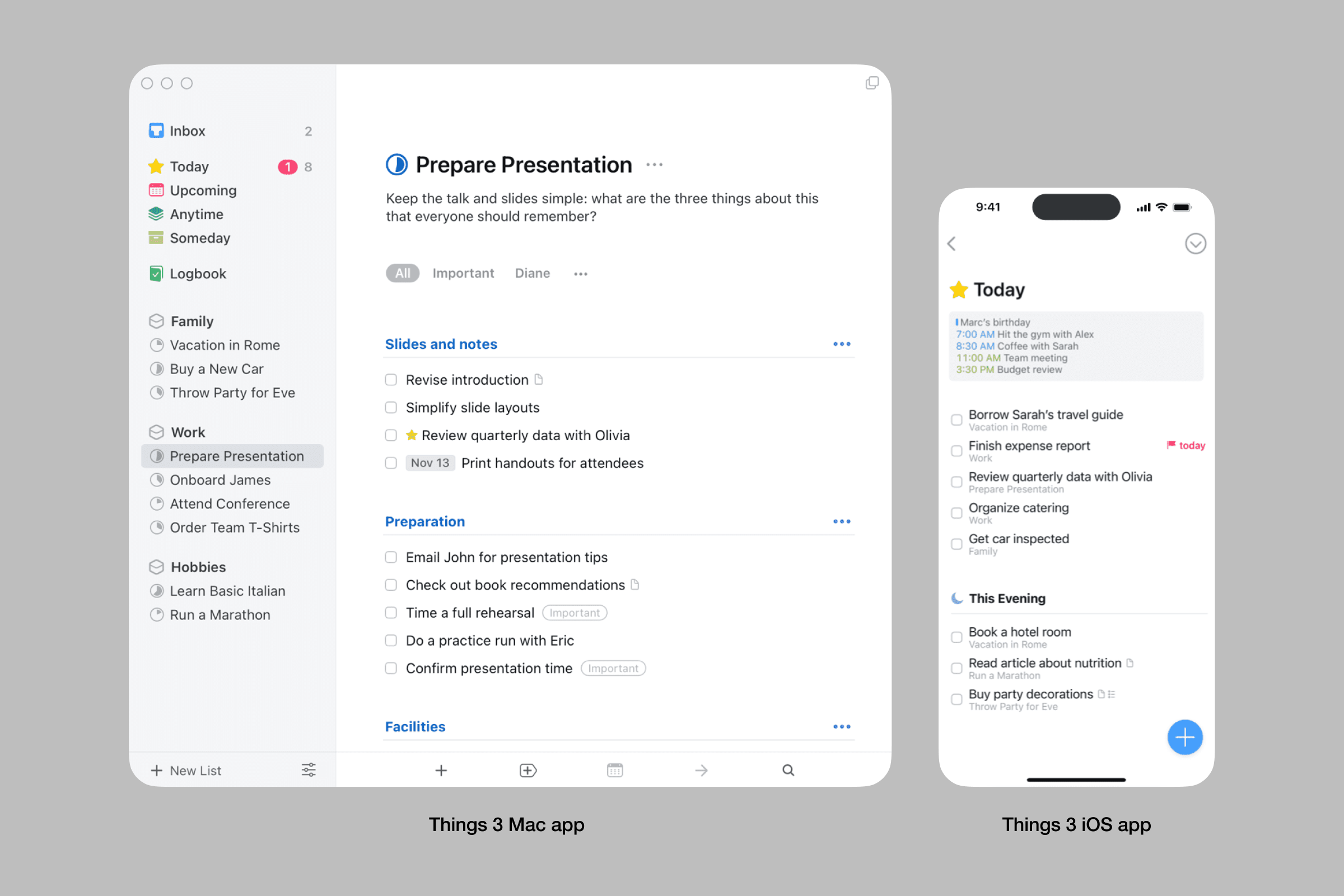
\n Things 3, a task tracker app is one of the finest examples on the market of how an app can use native conventions to achieve seamless and intuitive user experience across platforms. Here’s a couple of things to keep in mind if you want to make your app feel truly native:
\
- ==Follow Platform Guidelines:== Adhere to Apple's Human Interface Guidelines for iOS apps or Google's Material Design for Android apps. For example, using the swipe gesture for navigation on iOS which is intuitive for iPhone users. See, how Things 3 adopted a MacOS sidebar making the navigation familiar to users.
\
- ==Utilize Native UI Components:== Employ platform-specific UI elements like the date picker on iOS or the floating action button on Android.
\
- ==Maintain Consistent Aesthetics:== Align your app’s design with the operating system's aesthetics, such as using vibrant colors and flat icons on Android to match its Material Design. Notice how Things 3 uses a muted subdued color palette matching the one from MacOS.
\
- ==Implement Intuitive Navigation:== Use familiar navigation patterns, and don’t forget to add system shortcuts for larger screens.
\
- ==Respect system settings:== Your native app should respect the system's color mode — switching to dark mode if the system is set to dark. Similarly, if the font size is increased in the system settings, your app should adjust accordingly.
Custom
\
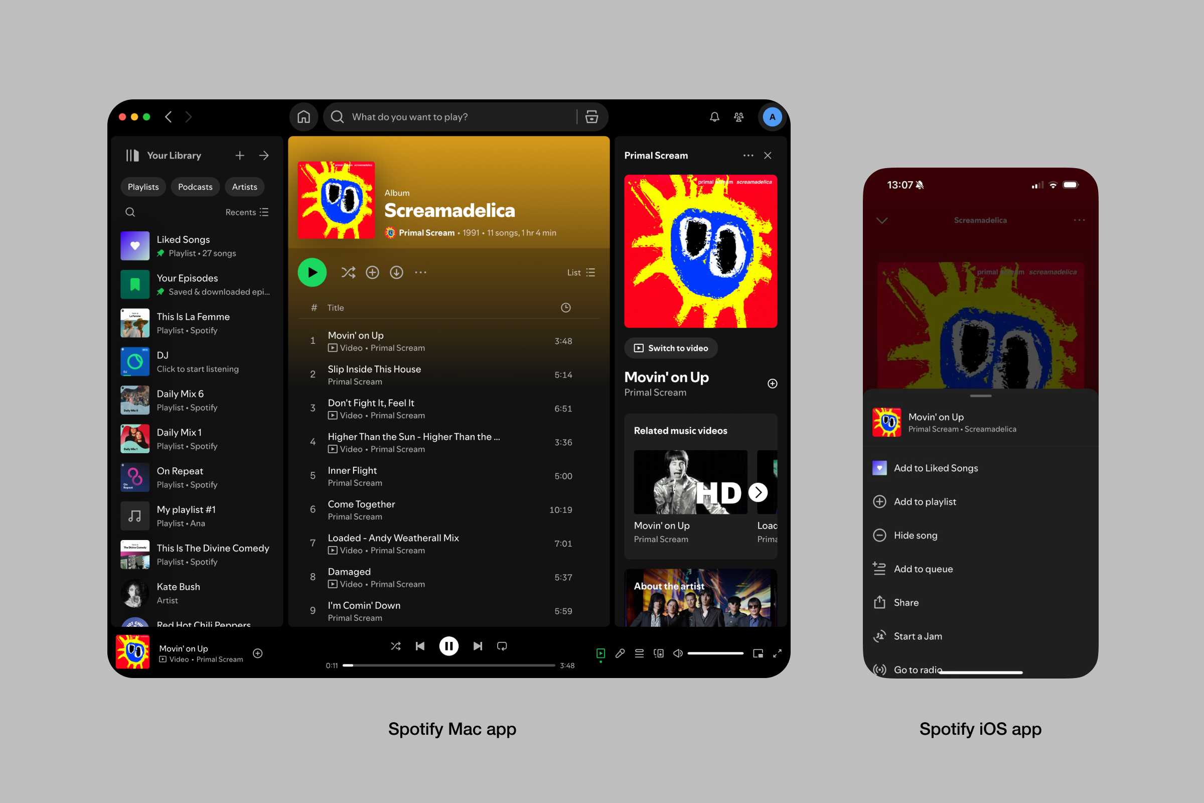
\ Spotify, on the contrary, is a great example of a custom-designed app. Here are key rules to follow for a full-on custom app:
\
- ==Brand Identity Over Native Feel:== See how Spotify prioritizes its recognizable brand identity (dark background no matter the mode) and distinctive greens as an accent color.
\
- ==Customized Navigation:== Instead of using typical native navigation patterns like a 2-column layout on Mac, Spotify adds a custom 2-column solution to provide more context for their desktop app.
\
- ==Cross-platform unity:== Reusing identical menus and drawers across desktop and mobile apps allowing users to see familiar controls and actions.
Comparing Approaches
No matter whether you decide to go custom, native, or some combination of both, each approach has its own advantages and challenges:
\
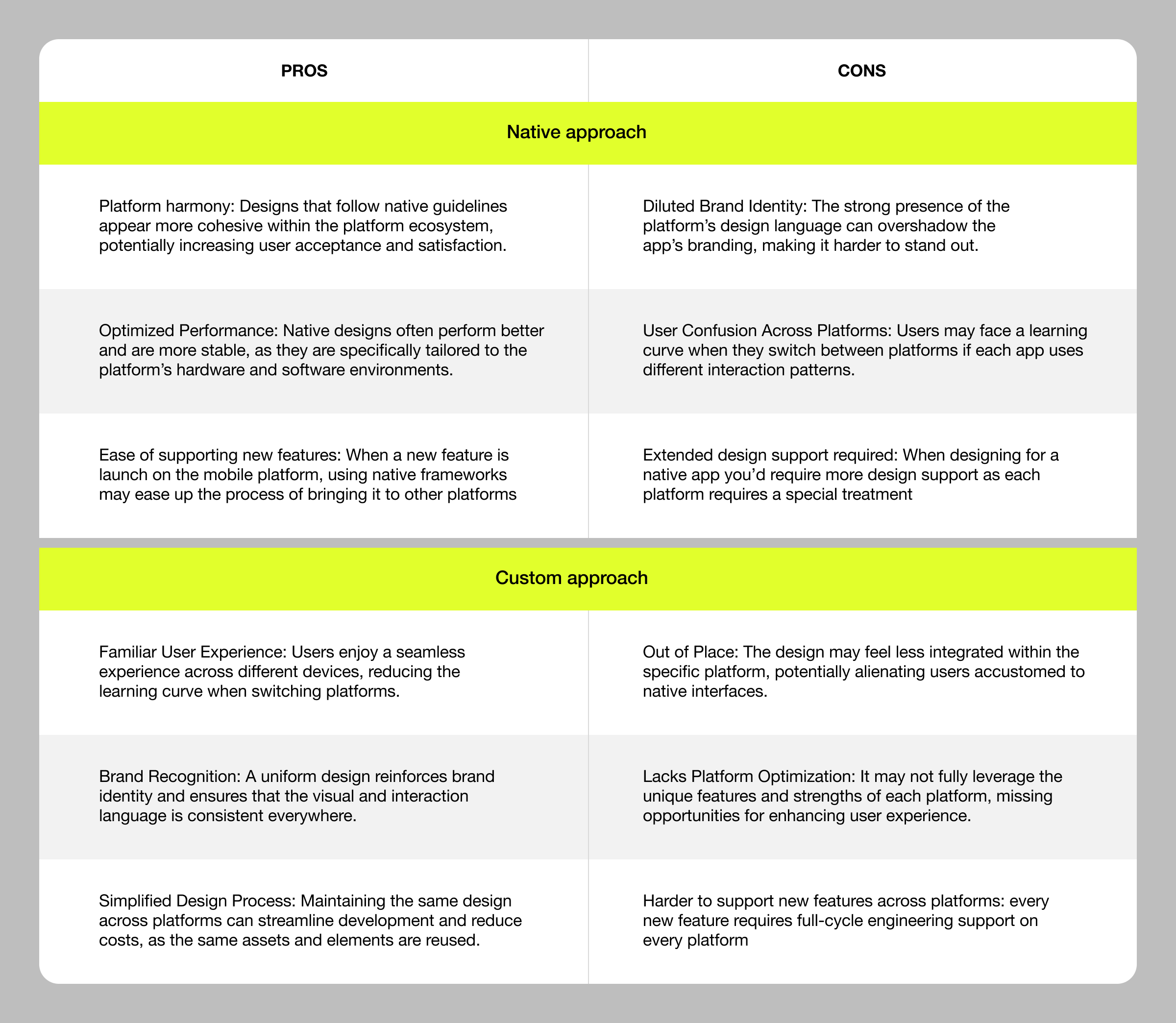
\ Choosing the approach is often part of the product and development strategy and is determined by many factors far beyond UX. Technical constraints, time-to-market pressures, or even pre-existing decisions that were made before you joined the team to name a few.
\ However, as a UX designer, it’s very important to be well-versed in the pros and cons of each approach so you can be prepared to tackle the challenges that come with the path you’ve chosen.
\ ✍️ Also Remember:
\ While designing cross-platform experiences, you need to consider factors that can significantly impact usability and user satisfaction. Performance is a key aspect — your design should be mindful of varying device capabilities and network conditions to ensure a smooth experience across the board.
\ Screen size and resolution variability also play a key role. The design needs to be flexible enough to adapt seamlessly across everything from small smartphones to large desktop monitors.
\ Another critical factor, and one of the most interesting ones, is the cultural and regional differences. For example, 5.2% of Internet users (which is 200M+) speak and write in Arabic. As you might imagine, using a right-to-left language requires different layout considerations in design. Moreover, in some countries, a tablet might serve as both a phone and a laptop, which calls for versatile design. And in some households, a single laptop is often shared among multiple users, where each has different needs and expectations for your app.
\ These elements are vital to creating a user experience that feels responsive, natural, and culturally aware, no matter where or how your app is used.
To Conclude
Cross-platform design demands more than just adapting layouts. It requires a deep understanding of how users interact across different devices and contexts. By focusing on the use case, the usage context, and the design approach, you make sure that your decisions are rooted in what truly matters to users.
\ The process doesn’t stop there. Market analysis, diverse user research, and relentless prototyping provide the insights needed to refine these decisions, while ruthless prioritization ensures that resources are directed where they’ll have the most impact.
\ These principles will help you stay adaptable, making sure your designs not only meet current needs but are also ready for what’s next.
\
This content originally appeared on HackerNoon and was authored by Anastasia Mironova
Anastasia Mironova | Sciencx (2024-09-10T00:26:16+00:00) Cross-Platform Design Wrapped Part 1: How to Anchor Every UX Decision. Retrieved from https://www.scien.cx/2024/09/10/cross-platform-design-wrapped-part-1-how-to-anchor-every-ux-decision/
Please log in to upload a file.
There are no updates yet.
Click the Upload button above to add an update.
