This content originally appeared on Telerik Blogs and was authored by Héctor Pérez
Learn everything you need to master the use of Shell in your .NET MAUI applications. First: Create a Shell file and add more elements to the app hierarchy.
In this series dedicated to .NET MAUI Shell, you will learn everything you need to master the use of Shell in your .NET MAUI applications. Let’s get started!
What Is .NET MAUI Shell?
This is the first question we must answer in case you have never heard of this term. Shell is a feature included as part of .NET MAUI, which reduces the complexity of application development by providing fundamental features that any app requires.
How does it reduce it? Well, through various features:
- Use of a single file where you define the structure of the application via pages
- Familiar navigation schemes for users, such as flyouts and tabs
- URL-based navigation system that allows navigation to any page of the application, even passing parameters
- Integrated search handler
Let’s see how to create an application using .NET MAUI Shell.
Creating Your First Shell
When you create a new project using the .NET MAUI App template, a file called AppShell.xaml is automatically created. However, to better understand how this file works, let’s create our own Shell file. To do this, create a new item using the .NET MAUI ContentPage (XAML) template, which we will call MyShell.xaml.
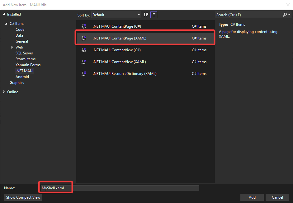
To indicate that this file will be the Shell file of the application—that is, where we will define the hierarchical structure of the application—we must replace the ContentPage type with Shell type and remove the initial content, resulting in the following code:
<Shell xmlns="http://schemas.microsoft.com/dotnet/2021/maui"
             xmlns:x="http://schemas.microsoft.com/winfx/2009/xaml"
             x:Class="MAUIUtils.MyShell"
             Title="MyShell">
              <!--Shell Content-->
</Shell>
Similarly, in MyShell.xaml.cs, we must change the type it inherits from, changing from ContentPage to Shell:
public partial class MyShell : Shell
{
public MyShell()
{
InitializeComponent();
}
}
Finally, in the App.xaml.cs file, we will replace AppShell with a new instance of MyShell, which is the Shell we want to use in our application:
public partial class App : Application
{
    public App()
    {
        InitializeComponent();
        MainPage = new MyShell();
    }
}
With this, we have a clean file with which we can experiment and analyze different Shell features.
First Utility: Color Generator
Once we have our Shell file, we need to add elements to the page hierarchy. For this exercise, we will create several pages that contain mini utilities for the users. The first utility that we will create will be in a new ContentPage called RandomColor.xaml, which will allow us to combine the values of three sliders to obtain an RGB color.
For this utility, we will use the following components:
- A
VerticalStackLayoutthat will group the controls on the page - A
Gridthat will change color according to the slider values - Three
RadSlidersthat allow us to combine their values to create a new RGB color - A
Labelthat will display the final hexadecimal value
Thanks to the versatility of the RadSlider control, we can change the color of each slider so that the user knows at a glance what color it is, resulting in the following XAML code:
<ContentPage.Resources>
    <Style x:Key="RedTrackStyle" TargetType="telerik:SliderRangeTrack">
        <Setter Property="TrackThickness" Value="8" />
        <Setter Property="Fill" Value="#E57373" />
        <Setter Property="Stroke" Value="#FFCDD2" />
        <Setter Property="StrokeThickness" Value="1" />
    </Style>
    <Style x:Key="RedThumbStyle" TargetType="telerik:SliderThumb">
        <Setter Property="Fill" Value="#F44336" />
        <Setter Property="Stroke" Value="#E53935" />
        <Setter Property="StrokeThickness" Value="2" />
    </Style>
    <Style x:Key="BlueTrackStyle" TargetType="telerik:SliderRangeTrack">
        <Setter Property="TrackThickness" Value="8" />
        <Setter Property="Fill" Value="#64B5F6" />
        <Setter Property="Stroke" Value="#BBDEFB" />
        <Setter Property="StrokeThickness" Value="1" />
    </Style>
    <Style x:Key="BlueThumbStyle" TargetType="telerik:SliderThumb">
        <Setter Property="Fill" Value="#2196F3" />
        <Setter Property="Stroke" Value="#1976D2" />
        <Setter Property="StrokeThickness" Value="2" />
    </Style>
    <Style x:Key="GreenTrackStyle" TargetType="telerik:SliderRangeTrack">
        <Setter Property="TrackThickness" Value="8" />
        <Setter Property="Fill" Value="#81C784" />
        <Setter Property="Stroke" Value="#C8E6C9" />
        <Setter Property="StrokeThickness" Value="1" />
    </Style>
    <Style x:Key="GreenThumbStyle" TargetType="telerik:SliderThumb">
        <Setter Property="Fill" Value="#4CAF50" />
        <Setter Property="Stroke" Value="#388E3C" />
        <Setter Property="StrokeThickness" Value="2" />
    </Style>
</ContentPage.Resources>
<VerticalStackLayout>
    <Grid
        x:Name="GeneratedColor"
        Background="Black"
        HeightRequest="250" />
    <telerik:RadSlider
        x:Name="rSlider"
        Maximum="1"
        Minimum="0"
        RangeTrackStyle="{StaticResource RedTrackStyle}"
        ThumbStyle="{StaticResource RedThumbStyle}"
        ValueChanging="Slider_ValueChanging"
        Value="0" />
    <telerik:RadSlider
        x:Name="gSlider"
        Maximum="1"
        Minimum="0"
        RangeTrackStyle="{StaticResource GreenTrackStyle}"
        ThumbStyle="{StaticResource GreenThumbStyle}"
        ValueChanging="Slider_ValueChanging"
        Value="0" />
    <telerik:RadSlider
        x:Name="bSlider"
        Maximum="1"
        Minimum="0"
        RangeTrackStyle="{StaticResource BlueTrackStyle}"
        ThumbStyle="{StaticResource BlueThumbStyle}"
        ValueChanging="Slider_ValueChanging"
        Value="0" />
    <Label
        x:Name="HexColor"
        FontAttributes="Bold"
        FontSize="Title"
        HorizontalOptions="Center"
        Text="#000000" />
</VerticalStackLayout>
The code behind for the utility is as follows:
public partial class RandomColor : ContentPage
{
public RandomColor()
{
InitializeComponent();
}

    private void Slider_ValueChanging(object sender, Telerik.Maui.ValueChangingEventArgs e)
    {
var r = rSlider.Value;
var g = gSlider.Value;
var b = bSlider.Value;
var color = Color.FromRgb(r, g, b);

GeneratedColor.Background = color;
HexColor.Text = $"#{(int)(r * 255):X2}{(int)(g * 255):X2}{(int)(b * 255):X2}";
    }
}
Adding an Element to the Hierarchy
Once we have added our Shell and the first utility of the application, it is time to integrate them. If we try to run the application at this moment, we will get the following error:
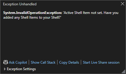
The error indicates that we have not added elements to the Shell file, so it is time to go to MyShell.xaml and start adding elements. The way we add elements to the application hierarchy is by using the ShellContent tag as shown below:
<ShellContent ContentTemplate="{DataTemplate UtilPages:RandomColor}" />
One point to highlight is that with the previous code, a ContentPage will be created on demand—that is, not until the user views the page. This happens thanks to the DataTemplate markup extension, which allows setting the ContentTemplate property of each ShellContent to a ContentPage object. Running the application, we get the following result:
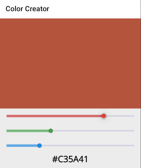
Something to note is that at this moment, with only one ShellContent element in the hierarchy, no navigation elements such as a flyout or tab bars appear. This is normal, as it would not make sense to have navigation elements if we want to create an application with a single page using Shell.
Second Utility: URL to QR Code
It is time to add new utilities to our application, so we will create a new ContentPage called URLToQR.xaml. This page consists of the following elements:
- A
VerticalStackLayoutto align the elements on the page - A
RadEntryfor the user to enter a URL - A
Buttonto start the QR code generation - A
RadBarcodethat will display the generated QR code
The RadBarcode control allows us to generate QR or bar codes in a very simple way, using components that are reliable and robust. Also, the RadEntry control allows customization of various aspects of a text box in our applications.
The XAML code that will define the utility is as follows:
<VerticalStackLayout Margin="25" Spacing="25">
    <telerik:RadEntry
        x:Name="URLEntry"
        BackgroundColor="LightBlue"
        FontSize="14"
        Placeholder="Enter your URL to convert to QR code:"
        PlaceholderColor="#99000000" />
    <Button
        x:Name="GenerateQR"
        Clicked="GenerateQR_Clicked"
        CornerRadius="10"
        Text="Generate QR code"
        WidthRequest="250" />
    <telerik:RadBarcode
        x:Name="QRCode"
        HeightRequest="250"
        IsVisible="False">
        <telerik:RadBarcode.Symbology>
            <telerik:QRCode SizingMode="Stretch" />
        </telerik:RadBarcode.Symbology>
    </telerik:RadBarcode>
</VerticalStackLayout>
On the other hand, the code behind is as follows:
public partial class URLToQR : ContentPage
{
public URLToQR()
{
InitializeComponent();
}

    private void GenerateQR_Clicked(object sender, EventArgs e)
    {
        QRCode.Value = URLEntry.Text;
        QRCode.IsVisible = true;
    }
}
Once we have created the second utility, let’s see how to add it to the app hierarchy
Adding Multiple ShellContent Elements
To add additional elements to the application hierarchy, let’s go to MyShell.xaml and add a new ShellContent tag, replacing the DataTemplate page, resulting in the following:
<ShellContent ContentTemplate="{DataTemplate UtilPages:RandomColor}" />
<ShellContent ContentTemplate="{DataTemplate UtilPages:URLToQR}" />
With this change, if we run the application again, it will seem like nothing has happened. However, if you look closely, you will see that next to the Color Creator page title, there is a blank space. If this is pressed, it will display a flyout that seems empty, as shown in the following image:
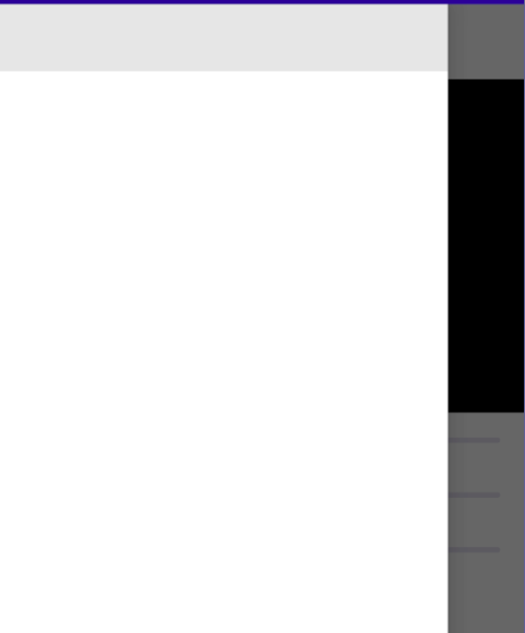
If you press just below the gray rectangle in the flyout, you will see how it navigates to the QR code generation utility, which I have run to show a generated QR code from the Progress Telerik site:
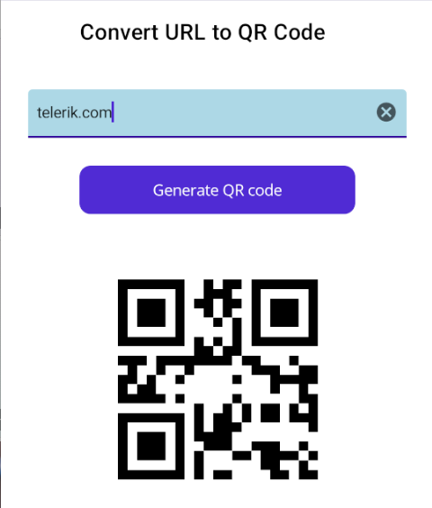
Although the lack of visual indicators may seem a bit disconcerting, the reality is that the interface has appeared this way because we have not performed a configuration, which we will do next.
Configuring the Titles and Icons of the Pages
The first thing we will do is assign a background color to the Shell navigation bar. This can be achieved by assigning the BackgroundColor property, as shown below:
<Shell
    x:Class="MAUIUtils.MyShell"
    xmlns="http://schemas.microsoft.com/dotnet/2021/maui"
    xmlns:x="http://schemas.microsoft.com/winfx/2009/xaml"
    xmlns:UtilPages="clr-namespace:MAUIUtils.Pages"
    Title="MyShell"
    BackgroundColor="#F9AA33">
Next, we will assign values to the Title and Icon properties of each ShellItem, as follows:
<ShellContent
    Title="Color Generator"
    ContentTemplate="{DataTemplate UtilPages:RandomColor}"
    Icon="dotnet_bot.png" />
<ShellContent
    Title="URL to QR"
    ContentTemplate="{DataTemplate UtilPages:URLToQR}"
    Icon="dotnet_bot.png" />
With these simple changes, we will see a substantial change in the application’s display:
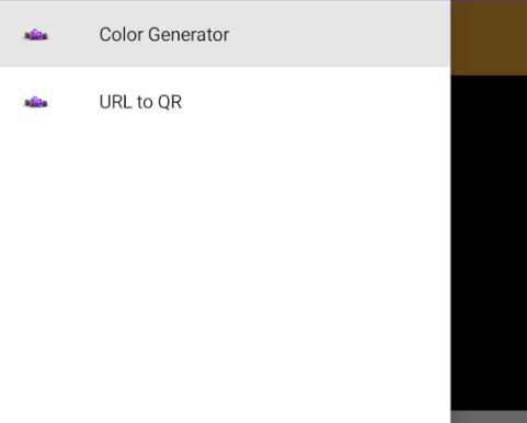
Now you know how to create your own Shell file and use it in your application, as well as how to add more elements to the application hierarchy. In the next post, you will see how Shell allows you to add different levels of hierarchy in the application through the use of tabs, and to carry out customization of both the flyout and the tabs.
Next: Go on to Part 2!
This content originally appeared on Telerik Blogs and was authored by Héctor Pérez
Héctor Pérez | Sciencx (2024-09-12T08:41:58+00:00) Mastering .NET MAUI Shell—Part 1. Retrieved from https://www.scien.cx/2024/09/12/mastering-net-maui-shell-part-1/
Please log in to upload a file.
There are no updates yet.
Click the Upload button above to add an update.
