
This content originally appeared on Bits and Pieces - Medium and was authored by Eden Ella
A quick guide to building your own version of MUI components
While Material UI lets you customize components by tweaking the theme or using the sx prop, nothing compares to the control and reusability of wrapping MUI components in your own custom library.
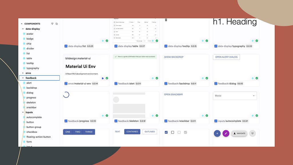
Visit this collection of custom MUI components on Bit Platform to get a better idea of what your own collection will look like.
To create your own collection of custom MUI components install Bit and initialize a new Bit workspace using the ‘Material UI’ starter. Make sure to replace the MY_ORG.MY_SCOPE value with your own organization/username and scope name on the Bit Platform.
npx @teambit/bvm install
bit new material-ui mui-ws --aspect teambit.community/starters/material-ui --default-scope MY_ORG.MY_SCOPE
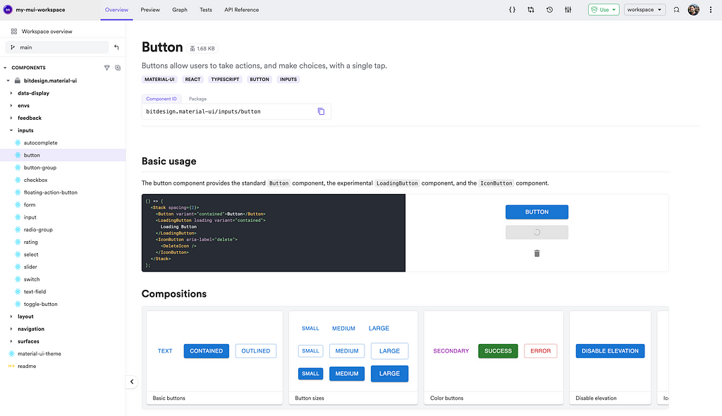
Run Bit’s dev server to explore your components:
bit start
To publish the first version of your components and make them available for other projects as Node packages or Bit components, run the following command:
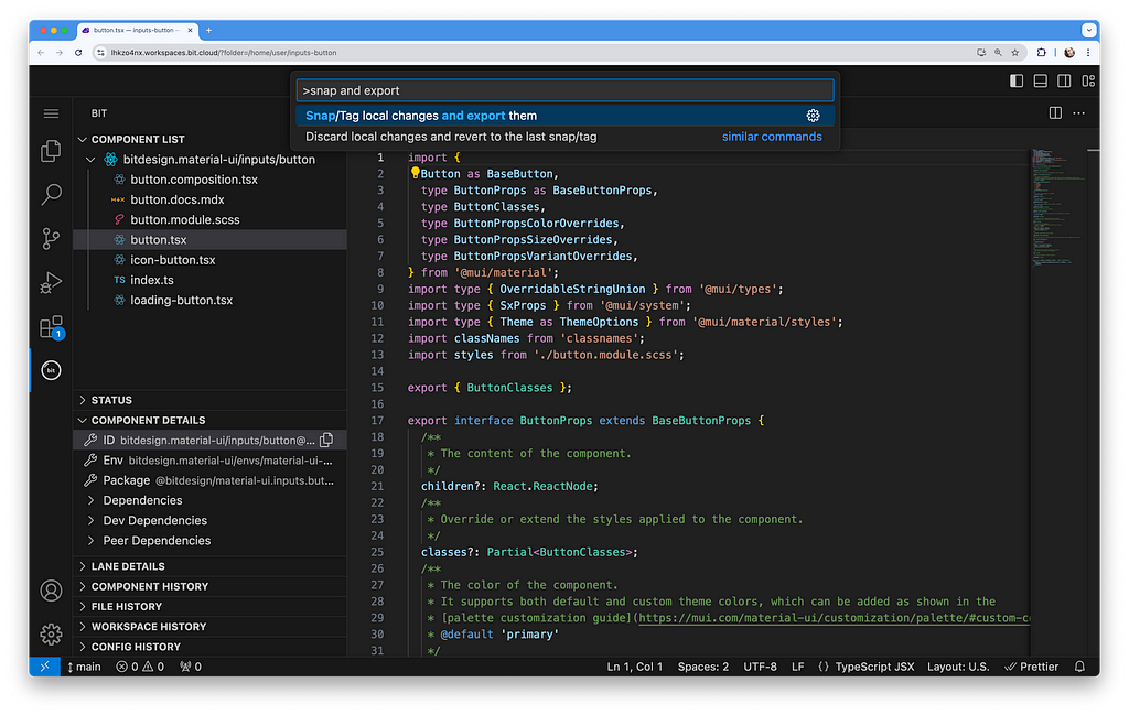
bit tag --message "initial version"
bit export
At any point, you can edit the full collection (“scope”) or a specific component by clicking the ‘Edit component’ or ‘Edit scope’ buttons in the top-right corner of the component or scope page
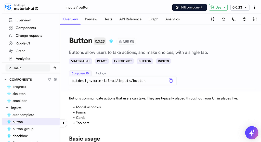
You can change your shared component’s source code, build, review, and release it, all without leaving Bit Platform/ your browser:
Why You Should Build a Custom Collection of MUI Components
Simplifying updates and ensuring compatibility
Wrapping UI components decouples their internal implementation from their API, giving you better control over your library and enhancing your support for projects that use it.
This approach allows you to upgrade your MUI version or switch between stable and ‘experimental’ components without adding significant overhead to other teams. It also enables you to build in backward compatibility as needed.
For example, you might want to switch the stable Button component with the experimental LoadingButton component:
import {
  LoadingButton
  type LoadingButtonProps
} from '@mui/lab';

export interface ButtonProps extends LoadingButtonProps {
}

export function Button({
  className,
  children,
  ...rest
}: LoadingButtonProps) {
  return (
    <LoadingButton
      {...rest}
    >
      {children}
    </BaseLoadingButton>
  );
}
Complete Control over the components’ API and behavior
To effectively maintain a UI library, you must have total control over your component’s API.
For example, you might want to add support for React Router navigation or prevent the use of native anchor tags:
import {
  Button as BaseButton,
  type ButtonProps as BaseButtonProps,
} from '@mui/material';

export interface ButtonProps extends BaseButtonProps {
   /**
   * The URL to link to when the button is clicked.
   * Uses react-router Link component.
   */
  to?: string;
   /**
   * The URL to link to when the button is clicked.
   * Uses react-router Link component.
   */
   href?: string;
}

eexport function Button({ to, href, children, ...rest }: ButtonProps) {
  const linkTo = to || href || "";
  return (
    <BaseButton to={linkTo} {...rest}>
      {children}
    </BaseButton>
  );
}
Simplify usage and maintenance / add custom features
While Material UI’s modular nature is a significant advantage, it might not always offer the best DevX. Integrating UI components with what MUI refers to as the “component API” can streamline their usage and maintenance.
You may also want to integrate your own custom features or add valuable functions from MUI’s examples found in their docs.
/**
 * @componentId: bitdesign.material-ui/data-display/avatar
 */

import from '@mui/material/Avatar';
import BaseAvatarGroup from '@mui/material/AvatarGroup';
import {
  Avatar as BaseAvatar,
 AvatarGroup as BaseAvatarGroup
} from '@mui/material';
// ...

export const Avatar = ({ children, ...rest }: AvatarProps) => {
  return <BaseAvatar {...rest}>{children}</BaseAvatar>;
};

export const AvatarGroup = ({ children, ...rest }: AvatarGroupProps) => {
  return <BaseAvatarGroup {...rest}>{children}</BaseAvatarGroup>;
};

// a sting to color function found in MUI's docs
function stringToColor(string: string) {
  let hash = 0;
  let i;

   for (i = 0; i < string.length; i += 1) {
    hash = string.charCodeAt(i) + ((hash << 5) - hash);
  }

  let color = '#';

  for (i = 0; i < 3; i += 1) {
    const value = (hash >> (i * 8)) & 0xff;
    color += `00${value.toString(16)}`.slice(-2);
  }

  return color;
}

export const stringAvatar = (name: string) => {
  return {
    sx: {
      bgcolor: stringToColor(name),
    },
    children: `${name.split(' ')[0][0]}${name.split(' ')[1][0]}`,
  };
};
More consistency across themes using a custom base theme
To ensure consistency and reuse existing solutions, you can create a custom base theme and a create-theme function that sets the guidelines for other themes used across different projects.
For instance, the theme below introduces a new typography variant called ‘handwriting.’
/**
 * @filename: theme-options.ts
 * @componentId: bitdesign.material-ui/material-ui-theme
 */

import type { ThemeOptions as BaseThemeOptions } from '@mui/material';
import type { TypographyVariantsOptions } from '@bitdesign/material-ui.data-display.typography';

/**
 * extend the options of the theme with an additional typography variants
 */
export interface ThemeOptions extends BaseThemeOptions {
  typography?: TypographyVariantsOptions;
}
/**
 * @filename: create-theme.ts
 * @componentId: bitdesign.material-ui/material-ui-theme
 */

import type { Theme } from '@mui/material';
import { createTheme as createThemeBase } from '@mui/material/styles';

import type { ThemeOptions } from './theme-options.js';

export function createTheme(options: ThemeOptions, ...args: object[]): Theme {
  return createThemeBase(options, ...args);
}
/**
 * @filename: default-theme.ts
 * @componentId: bitdesign.material-ui/material-ui-theme
 */

import { createTheme } from './create-theme.js';
import type { ThemeOptions } from './theme-options.js';

export function defaultTheme(): ThemeOptions {
  return createTheme({
    // ...
    typography: {
      fontFamily: 'Outfit, sans-serif',
      /* this is the custom typography variant */
      handwriting: {
        fontFamily: 'Handlee, cursive',
      },
    },
  });
}
Build a Custom Material UI Library in Minutes was originally published in Bits and Pieces on Medium, where people are continuing the conversation by highlighting and responding to this story.
This content originally appeared on Bits and Pieces - Medium and was authored by Eden Ella
Eden Ella | Sciencx (2024-09-18T15:36:30+00:00) Build a Custom Material UI Library in Minutes. Retrieved from https://www.scien.cx/2024/09/18/build-a-custom-material-ui-library-in-minutes/
Please log in to upload a file.
There are no updates yet.
Click the Upload button above to add an update.