This content originally appeared on Telerik Blogs and was authored by Héctor Pérez
Learn everything you need to master the use of Shell in your .NET MAUI applications. Today: Create hierarchies and customize a Shell file to fit your needs.
Let’s continue with the Mastering .NET MAUI Shell series. In a previous article of the series, you learned how to create your own Shell file and add content to it. Now it’s time to learn how to create hierarchies and customize it to fit your needs. Let’s get to it!
Adding New Utilities to the App
So that we can correctly visualize the upcoming examples in this guide, let’s add a couple of additional utilities to our application.
Third Utility: Cool Image Editor
The third utility we’ll add to the application is an image editor. How complicated could it be to create such a control? Definitely, it could take you several days to implement this type of control from scratch. Fortunately, the Telerik UI suite for .NET MAUI has an image editor control that we can quickly and easily integrate into the application.
This utility will be composed of the following components:
- A Telerik ImageEditor for .NET MAUI
To integrate this control into our application, we’ll create a new ContentPage called CoolEditor.xaml with the following content:
<Grid RowDefinitions="Auto,*">
    <telerik:RadImageEditorToolbar ImageEditor="{x:Reference imageEditor}" />
    <telerik:RadImageEditor x:Name="imageEditor" Grid.Row="1" />
</Grid>
Also, we’ll load an image into the control in the code behind, using the following C# code:
public CoolEditor()
{
    InitializeComponent();

    this.imageEditor.Source = ImageSource.FromFile("dotnet_bot.png");
}
Pretty simple, isn’t it? The new utility implements a bunch of image manipulation functionalities by default, having the following appearance:
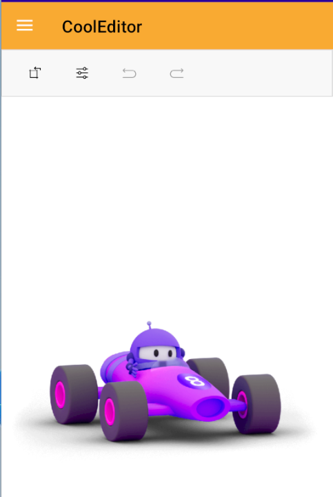
Now, let’s see how to create the fourth utility.
Fourth Utility: Word Counter
The next utility, which could be very helpful to our users, is a word counter that allows the user to know the number of words written in a text box. This utility will be composed of the following controls:
- A main
Gridto group the controls, assign a background color and the layout of the utility - A
Borderto give a better view to the text box, where the user will enter the words to count - An
Editorfor the user to enter the text that will contain the words to count - A
Labelto display the number of words counted
Let’s add a new ContentPage called WordCounter.xaml, and enter the following code:
<Grid BackgroundColor="DarkSlateBlue" RowDefinitions=".8*,.2*">
    <Border Margin="10" StrokeShape="RoundRectangle 12">
        <Editor
            x:Name="WordsInput"
            Background="MediumPurple"
            Placeholder="Your words"
            PlaceholderColor="LightGray"
            TextChanged="WordsInput_TextChanged" />
    </Border>
    <Label
        x:Name="WordCountLabel"
        Grid.Row="1"
        FontSize="24"
        HorizontalOptions="Center"
        Text="0 Words"
        TextColor="White"
        VerticalOptions="Center" />
</Grid>
In the code behind, the functionality to count the words will be defined as follows:
public partial class WordCounter : ContentPage
{
    public WordCounter()
    {
        InitializeComponent();
    }

    private void WordsInput_TextChanged(object sender, TextChangedEventArgs e)
    {
        var newText = e.NewTextValue;
        int wordCount = CountWords(newText);
        WordCountLabel.Text = $"{wordCount} Words";

    }

    // Method to count words in a given text
    private int CountWords(string text)
    {
        if (string.IsNullOrWhiteSpace(text))
        {
            return 0;
        }
        var words = text.Split(new[] { ' ', '\t', '\n', '\r' }, StringSplitOptions.RemoveEmptyEntries);
        return words.Length;
    }
}
Once the new utility is implemented, it will look like this:
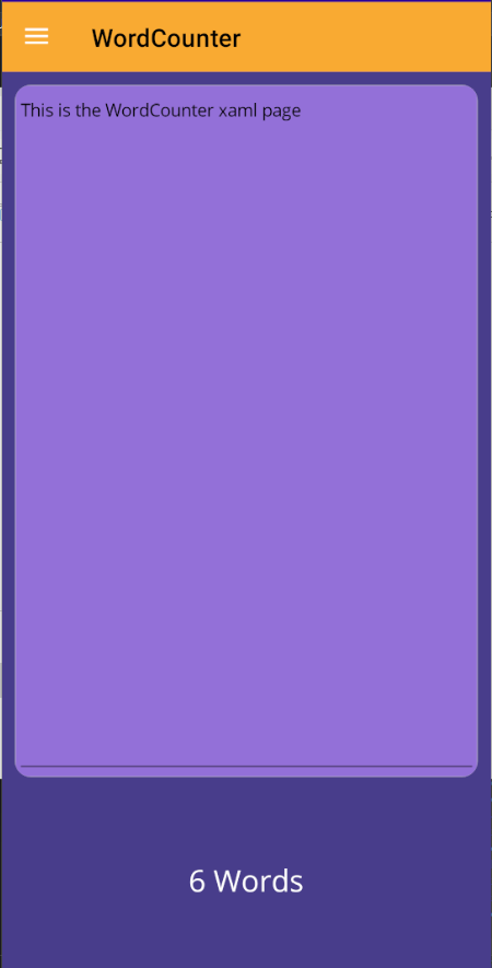
With this, we now have enough utilities to improve the hierarchy of the application. Let’s see how to do it in the next section.
Adding Subtabs to the Hierarchy
So far, we have created four utilities that are part of our application, and if you remember, they are in the same hierarchy within the Flyout as we can see in the following image:
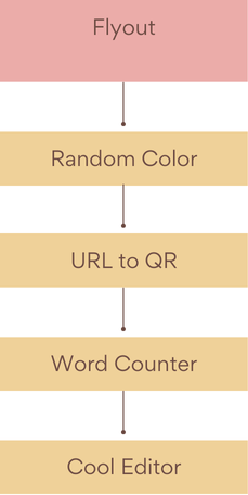
What’s currently happening is that the .NET MAUI framework automatically creates a FlyoutItem type element for each ShellContent. Maybe you don’t see any problem with this hierarchy right now—however, if the application grows with new utilities, the sidebar will fill up with elements, which will make navigation difficult. This is where we can start redefining the initial hierarchy to add tabs and better organize the app’s pages.
Let’s suppose we want a new hierarchy, dividing the utilities into categories, as in the following image:
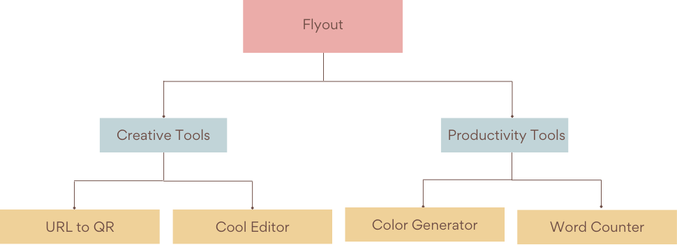
To group the tools into categories, we need to explicitly define FlyoutItem type elements in the MyShell.xaml file, nesting the ShellContent we had created. In our example, I will create two FlyoutItem elements to represent the categories, resulting in this form:
<Shell
    x:Class="MAUIUtils.MyShell"
    xmlns="http://schemas.microsoft.com/dotnet/2021/maui"
    xmlns:x="http://schemas.microsoft.com/winfx/2009/xaml"
    xmlns:UtilPages="clr-namespace:MAUIUtils.Pages"
    Title="MyShell"
    BackgroundColor="#F9AA33">

    <FlyoutItem Title="Creative Tools" Icon="dotnet_bot.png">
        <ShellContent
            Title="Image Editor"
            ContentTemplate="{DataTemplate UtilPages:CoolEditor}"
            Icon="dotnet_bot.png" />
        <ShellContent
            Title="URL to QR"
            ContentTemplate="{DataTemplate UtilPages:URLToQR}"
            Icon="dotnet_bot.png" />
    </FlyoutItem>

    <FlyoutItem Title="Productivity Tools" Icon="dotnet_bot.png">
        <ShellContent
            Title="Word Counter"
            ContentTemplate="{DataTemplate UtilPages:WordCounter}"
            Icon="dotnet_bot.png" />
        <ShellContent
            Title="Color Generator"
            ContentTemplate="{DataTemplate UtilPages:RandomColor}"
            Icon="dotnet_bot.png" />
    </FlyoutItem>
</Shell>
This results in only two FlyoutItems being added to the Flyout. You can see that in the XAML code, we have also added the Title and Icon properties for each FlyoutItem, giving the following result:
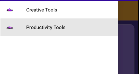
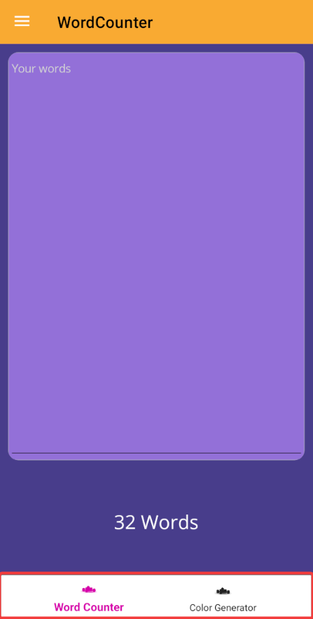
On the other hand, a couple of tabs have been created in each category representing the utilities.
Adding a New Level of Hierarchy with .NET MAUI Shell
.NET MAUI Shell allows adding another level of hierarchy than we’ve seen before. Let’s imagine that the application continues to grow, and that now we need to create subcategories in the application, as in the following example:
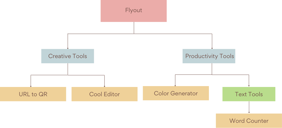
In this new categorization, we have added a subcategory called Text Tools, in which we will group all the text-related tools. To achieve this, in the XAML code we must explicitly create elements of type Tab, which will nest the tools of this subcategory as shown below:
<FlyoutItem Title="Productivity Tools" Icon="dotnet_bot.png">
    <Tab Title="Text Tools" Icon="dotnet_bot.png">
        <ShellContent
            Title="Word Counter"
            ContentTemplate="{DataTemplate UtilPages:WordCounter}"
            Icon="dotnet_bot.png" />
        <ShellContent
            Title="Color Generator"
            ContentTemplate="{DataTemplate UtilPages:RandomColor}"
            Icon="dotnet_bot.png" />
    </Tab>

    <Tab Title="Other Tools" Icon="dotnet_bot.png">
        <ShellContent
            Title="Word Counter"
            ContentTemplate="{DataTemplate UtilPages:WordCounter}"
            Icon="dotnet_bot.png" />
        <ShellContent
            Title="Color Generator"
            ContentTemplate="{DataTemplate UtilPages:RandomColor}"
            Icon="dotnet_bot.png" />
    </Tab>
</FlyoutItem>
In the code above, I have grouped the two ShellContent of the Productivity Tools category within a new Tab, to then duplicate it for the purpose of showing you the resulting visual appearance:
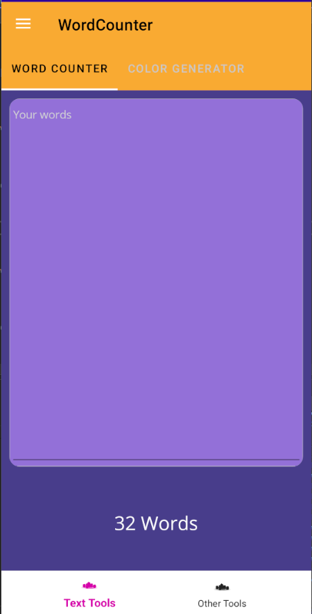
In the image above, you can see that a new tab section has been created above the page, which allows us to create a new level in the app’s hierarchy.
Customizing the Shell
.NET MAUI allows us to modify several visual aspects of the Shell, as we will see below.
Customizing the Flyout Icon
If for some reason, we want to change the hamburger icon that is part of Shell, we can do it through the FlyoutIcon property of the Shell page, as shown below:
<Shell
    x:Class="MAUIUtils.MyShell"
    xmlns="http://schemas.microsoft.com/dotnet/2021/maui"
    xmlns:x="http://schemas.microsoft.com/winfx/2009/xaml"
    xmlns:UtilPages="clr-namespace:MAUIUtils.Pages"
    Title="MyShell"
    BackgroundColor="#F9AA33"
    FlyoutIcon="dotnet_bot.png">
The result of the execution is as follows:
![]()
Customizing the Flyout Header and Flyout Footer
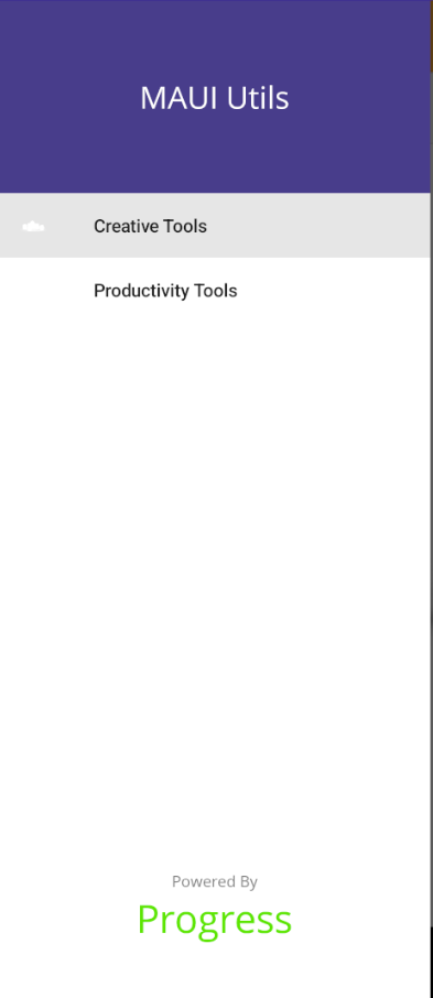
In .NET MAUI, we can also customize the Shell.FlyoutHeader and Shell.FlyoutFooter properties to modify the Header and Footer of the Flyout, as in the following example:
<Shell.FlyoutHeader>
    <Grid BackgroundColor="DarkSlateBlue" HeightRequest="150">
        <Label
            FontSize="24"
            HorizontalOptions="Center"
            Text="MAUI Utils"
            TextColor="White"
            VerticalOptions="Center" />
    </Grid>
</Shell.FlyoutHeader>

<Shell.FlyoutFooter>
    <VerticalStackLayout HeightRequest="100">
        <Label
            FontSize="12"
            HorizontalOptions="Center"
            Text="Powered By"
            TextColor="Gray"
            VerticalOptions="Center" />
        <Label
            FontSize="30"
            HorizontalOptions="Center"
            Text="Progress"
            TextColor="#5CE500"
            VerticalOptions="Center" />
    </VerticalStackLayout>
</Shell.FlyoutFooter>
The code above results in the following:
Customizing the Flyout Items
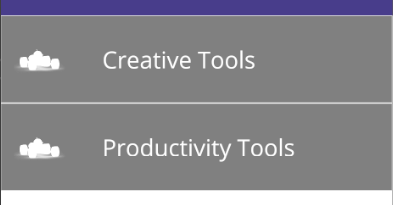
Undoubtedly, a common question is, how can we customize the Flyout items? This is possible by defining the Shell.ItemTemplate property, where we can bind to the FlyoutIcon and Title properties to add controls and customize them, as in the following example:
<Shell.ItemTemplate>
    <DataTemplate>
        <Grid
            ColumnDefinitions=".2*, .8*"
            HeightRequest="75"
            RowSpacing="0">
            <Rectangle
                x:Name="background"
                Grid.ColumnSpan="2"
                Fill="Black"
                Opacity=".5" />
            <Image
                HeightRequest="30"
                Source="{Binding FlyoutIcon}"
                VerticalOptions="Center" />
            <Label
                Grid.Column="1"
                Margin="20,0,0,0"
                FontSize="20"
                Text="{Binding Title}"
                TextColor="White"
                VerticalOptions="Center" />
        </Grid>
    </DataTemplate>
</Shell.ItemTemplate>
This results in the following:
Customizing the Appearance of the Selected Element
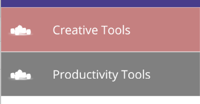
If you have modified the Shell.ItemTemplate property, you are probably now faced with the dilemma of how to modify the visual appearance of the element selected by the user. To solve this problem, we must modify the VisualStateManager.VisualStateGroups property, specifying the different states of the element, as well as its visual appearance as shown below:
<Shell.ItemTemplate>
    <DataTemplate>
        <Grid
           ...
            <VisualStateManager.VisualStateGroups>
                <VisualStateGroupList>
                    <VisualStateGroup x:Name="CommonStates">
                        <VisualState x:Name="Normal">
                            <VisualState.Setters>
                                <Setter TargetName="background" Property="Rectangle.Fill" Value="Black" />
                            </VisualState.Setters>
                        </VisualState>
                        <VisualState x:Name="Selected">
                            <VisualState.Setters>
                                <Setter TargetName="background" Property="Rectangle.Fill" Value="DarkRed" />
                            </VisualState.Setters>
                        </VisualState>
                    </VisualStateGroup>
                </VisualStateGroupList>
            </VisualStateManager.VisualStateGroups>
        </Grid>
    </DataTemplate>
</Shell.ItemTemplate>
In my case, I have defined it within the Container Grid, to be able to access the controls defined in Shell.ItemTemplate, giving the following result:
Customizing the Colors of the Shell Page
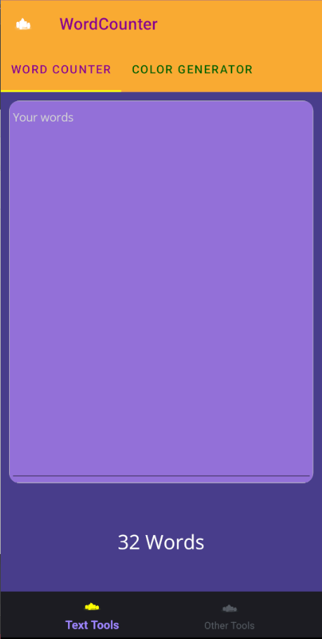
.NET MAUI Shell allows us to customize the colors of the Shell page through different properties. I show you below some Attached Properties (starting with the term Shell.X) that we can use to adjust the colors on Shell pages:
<Shell
    x:Class="MAUIUtils.MyShell"
    xmlns="http://schemas.microsoft.com/dotnet/2021/maui"
    xmlns:x="http://schemas.microsoft.com/winfx/2009/xaml"
    xmlns:UtilPages="clr-namespace:MAUIUtils.Pages"
    Title="MyShell"
    BackgroundColor="#F9AA33"
    FlyoutIcon="dotnet_bot.png"
    Shell.ForegroundColor="Yellow"
    Shell.TitleColor="DarkMagenta"
    Shell.UnselectedColor="DarkGreen">
It’s also possible to modify the visual appearance of the tabs, through a series of Attached Properties that start with the term Shell.TabBar, as shown below:
<Shell
    x:Class="MAUIUtils.MyShell"
    xmlns="http://schemas.microsoft.com/dotnet/2021/maui"
    xmlns:x="http://schemas.microsoft.com/winfx/2009/xaml"
    xmlns:UtilPages="clr-namespace:MAUIUtils.Pages"
    Title="MyShell"
    BackgroundColor="#F9AA33"
    FlyoutIcon="dotnet_bot.png"
    Shell.ForegroundColor="Yellow"
    Shell.TabBarBackgroundColor="#1D1F24"
    Shell.TabBarDisabledColor="#1D1F24"
    Shell.TabBarForegroundColor="Yellow"
    Shell.TabBarTitleColor="#9E86FF"
    Shell.TabBarUnselectedColor="#555A62"
    Shell.TitleColor="DarkMagenta"
    Shell.UnselectedColor="DarkGreen">
Lastly, it’s important to highlight that by default, in the Styles.xaml file that is created in any .NET MAUI project, we have the following section available:
    <Style ApplyToDerivedTypes="True" TargetType="Shell">
        <Setter Property="Shell.BackgroundColor" Value="{AppThemeBinding Light={StaticResource White}, Dark={StaticResource OffBlack}}" />
        <Setter Property="Shell.ForegroundColor" Value="{OnPlatform WinUI={StaticResource Primary}, Default={StaticResource White}}" />
        <Setter Property="Shell.TitleColor" Value="{AppThemeBinding Light={StaticResource Black}, Dark={StaticResource SecondaryDarkText}}" />
        <Setter Property="Shell.DisabledColor" Value="{AppThemeBinding Light={StaticResource Gray200}, Dark={StaticResource Gray950}}" />
        <Setter Property="Shell.UnselectedColor" Value="{AppThemeBinding Light={StaticResource Gray200}, Dark={StaticResource Gray200}}" />
        <Setter Property="Shell.NavBarHasShadow" Value="False" />
        <Setter Property="Shell.TabBarBackgroundColor" Value="{AppThemeBinding Light={StaticResource White}, Dark={StaticResource Black}}" />
        <Setter Property="Shell.TabBarForegroundColor" Value="{AppThemeBinding Light={StaticResource Magenta}, Dark={StaticResource White}}" />
        <Setter Property="Shell.TabBarTitleColor" Value="{AppThemeBinding Light={StaticResource Magenta}, Dark={StaticResource White}}" />
        <Setter Property="Shell.TabBarUnselectedColor" Value="{AppThemeBinding Light={StaticResource Gray900}, Dark={StaticResource Gray200}}" />
    </Style>
Here you can specify the different values of the Shell customization properties, for both dark and light mode of the application.
The result of the customizations is as follows:
With this, you now know how to create hierarchies using Shell and how to customize its colors. In the next post, you will learn how to perform navigation using Shell, including parameter passing, and how to create your own SearchHandler to allow your users to perform searches.
This content originally appeared on Telerik Blogs and was authored by Héctor Pérez
Héctor Pérez | Sciencx (2024-09-19T14:43:52+00:00) Mastering .NET MAUI Shell—Part 2. Retrieved from https://www.scien.cx/2024/09/19/mastering-net-maui-shell-part-2/
Please log in to upload a file.
There are no updates yet.
Click the Upload button above to add an update.
