This content originally appeared on Bits and Pieces - Medium and was authored by Eden Ella
Rethinking UI reuse with fully editable and shareable components
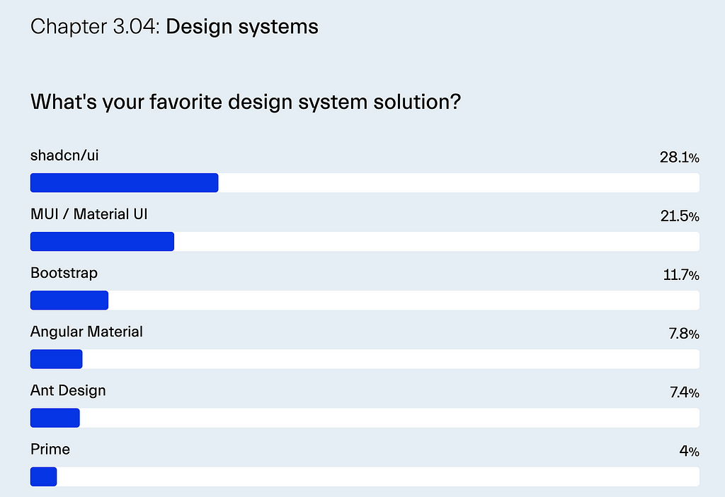
In recent years, a shift has emerged in how developers use UI libraries, moving away from installing entire component libraries through npm packages and towards directly embedding component code into projects.
This trend, largely popularized by Shadcn/UI, enables developers to copy customizable, ready-made components straight into their codebase for maximum flexibility.
Why Copy-Paste Wins for Complex Components
The copy-paste approach shines, particularly for complex UI elements such as authentication pages, detailed dashboards, or intricate data visualizations. These components require fine-tuned customization that’s difficult to achieve through immutable npm packages.
Instead of overwhelming the library’s API with endless configuration options, this approach allows developers to leverage the composable and declarative nature of modern frontend frameworks, enabling greater control over every part of the component.
Ultimately, the primary goal of modern UI frameworks is to enable us to write code that is straightforward and easy to understand. There’s no need to compromise that clarity with complex, restrictive APIs.
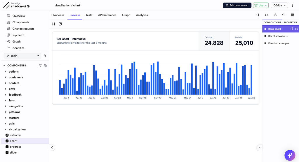
This approach has gained even greater significance with the introduction of AI coding assistants. Instead of generating components from scratch through AI with long, complex prompts — or engaging in a lengthy conversation with the assistant — you can begin with a pre-built composition close to what you need.
By embedding the code into your project, you give the AI assistant a specific, tangible context. From there, you can ask it to make incremental adjustments, such as tweaking styles, adding accessibility features, or changing the layout.
Bit Components: A New Frontier in Reusable UI
Bit has introduced a new entity to the world of web development: The Bit Component. In short, a Bit component can be thought of as a super-package. You can share it, install it, copy it, and even collaborate on it independently of any particular project setup.
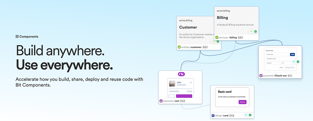
For simplicity, we can divide UI components into two groups: design system components and block components. In the design system, basic components like Card are fundamental building blocks. Meanwhile, block components, such as a MediaCard, are composed of design system elements but offer more advanced functionality.
Choice 1: Composing with Design System Components
When creating a new component, the first option is to compose from your design system. For instance, to build a custom card, you may need to combine components like Card, Button, and Typography.
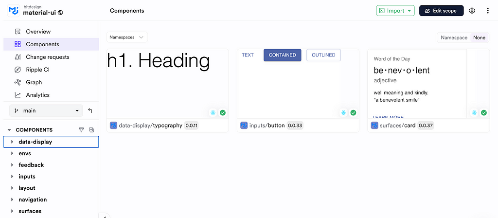
These components can be installed in your project through npm, pnpm, yarn, or Bit’s installation:
npm i @bitdesign/material-ui.surfaces.card bitdesign.material-ui/inputs/button @bitdesign/material-ui.data-display.typography
In this AI era, coding assistants, like Bit’s own Hope AI, can assemble these compositions for you, recognizing your codebase and enabling quick customization.
Hope AI: A Code Assistant for Composable Software
Choice 2: Utilizing Block Components
When opting for a pre-built block component, you have several flexible choices beyond simple installation.
The easiest route is to install the component package directly and use its API. This approach works well if the component fits your needs out of the box or requires only minor tweaks.
For scenarios where you need to make extensive changes, Bit’s fork command allows you to copy the component’s full code into your project. This includes source files, dependencies, and configurations (including the component’s dev tools).
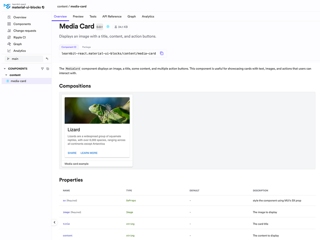
For example, to copy the MediaCard component and its configuration, we’ll run bit fork and pass its component ID (not package name) as an argument:
bit fork learnbit-react.material-ui-blocks/content/media-card
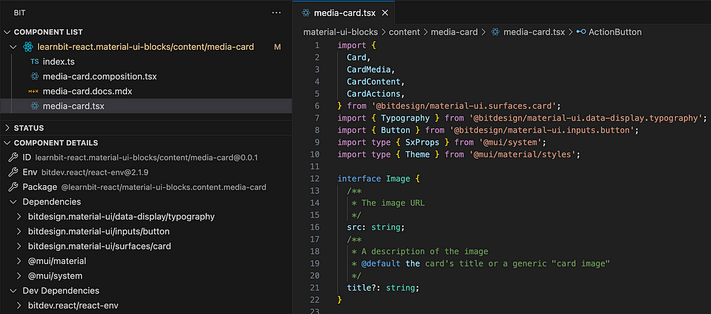
It’s worth noting that Bit also provides the bit import command, which allows you to create changes to the component and release a new version. This option requires that you have the proper permissions to modify the component (unlike the bit fork command, which does not affect the original component).
Ejecting dependencies’ source files
When forking components with dependencies, Bit auto-installs them for convenience. However, if you need direct access to the source code of a dependency, you can also fork those dependencies.
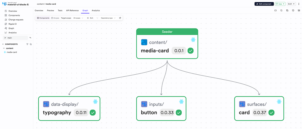
For instance, if you want to copy the Button component, you can fork it as well from your team’s collection on Bit Platform:
bit fork bitdesign.material-ui/inputs/button

In Summary
The rise of copy-paste UI libraries signifies a shift towards greater control and customization in component design, allowing developers to maximize flexibility without the constraints of package-bound APIs. With platforms like Bit providing robust tools for reusable components, developers can achieve modular, composable, and highly customizable UI experiences, elevating the way we build modern web applications.
Learn More
Beyond npm: How Direct Integration is Changing UI Libraries was originally published in Bits and Pieces on Medium, where people are continuing the conversation by highlighting and responding to this story.
This content originally appeared on Bits and Pieces - Medium and was authored by Eden Ella
Eden Ella | Sciencx (2024-10-28T15:11:18+00:00) Beyond npm: How Direct Integration is Changing UI Libraries. Retrieved from https://www.scien.cx/2024/10/28/beyond-npm-how-direct-integration-is-changing-ui-libraries/
Please log in to upload a file.
There are no updates yet.
Click the Upload button above to add an update.
