This content originally appeared on Telerik Blogs and was authored by Iva Borisova
In today’s technology-driven world, building a web app has become fairly simple. But wondering how to instill consistency, accessibility and ease of use even for complex UI can make you look like Rodin’s Thinker. Read on to find out the five essential Telerik UI for ASP.NET Core components that help solve the “How do I build that” riddle.
Let’s face it: Building a full component library often involves crafting dozens or even hundreds of UI components. Building these can take a ton of time, especially once you move beyond basic components like buttons and start building advanced UI controls like dropdowns, grid, charts and so on.
Luckily, third-party UI libraries are here to make your day-to-day developer’s life easier. Leveraging a commercial library like Progress Telerik UI for ASP.NET Core can save you tremendous amounts of time and effort, thus boosting productivity. With its 110+ out-of-the-box yet customizable UI components, Telerik UI for ASP.NET Core is the most complete ASP.NET Core library on the market, empowering you to build modern, inclusive and high-performing apps. From simple controls and navigational elements to layout tools and complex data grids—we’ve got you covered.
After all, good-looking, consistent UI is the silent seller, right? Now, let’s dive deep into the five essential Telerik UI for ASP.NET Core components that will help you speed up and standardize your UI development.
1. Grid
What’s the most complex UI component you can think of? I bet you thought “the Grid.” Yes, developing it from scratch can take months and maintaining it even more … not to mention when new features need to be added. Let’s see how we can help.
Telerik UI for ASP.NET Core DataGrid control is a fast, feature-rich component that can both handle large volumes of data with ease thanks to pagination, virtualization and infinite scrolling, and visualize and manipulate it in a way it makes sense for the user. You can choose which features to utilize and completely customize the component based on your requirements.
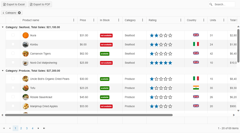
Look at the screenshot below. It demonstrates some of the essential Telerik UI for ASP.NET Core features like paging, sorting, filtering, grouping, export to Excel, export to PDF, search panel, checkbox selection, etc.—most of which can be enabled with a simple property.
Now, let’s check a typical implementation scenario to demonstrate how easy it is to work with the component. In this screenshot, you can see a few popular, built-in features, including sorting, paging and grouping data operations.
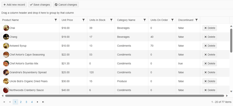
And all you need is the following code:
@(Html.Kendo().Grid<Kendo.Mvc.Examples.Models.ProductViewModel>()
    .Name("Grid")
    .Columns(columns =>
    {
            columns.Bound(p => p.ProductName)
            .ClientTemplate(
                @"<div class='product-photo'
                    style='background-image: url(" + @Url.Content("~/shared/web/foods/#:data.ProductID#.jpg") + ");'></div><div class='product-name'>#: ProductName #</div>").Title("Product Name").Width(320);
            columns.Bound(p => p.UnitPrice).Title("Unit Price").Width(150);
            columns.Bound(p => p.UnitsInStock).Title("Units In Stock").Width(150).MinScreenWidth(800);
            columns.Bound(p => p.Category.CategoryName).EditorTemplateName("ClientCategoryEditor").ClientTemplate("#=templateCell(data)#").Width(180);
            columns.Bound(p => p.UnitsOnOrder).Title("Units On Order").Width(150).MinScreenWidth(800);
            columns.Bound(p => p.Discontinued).Width(130);
            columns.Command(command => command.Destroy()).Width(160);
    })
    .ToolBar(toolbar =>
    {
        toolbar.Create();
        toolbar.Save();
    })
    .Editable(editable => editable.Mode(GridEditMode.InCell))
    .Pageable()
    .Navigatable()
    .Sortable()
    .Groupable()
    .Filterable()
    .Scrollable()
    .Events(events => events.Sort("onSort"))
    .DataSource(dataSource => dataSource
        .Ajax()
        .Batch(true)
        .PageSize(20)
        .ServerOperation(false)
        .Events(events => events.Error("error_handler"))
        .Model(model =>
        {
            model.Id(p => p.ProductID);
            model.Field(p => p.ProductID).Editable(false);
            model.Field(p => p.Category).DefaultValue(
                ViewData["defaultCategory"] as Kendo.Mvc.Examples.Models.CategoryViewModel);
        })
        .Create("Products_Create", "Grid")
        .Read("Products_Read", "Grid")
        .Update("Products_Update", "Grid")
        .Destroy("Products_Destroy", "Grid")
    )
)
<script type="text/javascript">
        function error_handler(e) {
            if (e.errors) {
                var message = "Errors:\n";
                $.each(e.errors, function (key, value) {
                    if ('errors' in value) {
                        $.each(value.errors, function() {
                            message += this + "\n";
                        });
                    }
                });
                alert(message);
            }
        }
        function templateCell(data) {
            var template = "";
            if (data.dirtyFields.Category) {
                template += "<span class='k-dirty'></span>"
            }
            template += data.Category.CategoryName;
            return template;
        }
        // Prevent sorting when new record without Product Name is added
        function onSort(e) {
            var gridData = e.sender.dataSource.data()
            gridData.forEach(function (element) {
                if (!element.ProductName) {
                    e.preventDefault()
                }
            });
        }
    </script>
<style>
    .product-photo {
        display: inline-block;
        width: 32px;
        height: 32px;
        border-radius: 50%;
        background-size: 32px 35px;
        background-position: center center;
        vertical-align: middle;
        line-height: 32px;
        box-shadow: inset 0 0 1px #999, inset 0 0 10px rgba(0,0,0,.2);
        margin-left: 5px;
    }
    .product-name {
        display: inline-block;
        vertical-align: middle;
        line-height: 32px;
        padding-left: 3px;
    }
    .k-grid-content td {
        position: relative;
    }
</style>
Check out the full Telerik UI for ASP.NET Core Grid demo here.
To cover more advanced scenarios, you can explore the Telerik UI for ASP.NET Core PivotGrid and PivotGrid v.2.
Interested in learning more?
- Getting started with the Telerik UI for ASP.NET Core Data Grid – Official documentation
- Meet the best-in-class ASP.NET Core Grid – An overview
- Displaying Data in a Consistent Format with Telerik UI for ASP.NET Core Grid – Use cases and implementation tips and tricks
2. Charts
Just think for a second how many areas and industries use charts as the indispensable visual component for websites and apps. A lot, right? Check your fitness app—it tracks your metrics using a chart, the same goes for pricing plans, monthly reports and so on. Nowadays, visualization comes everywhere.
Telerik UI for ASP.NET Core Charts library includes a wide range of chart types—from simple bar charts to sophisticated financial and scientific charts. Each chart series is highly customizable, helping you to easily understand trends in data through compelling visual representations.
Below you can see an example of a stock chart used to visualize the price movement of a financial instrument over a specific period.
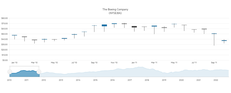
How do you create this chart? All you need to do is use the following code:
<div class="demo-section wide">
    @(Html.Kendo().StockChart<Kendo.Mvc.Examples.Models.StockDataPoint>()
        .Name("stockChart")
        .Title("The Boeing Company \n (NYSE:BA)")
        .DataSource(ds => ds.Read(read => read
            .Action("_BoeingStockData", "Financial")
        ))
        .DateField("Date")
        .Series(series =>
        {
            series.Candlestick(s => s.Open, s => s.High, s => s.Low, s => s.Close);
        })
        .Navigator(nav => nav
            .Series(series =>
            {
                series.Area(s => s.Close);
            })
            .Select(
                DateTime.Parse("2009/02/05"),
                DateTime.Parse("2011/10/07")
            )
        )
    )
</div>
Getting started with Telerik UI for ASP.NET Core Charts is easy. Check out the following resources for a running start:
- Getting started with Telerik UI for ASP.NET Core Charts – Official documentation starting point
- The Power of the Telerik UI for ASP.NET Core Charts – Learn how to implement and integrate charts with other components
3. Scheduler (Event Calendar)
What a dynamic world we live in, right? The only way to manage your time is if you track it right, and that’s why a great number of web apps require scheduling, also called an event calendar component.
From managing meetings, appointments and events to reserving a time slot, the Telerik UI for ASP.NET Core Scheduler control comes to the rescue.
With a few lines of code, you can cover even the most complex scheduling requirements, including use cases such as time zone conversions, resource visualization, grouping, editing, ongoing and recurring events.
Here is an example of a classic calendar view built with the Telerik UI for ASP.NET Core Scheduler:
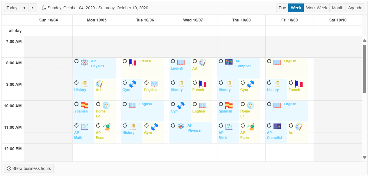
And here’s the code you need for its implementation:
@using Kendo.Mvc.UI

<script id="event-template" type="text/x-kendo-template">
    <div class="template-container">
        # if (Image) { #
        <img alt="Telerik UI for ASP.NET Core Scheduler #: title # icon" src="@Url.Content("~/shared/web/scheduler/" + "#= Image #")" style="height:25px; width: 25px;" />
        # } #
        <h3 class="template-title-#= resources[0].value #">#: title #</h3>
    </div>
</script>
@(Html.Kendo().Scheduler<Kendo.Mvc.Examples.Models.Scheduler.Activity>()
    .Name("scheduler")
    .Date(new DateTime(2020, 10, 4))
    .StartTime(new DateTime(2020, 10, 4, 7, 00, 00))
    .EndTime(new DateTime(2020, 10, 4, 20, 00, 00))
    .Height(600)
    .EventTemplateId("event-template")
    .Views(views =>
    {
        views.DayView();
        views.WeekView(week =>
        {
            week.Selected(true);
        });
        views.WorkWeekView();
        views.MonthView();
        views.AgendaView();
    })
    .Resources(resource =>
    {
        resource.Add(m => m.Attendee)
        .Title("Attendee")
        .DataTextField("Text")
        .DataValueField("Value")
        .DataColorField("Color")
        .BindTo(new[] {
            new { Text = "Jason", Value = 1, Color = "#eaf8ff" },
            new { Text = "Maddie", Value = 2, Color = "#fdfdf4" }
        });
    })
    .DataSource(d => d
        .Model(m =>
        {
            m.Id(f => f.ID);
            m.Field(f => f.Title).DefaultValue("No title");
            m.Field(f => f.Attendee).DefaultValue(1);
        })
        .Read("Overview_Read", "Scheduler")
        .Create("Overview_Create", "Scheduler")
        .Destroy("Overview_Destroy", "Scheduler")
        .Update("Overview_Update", "Scheduler")
    )
)
<style>
    .template-container {
        margin-top: -8px;
    }
    .template-container img {
        float: left;
        margin: 0 4px;
        margin-right: 10px;
    }
    .template-container h3 {
        padding: 0 4px 4px;
        font-size: 12px;
        font-weight: 600;
        margin-right: 14px;
    }

    .template-title-1 {
        color: #65CCFF;
    }

    .template-title-2 {
        color: #D0D03B;
    }

    .k-event .k-i-reload,
    .k-event .k-i-non-recurrence {
        display: none;
    }
</style>
For even more advanced scenarios, you can utilize the Telerik UI for ASP.NET Core GanttChart component.
Interested in learning more?
- Getting Started with the Telerik UI for ASP.NET Core Scheduler – Official documentation starting point
- Interactive Telerik UI for ASP.NET Core Scheduler feature demos – Official demos with a source code
4. PDF Viewer
If you need to include a PDF in your ASP.NET Core application, then we have the key to do so without the hassle.
The Telerik UI for ASP.NET Core PDF Viewer not only offers the easiest way to handle PDF files but also serves as the better alternative to the browser PDF viewer. Why? Because the browser PDF viewer will always open in a new tab, removing the user from the application flow.
Also the UX will change from user to user, depending on which browser they’re using. Not to mention the variety of design and customization options.
And the best part is that it’s super easy to use—with a few lines of code only. Look at the example below:
<script src="https://cdnjs.cloudflare.com/ajax/libs/pdf.js/2.2.2/pdf.js"></script>
<script>
    window.pdfjsLib.GlobalWorkerOptions.workerSrc = 'https://cdnjs.cloudflare.com/ajax/libs/pdf.js/2.2.2/pdf.worker.js';
</script>

<div id="example">
    @(Html.Kendo().PDFViewer().Name("pdfviewer")
        .PdfjsProcessing(pdf => pdf.File(Url.Content("~/shared/web/pdfViewer/sample.pdf")))
        .Height(1200)
    )
</div>

<style>
    html body #pdfviewer {
        width: 100% !important;
    }
</style>
Did you know that the PDF Viewer is also part of the Smart (AI) components in Telerik UI for ASP.NET Core?
The AI-powered PDFViewer assistant relies on the retrieval-augmented generation (RAG) technique that enables you to chat with your documents and summarize, explain or answer questions based on the context of your own data. How cool is that?
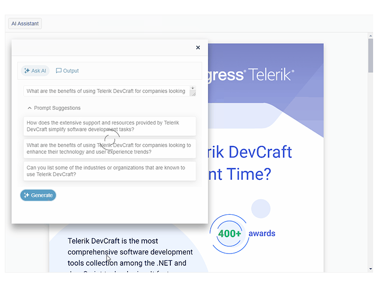
Getting started with Telerik UI for ASP.NET Core PDFViewer is a piece of cake. Check out the following resources for a running start:
- Getting started with Telerik UI for ASP.NET Core PDFViewer – Official documentation
- Viewing and Downloading PDF Files with the Telerik UI for ASP.NET Core PDFViewer – See how to open, view, download and print PDF documents
- Integrating AI Analysis with Telerik PDF Viewer in ASP.NET Core – Learn how to get started with the AI capabilities in PDF Viewer
5. DropDownList
Want to save space and display options only when needed? The obvious choice is using a dropdown list. It also elevates the user experience by offering a set of predefined items like a movie genre, a flavor of ice cream or a sock size to choose from. Great!
Where is the catch? A functional, well-styled dropdown is difficult to implement … usually, a designer would create the appearance, a frontend-er would implement the design and a backend developer would set up the data binding. A large overhead, right?
Telerik UI for ASP.NET Core DropDownList offers the solution by providing a quick-to-configure dropdown, packaged in HtmlHelper and TagHelper wrappers. It covers, well, basically everything: flexible data binding, virtualization, cascading lists, appearance customization through templates, events, validation, accessibility, easy integration with other ASP.NET Core controls, RTL support and keyboard navigation.
Here is a classic scenario where you can bind the component to a list of values and select from the available options:
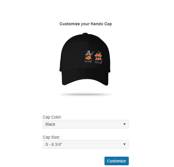
And here’s the code you’ll need:
<div class="k-d-flex k-justify-content-center" style="padding-top: 54px;">
    <div class="k-w-300">
        <h4 style="text-align: center;">Customize your Kendo Cap</h4>
        <div id="cap" class="black-cap"></div>
        <br />
        <br />
        <label for="color">Cap Color:</label>
        @(Html.Kendo().DropDownList()
              .Name("color")
              .DataTextField("Text")
              .DataValueField("Value")
              .Events(e => e.Change("change"))
              .BindTo(new List<SelectListItem>() {
                  new SelectListItem() {
                      Text = "Black",
                      Value = "1"
                  },
                  new SelectListItem() {
                      Text = "Orange",
                      Value = "2"
                  },
                  new SelectListItem() {
                      Text = "Grey",
                      Value = "3"
                  }
              })
              .Value("1")
              .HtmlAttributes(new { style = "width: 100%" })
        )
        <br />
        <br />
        <label for="size">Cap Size:</label>
        @(Html.Kendo().DropDownList()
              .Name("size")
              .BindTo(new List<string>() {
                  "S - 6 3/4\"",
                  "M - 7 1/4\"",
                  "L - 7 1/8\"",
                  "XL - 7 5/8\""
              })
             .HtmlAttributes(new { style = "width: 100%" })
        )
        <button class="k-button k-button-solid-primary k-button-solid k-button-md k-rounded-md" id="get" style="margin-top: 2em; float: right;">Customize</button>
    </div>
</div>
<style>
    #cap {
        width: 242px;
        height: 225px;
        margin: 20px auto;
        background-image: url('@Url.Content("~/shared/web/dropdownlist/cap.png")');
        background-repeat: no-repeat;
        background-color: transparent;
    }
    .black-cap {
        background-position: 0 0;
    }
    .grey-cap {
        background-position: 0 -225px;
    }
    .orange-cap {
        background-position: 0 -450px;
    }
</style>

<script>
    function change() {
        var value = $("#color").val();
        $("#cap")
                .toggleClass("black-cap", value == 1)
                .toggleClass("orange-cap", value == 2)
                .toggleClass("grey-cap", value == 3);
    };

    $(document).ready( function () {
        $("#get").click(function () {
            var color = $("#color").data("kendoDropDownList"),
                size = $("#size").data("kendoDropDownList");

            alert('Thank you! Your Choice is:\n\nColor ID: ' + color.value() + ' and Size: ' + size.value());
        });
    });
</script>
Here are some resources for an easy-peasy start with the Telerik UI for ASP.NET Core DropDownList:
- Getting started with Telerik UI for ASP.NET Core DropDownList – Official documentation
- Getting the Most out of the Telerik UI for ASP.NET Core DropDownList – See how powerful the dropdown component from Telerik UI for ASP.NET Core really is
Bonus: Progress Telerik REPL for ASP.NET Core
Telerik REPL for ASP.NET Core is a no-cost playground for creating, running, saving and sharing code snippets and examples from the comfort of your browser. Speed up project creation by playing around with pre-built components, editing demos on the spot and saving and sharing your work.
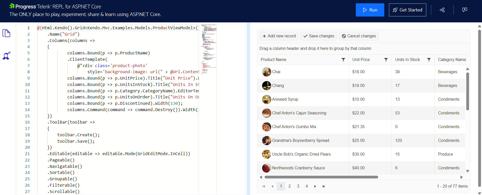
- Write, test and share ASP.NET Core snippets – Learn what’s in it for you
- Open Telerik REPL for ASP.NET Core – Start playing around
Summary
“How do I build that?” said no one after trying Telerik UI for ASP.NET Core. Creating great UX is made easy with our unique focus on design and related tools. Paired with the industry’s best support, detailed documentation and comprehensive library of learning resources, you have everything you need to increase productivity and speed up development.
Don’t take our word for it—try out Telerik UI for ASP.NET Core free for 30 days and get access to professional support while checking it out. Give it a shot and see yourself how easy it is to build stunning ASP.NET Core apps.
This content originally appeared on Telerik Blogs and was authored by Iva Borisova
Iva Borisova | Sciencx (2024-10-29T08:14:50+00:00) ‘How Do I Build That?’: 5 Telerik UI for ASP.NET Core Components That Simply Do the Job. Retrieved from https://www.scien.cx/2024/10/29/how-do-i-build-that-5-telerik-ui-for-asp-net-core-components-that-simply-do-the-job/
Please log in to upload a file.
There are no updates yet.
Click the Upload button above to add an update.
