This content originally appeared on Telerik Blogs and was authored by Héctor Pérez
See how you can use the new Telerik .NET MAUI Slider control to adapt it to your own mobile applications.
In this post, I’m going to tell you about the recently launched .NET MAUI Slider control from Progress Telerik, which will allow users of your applications to easily select values. Let’s get started!
Adding the Telerik Slider Control for .NET MAUI
The first thing you need to do to use the Telerik Slider control in a project is to install the controls following the official installation guide.
In my case, I’m going to follow the path of local NuGet packages and add the NuGet package to my project. Once you’ve done this, go to the MauiProgram.cs file and add the invocation to the UseTelerik method:
using Telerik.Maui.Controls.Compatibility;

public static class MauiProgram
{
    public static MauiApp CreateMauiApp()
    {
        var builder = MauiApp.CreateBuilder();
        builder
            .UseTelerik()
            ...
    }
}
Next, you can go to the page where you want to use the control and add it in its simplest possible form:
<ContentPage...>
    <telerik:RadSlider x:Name="slider">
    ...
<ContentPage/>
Finally, to avoid problems with references, add the namespace pointing to the Telerik controls as shown below:
<ContentPage...
    xmlns:telerik="http://schemas.telerik.com/2022/xaml/maui"
    ...
When running the application, we’ll be able to see the Slider control on the screen showing its basic functionality, which we’ll improve throughout this post:

Now that you know how to add the component to a XAML page, let’s integrate a couple of Sliders into a very simple example application. First, the XAML code will be as follows:
<VerticalStackLayout
    HorizontalOptions="Center"
    Spacing="20"
    VerticalOptions="Center">
    <Label
        FontAttributes="Bold"
        FontSize="24"
        HorizontalOptions="Center"
        Text="BMI Calculator"
        TextColor="White" />
    <Frame
        Padding="20"
        BackgroundColor="White"
        CornerRadius="10"
        HasShadow="True"
        WidthRequest="300">
        <VerticalStackLayout Spacing="15">
            <Label
                FontSize="18"
                Text="Height (cm)"
                TextColor="#666" />
            <telerik:RadSlider
                x:Name="heightSlider"/>
            <Label
                FontSize="18"
                Text="Weight (kg)"
                TextColor="#666" />
            <telerik:RadSlider
                x:Name="weightSlider"/>
            <Button
                Padding="10"
                BackgroundColor="#007aff"
                CornerRadius="5"
                HorizontalOptions="Center"
                Text="Calculate BMI"
                TextColor="White" />
        </VerticalStackLayout>
    </Frame>

    <Label
        x:Name="resultLabel"
        FontSize="18"
        HorizontalOptions="Center"
        HorizontalTextAlignment="Center"
        Text="Your BMI will be displayed here."
        TextColor="White" />
</VerticalStackLayout>
The result of running the application with the above code is as follows:
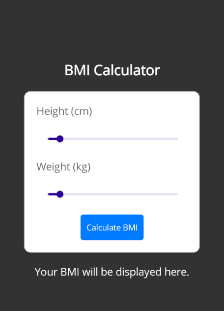
Now that we have an app ready to showcase the use of Sliders in a practical case, let’s see how to customize them.
Getting to Know the Parts of the Telerik .NET MAUI Slider Control
You should know that the Telerik Slider control is highly customizable. For your reference on the parts that make up the Slider control, I’m leaving you with an image from the Telerik documentation that shows its anatomy:
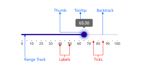
Now, let’s see how to customize the elements that make up the control.
Working with Slider Values
Surely one of the first things you want to do with a Slider control is to define a maximum and minimum value for the scroll bar, as well as for the Slider value.
This is easy to achieve using the Minimum, Maximum and Value properties, with the value of the Value property being the one we’ll use to perform some operation.
Below, we modify the aforementioned properties to better fit the values of a body mass index calculator, in addition to adding an event handler called CalculateBMI_Clicked to the button to perform the body mass index calculation:
...
<telerik:RadSlider
    x:Name="heightSlider"
    Maximum="250"
    Minimum="50"
    Value="178" />
    ...
<telerik:RadSlider
    x:Name="weightSlider"
    Maximum="150"
    Minimum="30"
    Value="68" />
<Button
    Padding="10"
    BackgroundColor="#007aff"
    Clicked="CalculateBMI_Clicked"
    CornerRadius="5"
    HorizontalOptions="Center"
    Text="Calculate BMI"
    TextColor="White" />
...
Once the properties are defined, let’s modify the code behind to work with the Value property of the Sliders as follows:
public partial class MainPage : ContentPage
{
    public MainPage()
    {
        InitializeComponent();
    }

    private void CalculateBMI_Clicked(object sender, EventArgs e)
    {
        CalculateBMI();
    }

    private void CalculateBMI()
    {
        // Retrieve the height and weight values from the sliders
        double heightInMeters = heightSlider.Value / 100; // Convert cm to meters
        double weightInKg = weightSlider.Value;

        // Calculate BMI
        double bmi = weightInKg / (heightInMeters * heightInMeters);

        // Determine BMI category
        string category;
        if (bmi < 18.5)
        {
            category = "Underweight";
        }
        else if (bmi >= 18.5 && bmi < 24.9)
        {
            category = "Normal weight";
        }
        else if (bmi >= 25 && bmi < 29.9)
        {
            category = "Overweight";
        }
        else
        {
            category = "Obese";
        }

        // Display the result
        resultLabel.Text = $"Your BMI is {bmi:F2}.\n Category: {category}";
    }
}
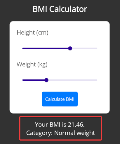
With the modifications made, when running the application and pressing the button, we’ll get the result in a Label control:
Now, let’s see how to customize the appearance of the Sliders.
Modifying the Appearance and Behavior of the Thumb
The thumb (the slider’s value cursor) of the Telerik .NET MAUI Slider can be modified through the ThumbFill and ThumbStyle properties.
The ThumbFill property allows you to quickly modify the Fill of the control to a solid color, while ThumbStyle allows for greater customization by allowing you to modify the Fill, Stroke and StrokeThickness through the use of a style as shown in the following example:
<ContentPage.Resources>
    <Style x:Key="CustomThumbStyle" TargetType="telerik:SliderThumb">
        <Setter Property="Fill" Value="Salmon" />
        <Setter Property="Stroke" Value="DarkRed" />
        <Setter Property="StrokeThickness" Value="5" />
    </Style>
</ContentPage.Resources>

<VerticalStackLayout
    HorizontalOptions="Center"
    Spacing="20"
    VerticalOptions="Center">
    ...
        <telerik:RadSlider
            ThumbFill="DarkRed" .../>
            ...
        <telerik:RadSlider ...
            ThumbStyle="{StaticResource CustomThumbStyle}"/>
</VerticalStackLayout>
When running the above code, we can see the Sliders modified with the applied values:
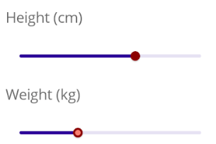
Another customization we can apply to the thumb is to specify the drag mode. This property allows us to indicate how we’re going to allow the user to select a position on the track, being able to specify the following values:
Thumb: If the thumb is dragged, it will move along the track.Free: If the user presses on any position of the track, the thumb will move to that position.Disabled: The thumb will not move and its position will be fixed.
Adjusting the Styles and Behavior of the Backtrack and Range Track
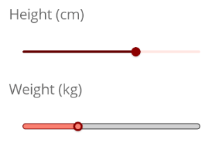
In the last image, you could see that we’ve modified the color of the thumb. However, the colors of the scroll bar don’t have a matching color so we need to modify them.
Before doing so, it’s important that you know that the Slider control has the OriginValue property, which indicates the initial position of the range track and which by default is assigned to the Minimum value of the backtrack. It’s useful to modify this property when we need to show negative numbers on the slider, but we want the origin value to remain 0.
We can modify the colors of both the backtrack (the line along which the thumb moves) and the range track (the line between the OriginValue and Value). We can do this with the BackTrackThickness and BackTrackColor properties to modify the backtrack, as well as the RangeTrackFill property to modify the range track.
If we want more customization, we can use the BackTrackStyle and RangeTrackStyle properties that allow us to use a custom style. Below I show you an example of use with both approaches:
<ContentPage.Resources>
    ...
    <Style x:Key="CustomBackTrackStyle" TargetType="telerik:RadBorder">
        <Setter Property="BorderColor" Value="#333" />
        <Setter Property="BackgroundColor" Value="#D1D1D2" />
        <Setter Property="BorderThickness" Value="1" />
        <Setter Property="CornerRadius" Value="4" />
        <Setter Property="HeightRequest" Value="8" />
    </Style>
    <Style x:Key="CustomRangeTrackStyle" TargetType="telerik:SliderRangeTrack">
        <Setter Property="Stroke" Value="DarkRed" />
        <Setter Property="CornerRadius" Value="4" />
        <Setter Property="StrokeThickness" Value="1" />
        <Setter Property="TrackThickness" Value="8" />
        <Setter Property="Fill" Value="Salmon" />
    </Style>
</ContentPage.Resources>
 <VerticalStackLayout ...>
    <telerik:RadSlider
        BackTrackColor="#FFE6E2"
        BackTrackThickness="3"
        RangeTrackFill="#650003"
        .../>
    ...
    <telerik:RadSlider
        BackTrackStyle="{StaticResource CustomBackTrackStyle}"
        RangeTrackStyle="{StaticResource CustomRangeTrackStyle}"
        .../>
    ...

</VerticalStackLayout>
Running the above changes, we see that the colors are more uniform throughout the Slider as shown below:
Next, let’s see how to add visual indicators to the sliders.
Adding Labels, Tooltips and Ticks to the Control
Undoubtedly, adding visual references for users to recognize the values of a Slider as soon as they see it is something you’ll want to do in your applications. Let’s see how to add them below.
Adding and Adjusting .NET MAUI Slider Ticks
To add ticks to the slider, we just need to adjust the TickStep property first, which allows us to assign an interval of values to show a tick. On the other hand, the TicksPlacement property specifies where the ticks will appear, with the valid values being None, Start, Center and End.
The following is an example showing the use of ticks in a Slider control:
<telerik:RadSlider
    TickStep="20"
    TicksPlacement="Start"
    .../>
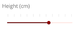
When running the above change, we can see the ticks positioned above the Slider, because we have specified TicksPlacement as Start, as well as a separation between ticks of 20 units, due to the TickStep property.

If we want to customize the appearance of the ticks, the easiest way is by creating a DataTemplate for the TickTemplate property, which allows us to create practically any shape we want, as shown below:
 <ContentPage...>
    <ContentPage.Resources>
        ...
        <DataTemplate x:Key="GrayTickTemplate">
            <Rectangle
                Fill="#E0E0E0"
                HeightRequest="10"
                WidthRequest="2" />
        </DataTemplate>
    </ContentPage.Resources>
    <VerticalStackLayout...>
        ...
        <telerik:RadSlider
            TickStep="20"
            TickTemplate="{StaticResource GrayTickTemplate}"
            TicksPlacement="Start"
            .../>
    </VerticalStackLayout>
</ContentPage>
The result of running the above code can be seen in the following image:
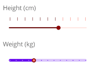
There are other properties of the Telerik Slider control that allow us greater customization of the control. First, InRangeTickColor allows us to specify a color for the ticks positioned between the OriginValue and Value, while OutOrRangeTickColor allows us to define the color for the other ticks. Additionally, the TickThickness and TickLength properties allow us to define a width and height for the ticks.
It’s also possible to assign styles to the InRangeTickStyle and OutOfRangeTickStyle properties to define the appearance of the Sliders. Below I show you an example of using both approaches:
 <ContentPage...>
    <ContentPage.Resources>
        ...
        <Style x:Key="CustomInRangeTickStyle" TargetType="telerik:RadBorder">
            <Setter Property="BackgroundColor" Value="#DAC4FB" />
            <Setter Property="WidthRequest" Value="2" />
            <Setter Property="HeightRequest" Value="2" />
        </Style>
        <Style x:Key="CustomOutOfRangeTickStyle" TargetType="telerik:RadBorder">
            <Setter Property="BackgroundColor" Value="#6708EF" />
            <Setter Property="WidthRequest" Value="2" />
            <Setter Property="HeightRequest" Value="2" />
        </Style>
    </ContentPage.Resources>
    <VerticalStackLayout...>
        ...
        <telerik:RadSlider
            InRangeTickColor="#650003"
            OutOfRangeTickColor="Salmon"
            TickLength="10"
            TickStep="20"
            TickThickness="1"
            TicksPlacement="Start"
            .../>
            ...
        <telerik:RadSlider
            InRangeTickStyle="{StaticResource CustomInRangeTickStyle}"
            OutOfRangeTickStyle="{StaticResource CustomOutOfRangeTickStyle}"
            TickStep="10"
            TicksPlacement="Center"
            .../>
    </VerticalStackLayout>
</ContentPage>
When running the above code, you can see that we can achieve a design totally different from the initial design:
Now, let’s see how to add Labels to the sliders.
Adding Labels to Telerik .NET MAUI Sliders
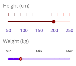
A second visual indicator that we can add to the sliders are Labels. We have the LabelStep property to indicate the interval in which they will appear, and the LabelsPlacement property to define the position through the values None, Start and End.
On the other hand, if we need to format the integer values that appear by default, to change them to text strings, symbols, etc., we can use the StringFormat property, or the StringConverter property linked to a static resource of the DictionaryStringConverter type with the values to show to the user.
Finally, to modify the Label to change, for example, the size, font, color and other properties of a Label control, we can do it through the DataTemplate property. Below I show you an example of Labels added to the Slider controls:
 <ContentPage...>
    <ContentPage.Resources>
        ...
        <telerik:DictionaryStringConverter x:Key="LowMidHighConverter">
            <telerik:DictionaryStringConverterItem Key="{x:Double 30}" Value="Min" />
            <telerik:DictionaryStringConverterItem Key="{x:Double 90}" Value="Min" />
            <telerik:DictionaryStringConverterItem Key="{x:Double 150}" Value="Max" />
        </telerik:DictionaryStringConverter>
        <DataTemplate x:Key="CustomLabelTemplate">
            <Label
                FontAttributes="Bold"
                FontSize="16"
                Text="{Binding}"
                TextColor="#674BB2" />
        </DataTemplate>
    </ContentPage.Resources>
    <VerticalStackLayout...>
        ...
        <telerik:RadSlider
            LabelStep="50"
            LabelTemplate="{StaticResource CustomLabelTemplate}"
            LabelsPlacement="End"
            StringFormat="{}{0} cm"
            ... />
        ...
        <telerik:RadSlider
            LabelStep="60"
            LabelsPlacement="Start"
            StringConverter="{StaticResource LowMidHighConverter}"
            .../>
    </VerticalStackLayout>
</ContentPage>
The above code allows us to display Labels associated with the Sliders as follows:
Customizing the .NET MAUI Slider Tooltip
The last visual indicator of the Slider control we’ll talk about is the tooltip that appears when dragging the slider’s thumb:
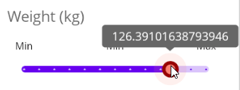
If we want to customize the tooltip, we can do it in different ways. The first is by applying a formatting to the value string through the TooltipStringFormat property.
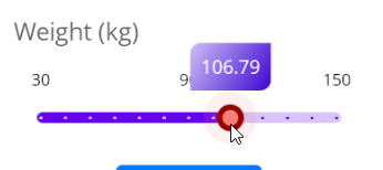
Similarly, we can apply a DataTemplate to modify the tooltip content thanks to the TooltipContentTemplate property. Finally, if we want to change the overall appearance of the tooltip, we have the TooltipControlTemplate property available, to which we can apply a ControlTemplate to customize the tooltip design. Below I show you an example of these properties being applied:
 <ContentPage...>
    <ContentPage.Resources>
        ...
        <DataTemplate x:Key="CustomTooltipTemplate">
            <Grid>
                <Label
                    Margin="5"
                    FontAttributes="Bold"
                    Text="{Binding FormattedValue}"
                    TextColor="{OnPlatform Default='#674BB2',
                                           Android='#ebf2b8',
                                           iOS='#f0b8f2'}" />
            </Grid>
        </DataTemplate>
        <ControlTemplate x:Key="CustomTooltipControlTemplate">
            <telerik:RadBorder Padding="8" CornerRadius="8,0,8,0">
                <telerik:RadBorder.Background>
                    <LinearGradientBrush>
                        <GradientStop Offset="0" Color="#cebef7" />
                        <GradientStop Offset="1" Color="#3d06cf" />
                    </LinearGradientBrush>
                </telerik:RadBorder.Background>
                <Label
                    FontSize="{OnPlatform iOS=13,
                                          MacCatalyst=10}"
                    Text="{Binding FormattedValue}"
                    TextColor="White" />
            </telerik:RadBorder>
        </ControlTemplate>
    </ContentPage.Resources>
    <VerticalStackLayout...>
        ...
        <telerik:RadSlider
            TooltipContentTemplate="{StaticResource CustomTooltipTemplate}"
            .../>
        ...
        <telerik:RadSlider
            TooltipControlTemplate="{StaticResource CustomTooltipControlTemplate}"
            TooltipStringFormat="{}{0:N2}"
            .../>
    </VerticalStackLayout>
</ContentPage>
The above code modifies the Sliders as follows:
Events in the Telerik .NET MAUI Slider Control
To finish the article, you should know that you have at your disposal the ValueChanging event, which allows you to know when the Value property is being modified. In our example, we’re going to modify the sliders’ code to add the ValueChanging event:
<telerik:RadSlider
    ValueChanging="slider_ValueChanging"
    ... />
In the code behind, we’ll simply invoke the CalculateBMI method to perform the calculation:
private void slider_ValueChanging(object sender, Telerik.Maui.ValueChangingEventArgs e)
{
    CalculateBMI();
}
This will cause the calculation to be performed automatically each time the slider’s thumb is moved.
Conclusion
Throughout this article, you’ve been able to get to know in depth the new Telerik .NET MAUI Slider control to adapt it to your own mobile applications. It’s your turn to create fantastic applications using Telerik controls!
This content originally appeared on Telerik Blogs and was authored by Héctor Pérez
Héctor Pérez | Sciencx (2025-01-06T22:46:51+00:00) Customizing and Integrating Telerik Slider Control in .NET MAUI Projects. Retrieved from https://www.scien.cx/2025/01/06/customizing-and-integrating-telerik-slider-control-in-net-maui-projects/
Please log in to upload a file.
There are no updates yet.
Click the Upload button above to add an update.
