
This content originally appeared on Bits and Pieces - Medium and was authored by Eden Ella
Bit components often start as tailored solutions for specific needs and evolve through a collaborative process into generic tools that maximize code reuse.

Before Bit became part of our workflow, sharing and collaborating on individual components was a complex and cumbersome process. It demanded a sophisticated build setup to manage dependencies, packaging, documentation, and more. But, the challenges didn’t stop there — these elaborate setups, often dependent on multiple third-party tools, frequently caused issues and introduced bugs.
For these reasons, individual component sharing was often reserved for the most generic and reusable pieces of code, namely, UI elements and utility functions. However, that is no longer the case. Today, many developers opt for a fully component-driven development and composable design built using loosely coupled components.
Bit components are not only a way to share code. When used as the building blocks of your application, they transform your codebase from a big pile of files into an elegant graph, where each node is a component with a meaningful name and a purpose.
Since every “building block” in your application is a component, not all components are generic and reusable. Having said that, using Bit’s tools for collaboration, teams are empowered to progressively refine and generalize components to meet diverse requirements without duplicating efforts.
Components may start as very concrete but, through collaborative iterations, transform into more generic solutions that address emerging requirements.
In this blog, we’ll explore this workflow through a story involving two teams: “CRM” and “HR.” Their journey illustrates the power of Bit in enabling seamless component refinement and reuse.
The Journey of a Shared Component: From Specific to Generic
Chapter 1: The HR Team Creates the “Employee Card”
The HR team is tasked with building a sleek “Employee Card” component to display employee details. This component is intended to be used in the company’s HR platform (maintained by the HR team).
The team uses foundational UI elements shared by the “Design team,” such as buttons and typography components, as the building blocks.
The “Employee Card” becomes an effective and well-tested component that meets the HR team’s requirements.

Chapter 2: The CRM Team Discovers the “Employee Card”
The CRM team needs a “Customer Card” component to display customer details and perform common actions. This component is intended to be used in the company’s CRM platform.
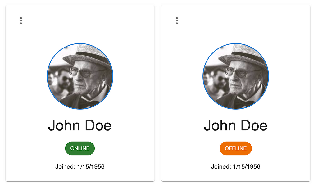
While exploring shared components on Bit Platform, they found the “Employee Card” to be an almost perfect match. However, certain actions and fields are not relevant for customer details.
For instance, the “Employee Card” displays the type of contract, while the customer card needs to display whether the customer is ‘online,’ i.e., browsing the company’s online shop or ‘offline.’
Components are only built to address current needs, even though they are shared by default. The “Employee Card” was built for that specific purpose, with hardcoded values and types:
// imports...

export interface EmployeeCardProps {
  contractType: 'full-time' | 'part-time' | 'intern';
 // ...

}

const contractTypeColors = {
      'full-time': 'success',
      'part-time':'warning',
      intern: 'info'
  };

export const EmployeeCard = ({
  avatarUrl,
  // ...
}: EmployeeCardProps) => {
// ...

  return (
    <Card>
      // ...
      <CardContent>
        // ...
          <Chip
            label={`${contractType.toUpperCase()}`}
            color={contractTypeColors[contractType]}
          />
      // ...
    </Card>
  );
};
Chapter 3: Refining and Generalizing the Component
Rather than starting from scratch, the CRM team decides to generalize the “Employee Card” to meet their needs. They propose changes that extend the card’s functionality while ensuring backward compatibility. This involves:
- Custom Sections: The default section displaying customer-specific information can now be replaced using a more flexible API. In this case, the ‘chip’ that displays the contract type can be used to display other values with corresponding colors.
- Backward Compatibility: If no custom values are provided, the card defaults to displaying customer-specific fields, preserving compatibility for existing use cases. In this case, developers using the component will be able to keep using the ‘contract type’ to display the employee’s contract type, just as before.
// imports ...

const contractTypeColors = {
  'full-time': 'success',
  'part-time': 'warning',
  intern: 'info',
} as const;

type ContractType = typeof contractTypeColors;
/**
 * the custom color-map lables can be any string,
 * but the color values can only be those supported by this component
 */
type ChipColorMap = Record<string, ContractType[keyof ContractType]>;

/**
 * Extend the prop type to allow for custom color maps and values
 * instead of the default `contractTypeColors`
 */
export interface EmployeeCardProps<T extends ChipColorMap = ContractType> {
  contractType: T extends ContractType ? keyof ContractType : keyof T;
 /**
  * Nest the props for cutomization under `options` as these are
  * expected to only be used by developers extending this component
  * (rather than using it directly)
  */
  options?: {
    chipColorMap: T;
  };
 // ...
}

export const EmployeeCard = <T extends ChipColorMap>({
  contractType,
  options,
 // ...
}: EmployeeCardProps<T>) => {
  /**
   * Use the custom color maps and values, if available
   */
  const chipColorMap = options?.chipColorMap ?? contractTypeColors;

  return (
    <Card>
      <CardContent>
          <Chip
            label={`${contractType.toUpperCase()}`}
            color={(chipColorMap as T)[contractType]}
          />
      // ...
      </CardContent>
    </Card>
  );
};
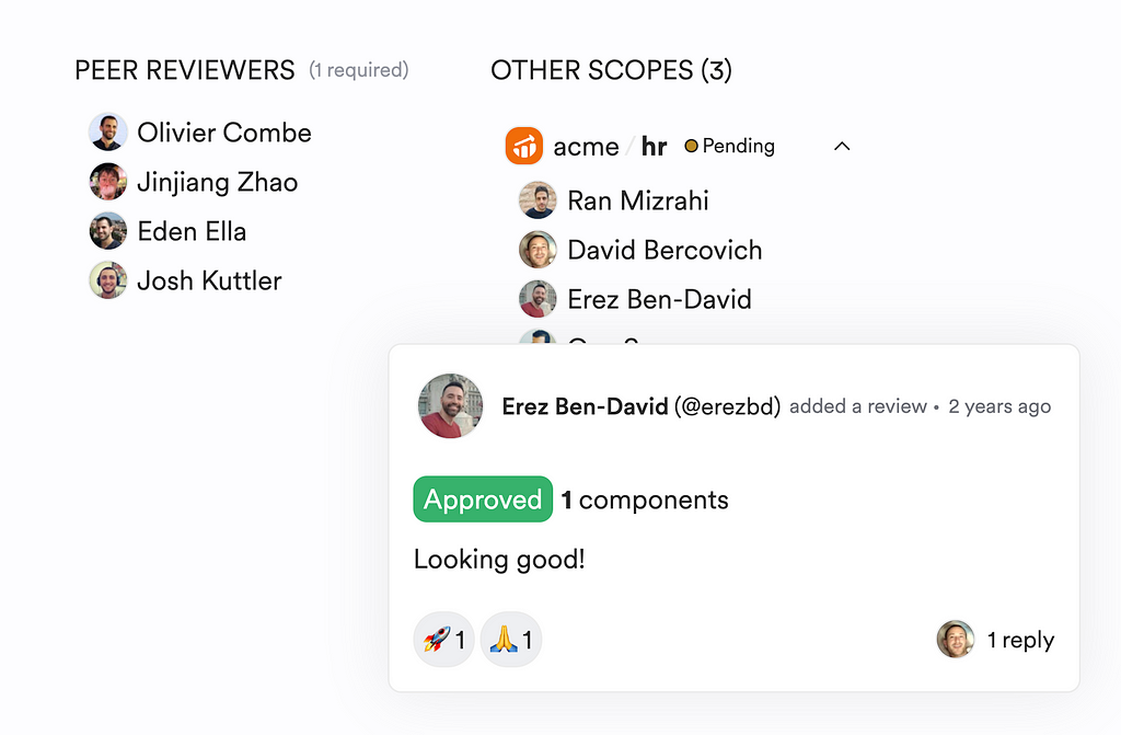
The CRM team submits a change request (similar to a “Pull Request”) to the HR team via Bit Platform. This request includes detailed documentation of the changes and previews showcasing the card’s extended functionality.
# create a new 'lane' (analogous to git branches)
bit lane create enable-custom-chip-values

# create a 'snap' (analogous to git commit)
bit snap --message "enable the display of custom values instead of contract types"

# push the 'snap' to Bit Platform and build a pre-release package version of it
bit export
Note that the latest “Employee Card” version is now available to any project as a pre-released package. It is not confined to the current project.
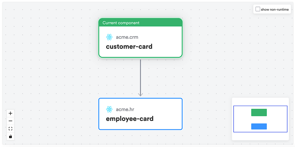
While the change request is under review, the CRM team continues to build their “Customer Card” component as a composition of the latest (modified and generalized) version of the “Employee Card.”
import {
  EmployeeCard,
  type EmployeeCardProps,
} from '@learnbit-react/generalization.employee-card';

const statusColors = {
  online: 'success',
  offline: 'warning',
} as const;

type Status = typeof statusColors;

export interface CustomerCardProps
  extends Omit<EmployeeCardProps<Status>, 'contractType'> {
  status: keyof Status;
}

export function CustomerCard({
  status,
 // ...
}: CustomerCardProps) {
  return (
    <EmployeeCard<Status>
      contractType={status}
      fullName={fullName}
      startDate={startDate}
      avatarUrl={avatarUrl}
      options={{
        chipColorMap: statusColors,
      }}
    />
  );
}
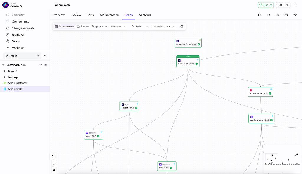
The “Customer Card” dependencies page (shown in Bit’s Workspace UI) reveals the new dependency:
Chapter 4: Finalizing the “Customer Card”
Once the changes to the “Employee Card” are approved by the HR team, the CRM team can install and use the new release version of it instead of the current one:
# install using bit
bit install @acme/hr.employee-card@1.1.0

# install using npm
npm i @acme/hr.employee-card@1.1.0
Benefits Across the Organization
The generalization of the “Employee Card” opens doors for other teams. For example:
- Rapid Development: Teams can now create specialized card components for different use cases by building on the generalized API.
- Consistency: All card components share a unified design language and behavior, ensuring a cohesive user experience.
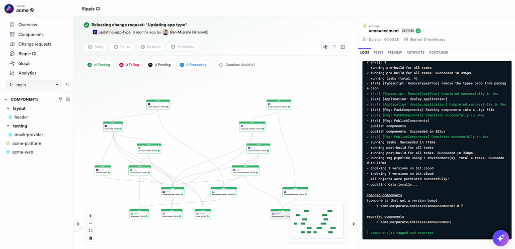
- Maintainability: Updates to the generalized card propagate to all dependent components, reducing duplication and effort. To learn more, see Ripple CI.
When to Implement Generalization
While this workflow minimizes redundancy and promotes code reuse, it’s not always the best approach. Situations where the differences between components are too substantial, requiring extensive changes to internal logic or APIs, may result in:
- Complexity: Overgeneralized components can become difficult to maintain or understand.
- Bug Risks: Extensive changes increase the likelihood of introducing bugs or breaking existing functionality.
In such cases, creating a separate component might be more efficient. This can be done by “forking” (creating a new copy of) an existing component:
# Use an existing shared component as the template for a new component
bit fork COMPONENT_ID
Or, by creating a new component from scratch:
# Use a minimal component template to generate a new component
bit create COMPONENT_TEMPLATE COMPONENT_NAME
Conclusion
The progressive refinement and generalization workflow empowers organizations to build adaptable, reusable, and maintainable UI components. Tools like Bit enable seamless collaboration, component versioning, and integration, fostering a culture of shared innovation.
By carefully balancing generalization and specificity, teams can maximize productivity while maintaining high-quality software. Try Bit today and experience the power of component-driven development firsthand!
Progressive Refinement and Generalization of Components was originally published in Bits and Pieces on Medium, where people are continuing the conversation by highlighting and responding to this story.
This content originally appeared on Bits and Pieces - Medium and was authored by Eden Ella
Eden Ella | Sciencx (2025-01-07T11:59:30+00:00) Progressive Refinement and Generalization of Components. Retrieved from https://www.scien.cx/2025/01/07/progressive-refinement-and-generalization-of-components/
Please log in to upload a file.
There are no updates yet.
Click the Upload button above to add an update.