This content originally appeared on DEV Community and was authored by Atul Prajapati
Hi dear folks ?
In 2016, When I have started learning web development, CSS media queries are the most confusing thing for me. The reason is that there are lots of options and customizations we can do to write a single media query. But don't worry I have prepared this article to explain to you everything about media queries with lots of real-life example.
Syntax
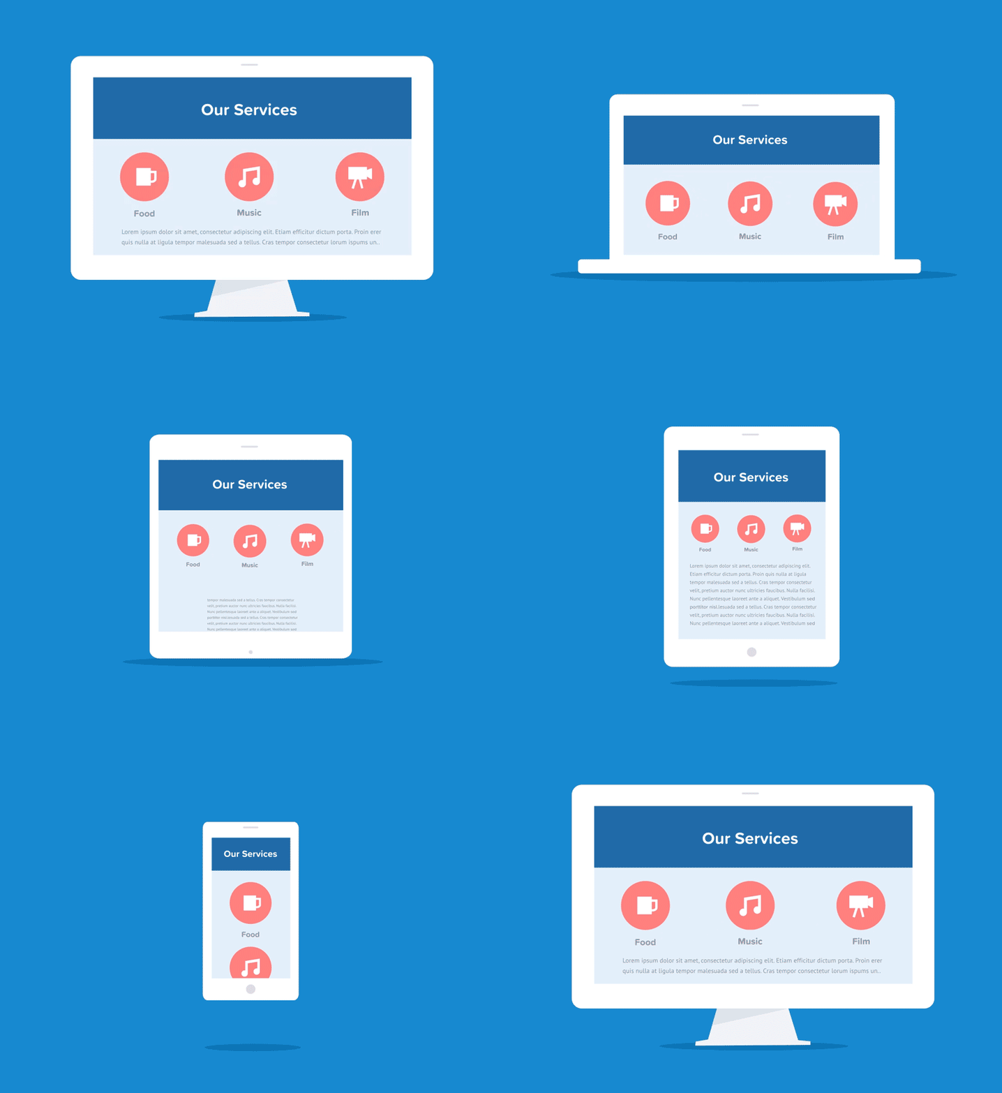
According to me, media queries is mostly used to make web pages responsive, to look good at any media screens like this.
I have seen lots of other developers write different media query rules for different media screens, but you can also write a single media query for all media screens if you are know everything in media queries! But at this stage of your dev journey if you don't know anything in CSS media queries And if you have a true desire to know everything in CSS media queries you are on the right web page, Congratulations?
CSS media query properly introduced in 2001, there are almost 4 types of media query in CSS which is print media, screen media and speech media. And when we don't target any media type it will automatically set to all media types by default. Let's deep dive into the ocean of media queries step by step but here we are mostly discussing screen media query.
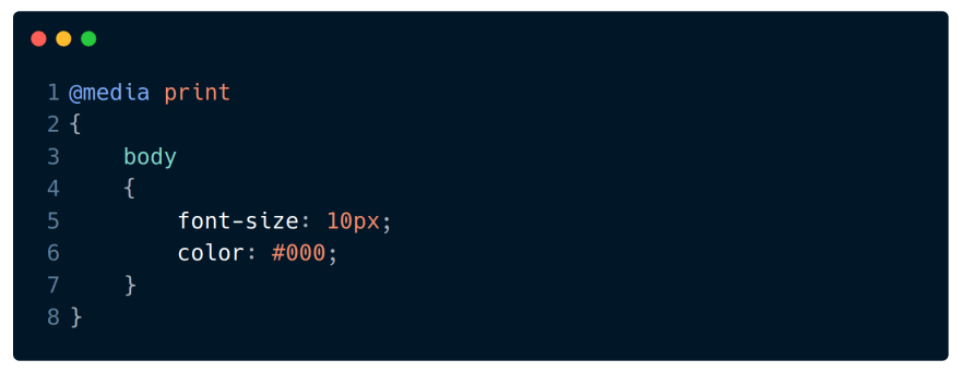
print media query
when we give the command to our pc/laptop for print out then our device creates a media to print documents like images, pdf, etc. In that case, we can use print media queries to show a proper document in print out.
syntax
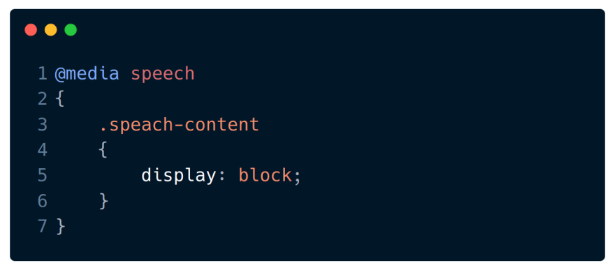
speech media query
This media is used for blind people they use screen reader software that "reads" the web page. There are other lot's of uses too for speech media read more
syntax
NOTE: Media queries are case-insensitive I mean you can't make spelling mistakes in syntax.
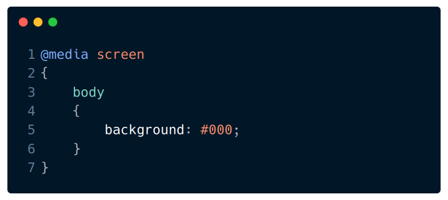
screen media query
screen media means device screen size like smartphone, tablet, laptop and desktop screens. we write CSS media queries for all of these device screens and in this article, we are going to learn more about screen media.
syntax
In simple words, CSS screen media query is used to customize or represent our web page to look similar (responsive) on all devices like basic phone, smartphone, tablet, laptop, desktop and TV.
If you noticed that, when we open a website on a mobile(smartphone) screen it looks different as compared to the desktop screen.
Let's open a website on your device in which you are reading this post, click on this link https://www.dev.to, I have opened the link on the desktop device which look like this...
And if I open this same website on a different device it will look a little bit different because it is made to look good(responsive) at any device screen. Hope you understand the use of CSS media query now.
Now you are ready to play with a real-life example
I have designed a words best codepen project to explain to you the behaviour of media query. In this example, we will use three different media queries which will change its behaviour according to screen width.
{ % codepen https://codepen.io/atulcodex/full/LYWPopQ % }
We are going to use max-width for the media query rule, so if you don't know much about it. i recommend this article

What is CSS min max, actually?
Atul Prajapati ・ Apr 13 ・ 2 min read
Short explaination
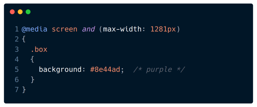
1) I have written this CSS media query for desktop screens which will change the background colour of the body to purple at max-width 1281 pixel and a minimum of 0 pixels.
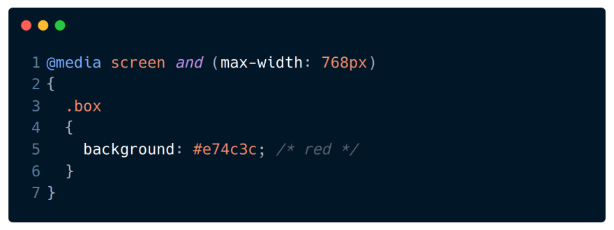
2) This media query will change the background colour of the body to red at screen size 768 pixel means tablet screen size.
3) And this last media query will change the body colour to yellow on the smartphone screen (375px).
Pro-tip learned from my real-life experience!
1 - Always write a media query at the bottom of your CSS file.
2 - Write media query in the sequence of big screen to small screen like first desktop screen then tablet screen and then a smartphone.
This content originally appeared on DEV Community and was authored by Atul Prajapati
Atul Prajapati | Sciencx (2021-05-16T09:34:27+00:00) CSS media query in depth. Retrieved from https://www.scien.cx/2021/05/16/css-media-query-in-depth/
Please log in to upload a file.
There are no updates yet.
Click the Upload button above to add an update.


