This content originally appeared on Bram.us and was authored by Bramus!

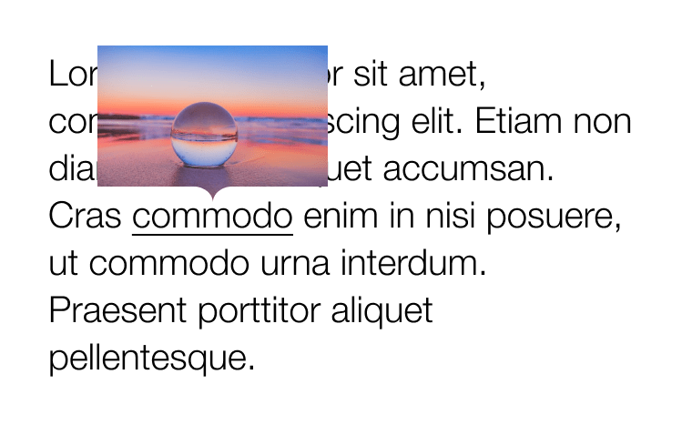
In this post Louis Hoebregts creates nice tooltips. No, not a typical triangle injected at the bottom but a nice curved one, also letting the image underneath peek through.
For it he uses mask-image consisting of two parts: one rectangle overlaying the top part of the image + one SVG arrow overlaying the bottom part.
.tooltip {
  mask-image:
    linear-gradient(#fff, #fff), /* Rectangle */
    url('data:image/svg+xml;utf8,'); /* Bottom  arrow */
  mask-position:
    0 0, /* Rectangle */
    50% 100%; /* Bottom arrow */
  mask-size:
    100% calc(100% - 18px), /* Rectangle */
    38px 18px; /* Bottom arrow */
  mask-repeat: no-repeat;
}
See the Pen
Idea #3 – Responsive complex clipping in CSS by Louis Hoebregts (@Mamboleoo)
on CodePen.
Cranking it up a notch he even creates some nice looking message bubbles.
Perfect Tooltips With CSS Clipping and Masking →
This content originally appeared on Bram.us and was authored by Bramus!
Bramus! | Sciencx (2021-06-30T15:53:06+00:00) Perfect Tooltips With CSS Clipping and Masking. Retrieved from https://www.scien.cx/2021/06/30/perfect-tooltips-with-css-clipping-and-masking-2/
Please log in to upload a file.
There are no updates yet.
Click the Upload button above to add an update.
