This content originally appeared on Bits and Pieces - Medium and was authored by Nethmi Wijesinghe
5 Reasons to Use Bulma CSS in Your Next Project

Bulma is an open-source, responsive, and lightweight CSS framework based on the Flexbox layout. As a new framework, it has already won the hearts of many developers.
So, in this article, I’m going to discuss 5 reasons why developers love Bulma CSS.
1. Short Learning Curve
Bulma is an easy-to-learn framework with a short learning curve. Using starter templates and video tutorials on the official website, you can get a design started in minutes.
Bulma has the most readable CSS classes compared to other CSS frameworks.
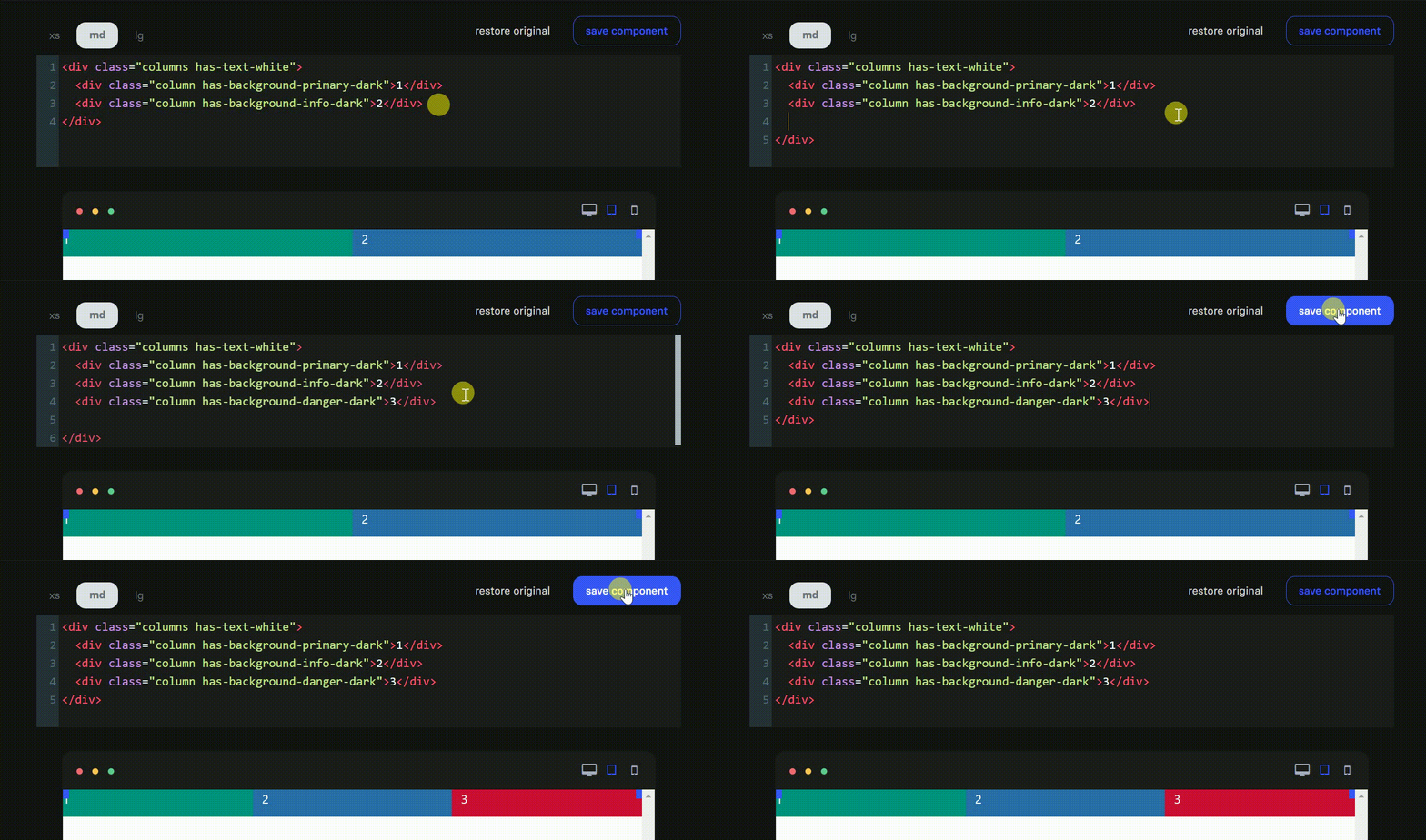
It provides readable class names like .column, .button and straightforward modifiers like .success and .is-link. Need to add an extra column to your grid? Take a look at the following example to see how easy to do it with Bulma.

2. Bulma is Modular
With many traditional CSS frameworks, we have to deal with unused CSS. Fortunately, with Bulma, it’s not everything or nothing.
Bulma is a fully modular framework where you can import only what you need.
Bulma consists of 39 .sass files, which you can import individually. For example, let’s say you only want Bulma’s button styles. Then, simply import the utility dependencies and the individual .sass file as shown below;
@import "bulma/sass/utilities/_all.sass"
@import "bulma/sass/elements/button.sass"
3. 100% Responsive
Bulma is a mobile-first CSS framework that offers optimized site responsiveness on desktop, mobile phones, flat-panel screens of numerous sizes.
Every element in Bulma is mobile-first and optimized for vertical reading. So, in mobile;
- The Bulma columns are stacked on top of each other.
- The nav menu is hidden.
- The children of the level component are stacked vertically.
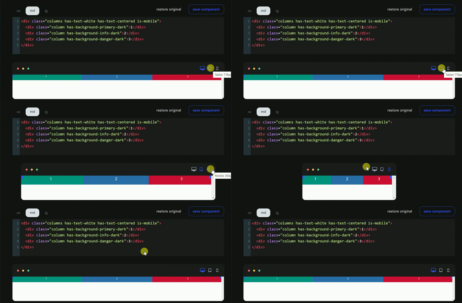
Besides, you can quickly implement a horizontal layout for both columns and level components by adding the is-mobile modifier. So, you can horizontally stack columns in the mobile view, as demonstrated in the example below.

By default, columns are activated from the tablet size onwards. Let’s say you only want columns on the desktop. Use the is-desktop modifier on the columns container as shown below.

4. No JavaScript
Bulma provides lightweight solutions that can be easily implemented in any development environment like Angular, React, Vue, Ember, etc. The only output in Bulma is a CSS file named bulma.css. If you want to customize the variables, you can download the individual .sass source files.
Well, all of this means there’s no JavaScript in Bulma.
Bulma has sometimes been described as an ‘environment agnostic’ framework: a style layer sits on top of the logic.
5. A Massive Library of Interactive Components
Bulma provides pretty much everything you need to create your website. It provides a large variety of customizable components with 100+ functional helper classes, which you can use to alter the styles of any element.
The below example shows how to create a breadcrumb component by using few CSS classes.
<nav class="breadcrumb" aria-label="breadcrumbs">
  <ul>
    <li><a href="#">Bulma</a></li>
    <li><a href="#">Documentation</a></li>
    <li><a href="#">Components</a></li>
    <li class="is-active"><a href="#" aria-current="page">Breadcrumb</a></li>
  </ul>
</nav>
Now let’s say you need to customize your breadcrumb by changing its default separator. There are four alternative modifiers that you can choose from: has-arrow-separator, has-bullet-separator, has-dot-separator, and has-succeeds-separator.
<nav class="breadcrumb has-bullet-separator" aria-label="breadcrumbs">
  <ul>
    <li><a href="#">Bulma</a></li>
    <li><a href="#">Documentation</a></li>
    <li><a href="#">Components</a></li>
    <li class="is-active"><a href="#" aria-current="page">Breadcrumb</a></li>
  </ul>
</nav>
Also, Bulma provides comprehensive documentation to help you with these customizations with examples and demos. Even though Bulma is not yet popular as Bootstrap, it has a highly passionate, rapidly growing community. So with the help of the community, you can bring your Bulma project to the next level.
Final Thoughts
Bulma may be a relatively new CSS framework. However, it has already proven its place in the CSS framework landscape.
And I would highly recommend trying Bulma CSS at least once. I’m pretty sure you won’t regret it.
Thank you for reading!
Build & share independent JS components with Bit
Bit is an extensible tool that lets you create truly modular applications with independently authored, versioned, and maintained components.
Use it to build modular apps & design systems, author and deliver micro frontends, or simply share components between applications.

Bit: The platform for the modular web
Learn More
- Creating a Component Library
- Debugging CSS Grid like a PRO
- Improve Page Rendering Speed Using Only CSS
Why Developers Love Bulma CSS was originally published in Bits and Pieces on Medium, where people are continuing the conversation by highlighting and responding to this story.
This content originally appeared on Bits and Pieces - Medium and was authored by Nethmi Wijesinghe
Nethmi Wijesinghe | Sciencx (2021-07-26T20:39:22+00:00) Why Developers Love Bulma CSS. Retrieved from https://www.scien.cx/2021/07/26/why-developers-love-bulma-css/
Please log in to upload a file.
There are no updates yet.
Click the Upload button above to add an update.
