This content originally appeared on Bootstrap Blog and was authored by Mark Otto
The first minor release of Bootstrap 5 is here! v5.1.0 has arrived and is packed with exciting new features and improvements. There’s experimental support for CSS Grid, offcanvas in the navbar, a new placeholders component, horizontal collapse support, new helpers, new CSS variables in our utilities, refactored JavaScript, and more.
Jump to a section:
- CSS Grid
- Offcanvas in navbars
- Placeholders
- Horizontal collapse
- Stack and vertical rule helpers
- New CSS variables
- Updated
.bg-*and.text-*utilities - Four new examples
- Modal and offcanvas backdrops
CSS Grid
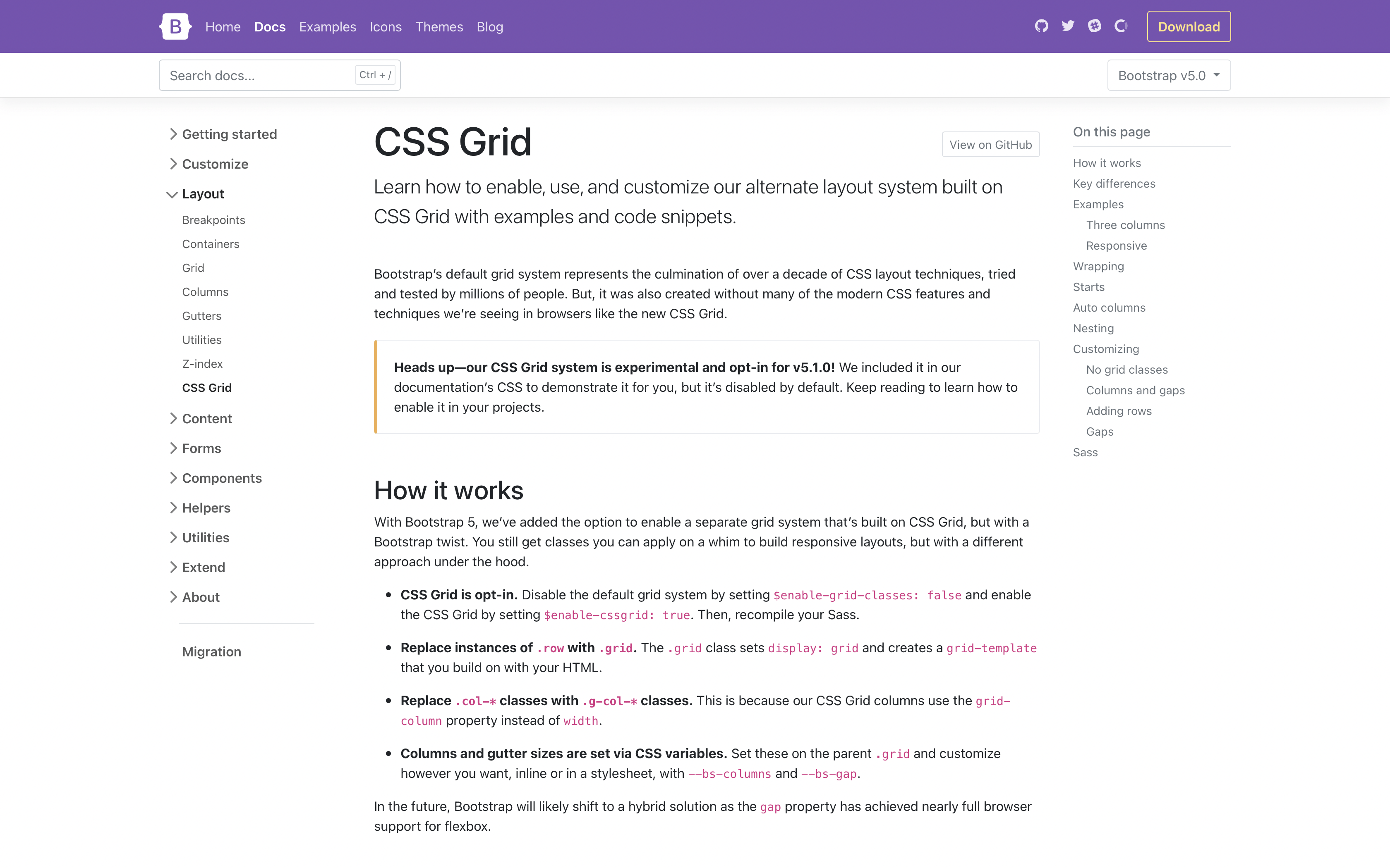
We’ve added an experimental version of a new CSS Grid as an opt-in replacement to our default grid system. To enable it, disable the default grid, by setting $enable-grid-classes: false and enable the CSS Grid by setting $enable-cssgrid: true. Once recompiled, you’ll be able to switch to the new classes. Our new CSS Grid docs page has all the details and some helpful examples to get you started.
Shipping CSS Grid support as experimental allows us to play with things a bit without breaking backward compatibility for folks. Please help us out by testing it and sharing feedback. We expect it to go stable for widespread use in a future minor release.
Read the Bootstrap CSS Grid docs for more info.
Offcanvas in navbars
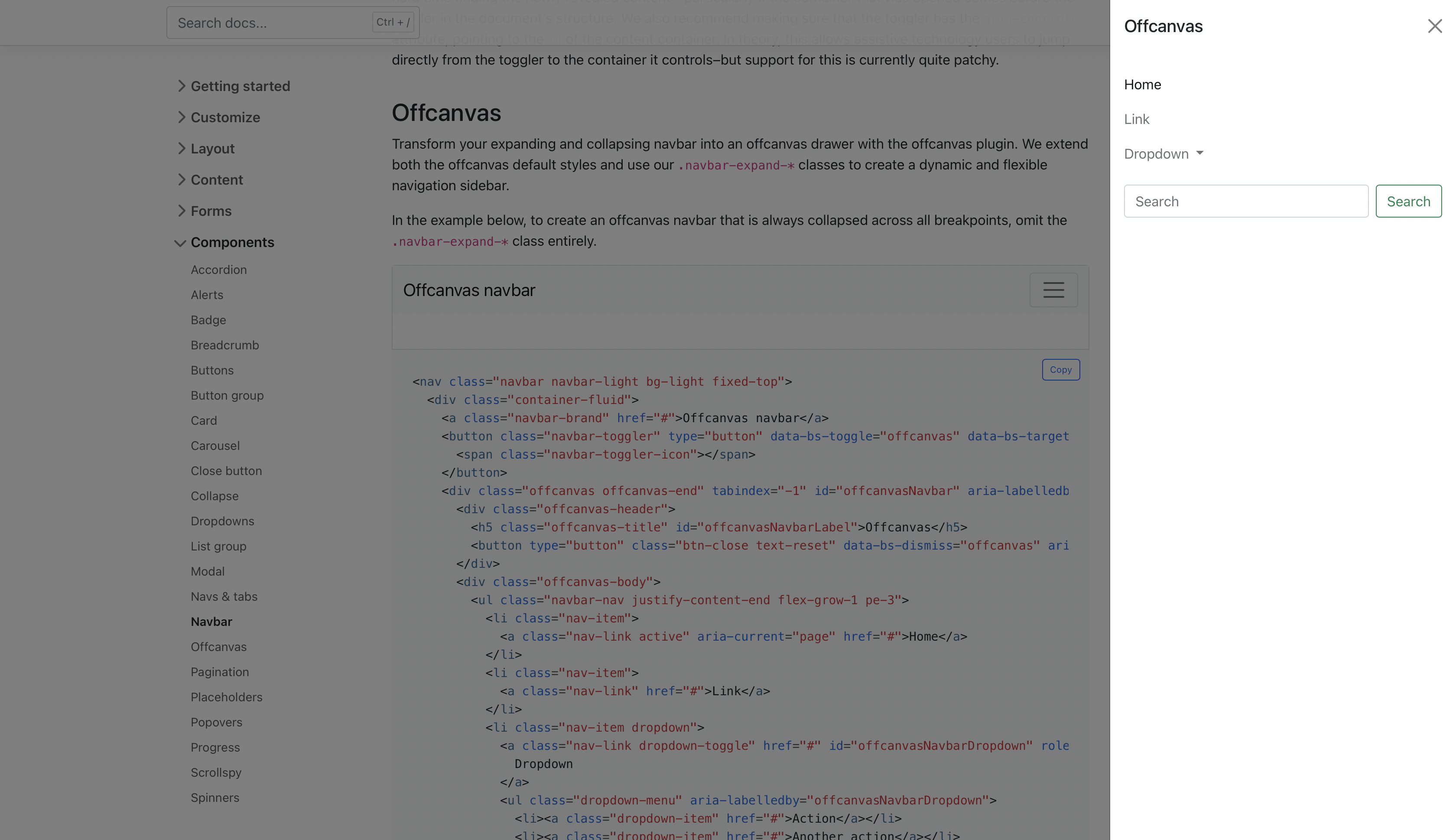
We’ve expanded our .navbar-expand-* classes (see what we did there?) to include support for offcanvases inside the navbar. Wrap your navbar elements with the appropriate offcanvas HTML, point your navbar toggler button to the offcanvas, and voila.
Head to the offcanvas navbar docs for more information and a live demo.
Placeholders
There’s a new component in town with placeholders, a way to provide temporary blocks in lieu of real content to help indicate that something is still loading in your site or app. Our first iteration here aims to only provide the HTML and CSS—it’s up to you to implement these placeholders with whatever custom code you might need.
Consider the basic Bootstrap card component shown above.
<div class="card">
  <img src="..." class="card-img-top" alt="...">
  <div class="card-body">
    <h5 class="card-title">Card title</h5>
    <p class="card-text">Some quick example text to build on the card title and make up the bulk of the card's content.</p>
    <a href="#" class="btn btn-primary">Go somewhere</a>
  </div>
</div>
Here it is rebuilt with glowing placeholder bars to indicate something is still loading.
<div class="card" aria-hidden="true">
  <img src="..." class="card-img-top" alt="...">
  <div class="card-body">
    <h5 class="card-title placeholder-glow">
      <span class="placeholder col-6"></span>
    </h5>
    <p class="card-text placeholder-glow">
      <span class="placeholder col-7"></span>
      <span class="placeholder col-4"></span>
      <span class="placeholder col-4"></span>
      <span class="placeholder col-6"></span>
      <span class="placeholder col-8"></span>
    </p>
    <a href="#" tabindex="-1" class="btn btn-primary disabled placeholder col-6"></a>
  </div>
</div>
Head to the placeholder docs to learn more.
Horizontal collapse
Hot damn, we’ve finally added official support for horizontally collapsing! The collapse plugin has been able to detect width vs height for some time (even in v4), but we never had a working example in our docs until now. Add the .collapse-horizontal modifier class to transition the width instead of height and set a width on the immediate child element.
<button class="btn btn-primary" type="button" data-bs-toggle="collapse" data-bs-target="#collapseWidthExample" aria-expanded="false" aria-controls="collapseWidthExample">
  Toggle width collapse
</button>

<div style="min-height: 120px;">
  <div class="collapse collapse-horizontal" id="collapseWidthExample">
    <div class="card card-body" style="width: 300px;">
      This is some placeholder content for a horizontal collapse. It's hidden by default and shown when triggered.
    </div>
  </div>
</div>
Heads up! You may need some min-height or height to avoid excessive browser repainting, as we’ve included in our demo above.
Stack and vertical rule helpers
While utilities get most of the spotlight these days, helpers are still incredibly useful. Our newest helpers are called stacks and they’re shortcuts for vertical and horizontal stacks of elements. They’re inspired by the open source Pylon project, which was in turn inspired by iOS’s stacks. Right now, stacks aren’t responsive, but that can easily change with your feedback.
To create a vertical stack, wrap a series of elements in .vstack. Use .gap-* utilities on the parent (or set individual margin utilities) to quickly space elements.

<div class="vstack gap-3">
  <div class="bg-light border">First item</div>
  <div class="bg-light border">Second item</div>
  <div class="bg-light border">Third item</div>
</div>
Want a horizontal stack? Use .hstack instead.

<div class="hstack gap-3">
  <div class="bg-light border">First item</div>
  <div class="bg-light border">Second item</div>
  <div class="bg-light border">Third item</div>
</div>
To support these stacks, we’ve also added an additional new helper—.vr, or vertical rule. HTML has had native <hr> elements for the longest time to create horizontal rules, but never anything for vertical rules. The new .vr helper works great in horizontal stacks and other situations where borders are a little trickier.

<div class="hstack gap-3">
  <input class="form-control me-auto" type="text" placeholder="Add your item here...">
  <button type="button" class="btn btn-secondary">Submit</button>
  <div class="vr"></div>
  <button type="button" class="btn btn-outline-danger">Reset</button>
</div>
Learn more in the stacks helper docs.
New CSS variables
We’ve expanded our :root CSS variables to include our gray color palette, new <body> variables, and new RGB variables for our theme colors. The grayscale colors join our existing color and theme color variables to complete the set of globally available CSS colors. As the development of v5 progresses, these variables will be used more and more in our components to better enable global theming.
Speaking of, our new <body> CSS variables now control the styling of the <body>. This is what you’ll find in the compiled CSS:
body {
  margin: 0;
  font-family: var(--bs-body-font-family);
  font-size: var(--bs-body-font-size);
  font-weight: var(--bs-body-font-weight);
  line-height: var(--bs-body-line-height);
  color: var(--bs-body-color);
  text-align: var(--bs-body-text-align);
  background-color: var(--bs-body-bg);
  -webkit-text-size-adjust: 100%;
  -webkit-tap-highlight-color: transparent;
}
Like all our other :root CSS variables, the values for these are generated from our Sass variables. That means that no matter how you customize Bootstrap—via Sass or CSS variables—you haven’t lost any functionality or convenience.
Read the CSS variables customization docs for more info.
Updated .bg-* and .text-* utilities
Our new RGB values are built to help us make better use of CSS variables across the entire project. To start, our background-color and color utilities have been updated to use these new RGB values for real-time customization without recompiling Sass and on-the-fly transparency for any background or text color.
Here’s how our .bg-* and .text-* color utilities look now once compiled:
.bg-success {
  --bs-bg-opacity: 1;
  background-color: rgba(var(--bs-success-rgb), var(--bs-bg-opacity)) !important;
}

.text-primary {
  --bs-text-opacity: 1;
  color: rgba(var(--bs-primary-rgb), var(--bs-text-opacity)) !important;
}
We use an RGB version of each color’s CSS variable and attach a second CSS variable, --bs-text-opacity or --bs-bg-opacity, for the alpha transparency (with a default value 1 thanks to a local CSS variable in the ruleset). That means anytime you use .text-primary now, your computed color value is rgba(13, 110, 253, 1). The local CSS variable inside each .text-* class helps avoid inheritance issues when nesting instances of these classes.
To support these changes, we’ve added some new .text-opacity-* and .bg-opacity-* utilities. Choose from a predefined set (which you can modify in the utilities API) of classes to quickly change the local CSS variable when a given .text-* or .bg-* utility is used. For example:

<div class="text-primary">This is default primary text</div>
<div class="text-primary text-opacity-75">This is 75% opacity primary text</div>
<div class="text-primary text-opacity-50">This is 50% opacity primary text</div>
<div class="text-primary text-opacity-25">This is 25% opacity primary text</div>
We expect this approach to make its way to border utilities next. Have more CSS variables you’d like to see added? Share your thoughts on a new issue on GitHub. Head to the color utilities or background utilities docs to learn more.
Four new examples

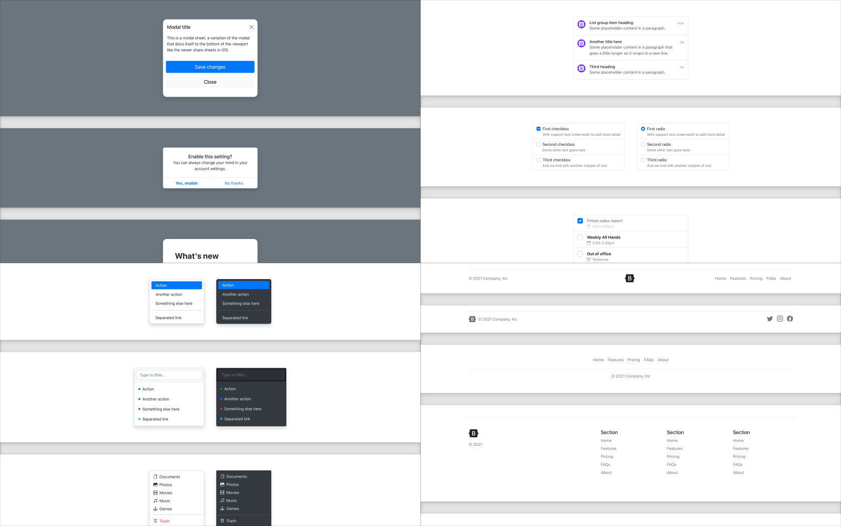
We’ve expanded on our component examples with four new examples that customize some of our core components and implement common patterns. Here’s what’s new:
Explore all our examples to see more.
Modal and offcanvas backdrops
We’ve variablized the class name for our backdrops that are used across our modal and offcanvas components. This comes with a new class for the offcanvas backdrop, .offcanvas-backdrop, and perhaps more importantly, some updated z-index values.
Previously, there was a single offcanvas z-index between the modal and modal backdrop z-indexs, due to offcanvas sharing the modal’s backdrop.
// Before v5.1.0
$zindex-modal-backdrop:       1040 !default;
$zindex-offcanvas:            1050 !default;
$zindex-modal:                1060 !default;
We’ve changed this to allow offcanvases and modals to work together better with separate z-index values for offcanvas, the offcanvas backdrop, modal, and the modal backdrop.
// After v5.1.0
$zindex-offcanvas-backdrop:   1040 !default;
$zindex-offcanvas:            1045 !default;
$zindex-modal-backdrop:       1050 !default;
$zindex-modal:                1055 !default;
Unless you’ve modified the offcanvas component or its Sass variables, there should be no breaking changes for you.
And more!
There’s a lot more in this release that we didn’t include in the highlights above:
- Reverted the ability for
.col-*classes to override.row-cols-*as it caused some breaking bugs in our layouts. We’ll revisit and restore it when we can engineer it in a more scalable and easy to maintain way. - Added new
.opacity-*utilities (with0,.25,.5,.75, and1default values). - Updated several JavaScript plugins with some major cleanups—alerts, collapse, dropdowns, popovers, and tooltips.
- Plugins now accept arguments of different types in the
getInstancemethod. - Added new Sass maps for all our colors, as well as a new
map-merge-multiple()function to combine Sass maps. - Updated
data-dismisson modals so that it can be outside of a modal usingbs-target. - Updated toasts to change show timings and classes to keep toast
display: noneby default. - Added
Shift+Tabkeyboard support to modal and offcanvas components. - Renamed
Build Toolspage toContributeto better communicate its purpose. - Fixed
Manipulator.offset()in Scrollspy to improve scroll position detection. - Added examples of live alerts to the docs.
Get the release
Head to https://getbootstrap.com for the latest. It’s also been pushed to npm:
npm i bootstrap
Review the GitHub v5.1.0 release changelog for a complete list of changes since our last release.
Support the team
Visit our Open Collective page or our team members’ GitHub profiles to help support the maintainers contributing to Bootstrap.
This content originally appeared on Bootstrap Blog and was authored by Mark Otto
Mark Otto | Sciencx (2021-08-04T00:00:00+00:00) Bootstrap 5.1.0. Retrieved from https://www.scien.cx/2021/08/04/bootstrap-5-1-0/
Please log in to upload a file.
There are no updates yet.
Click the Upload button above to add an update.


