
This content originally appeared on Laura Kalbag’s Blog Posts and was authored by Laura Kalbag
A month ago I spoke at Responsive Day Out, an “affordable, enjoyable gathering of UK designers and developers sharing their workflow strategies, techniques, and experiences with responsive web design.” As I said to Jeremy Keith when he first asked me if I wanted to do it, this would be a day I couldn’t possibly miss, regardless of speaking. It very much lived up to my expectations.
After a whole month of mulling over the talks in my head, and chatting to other people who were there or who have listened to the talks since (you can listen to them here, or watch them on BeSquare), I’ve joined a lot of dots in my head. I had intended to publish this writeup just a few days after the event, but burnout and a whole lot of client work got on top of me.
Even though it’s a month later, I still wanted to share all of these great things I learned on that day. This writeup has now become a writeup-reflection. Do I still feel excited by these things a month later? How did these talks affect my work over the next month?
The hugeness that is Responsive Web Design
Elliot Jay Stocks described Responsive Web Design as being about “making your site accessible and adaptable to any device, regardless of the design.” Bruce Lawson described it as “make it work everywhere or else you’re a walrus.”
For a seemingly niche subject for a day-long conference, the amount covered in this day was huge. As Mark Boulton put it in the closing talk, responsive web design is, in a way, bigger than web standards. It disrupts far more industries than our own. The subtleties in the markup that we write is only visible to us as developers, but responsive web design has an effect on any user of the web, and any industry that has a presence on the web.
Despite having such a huge impact on modern web design, there wasn’t anyone really preaching that responsive web design is the “one true solution”. One of the first points David Bushell made was that if a site that isn’t optimised for small viewports and isn’t too hard to browse on mobile, then it’s worth considering whether an alternative is really worthwhile.
All the devices
Since the dawn of Responsive Design (and before that, really) we seemed to focus on making our sites work on particular mobile devices. Namely the iPhone. It made life easier as we just had to design for a few more specific widths of websites.
Many of the speakers at Responsive Day Out spoke about how we need to break away from designing for specific devices, as you’ll never be able to cater for every user, and there is no average, normal or most common viewport width or capabilities. In his talk about future-friendly browser support, Tom Maslen posited that there are far too many edge cases (almost every device is an edge case in some way) to take this approach, and that you have no idea what’s going to come out next week or next year.
“You’re never going to win, you’re playing the wrong game…” David Bushell on designing for devices
“Device detection isn’t futureproof. Avoid.” Anna Debenham on designing for devices
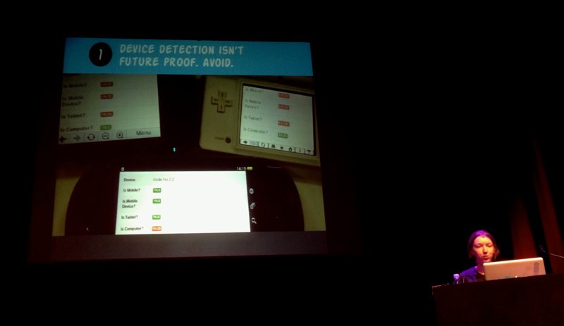
Anna Debenham—Device detection isn’t future proof. Avoid.
As Tom Maslen pointed out, we’re foolish focusing on devices. Before responsive design, did we ever talk about whether a website worked on a particular Dell PC or a MacBook? We didn’t, we thought in terms of browsers and whether our sites worked in Internet Explorer 8 or the most recent version of Firefox. This makes it much easier to test and gives us a much narrower set of requirements that our sites need to fulfil.
David Bushell explained how screen size doesn’t equate to viewport size, as many desktop users, especially those with very large displays, will use browser windows much narrower than their screen. Something that I also touched on in my talk was that you can’t judge what device is being used, or what user is doing based on the size of their viewport. A narrower viewport does not necessarily guarantee a mobile device, or low bandwidth or that the user is “on the go”. A narrower viewport could just mean that the user has stuck the browser window to one side of their enormous display on a high-end Mac, using broadband while at work in their office.
Breakpoints and tweakpoints
Many of the speakers discussed breakpoints, but not obsessing over them as the defining feature of Responsive Web Design. While most of us have been guilty of basing breakpoints on particular (Apple!) devices, the focus was on moving away from device-based breakpoints.
Mark Boulton suggested that breakpoints should be based on changing user experiences based on the features and capabilities of the browser; using “macro breakpoints” when something big happens, such as a layout change, and mostly basing your CSS around “micro breakpoints”, on the little tweaking details that add up to 80% of your styles. These are very much along the same lines as Jeremy Keith’s “tweakpoints”.
In my talk I shared my ideas of basing breakpoints around the optimal display of the content, as every content element has an ideal maximum width and and ideal minimum width. Using the content in this way ensures the best browsing experience, as well as using constraints derived from the one thing that won’t change in the future.
Bruce Lawson also touched on making assumptions about types of user interaction based on viewport size. Bruce gave the example of browsing a site on a TV. Whilst the TV screen is very large, the distance at which you sit from it makes the interaction more akin to using a mobile device, they occupy the same space in your field of vision.
Not just screens, but inputs
Anna Debenham’s talk on consoles showed us the wide range of web browsing experiences on gaming devices, and how the inputs and interactions on these devices have a huge impact on the browsing experience. Combinations of touch screen and voice input, stylus wielding, button hitting, pointer waving and joystick nudging can make the web a challenging experience on consoles, however Anna emphasised that designing specifically for these devices isn’t the way forward. These devices are rapidly improving their support for web standards, so building a site with web standards, multiple contexts and accessibility in mind will inevitably result in a site that’s a joy to use on a console.
“Don’t design for consoles, design for everything and nothing.” Jeremy Keith summing up in the panel session after Anna’s talk
Designing for features and capabilities
Mark Boulton, Andy Hume and Tom Maslen all spoke about designing for features and capabilities instead of devices. This is tied in with the idea of progressive enhancement, which many of us have been using as a web development mantra for years. Tom Maslen named his talk after the technique of judging browsers which “cut the mustard.”
Cutting the mustard
Tom Maslen and Andy Hume both work on large news sites (bbc.co.uk, guardian.co.uk) and so shared their experiences of practically applying responsive design to huge content-heavy sites. Their technique of “cutting the mustard” is to define a list of browsers deemed to be ‘modern’, with a certain set of features and capabilities, and then delivering a progressively enhanced experience to those browsers only.
This technique relies on building a simple core experience where the content is accessible from any device. Andy suggested there are three stages of the page load, where only one is vital:
- “content”: HTML and CSS
- “enhancement”: javascript which enhances the experience with rich/interactive media
- “leftovers”: analytics, ads, and anything else which is least important to the users but useful to include on the page
Tom pointed out that using this technique would mean no time wasted on polyfilling, or other ways of trying to make the older/less capable browsers support the same enhancements. As the browsers that cut the mustard all support modern standards, you can be assured of a good level of support for CSS and other modern technologies.
This approach is far easier to manage than the BBC’s previous strategy of supporting a specific table of browsers, using graceful degradation to give a similar experience to all users. This was all easy enough when all browsers were free, uncomplicated and easy to test; where you could test most browsers on either a PC or Mac, but now you need to invest in an enormous array of devices to test on every browser.
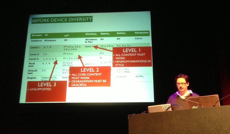
Tom Maslen demonstrating the BBC’s previous strategy of supporting a specific table of browsers
More markup and code
“The web and web standards have always been responsive”-Bruce Lawson on how the web is inherently flexible.
Bruce Lawson started his talk saying that we constrained ourselves on the web. Mark Boulton later pointed out that we didn’t really constrain ourselves, we’ve been using the web for everything and anything when it was really just designed for memos. The web wasn’t designed to be inherently flexible, it just happened that way.
Fluid design
However, Bruce was really highlighting the fact that we could have been developing sites based on fluid layouts for years, it’s just that most of us have been falsely constraining ourselves with fixed-width layouts in order to give us more control. Throughout the day, Jeremy Keith relished in telling us how he’d always worked in this way and how it made the move to responsive layouts significantly easier.
Andy Hume spoke of an ideal future where every component of a site would be standalone, as a modular part of a greater system. Building our sites in this way would mean we didn’t even need to rely on media queries. If we built our components to suit any width, embracing fluidity, they would fit any device without forcing particular responsive behaviour.
All the CSS possibilities
Bruce Lawson introduced us to a huge amount of existing and up-and-coming standards that we’ll be able to use to make responsive design much easier.
Viewport meta and @viewport
Bruce explained how the viewport meta tag meta name="viewport" content="width=device-width" is a bit of a blunt instrument, and how it’s really mixing presentation into our structure as it’s telling pages how to display from within the HTML and not the CSS.
Bruce showed us a potential solution using an @viewport rule in your CSS which could replace the viewport meta tag and allow for more sophisticated combinations of viewport and media query rules.
Some next level CSS
Under the cheeky name of “CSS Level 4”, Bruce walked us through some proposed additional media queries:
(script)which can be used to provide fallbacks or enhancements based on whether the browser supports JavaScript- supported inputs and interactions such as
(touch),(hover),(remote)and(keyboard)which can be used to optimise the user experience based on the capabilities of their device
These could be used to replace the functionality of something like Modernizr, where JavaScript is used to detect browser capabilities.
Flexbox
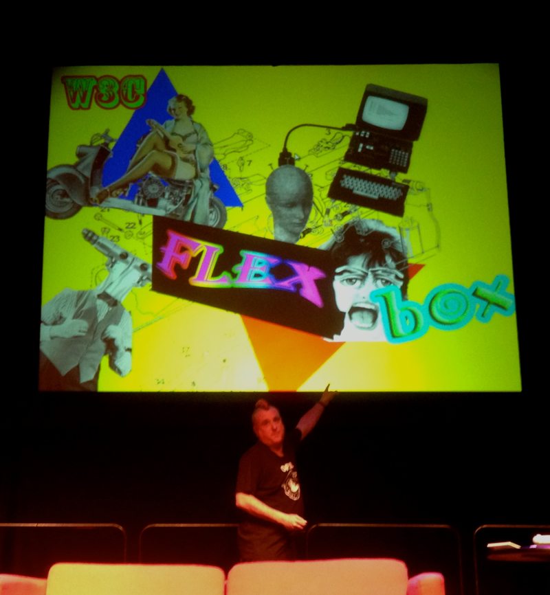 , as shown by Bruce, is so full of exciting potential for CSS layouts. The rules associated with flexbox gives layout superpowers:
- reorder content on the page without changing the hierarchy of the HTML
- make content redistribute across any given space
- centre content horizontally or vertically
- create complex grid layouts without having to rely on dodgy class names or endless floating elements
Bruce warned us to be wary of the differences between the 2009 and 2011 flexbox syntaxes, as both are implemented differently across browsers, although a standard is being reached with the later syntax.
Pesky prefixes
Bruce emphasised that, when using any of these new CSS features, to always make sure you use both the prefixed (for browser vendor implementation testing) and unprefixed (the desired web standard) versions of each rule. This ensures current compatibility with browsers-in-flux but also future compatibility when all browsers consistently support the standard in the same way.
Performance
Performance was a key word of the day. Many speakers mentioned how we’ve been spoilt by broadband, and seemed to have forgotten about optimising our sites for limited bandwidth and poor connections. This has come back to bite us as we realise how much our weighty sites impact upon the mobile experience on responsively designed sites. Andy Hume pointed out that performance isn’t just about responsive design, it’s important for all design, and that responsive design has just put the light on our previously bad practices. Anna Debenham suggested that we should set a performance budget for each page, which we use to ensure that our resources aren’t getting out of hand.
Images
“Responsive images” are a common request among designers and developers. Really what most people want is a clever way to add flexibility to images, and some kind of browser magic to deliver the relevant image to suit the user’s bandwidth. Paul Robert Lloyd proposed that appropriate use of imagery is a more realistic solution. Paul questioned whether we really need to use images as much as we do, and maybe we should be working with truly scalable media. Paul posited that the element is an unrealistic solution as it gives developers the idea that you can aim for pixel perfection on the web when, especially in the world of varying-DPI displays, it’s just not achievable. When considering the best solutions for images, Paul put images into three categories:
- Interface
- Content
- Decorative
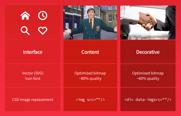
Paul Robert Lloyd’s slide on types of images
Asset fonts
Where images meet fonts, Josh Emerson spoke about using asset fonts for one-colour graphic elements. Much like the Webdings icons font, Josh explained that asset fonts could be created as your own set of scaling icons. The glyphs are much easier to manage than hacky image sprites, they’re supported by any browser that supports web fonts and provide resolution-independent sharp graphics that work on any-DPI display, not just retina displays.
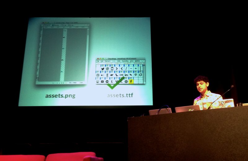
Josh pointed out that, whilst asset fonts are a fantastic solution for vector-style graphics, images that require more than one colour are better served by SVG.
Another way of delivering assets through fonts are with ligature asset fonts. Josh talked about Symbolset, where words can be converted semantically into icons using the ligature format built into fonts. I previously thought that this would be tricky, as you’d have to use the exact language and exact words in your content to trigger the correct icons, which could result in your copy following your design, not separating content and presentation. Josh pointed out that you can use this same ligature formatting to build ligature asset fonts for yourself, using the words and graphics that you want. Unfortunately, ligature asset fonts do require OpenType ligature support which is still slightly patchy.
Typography
There was a lot of talk of typography throughout the day as our excitement with two of the biggest turning points in web development in the last few years; web fonts and responsive web design, were brought together.
Typography first
In my talk, I spoke about how text makes up so much of web design that typography, and your choice of typeface, could be the one thing that makes your design feel consistent across any viewport or device. With the web font support we have nowadays, or even using a basic palette of “web safe” fonts, you could easily give your website a distinctive voice and atmosphere without the need for complex responsive layouts, just embracing the built-in fluidity of the web.
Web fonts and fallbacks
Richard Rutter spoke about how we could improve the experience of web fonts. Richard pointed out the problems that occur when there’s no visible text until the weighty-but-beautiful web font loads. Richard saw it as us having four options:
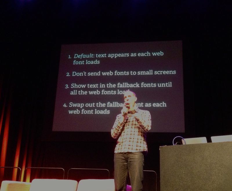
Richard Rutters potential solutions for web font loading wait-time
- Default: text appears as each web font loads
- Don’t send web fonts to small screens
- Show text in the fallback fonts until all the web fonts load
- Swap out the fallback font as each web font loads
After a day of speakers talking about how we can’t guess the performance of a browser based solely on viewport size, it seemed like not sending web fonts to small screens was a very general solution which you would have to weigh up with the probability of narrow viewports equating to low bandwidth.
Richard talked about the WebFont Loader which gives you JavaScript classes to make all browsers load fonts in the same way, and give you more fine-grained control on when and how the fonts appear.
Richard emphasised the importance of operating system font fallbacks for web fonts, and how these could be used as a very workable, readable version of a page until the web fonts are loaded. The knack to getting this right is to make the fallback fonts as similar as possible to the web font. This involves researching the most appropriate fallback fonts on different devices, and tweaking the metrics of the fallback font to best match the web font size and shape.
Layouts and navigation
Differentiating and uniting
The main focus of my talk was trying to get our heads round how our visual designs respond to responsiveness, and how we can use this to create good and familiar experiences no matter what the viewport. I spoke about design systems, and how our visual systems are built from typography, layout, colour and shape/form. When considering each of these modules, we should consider what works to unite the feel of our site across different viewports and what we must differentiate in order to optimise the experience for different viewport widths.
Antiphonal geometry
Owen Gregory spoke about how we can’t base web design layouts on print geometry as our materials are just not the same. Print is static, but the web is the complete opposite. Owen pointed out that we can keep using geometric layouts, they just have to be made flexible. Whilst Mark Boulton spoke about not constraining ourselves with frames that we create ourselves, Owen talked about how these frames are ever-present without our input, every device uses frames to deliver content in the form of a screen.
Owen agreed with Mark in that we can’t use frames as false constraints, we must acknowledge that we can’t possibly guess what size these frames are going to be, but Owen also pointed out that the ratios between the height and width of many devices are roughly the same, so we could potentially use these values in our designs.
On reflection, this was an exciting revelation to many of us (the similarity between the ratios) but I still disagree with this as something to design around. There may well be similarities between the proportions now, but the point of embracing the responsiveness of the web and not focusing on specific devices is that we don’t know what those proportions will be in the near or distant future. For now, this may be the most aesthetically pleasing ratio, but our tastes could well change.
Owen spoke about the similarities between the ratios of device proportions and the harmony of musical intervals. This is similar to Tim Brown’s talk I saw at Ampersand conference 2011 (also a fantastic article on A List Apart) about using typography built on a modular scale based on musical intervals. These principles use the interval harmonies found in music, which is can also be found in maths and nature, to create scales for your typographic hierarchy which has that same harmonious and balanced feel.
Types of navigation
David Bushell got into the meat of responsive navigation. Despite showing us many different types of navigation, David emphasised that we shouldn’t try to be too clear with our navigation, as we’ll likely just end up confusing the users. We must remember that the reason navigation exists is to make it easy for the user to find what they’re looking for.
As a general rule, David suggested we should aim for as few menu items as possible. The navigation menu isn’t the only form of discoverability on a site, so we don’t need to cram everything in there. We’re risking all of the site on a single point of failure if we only have a single point of navigation.
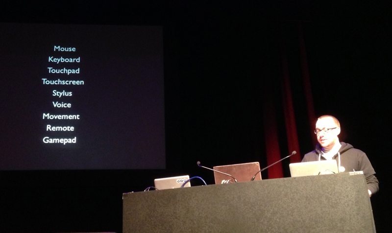
It’s also important to bear in mind that it’s not just the mouse or keyboard that we’re trying to accommodate, we must make navigation work with any form of input. Still, any interaction made with any of these forms of input is, in essence, the equivalent of one click-event and so still requires effort from the user and potentially slowing the user down with more page loads.
David Bushell on types of input
A few of the different types of navigation David talked about were:
- a print-style table of contents which makes the content hierarchy very clear
- jumping to a ‘big footer’, where you’ve no limitations on the amount of navigation as it’s not above, or hiding, the primary content
- hiding and revealing the navigation, above or to one side of the primary content
- overlaying the navigation over the primary content, so it’s not pushing the content down
- multiple tiers of sub-menus, allowing the user to drill down to what they’re looking for
- just simply using menu items floating side-by-side, with clever breakpoints to optimise their readability
The “hamburger” icon
David’s talk was the first where I’d heard the description of three horizontal lines as the “hamburger” icon. David spoke about this icon as a potential convention that’s arising in responsive design, as it’s used by some very large mainstream sites with a wide audience. However, it’s possibly being used as an easy option for designers looking to hide a menu button in as small a space as possible, without considering whether it’s really the best and easiest-to-understand option for the users.
A matter of process
Process is one of the trickiest topics in responsive design. Both Elliot Jay Stocks and I spoke about how hard it is for us to let go of the tried-and-tested processes that worked for us for so long. Sarah Parmenter described our processes themselves as being adaptive, and how our the task of creating good working processes will never truly be done. Sarah said it was a problem of workflow, and we need to find workflows that work for us as individuals. Elliot Jay Stocks pointed out that once we rethink our processes, responsive design will no longer be described as such a time-consuming process.
Communication
In my talk, I tried to emphasise that a lot of our problems with responsive design stem from our focus on the deliverables, and mockups, that we produce for clients. We need to remember why we create these mockups in the first place, that they’re really just tools for communication our ideas and concepts. We need to let go of the perfectionism in our mockups and focus on presenting our ideas to our clients and colleagues in an efficient way which also helps us visualise our own work effectively.
Designers who can code
Elliot Jay Stocks pointed out the value in being a designer who can code. Being able to code means that you’re not stuck in the static format of a graphics editor. You may not be an amazing front-end developer, but being able to code will make it so much easier to communicate the responsive elements of your design work to your clients and colleagues.
Content, content, content
When he was speaking about designing navigation, David Bushell pointed out that knowing your content hierarchy is incredibly important for understanding the best form of navigation. Placeholder content is not a viable substitute as you just don’t know what you’re designing around.
Many speakers went back to this point. In my talk I returned to it when I said that the whole purpose of a site is to present the content in an optimal experience, so we really need the content before we can make decisions on the most appropriate form of presentation.
Sarah Parmenter quoted Mark Boulton saying that you need to know the content structure, not just the content. Sarah spoke about the importance of a content audit, and really knowing your content structure. Sarah had the idea of getting clients to not sign off on visual mockups or wireframes, but on the content hierarchy, where the importance of each element was agreed with the client.
Paul Robert Lloyd described it as meaning being our baseline. Aesthetic design is just an enhancement. On the most basic level, the HTML page of content is a usable website. Anything we put on top of that basic usability must be carefully considered so that it adds to, rather than damages, the experience.
Approaches and attitudes
In the month since Responsive Day Out, I’ve heard the term “winging it” over and over. It was Sarah Parmenter kicking the day off saying “we’re winging it” that initiated this kind of group honesty where everyone felt they could share what they didn’t know about responsive design. I’ve noticed people starting to be more free with their ideas and experimentation.
Not being comfortable
Mark Boulton ended the day on the point that we need to stop trying to be comfortable with what we’re doing. We need to start feeling comfortable with feeling uncomfortable. We previously gave ourselves false constraints to make our lives easier, and to make our work feel like it fitted. These constraints have done nothing but cause us problems with future compatibility.
This feeling of uncertainty is here for good, and it’s a valuable part of ensuring we make our sites better for those unpredictable situations.
Related reading
Anna Debenham’s Game console browsers test results site
[http://console.maban.co.uk/](http://console.maban.co.uk/) * ### Paul Robert LLoyd’s responsive markup patterns for images
[http://prlloyd.com/responsiveconf](http://prlloyd.com/responsiveconf) * ### Jeremy Keith’s ‘Tweakpoints’
[http://adactio.com/journal/6044/](http://adactio.com/journal/6044/) * ### Flexbox basics
[http://dev.opera.com/articles/view/flexbox-basics/](http://dev.opera.com/articles/view/flexbox-basics/) * ### Flexbox syntaxes
[http://css-tricks.com/old-flexbox-and-new-flexbox/](http://css-tricks.com/old-flexbox-and-new-flexbox/) * ### An introduction to meta viewport and @viewport
[http://dev.opera.com/articles/view/an-introduction-to-meta-viewport-and-viewport/](http://dev.opera.com/articles/view/an-introduction-to-meta-viewport-and-viewport/) * ### “Cutting the Mustard”, looking at device support with Responsive News
[http://blog.responsivenews.co.uk/post/18948466399/cutting-the-mustard/](http://blog.responsivenews.co.uk/post/18948466399/cutting-the-mustard/) [Hat tip to Andy Hume.](https://twitter.com/andyhume/status/319001952740585472)
Related resources
-
Fontforge, an app for creating fonts, recommended by Josh Emerson
-
Symbolset, a ligature asset fonts service, recommended by Josh Emerson
-
Icomoon, a service for creating asset fonts, recommended by Josh Emerson as the simplest solution
-
WebFont Loader, a JavaScript library to give you more control over font loading, recommended by Richard Rutter
https://developers.google.com/webfonts/docs/webfont_loader
-
Modernizr, a JavaScript library used to detect browser capabilities, recommended by Bruce Lawson
-
Modular Scale, a tool built by Tim Brown to design typographic ratios around musical intervals
8 comments
Read the original post, 'Responsive Day Out'.
This content originally appeared on Laura Kalbag’s Blog Posts and was authored by Laura Kalbag
Laura Kalbag | Sciencx (2013-04-01T22:52:39+00:00) Responsive Day Out. Retrieved from https://www.scien.cx/2013/04/01/responsive-day-out/
Please log in to upload a file.
There are no updates yet.
Click the Upload button above to add an update.
I was waiting for this one from Responsive Day Out, all at one place.
Thanks Laura!!
Thanks for doing the write up –; you have picked up (researched) a lot more links than I remember on the day so it will be good to return to this post again and again.
I’d like to respond, however and clarify a few points. If this stuff wasn’t clear from my talk, then I apologize; I had to cram a lot into the twenty minutes and knew very well that I had to simply miss things out or leave them unexplained.
I wouldn’t characterize using the principles and implications of antiphonal geometry as creating “geometric layouts”, more that such an approach encourages web designers to take and use certain aspects of visual design they might think aren’t available to them in a fluid medium: namely, the ratios of the screens that necessarily frame our work.
I certainly didn’t intend to say that the aspect ratios of the screens we use are “roughly the same”. 3:5 isn’t 5:8. But for each distinct ratio there are several different devices, from smartphone to desktop screen; the iPhone 5, for example, shares the same aspect ratio as the Thunderbolt display. Far from “focusing on specific devices”, the principles of antiphonal geometry allow us to use properties that devices share, not set them apart.
I tried to make clear that there is a set of aspect ratios used for web screens (2:3, 3:4, 3:5, and so on) that matches natural musical harmonic intervals, so why not use those values to inform our designs. The main idea is that when the screen aspect ratio is 3:4, for example, we use that to change parts of a visual design. And when the aspect ratio changes, so too can the design. Using musical harmony is merely an interesting (well, I think so!) extension of that.
Of course, you’re right to say that “we don’t know what those proportions will be in the near or distant future”, but I believe we’ll continue to see the same set of proportions in screen aspect ratios for many years to come.
Also, I never intended that these ideas be “something to design around.” I wouldn’t design with these principles in mind from the start, but I might apply some of them where appropriate to help create a resonance between the design and the device it’s displayed on.
I hope that clears a few things up. I might try to write up my complete take on antiphonal geometry eventually, and set it out as clearly as I can, for anyone willing to take the risk! Thank you again for your thoughts.