This content originally appeared on DEV Community and was authored by Mursal Furqan
Well, applying color to our interfaces can become a very complicated task. In this post, I am sharing some quick tips to learn how you can make an easy (beautifully) by applying the 60-30-10 technique.
Let's Start...
Step 1: Set your main color!
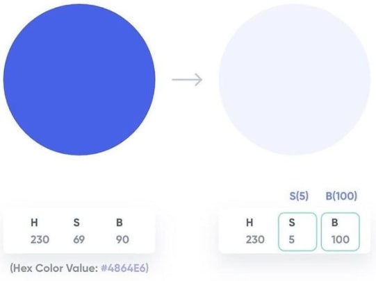
Create a new shape and select the color of your preference. It can be the main color of your product. Here, let's say, Hex Color Value: #4864E6.
Step 2: Let's set a secondary!
Duplicate the main color and change mode to HSB in your picker. Wondering how? Easy. Set the S (Saturation) value between 5-10 points and B (Brightness) value between 95-100 points and set.
So if your primary color's HSB values are 230:69:90, let's make 'em 230:5:100.
Step 3: Now let's set an accent!
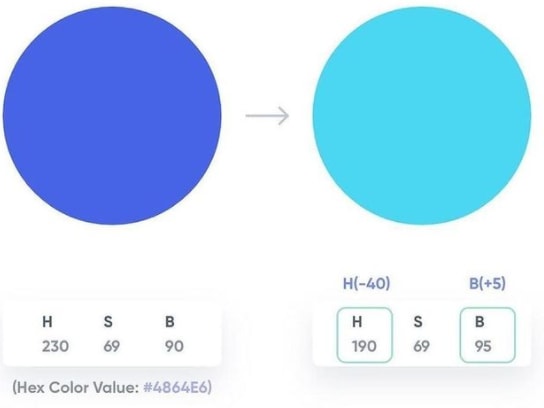
Duplicate again the main color. Increase or decrease the H (Hue) value by 30-40 points and increase the B (Brightness) value by 5-10 points. So if your primary color's HSB Values are 230:69:90m let's make 'em 190:69:95.
Step 4: Now we have a cool three-color scheme!
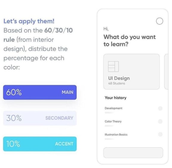
Let's apply them based on the 60/30.10 rule (from interior design), distribute the percentage for each color. So, if we talk in numbers, you can distribute the colors in the following distributions:
- Main/Primary Color: 60%
- Secondary Color: 30%
- Accent: 10%
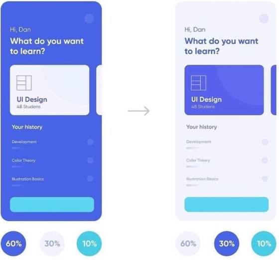
Step 5: Distribute the colors in your layout. Here, I am sharing the almost best way to distribute these colors among your layout elements. You can refer to the following few lines:
- 60% of your primary/main color: Backgrounds, main elements
- 30% of your secondary color: For 2nd level elements, i.e. texts, icons, etc.
- 10% of your accent color: For CTAs (Call To Actions) and access touches.
Step 6: Now since you have a perfect balance, you can play around with the variations using the same colors. And believe me, it will work perfectly fine. 😍😍😍
With this scheme, you can create analogous color palettes, along with a tint of greater harmony. This way your designs will look soft and fresh (and without horrible colors)
This content originally appeared on DEV Community and was authored by Mursal Furqan
Mursal Furqan | Sciencx (2021-11-14T10:56:16+00:00) A cool way of Coloring in UI Design. Retrieved from https://www.scien.cx/2021/11/14/a-cool-way-of-coloring-in-ui-design/
Please log in to upload a file.
There are no updates yet.
Click the Upload button above to add an update.


