This content originally appeared on DEV Community and was authored by Zoltán Szőgyényi
In this tutorial I would like to show you how you can build a Tailwind CSS modal element using Flowbite and make it work with dark mode as well.
Last time I showed you how to build a responsive navbar using Tailwind CSS here on the DEV community and I'm excited to get started with this modal component.
Modals are a very important and interactive element that you can use to show and receive information from your website users.
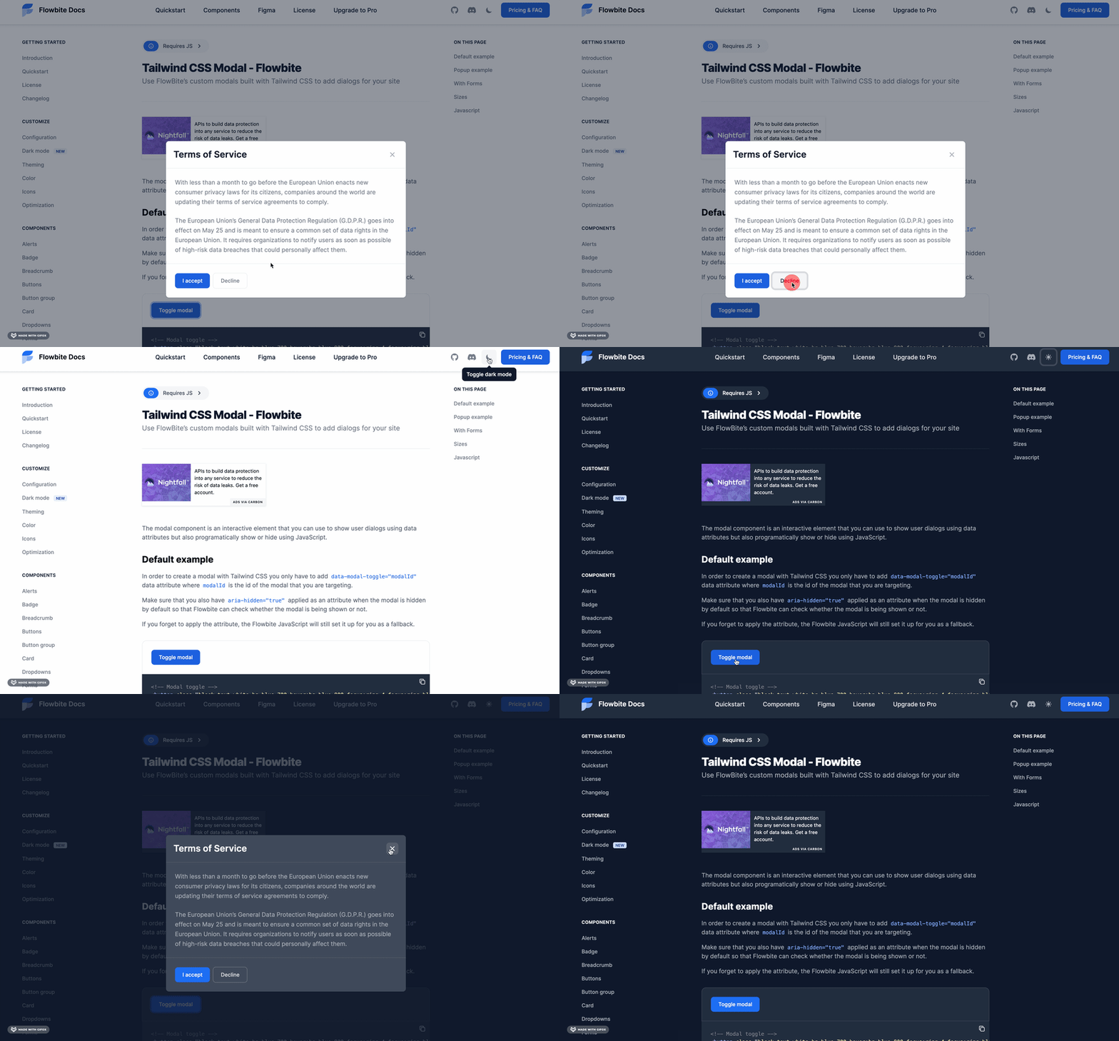
Here's a preview of what we will build:
Let's get started!
Tailwind CSS modal component
Before getting started, make sure that you have Tailwind CSS and Flowbite installed on your project.
I assume that you already have a working Tailwind CSS project so we'll start by installing Flowbite:
npm i @themesberg/flowbite
Now require it as a plugin in your tailwind.config.js file:
module.exports = {

    plugins: [
        require('@themesberg/flowbite/plugin')
    ]

}
And now also include the Flowbite JavaScript file either from NPM or as a CDN:
<script src="../path/to/@themesberg/flowbite/dist/flowbite.bundle.js"></script>
Via CDN:
<link rel="stylesheet" href="https://unpkg.com/@themesberg/flowbite@1.2.0/dist/flowbite.min.css" />
Awesome! Let's now first add the button that will toggle the modal itself:
<!-- Modal toggle -->
<button class="block text-white bg-blue-700 hover:bg-blue-800 focus:ring-4 focus:ring-blue-300 font-medium rounded-lg text-sm px-5 py-2.5 text-center dark:bg-blue-600 dark:hover:bg-blue-700 dark:focus:ring-blue-800" type="button" data-modal-toggle="default-modal">
  Toggle modal
</button>
As you can see we added a data-modal-toggle data attribute where default-modal is the id of the modal element that we will now build.
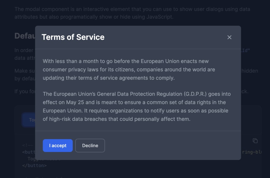
Let's use one of the modal component examples from Flowbite and add it just after the button component:
<!-- Main modal -->
<div id="default-modal" aria-hidden="true" class="hidden overflow-x-hidden overflow-y-auto fixed h-modal md:h-full top-4 left-0 right-0 md:inset-0 z-50 justify-center items-center">
    <div class="relative w-full max-w-2xl px-4 h-full md:h-auto">
        <!-- Modal content -->
        <div class="bg-white rounded-lg shadow relative dark:bg-gray-700">
            <!-- Modal header -->
            <div class="flex items-start justify-between p-5 border-b rounded-t dark:border-gray-600">
                <h3 class="text-gray-900 text-xl lg:text-2xl font-semibold dark:text-white">
                    Terms of Service
                </h3>
                <button type="button" class="text-gray-400 bg-transparent hover:bg-gray-200 hover:text-gray-900 rounded-lg text-sm p-1.5 ml-auto inline-flex items-center dark:hover:bg-gray-600 dark:hover:text-white" data-modal-toggle="default-modal">
                    <svg class="w-5 h-5" fill="currentColor" viewBox="0 0 20 20" xmlns="http://www.w3.org/2000/svg"><path fill-rule="evenodd" d="M4.293 4.293a1 1 0 011.414 0L10 8.586l4.293-4.293a1 1 0 111.414 1.414L11.414 10l4.293 4.293a1 1 0 01-1.414 1.414L10 11.414l-4.293 4.293a1 1 0 01-1.414-1.414L8.586 10 4.293 5.707a1 1 0 010-1.414z" clip-rule="evenodd"></path></svg>
                </button>
            </div>
            <!-- Modal body -->
            <div class="p-6 space-y-6">
                <p class="text-gray-500 text-base leading-relaxed dark:text-gray-400">
                    With less than a month to go before the European Union enacts new consumer privacy laws for its citizens, companies around the world are updating their terms of service agreements to comply.
                </p>
                <p class="text-gray-500 text-base leading-relaxed dark:text-gray-400">
                    The European Union’s General Data Protection Regulation (G.D.P.R.) goes into effect on May 25 and is meant to ensure a common set of data rights in the European Union. It requires organizations to notify users as soon as possible of high-risk data breaches that could personally affect them.
                </p>
            </div>
            <!-- Modal footer -->
            <div class="flex space-x-2 items-center p-6 border-t border-gray-200 rounded-b dark:border-gray-600">
                <button data-modal-toggle="default-modal" type="button" class="text-white bg-blue-700 hover:bg-blue-800 focus:ring-4 focus:ring-blue-300 font-medium rounded-lg text-sm px-5 py-2.5 text-center dark:bg-blue-600 dark:hover:bg-blue-700 dark:focus:ring-blue-800">I accept</button>
                <button data-modal-toggle="default-modal" type="button" class="text-gray-500 bg-white hover:bg-gray-100 focus:ring-4 focus:ring-gray-300 rounded-lg border border-gray-200 text-sm font-medium px-5 py-2.5 hover:text-gray-900 focus:z-10 dark:bg-gray-700 dark:text-gray-300 dark:border-gray-500 dark:hover:text-white dark:hover:bg-gray-600">Decline</button>
            </div>
        </div>
    </div>
</div>
Great job! Now you have a working and responsive modal that you can use in your Tailwind CSS projects.
This modal component also supports dark mode and you can check out the Tailwind CSS dark mode switch guide from Flowbite to set it up yourself.
There are plenty of other modal component variations and sizes from the Flowbite component library that you can check out and use for your projects.
This content originally appeared on DEV Community and was authored by Zoltán Szőgyényi
Zoltán Szőgyényi | Sciencx (2021-11-30T12:55:23+00:00) How to build a Tailwind CSS modal component. Retrieved from https://www.scien.cx/2021/11/30/how-to-build-a-tailwind-css-modal-component/
Please log in to upload a file.
There are no updates yet.
Click the Upload button above to add an update.


