This content originally appeared on DEV Community and was authored by Appmaster.io
If the mobile app doesn’t correspond to the latest design trends, it will probably be out of users’ interest.
Making the app look modern and beautiful is challenging, considering that trends never stay the same, and there is always a new trend to appear. But following the design trends is a must for every app developer.
We understand that It is not always possible to keep track of all the tendencies and trends in the industry. There are always new guidelines, animation content, video, new approaches to illustrations, and many other concepts you need to find time to study and test first.
10 Design trends: 2022 expectations
We have completed this task for you and collected 10 top design trends and ideas to use in 2022 and make your apps’ design stand out:
- Motion and animation
- Gestures and swiping experiences
- 90's style
- Depth in graphic
- Dark mode
- Typography
- AR and VR
- Gradients and transparent elements
Let’s discover and look into each trend more closely.
Motion and animation
We all love watching videos and spend a lot of time on TikTok or YouTube. Video content and animation are more engaging and interactive.
Statistics show that the majority of people watch explanatory videos before using an app. Animation and motion design trends make the content more engaging. It is easier to consume the information when there is a practical example in front of you. Unlike static content with long descriptions, animation retains the users' attention and makes the app more appealing.
It is always a good idea to highlight essential things with the animation trend. For example, you may animate the buttons in your app to make the user interaction with an app better and more straightforward. Micro-movements like icon animation can change your application significantly.
With the help of an animation, you can emphasize app features, improve conversion rates and even sales.
Explore advanced animation: simple movements do not work for users anymore. Use more complicated transitions and differentiate animation approaches.

Source: Dribbble
Gestures and swiping experiences
Gesture and swiping experiences are what make mobile devices more attractive opposite to computers. Plus, swiping is just more fun.
We spend hours scrolling and swiping daily. Buttons and additional actions can irritate and distract.
This design trend became one of the highest priorities for modern app design. Some of the app creators even do not support the usage of the buttons at all. Buttons create clutter and take too much screen space. And the gesture design trend suggests replacing buttons with swiping functionality.
It can be helpful to try animation for swiping actions. Books apps usually use animation for turning the pages, for example.

Source: Dribbble
90's style
The style of the 90's affected all areas, even the design of mobile apps.
Designers use retro fonts, images, graphics similar to popular PlayStation games from the 90's (for example, Mario or Pac-Man). With 90's vibes, you have a chance to acquire interest from two generations: young people love vintage things, and older ones experience nostalgia.
This trend won't suit every product, but if the retro style is appropriate in your app, be sure to experiment.
Source: Dribbble
Depth in graphic
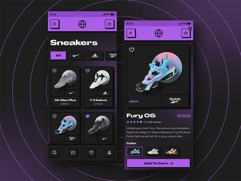
Flat design and pictures may be more strict and direct unless they become dull. People love seeing more realistic and interactive content.
Shadows and layers in graphics give them a 3D effect, volume, and depth so that people can enjoy more realistic images.
This trend can be used with any element, creating a hierarchy of objects on the screen and helping the user navigate the application more easily.
Couple of words about 3D. 3D is a revolutionizing technology. 3D graphics can be used in almost any app. For instance, developers could use 3D imaging technology to build apps that store maps of buildings and room interiors. It can become very applicable in games and change the whole experience for players. So when adding depth to graphics in your app, think of a 3D trend.

Source: Dribbble
Dark mode
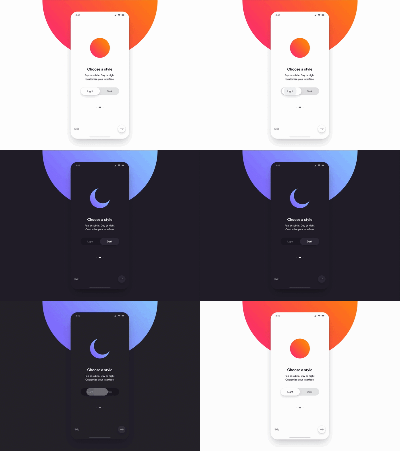
The dark mode is one of the biggest design trends that are already highly used in many apps. Recently vast developers have provided the opportunity of switching between standard mode and dark mode in the apps. So users can choose whatever they like most.
Dark theme design turns the background into dark mode and makes fonts and other elements light/white.
The dark mode is now available in the most popular apps like Facebook, for example. Switching to the dark mode helps people to reduce eye strain and navigate more conveniently.

Source: Dribbble
Typography
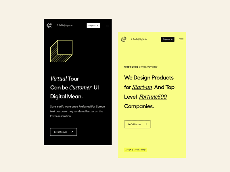
Choosing the right font is an essential step in mobile app design. People usually scan content on the Internet; they don’t read it. Therefore, it is worth using a font that will properly set emphasis.
Designers have started to use unusual fonts. The text no longer looks so boring and does not get lost in the background. Its purpose is to make the design brighter and more original.
Correctly selected fonts will help:
- set the tone and mood;
- raise brand awareness;
- provide better visual experience;
- improve readability.
Offer your app users a pleasant and readable user experience by organizing typography: set point sizes, line-spacing, line length, tracking, and hierarchy.
Bear in mind that unusual, "crazy" typography is not suitable for every product. Define the function that text carries in your application. If it provides an additional and informational function, do not experiment that much with fonts. But, for example, in an online magazine, you can play with formats, making the layout more interesting.

Source: Dribbble
AR and VR
Virtual reality and Augmented reality give you this incredible opportunity to have interactive experiences just from your mobile phones. The app design trend immersed especially during the lockdowns, replacing actual activities for people sitting in their houses.
In the upcoming year, this magical UI mobile design trend tends to grow and spread. The key to this design trend is that the app’s interface makes you feel like you’re inside the app. Engaging design elements and gamification are the keys to this experience.
It is a great chance to combine the previous trends we discussed, like animation and 3D effects. Primarily, well-created animation and 3D touches can support VR in your app design.
Do you remember those engaging filters from Instagram allowing us to place different characters wherever we want just through the app and mobile camera? Then you know how fun that could be. Moreover, it can be not only fun but efficient. For example, IKEA used AR to show how a piece of furniture will look in different spots of your house.

Source: IKEA Place App
Gradients and transparent elements
This app design trend is all about gradients and transparency. Designers usually use gradients on buttons and the backgrounds of the apps. Mobile gradient trend highlights essential parts of the application and makes people focus on the particular aspects giving them a sense of hierarchy.
Transparent elements in mobile app design demonstrate the depth and drive attention to certain app parts, making the design clearer and more attractive.
You can use the transition from light to dark theme design, thus dividing the screen into two logical parts. Also, you can use gradient themes on buttons to make them pop up on the screen.
The concept of glassmorphism is also worth mentioning. The idea behind glassmorphism is to soften the contrast between light and dark design elements. The design concept uses transparent blurred backgrounds that resemble the surface of the matte glass.
Main characteristics of glassmorphism:
- transparency and background blur;
- thin light border on transparent objects;
- layering;
- bright colors.

Source: Dribbble
Comfort visuals
Comforting visuals are easy on the eyes. Both users and app developers love this recent mobile app design trend.
Mobile apps design shouldn’t be just beautiful. It should be convenient and easy for our eyes. During the whole day, we stare at our screens and, by the end of it, experience fatigue and eye strain. To reduce this adverse effect, app developers create a design we can consume comfortably.
The concept of comfort visual design trend is to use natural colors, soothing images, and simple layouts for your app. These techniques can usually be found in meditation apps. They include real photos of nature with calming colors and light elements with simple structure, rarely dark theme design.

Source: Dribbble
Abstract art
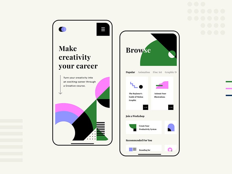
After discussing comfort visuals, simplicity, and real photos, mentioning the abstract art design trend may sound contradictory. However, this technique is highly used in the UI mobile industry.
Why is that so? Abstract images and geometric art look very artistic in mobile apps. It draws attention to colors and shapes without distracting from the app functionality and creating an original design. There is no need to turn to pricey photography and real photos at all or illustration. That is the easiest way to grab users’ attention quite firmly.

Source: Dribbble
What are good app design practices, and where to find ideas?
Implementing all top design trends won’t make your app perfect. Besides following the ideas, you may as well use some quality design practices.
- Inspecting others’ work. Examine the leading mobile UI works and analyze their pros and cons. Learn from their experience but never copy.
- Make the app intuitive. Use all of the trends to create an app with a user-friendly and intuitive interface. Whether these are 3D effects, animation, or VR, make sure it only simplifies the app and makes it convenient to use.
- Use standard navigation. Don’t overflow menu bars with lots of options. Keep only the essentials. Remember that buttons distract and take a lot of space on the screen.
- Use attractive images. We have listed too many options of how you can create attractive images. Abstract art, illustration, real photos trend — everything can help catch the attention of a user.
But where to find inspiration?
Yes, there are tons of different selections on the Internet. However, instead of just searching, go directly to websites of the companies related to the industry. As professionals, they can share some great ideas. For example, the Shakuro app design agency usually posts quality articles on design trends. Being a professional in digital and app design, Shakuro provides excellent information. And for looking for “design trends 2022” and app theme design Shakuro will be a great place.
To find more ideas, try Awwwards — a collection of thousands of designs presented by creators from all over the world; or Mobbin — a library of 50,000+ app screenshots.
Of course, there is no intention to make you follow all the design trends. One approach suits one type of business and can break another. The critical point is to keep an eye on the trends, evaluate the market and analyze the demand of your customers.
This content originally appeared on DEV Community and was authored by Appmaster.io
Appmaster.io | Sciencx (2021-12-01T21:46:58+00:00) TOP 10 Mobile App UI Design Ideas in 2022. Retrieved from https://www.scien.cx/2021/12/01/top-10-mobile-app-ui-design-ideas-in-2022/
Please log in to upload a file.
There are no updates yet.
Click the Upload button above to add an update.

