This content originally appeared on DEV Community and was authored by Masa Kudamatsu
TL;DR
To create a frosted glass look (known as glassmorphism) on the web, using backdrop-filter: blur() in CSS is the simplest approach if you can ignore Firefox users (Section 1).
For Firefox users, however, there is a trick quite straightforward to implement glassmorphism: using the -moz-element() CSS function. (Section 2)
If the background graphic is set with background-image, there is another way of creating glassmorphism effects that is compatible with all modern browsers: applying filter: blur() to the duplicated background image (Section 3).
And all these techniques can be used not just for glassmorphism but also for any graphical effects created with the filter CSS property.
Introduction
Belatedly, I just learned about a recent UI design trend known as glassmorphism, popularized by Microsoft's “Acrylic Material” of Fluent design system and, more recently, by macOS Big Sur.
Acrylic Material of the Fluent design system by Microsoft (image source: Microsoft Docs)
An example alert in macOS Big Sur (image source: Apple Developer)
I googled how to implement this frosted glass look with CSS. Most articles suggest using the backdrop-filter CSS property, and they all mention that it's not supported by Firefox, without explaining what can be done for Firefox users.
Frustrated, I further explored the topic and learned the following:
(1) If the background graphic is set with background-image, using filter: blur() can achieve glassmorphism for all modern browsers, including Firefox;
(2) There is also a Firefox-specific implementation that can work with any background graphic (e.g., the image drawn with Canvas API): using -moz-element() to copy the background and blur it with filter: blur().
The second method appears to be lesser-known among web developers interested in glassmorphism. But it's definitely a great approach to complement backdrop-filter. The first method can be used to support the legacy browsers that don't support backdrop-filter but do support the filter CSS property (which excludes IE, by the way).
This article elaborates on these two approaches to implement glassmorphism for Firefox.
1. The backdrop-filter approach
Before getting into Firefox, let's recap how to use backdrop-filter to create a glassmorphism look. The benefit of this approach is its simplicity. The limitation is that it doesn't work for Firefox, even for its latest version (as of December 2021).
1.1 Basic syntax
The core of this approach is to apply the following pair of CSS declarations to the element floated over the background:
  background-color: hsla(0, 0%, 97%, .25); /* translucent off-white */
  backdrop-filter: blur(5px);
The exact values of lightness and opacity for the background color and of the blur() function's parameter need to be adjusted for each case. The color doesn't have to be neutral: for a tinted glass look, change the hue and saturation values of the hsla() function.
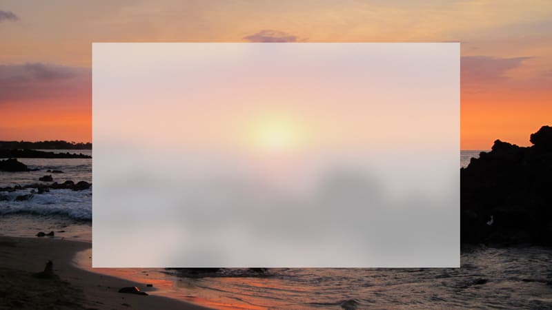
The above pair of CSS declarations creates a frosted-glass rectangle like this:
Basic glassmorphism effect (image source: Tudor 2021)
It's important to create translucency with the alpha value of color code (the rgba() function will work, too). If you set a solid color as the background and use the opacity property, it won't work. See Tudor (2021) for detail.
You may want to add more filters, to achieve the desired effect. According to Microsoft Design's blog article (Day 2018), the Acrylic Material of the Fluent design system can be replicated with the following value of backdrop-filter:
backdrop-filter: blur(30px) saturate(125%);
1.2 With glass-edge border
To enforce the appearance of a frosted glass plate, Malewicz (2020) recommends adding a 1px-thick border in translucent white as an imitation of the edge of glass. Walicki (2020a) presents an example of this approach:
  background: rgba(255,255,255,0.4); /* translucent white */
  backdrop-filter: blur(10px);
  border: 1px solid rgba(255,255,255,0.2);
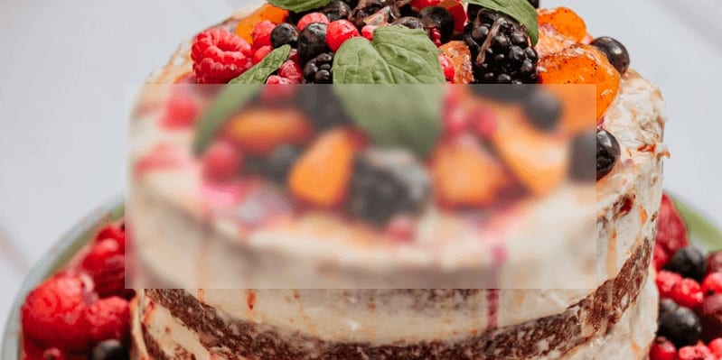
which produces a UI like this:
Glassmorphism effect with 1px-thick translucent white border (image source: a Chrome screenshot of Walicki 2020b)
For more examples of the backdrop-filter approach to achieve glassmorphism, see the CodePen by Francis (2021) and by Ellis (2020). For the latter, uncomment backdrop-filter: blur(15px) in the .container class, to see the glassmorphic calculator(!).
1.3 Support for Safari
Safari doesn't support backdrop-filter unless it's prefixed with -webkit- (Can I Use 2021b). So write CSS code like:
background: rgba(255,255,255,0.4); /* translucent white */
-webkit-backdrop-filter: blur(10px); /* ADDED */
backdrop-filter: blur(10px);
border: 1px solid rgba(255,255,255,0.2);
Alternatively, use a tool like Autoprefixer. CSS-in-JS libraries may also do it for you (for Styled Components, it's a default feature).
1.4 Limitation
However, Firefox doesn't support backdrop-filter unless the user changes the browser's settings (Can I Use 2021b). And it's unlikely that an average Firefox user changes the settings specifically to enable backdrop-filter. So the above example will be shown in Firefox like this:
Glassmorphism effect disabled in Firefox (image source: a Firefox screenshot of Walicki 2020b)
Somehow, most recent articles on glassmorphism stop discussions here, as if it were fine to ignore Firefox users.
But Firefox accounts for 3.61% of global page views in October 2021 (Can I Use 2021a). That's not an ignorable number of users.
And I'm one of them. :-) Using Firefox, I was reading Karkovack (2021), an article showcasing “8 stunning examples of CSS glassmorphism effects” with links to CodePen for each example. Some of these examples rely on backdrop-filter. So I actually couldn't see any glassmorphism effects at all. That wasn't a pleasant user experience.
1.5 Fallback for Firefox (and legacy browsers)
There is a way to achieve glassmorphism for Firefox (see Section 2 below). But if you're in a hurry, you should at least provide a fallback UI for Firefox users (as suggested by Graham 2020). The translucent white without being blurred with the background may not create a sufficient level of contrast between text and background. If so, change the background color to ensure the legibility of text for Firefox users. If we use CSS custom properties:
/* Fallback for Firefox and legacy browsers */
background: var(--background-for-firefox);

/* Glassmorphism for other modern browsers */
@supports (backdrop-filter: blur(5px)) {
  background: var(--background-for-glassmorphism);
  backdrop-filter: blur(5px);
}
As Firefox doesn't support backdrop-filter: blur(5px), the glassmorphism part of CSS will be ignored. For other modern browsers, the background property will be overridden with var(--background-for-glassmorphism). (In case the @supports query is new to you, I recommend reading Simmons 2016.)
2. The -moz-element() approach
To implement glassmorphism for Firefox users, Tudor (2021) proposes the use of -moz-element(), a Firefox-only CSS function, for applying a glassmorphism effect on emoji text.
The technique appeared to me equally applicable to any other cases of glassmorphism. So I spent a lot of time to figure out how to achieve the frosted-glass look with -moz-element(). But I couldn't really figure it out.
Then, I googled the phrase “element() css function”, an idea that somehow slipped from my mind. I found an article written 6 years ago by De Oliveira (2015), which showcases how to use -moz-element() as a fallback for backdrop-filter(!).
The article doesn't refer to glassmorphism or a frosted-glass look, which is probably why this technique is unnoticed by those web developers interested in glassmorphism in the past couple of years.
Below I'll explain how this method works.
2.1 Initial UI
Let's start by using the Firefox logo on a gradient background, taken from Mozilla (2021), as our background graphic with a <div> element:
<div id="background" class="full-screen"></div>
with the following CSS code:
.background {
  background-image: url('https://blog.mozilla.org/wp-content/blogs.dir/278/files/2021/02/ff_blog_header_ff_1400x770.jpg');
  background-position: center;
  background-size: cover;
}

.full-screen {
  position: absolute;
  top: 0; bottom: 0; left: 0; right: 0;
}
We will later need to refer to the element that contains the background graphic for using the -moz-element() CSS function. So I add id="background" to the <div> element that contains the background graphic. We can instead use <body id="background"> to embed the full-screen background graphic. But I use a <div> to demonstrate that the background graphic can be any HTML element.
Also, the background graphic doesn't need to be set with the background-image property. This <div> element can instead be, for example, a <canvas> element in which JavaScript draws a raster image (see MDN Contributors 2021b for how), or an embedded Google Maps (with the use of Google Maps JavaScript API).
Then, we render a card to be glassmorphed:
<div class="background full-screen"></div>
<!-- ADDED FROM HERE -->
<h1 class="card">
  glassmorphism for Firefox
</h1>
at the center of the screen:
.background {
  background-image: url('https://blog.mozilla.org/wp-content/blogs.dir/278/files/2021/02/ff_blog_header_ff_1400x770.jpg');
  background-position: center;
  background-size: cover;
}

.full-screen {
  position: absolute;
  top: 0; bottom: 0; left: 0; right: 0;
  z-index: -1; /* ADDED */
}

/* ADDED FROM HERE */
html {
  height: 100%;
}
body {
  align-items: center;
  display: flex;
  height: 100%;
  justify-content: center;
}
.card {
  background-color: hsla(0, 0%, 97%, 0.2);
  border: 1px solid hsla(0, 0%, 97%, 0.4);
  height: 66%;
  width: 66%;
}
We need z-index: -1 for the background image element so it goes underneath the card to be glassmorphed. This is because an absolutely-positioned element, without z-index specified, will be rendered above other normally positioned elements (Walson 2013).
Note that the card's background and border is in translucent white (as in Section 1.2 above). It can be any color, though, as long as it's translucent.
And I style the text by adding the font class:
<div class="background full-screen"></div>
<h1 class="card font"> <!-- REVISED -->
  glassmorphism for Firefox
</h1>
and the following additional CSS code:
/* Styling font */
.font {
  /* center-align text */
  align-items: center;
  display: flex;
  justify-content: center;
  text-align: center;

  /* style text */
  color: white;
  font-family: 'Glass Antiqua', cursive;
  font-size: 36px;
}
@media screen and (min-width: 420px) {
  .font {
    font-size: 48px;
  }
}
I use an elegant, art nouveau font called Glass Antiqua from Google Fonts. The early 20th century design style of art nouveau is well-known for glass works, often in translucent milky white. So it's very fitting. :-)
The above HTML/CSS code gives you this:
A Firefox screenshot of the CodePen by the author (click this link for a demo)
From now on, I recommend reading this article with Firefox. Otherwise you won't be able to see the demo of each step as intended.
2.2 Using -moz-element() to copy the background
The first thing to do for a glassmorphism effect for Firefox is to create a pseudo element for the element to be glassmorphed. Let's add a new class called glassmorphism to the card so that we can group all the CSS declarations for glassmorphism together:
<div id="background" class="full-screen"></div>
<h1 class="glassmorphism card font"> <!-- REVISED -->
  glassmorphism for Firefox
</h1>
And create a pseudo element that fully overlaps behind:
.glassmorphism {
  position: relative;
}
.glassmorphism::before {
  content: "";
  position: absolute;
  top: 0; bottom: 0; left: 0; right: 0;
  z-index: -1;
}
This is a standard technique used for various purposes of styling (see Hazeez 2021, for example).
Now we duplicate the background graphic as the one for this pseudo element, with -moz-element():
.glassmorphism {
  position: relative;
}
.glassmorphism::before {
  background-attachment: fixed; /* ADDED */
  background-image: -moz-element(#background); /* ADDED */
  content: "";
  position: absolute;
  top: 0; bottom: 0; left: 0; right: 0;
  z-index: -1;
}
Notice that the -moz-element() function takes #background as its argument. This way, it refers to the graphic contained by <div id="background">.
Also notice that we add background-attachment: fixed. Without this declaration, we would get this:
A Firefox screenshot of the CodePen by the author (click this link for a demo with Firefox!)
Without background-attachment: fixed, the top left corner of the background graphic would be set at the top left corner of the card. Unless the card is positioned at the top left corner of the screen, this means that the two background graphics would get misaligned.
Before discovering an article by De Oliveira (2015), as mentioned at the beginning of Section 2 above, I worked on my own to achieve glassmorphism with -moz-element() in Firefox. But I couldn't achieve it as simple as De Oliveira (2015) does, because I didn't notice that background-attachment: fixed could easily align the two background graphics.
Incidentally, Safari doesn't support background-attachment: fixed (Can I Use 2021d). But that's fine because we're dealing with Firefox only.
Now we are only one step away from the glassmorphism look for Firefox.
2.3 Blurring the background with filter: blur()
The last step for glassmorphism in Firefox is very simple:
.glassmorphism {
  position: relative;
}
.glassmorphism::before {
  background-attachment: fixed;
  background-image: -moz-element(#background);
  content: "";
  filter: blur(10px); /* ADDED */
  position: absolute;
  top: 0; bottom: 0; left: 0; right: 0;
  z-index: -1;
}
The filter: blur() makes the entire element blurred. Adjust the pixel value in parentheses to achieve the desired degree of blurriness.
Here's what the above code achieves with Firefox:
A Firefox screenshot of the CodePen by the author (click this link for a demo with Firefox!)
2.4 Dealing with other modern browsers
The above code only works for Firefox. For other modern browsers, we can use the backdrop-filter approach described in Section 1 above. We can simply add it to the card.
.glassmorphism {
  -webkit-backdrop-filter: blur(10px); /* ADDED */
  backdrop-filter: blur(10px); /* ADDED */
  position: relative;
}
.glassmorphism::before {
  background-attachment: fixed;
  background-image: -moz-element(#background);
  content: "";
  filter: blur(10px);
  position: absolute;
  top: 0; bottom: 0; left: 0; right: 0;
  z-index: -1;
}
There's no harm for Firefox, as it will ignore the line containing backdrop-filter. That's how CSS works. Let me cite the following passage from Resilient Web Design by Keith (n.d.):
The loose error‐handling of HTML and CSS means that many authoring mistakes or browser support issues are handled gracefully; the browser simply ignores what it doesn’t understand and carries on.
But other modern browsers will create the pseudo element for no purpose. To avoid this unnecessary browser rendering, we can wrap all the CSS declarations specific to this Firefox trick with the @supports query:
.glassmorphism {
  -webkit-backdrop-filter: blur(10px);
  backdrop-filter: blur(10px);
}
@supports (background: -moz-element(#background)) {  /* ADDED */
  .glassmorphism {        /* ADDED */
    position: relative;   /* MOVED */
  }                       /* ADDED */
  .glassmorphism::before {
    background-attachment: fixed;
    background-image: -moz-element(#background);
    content: "";
    filter: blur(10px);
    position: absolute;
    top: 0; bottom: 0; left: 0; right: 0;
    z-index: -1;
  }
}    /* ADDED */
Furthermore, maybe one day, Firefox will start supporting backdrop-filter in which case we no longer need the -moz-element() trick. Since it does support -moz-element(), the above code lets Firefox create a pseudo element. So, to be future-proof, we can revise the @support query as follows:
.glassmorphism {
  -webkit-backdrop-filter: blur(10px);
  backdrop-filter: blur(10px);
}
@supports (background: -moz-element(#background)) and (not (backdrop-filter: blur(10px))) {  /* REVISED */
  .glassmorphism {
    position: relative;
  }
  .glassmorphism::before {
    background-attachment: fixed;
    background-image: -moz-element(#background);
    content: "";
    filter: blur(10px);
    position: absolute;
    top: 0; bottom: 0; left: 0; right: 0;
    z-index: -1;
  }
}
For how the not operator works for the @supports query, see MDN Contributors (2021a).
By the way, KaiOS Browser doesn't support backdrop-filter (Can I Use 2021b), but it does support -moz-element() (Can I Use 2021c). So the above query applies to KaiOS Browser as well as Firefox.
Here's the CodePen demo of the above code, achieving glassmorphism for all modern browsers. Hooray!
And don't forget to prepare a fallback UI, as in Section 1.5 above, for those browsers supporting neither backdrop-filter nor -moz-element().
3. The filter: blur() approach
There is another way to achieve glassmorphism across all modern browsers, including those not supporting backdrop-filter, as long as the background graphic is set with the background-image CSS property.
It is an "old-school" technique, dating back to 2014 (Travis 2014). There are several variants of this approach. Examples include Wetton (2019) and Feed-the-Cats (n.d.). The latter's CodeSandbox demo uses this technique explicitly for implementing a glassmorphism effect for Firefox.
Another example is Tahir (2018), which I find the most elegant implementation. It builds on the technique proposed by shramee (2017).
But no one appears to explain this approach in detail. Below let me build up the CSS code for it, step by step.
3.1 Initial UI
Let's start with a full-screen background image of Firefox logo, the same one as used in Section 2 above:
html, body {
  height: 100%;
}
body {
  background-image: url('https://blog.mozilla.org/wp-content/blogs.dir/278/files/2021/02/ff_blog_header_ff_1400x770.jpg');
  background-position: center;
  background-size: cover;
}
This time, I use the <body> element to show the background graphic. But it can be any HTML element as long as you use background-image to embed the graphic.
Then overlay a translucent white card at the center, with the following HTML
<body>
  <h1 class="card font">
    glassmorphism for Firefox
  </h1>
</body>
and the following additional CSS code:
/* center-align the card */
body {
  display: flex;
  align-items: center;
  justify-content: center;
}

/* translucent white card */
.card {
  background-color: hsla(0, 0%, 97%, 0.2);
  border: 1px solid hsla(0, 0%, 97%, 0.4);
  height: 66%;
  width: 66%;
}

/* Other styling */
.font {
  /* center-align text */
  align-items: center;
  display: flex;
  justify-content: center;
  text-align: center;

  /* style text */
  color: white;
  font-family: 'Glass Antiqua', cursive;
  font-size: 36px;
}
@media screen and (min-width: 420px) {
  .font {
    font-size: 48px;
  }
}
The styling is exactly the same as in Section 2 above.
The above HTML/CSS code will produce this:
A screenshot of the CodePen by the author (click this link for a demo)
3.2 Copying the background image to the card's pseudo element
Let's add a new class called glassmorphism to the card so that we can group all the relevant CSS code for glassmorphism together. And wrap the text with <span>:
<body>
  <h1 class="card font glassmorphism">     <!-- REVISED -->
    <span>glassmorphism for Firefox</span> <!-- REVISED -->
  </h1>
</body>
With these, create a pseudo element that duplicates the card at the same position and place it beneath the text:
.glassmorphism {
  position: relative;
}
.glassmorphism::before {
  content: "";
  height: 100%;
  position: absolute;
  width: 100%;
}
.glassmorphism span {
  position: absolute;
}
This time I use height: 100%; width: 100% to make the pseudo element spread across its parent element, instead of using top: 0; bottom: 0; left: 0; right: 0; as in Section 2. We will see why in Section 3.5 below. (In case you don't know, the ::before and ::after pseudo selectors always create child elements of the element referred to by the preceding selector—a piece of knowledge I didn't know when I first learned about pseudo elements).
Note also that I wrap text with <span> so that it can be absolutely positioned. Otherwise, the text will be hidden behind the pseudo element. Unlike in Section 2.1 above, adding z-index: -1 doesn't work here, because we will inherit the background property all the way down from <body> to the pseudo element. This means that the <h1> element itself is not transparent, and that the negative z-index will hide the pseudo element behind its parent. This is not convenient because we're going to blur the background of the pseudo element.
Now, copy the background image with background: inherit, with one additional CSS declaration on the <body> element:
body {
  background-attachment: fixed; /* ADDED */
  background-image: url('https://blog.mozilla.org/wp-content/blogs.dir/278/files/2021/02/ff_blog_header_ff_1400x770.jpg');
  background-position: center;
  background-size: cover;
}

...

.card {
  background-color: hsla(0, 0%, 97%, 0.2); /* NOW OVERRIDDEN */
  border: 1px solid hsla(0, 0%, 97%, 0.4);
  height: 66%;
  width: 66%;
}
.glassmorphism {
  background: inherit; /* ADDED */
  position: relative;
}
.glassmorphism::before {
  background: inherit; /* ADDED */
  content: "";
  height: 100%;
  position: absolute;
  width: 100%;
}
.glassmorphism span {
  position: absolute;
}
First of all, it's critical to have background-attachment: fixed for the background image. Otherwise, the duplicated background images for the card and its pseudo element will get misaligned against the original one (shramee 2017).
To duplicate the background image and its settings (including the background-attachment property), the use of background: inherit—rather than repeating the same set of CSS declarations for the background image—is a smart, concise way used by Tahir (2018), although this requires the container element to be the direct child of the <body> element. This is why I set the background graphic for <body> element, rather than a sibling element of the card as in Section 2.
With the above HTML/CSS code, we have the following UI:
A screenshot of the CodePen by the author (click this link for a demo)
Notice that the white translucency is gone, because background-color: hsla(0, 0%, 97%, 0.2) is now overridden with background: inherit. We will need to figure out an alternative way of adding a translucent whitewash to create the frosted-glass appearance (wait until Section 3.4 below).
3.3 Blurring the background image
Now it's time to blur the background image, only for the area covered with the card, by applying filter: blur(10px) to the pseudo element:
.glassmorphism {
  background: inherit;
  position: relative;
}
.glassmorphism::before {
  background: inherit;
  content: "";
  filter: blur(10px); /* ADDED */
  height: 100%;
  position: absolute;
  width: 100%;
}
.glassmorphism span {
  position: absolute;
}
You might wonder why we need to blur the background of the pseudo element, not the background of the card itself. Wait until Section 3.5 below.
The above CSS code creates this:
A screenshot of the CodePen by the author (click this link for a demo)
Notice that, in this screenshot, the Firefox logo is not blurred at the top and at the bottom, the area outside the card.
3.4 Applying translucent white
Now we need to figure out how to add translucent white for creating a frosted-glass appearance, without using background-color.
One approach, proposed by shramee (2017), is to add another pseudo element (::after) of the card and use a translucent white image as its background.
But there is a simpler way, as proposed by Tahir (2018): use the inset box-shadow!
.glassmorphism {
  background: inherit;
  position: relative;
}
.glassmorphism::before {
  background: inherit;
  box-shadow: inset 0 0 0 50vw hsla(0, 0%, 97%, 0.2); /* ADDED */
  content: "";
  filter: blur(10px);
  height: 100%;
  position: absolute;
  width: 100%;
}
.glassmorphism span {
  position: absolute;
}
While Tahir (2018) uses a pixel value to set the spread radius of the inset box-shadow, I use 50vw to make it responsive to the screen width. Ideally, I want to use 50% so the inset shadow is cast from each side to the middle, to cover the entire card. But the box-shadow property doesn't allow the use of percentages to set shadow parameters. To keep it responsive, a work around that I've found is to use the viewport width unit, vw. The value of 50vw is larger than necessary, but it ensures the entire card to be whitewashed irrespective of the screen width.
The above CSS code produces the following appearance:
A screenshot of the CodePen by the author (click this link for a demo)
Seems like we've managed to create a glassmorphism effect on all modern browsers including Firefox... Well, not quite yet.
3.5 Fine-tuning the edges
There's a problem. If you carefully look at the above screenshot, the Firefox logo is not fully blurred near the top and bottom edges of the card.
This is because, since the blur() function's parameter is set to be 10px, the background image isn't fully blurred within 10px from the edges.
(For your information, this wasn't an issue in Section 2 above, because the blur() function applies to the entire background image, not just to the area cut out by the card. That was the beauty of -moz-element().)
To remove these 10px-wide bands of imperfectly blurred background, shramee (2017) proposes the following technique: expand the pseudo element by 10px for each of the four sides. To do so, increase its width and height and move its top-left corner by 10px both vertically and horizontally. Finally, cut these expanded 10px edges by hiding the overflowing parts of the card with overflow: hidden:
.glassmorphism {
  background: inherit;
  overflow: hidden;   /* ADDED */
  position: relative;
}
.glassmorphism::before {
  background: inherit;
  box-shadow: inset 0 0 0 50vw rgba(255,255,255,0.2);
  content: "";
  filter: blur(10px);
  height: calc(100% + 2*10px);  /* REVISED */
  width: calc(100% + 2*10px); /* REVISED */
  position: absolute;
  top: -10px;  /* REVISED */
  left: -10px; /* REVISED */
}
.glassmorphism span {
  position: absolute;
}
You might want to use CSS variables to refer to 10px in the above code so that the blur radius can quickly be adjusted.
The necessity of this fine-tuning is the reason why we need a pseudo element to blur the background, rather than blurring its parent directly. It is also why we created a pseudo element by specifying height and width, rather than top: 0; bottom: 0; left: 0; right: 0;.
Here's the result:
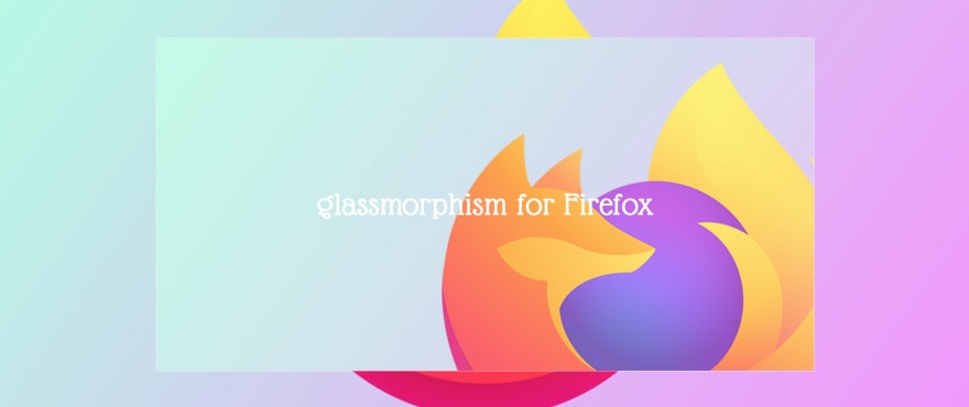
A screenshot of the CodePen by the author (click this link for a demo)
This is it! The same code produces exactly the same look for all modern browsers, including those supporting neither backdrop-filter nor -moz-element().
3.6 Limitations
As this approach relies on background: inherit, it cannot be used if the background graphics is set with other means than the background CSS property. One such example is the background created with the <canvas> element. Another is an embedded Google Maps (with the use of Google Maps JavaScript API). In these cases, we need to use the -moz-element() approach described in Section 2 above.
Also, it relies on filter: blur(). For those legacy browsers not supporting the filter CSS property (e.g., IE), we need a fallback UI as described in Section 1.5 above.
4. Other filter effects
All the methods described in this article can also be applied for other graphic effects than glassmorphism, as long as the filter CSS property can achieve such effects. For example, De Oliveira (2015) produces a back-and-white, blurred version of the background:
A non-glassmorphic example of the -moz-element() technique (image source: De Oliveira 2015)
Thank you for reading this far. Hopefully, this article will help you implement glassmorphism (and other similar visual effects) in a cross-browser compatible way.
References
Can I Use (2021a) “Browser Usage Table”, Can I Use?, Nov 21, 2021 (last accessed).
Can I Use (2021b) “CSS Backdrop Filter”, Can I Use?, Nov 25, 2021 (last accessed).
Can I Use (2021c) “CSS element() function”, Can I Use?, Nov 25, 2021 (last accessed).
Can I Use (2021d) “CSS background-attachment”, Can I Use?, Dec 2, 2021 (last accessed).
Day, Joe (2018) “DIY: A Web Version of the Fluent Design System’s Acrylic Material”, Microsoft Design, Jun 16, 2018.
De Oliveira, Vincent (2015) “CSS element() function”, iamvdo.me, Aug 2015.
Ellis, Jack (2020) “Glassmorph JS Calculator”, CodePen, Dec 14, 2020.
Feed-the-Cats (n.d.) “CSS Firefox Glassmorphism”, CodeSandbox, undated.
Francis, George (2021) “Generative macOS Big Sur Waves [SVG]”, CodePen, Mar 12, 2021.
Graham, Geoff (2020) “Backdrop Filter effect with CSS”, CSS-Tricks, Jul 16, 2020.
Hazeez, Habdul (2021) “7 Practical Uses for the ::before and ::after Pseudo-Elements in CSS”, CSS-Tricks, Sep 21, 2021.
Karkovack, Eric (2021) “8 Stunning Examples of CSS Glassmorphism Effects”, Speckyboy, Apr 26, 2021.
Keith, Jeremy (n.d.) Resilient Web Design, resilientwebdesign.com.
Malewicz, Michal (2020) “Glassmorphism in User Interfaces”, UX Collective, Nov 23, 2020.
MDN Contributors (2021a) “@supports”, MDN Web Docs, Sep 9, 2021 (last updated).
MDN Contributors (2021b) “Canvas tutorial”, MDN Web Docs, Sep 15, 2021 (last updated).
Mozilla (2021) “Remain calm. The fox is still in the Firefox logo”, dist://ed, Feb 26, 2021.
shramee (2017) “There are two ways to do this...”, StackOverflow, Jun 18, 2017.
Simmons, Jen (2016) “Using Feature Queries in CSS”, moz://a HACKS, Aug 17, 2016.
Tahir, Usama (2018) “Frosted Glass Effect - Form”, CodePen, Apr 13, 2018 (last updated).
Travis, Bear (2014) “Frosting Glass with CSS Filters”, CSS-Tricks, Apr 7, 2014.
Tudor, Anna (2021) “Icon Glassmorphism Effect in CSS”, CSS-Tricks, Nov 8, 2021.
Walicki, Albert (2020a) “Glassmorphism - how to create in pure CSS”, albertwalicki.com, Nov 24, 2020.
Walicki, Albert (2020b) “Glassmorphism”, CodePen, Nov 24, 2020.
Walson, Philip (2013) “What No One Told You About Z-Index”, philipwalton.com, Jan 15, 2013.
Wetton, Kyle (2019) "CSS - Frosted Glass", CodePen, Sep 17, 2019.
This content originally appeared on DEV Community and was authored by Masa Kudamatsu
Masa Kudamatsu | Sciencx (2021-12-03T06:50:16+00:00) Glassmorphism for Firefox. Retrieved from https://www.scien.cx/2021/12/03/glassmorphism-for-firefox/
Please log in to upload a file.
There are no updates yet.
Click the Upload button above to add an update.

