
This content originally appeared on Stefan Judis Web Development and was authored by Stefan Judis
A long time ago in 2014, the dialog element landed in Chromium 37. The idea behind the HTML element was to make it easier to build modals, dialogs and popups.
The specification defines the element as follows:
The dialog element represents a part of an application that a user interacts with to perform a task, for example a dialog box, inspector, or window.
We have 2022 now and almost made it to be able to use the dialog element! 🎉 In March, starting with Safari 15.4 (Safari release notes) and Firefox 98 (Firefox release notes), both missing browsers ship the element that's in Chromium for ages.
This progress brings us to a cross-browser-supported dialog element in all evergreen browsers soon!
Firefox and Safari shipping the element is excellent for accessibility because building an accessible modal has always been complicated. Read Scott O'Hara's article "Having an open dialog" if you want to learn more about modal accessibility.
I played with this new way to build dialogs and discovered that the HTMLDialogElement not only differentiates between non-modal and modal dialogs but also comes with modal functionality that's hard to get right.
Let's have a look at the dialog's super powers!
To get started, drop the element into your pages and find out that ...
[Interactive component: visit the article to see it...]
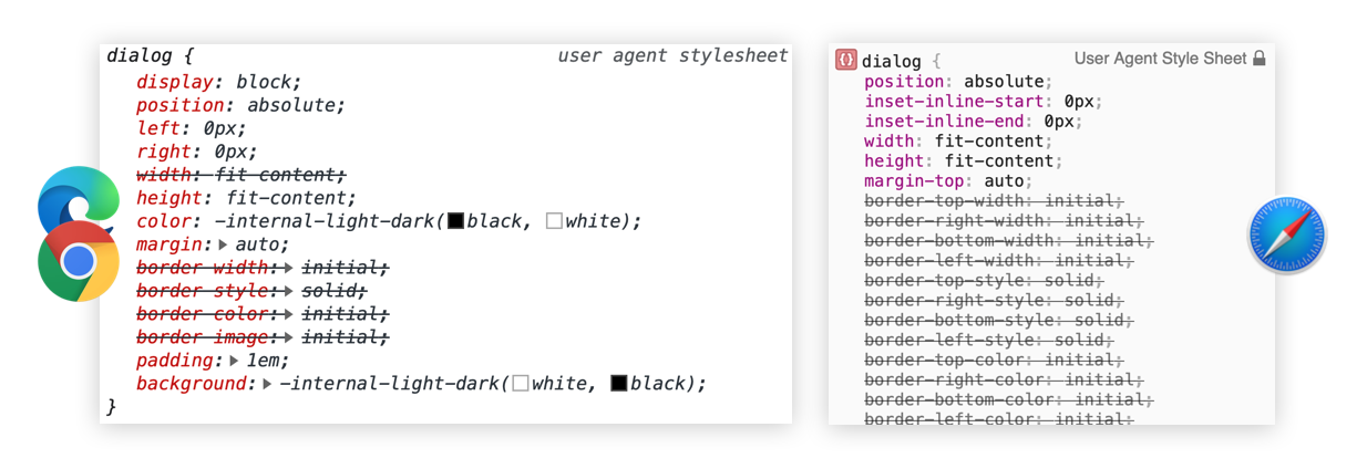
... you won't see anything. The supporting browsers include the following CSS in their user agent styles.
dialog:not([open]) {
  display: none;
}
The dialog element is hidden by default, and its visibility relies on a present open attribute. Let's add it to the HTML!
[Interactive component: visit the article to see it...]
And here we have it – a visible dialog element!
Usually, you would open dialogs via JavaScript, but if you server render pages after a form submit, defining it in HTML might make sense to show a modal after the page has loaded.
You could now tinker with the open attribute via JavaScript to show the dialog, but hold on! The element provides two additional methods for dynamic interactions.
To show a dialog as a non-modal, access the dialog element from the DOM and call its show method.
const dialog = document.querySelector('dialog');
dialog.show();

// to close the dialog use `close`
dialog.close();
See it in action below.
[Interactive component: visit the article to see it...]
Even though this functionality looks like a simple element display toggle, more things are going on. 🎉
The show method adds the open attribute to the dialog element, the element is absolute positioned following the user agent styles and the closing button is automatically focused.
You don't see mouse-triggered focus state on my site, because it uses :focus-visible. If you want to see the focus outlines, focus and press the "Open dialog" button with your keyboard.
But browsers are not only moving the focus into the modal when you open it. The focus will be moved back to the previously focused element if you close the modal with dialog.close(), too. That's pretty handy and very valuable for accessibility and keyboard usability.
Check the spec if you want to learn more about the dialog's focusing logic. But be warned: this part of the specification is not easy to grasp, and there are also discussions happening to change the described focus behavior.
These features are valuable to build non-modal popups, but what about the traditional full-page-covering modals? How do you create the modal page overlay, and how could you prevent users from clicking buttons or links outside of the open dialog?
showModal provides all these functionalities!
To create a modal dialog covering all the other page content, use the showModal method.
const dialog = document.querySelector('dialog');
dialog.showModal();

// to close the dialog use `close`
dialog.close();
See it in action by clicking the button below.
[Interactive component: visit the article to see it...]
The showModal method differs in multiple ways from show.
The modal dialog is position: fixed
If you inspect the modal, you'll see that Safari and Chromiums provide the styling via dialog:-internal-modal or dialog:-internal-modal-dialog.
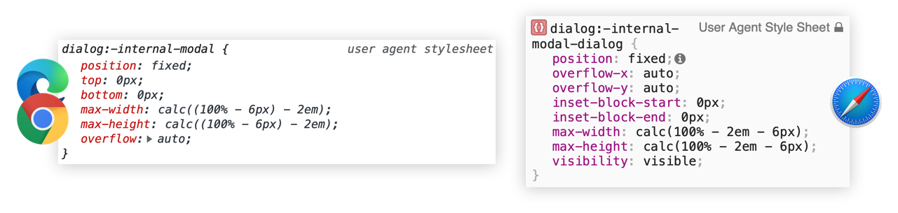
The dialog element is now fixed positioned and covers whatever was rendered on the screen.
The modal dialog provides a ::backdrop
Additionally, the dialog element comes with a ::backdrop overlay pseudo element when it's opened via showModal.
/* Included in the Chrome user agent styles */
dialog::backdrop {
  position: fixed;
  top: 0px;
  right: 0px;
  bottom: 0px;
  left: 0px;
  background: rgba(0, 0, 0, 0.1);
}
Unfortunately, neither Chromium nor Safari is showing the ::backdrop pseudo-element in the elements panel yet.
But there's more!
The modal dialog can be closed via ESC
Nothing more to say other than there's no need for adding keypress event handlers all over the place. 🎉 If the dialog is closed by pressing ESC a cancel event is triggered.
The modal dialog makes everything else inaccessible
If you open a modal dialog you can't click other elements anymore and that's not only becaues the backdrop covers them. If you hit the TAB key, you'll also find out that all the other interactive elements are inaccessible.
It's only the open dialog element you can interact with!
The inert element theoretically provides ways to make elements inaccessible, but there doesn't seem to be any browser movement to implement this attribute anytime soon.
I love seeing more typical UI use cases entering the web platform. And the dialog element is more than welcome because building accessible modals is so much more than toggling the display CSS property. The more functionality browsers provide the better for everyone.
The dialog element is also included in the Interop 2022 initiative, in which browser vendors work together to make building for the web easier for developers.
It's refreshing to see all the browser movement lately. I can't wait to see what's next!
Further reading
Here's are more resources if you want to learn more about the dialog element.
Reply to Stefan
This content originally appeared on Stefan Judis Web Development and was authored by Stefan Judis
Stefan Judis | Sciencx (2022-03-07T23:00:00+00:00) A look at the dialog element’s super powers (#blogPost). Retrieved from https://www.scien.cx/2022/03/07/a-look-at-the-dialog-elements-super-powers-blogpost/
Please log in to upload a file.
There are no updates yet.
Click the Upload button above to add an update.