This content originally appeared on DEV Community and was authored by Lucius Emmanuel Emmaccen
Hello 👋 , in this article we're going to learn how to build a simple, yet professional portfolio using pure HTML and CSS.
There are a million and one reasons to have a personal portfolio website, from helping you have a gallery of your work/projects online, to, improving your chances of getting a job etc. The fact is, not everyone needs to have one and I recently wrote an article explaining in detail what a portfolio is, why you might want to have one and it's importance in the world today.
What We'll Build 💪
- Contact Section (Serving as the Nav && Footer)
- About Section
- Work/Portfolio
It might be important to note that, this tutorial is beginner-friendly, you don't need to have a "god-mode" knowledge of HTML or CSS. We'll walk through the entire code together along with suggestions on how to improve them later because we'll be keeping things super simple and summarized.
File Structure 📂
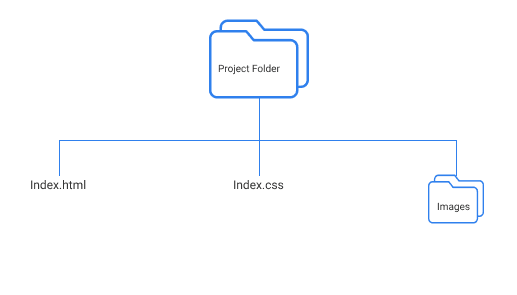
To follow along with this tutorial, you'll need a file structure such as this:
Warm-Up
Looking at the UI Design and having an overview of where we're going with code and how the finished website will look like, we can begin to mark out some key points such as colours, sections, styles etc.
Because of this, we'll start by creating some global styles following the DRY (don't repeat yourself) principle. Also, for this tutorial, we'll be interchanging between Grid and Flexbox. I promised to make this tutorial simple so, we won't be writing/coding anything complicated.
If you find something you don't understand in this article, that's fine, you can always Google or learn them later. Don't let anything stop you, you're already awesome 👍.
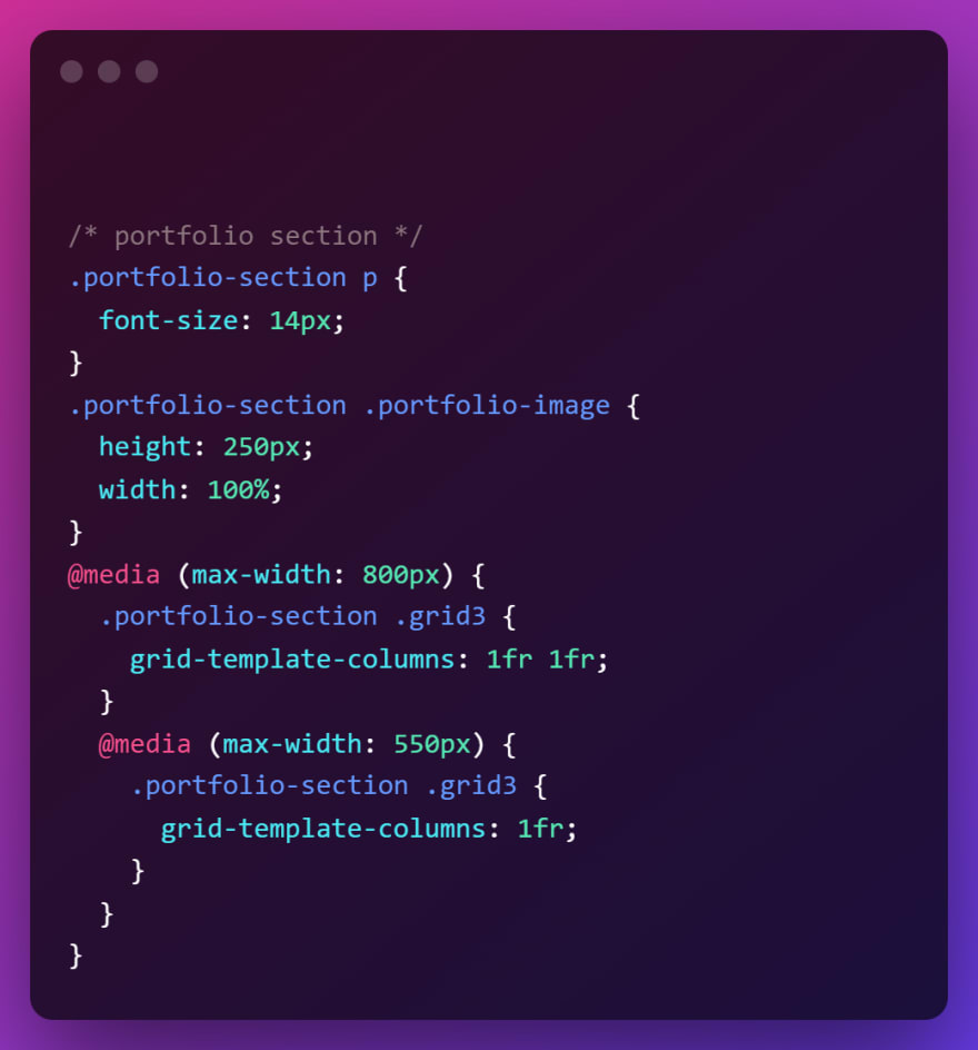
I've decided to paste the code snippets in PNG formats. This is just me trying to compel/encourage you to code it out by hand because it helps with understanding and well as retention.
If you don't want to go through the process of typing it out, head over to the end of the page and visit the GitHub link, you can download the entire project from there 🧑💻.
With that out of the way, we're ready to start coding.
Index.html
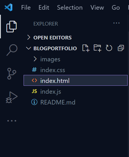
Your file structure should look something like this 👇
Please, ignore the index.js and README.md files. We won't be needing them for this tutorial. I'm using VS code by the way, you can use any code editor you want.
In your index.html file, create a basic HTML template. You can generate this by typing ! followed by the TAB key. See image for reference 👇
After you've done that, you should have something like this 👇
Few things to note from the image above.
- I've included a google font (we'll use this as our font but, feel free to use any font you want)
- I've linked the
index.cssfile so we can use it in ourindex.html.
For everything else, you can put anything you like. e.g the <title> or <meta> tags
Now, run the application and make sure it works as expected. I'm using Live server, a VS Code extension that provides real-time updates of your changes (You don't have to use it though).
To verify that our CSS file have been linked correctly.
In your CSS file, paste: body {background-color: #333;}
Now run the app, you should see a dark background.
If that is not the case, try to verify you don't have a typo when linking your file, either way, I'm sure you'll figure it out 😎!.
Moving forward.
For the files/assets (icons, images) we'll be using in this tutorial, Checkout the GitHub repo, you can download them from there, otherwise you can use Font Awesome, Flat Icon or any icon library of your choice.
CSS Globals and Setup ⚙️
We'll create some global styles/variables and some basic setups, these are properties I know for sure we'll be using more than once in this tutorial and you don't have to know it all at first, just create a global when you notice you're re-writing the same thing more than once.
You might have to click on the image if it appears to be blurry, stretched or unreadable
We'll be coding 3-sections for this portfolio and now that we have all the basic setup ready, let's get coding.
Contact Section (Also the Nav and Footer)
- HTML
- CSS
- Visual 🔎
If you didn't miss anything out, you should have this:
You can take some time to understand the HTML structure and how the styles apply. Also, as you move forward with the code, you'll soon come to realize that we're mostly just reusing the CSS we've written in globals earlier (Section: CSS Globals and Setup).
About Section
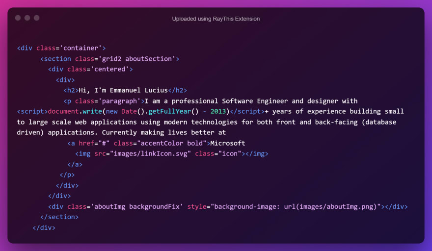
- HTML
Now, if you're wondering what <script>document.write(new Date().getFullYear() - 2013)</script> does. It's javaScript and it's here so we won't have to calculate the years of experience by updating the portfolio/code manually. So if 2012, 2018, or 2020 is the year you started coding? Just replace 2013 in the code with yours.
Though the year you started coding might not exactly pass as experience but... you get the point 🍵
- CSS
- Visuals 🔎
If you don't see something similar to the visual 👆 image above, make sure all your HTML Tags are closed correctly. Do some error checks on your syntax, I'm sure you'll fix it.
Experience Section
- HTML
From the snippet above, the duplicateThisDiv class is purely for reference, we won't be styling using that class name. Just duplicate the <div> by as much experience you have.
- CSS
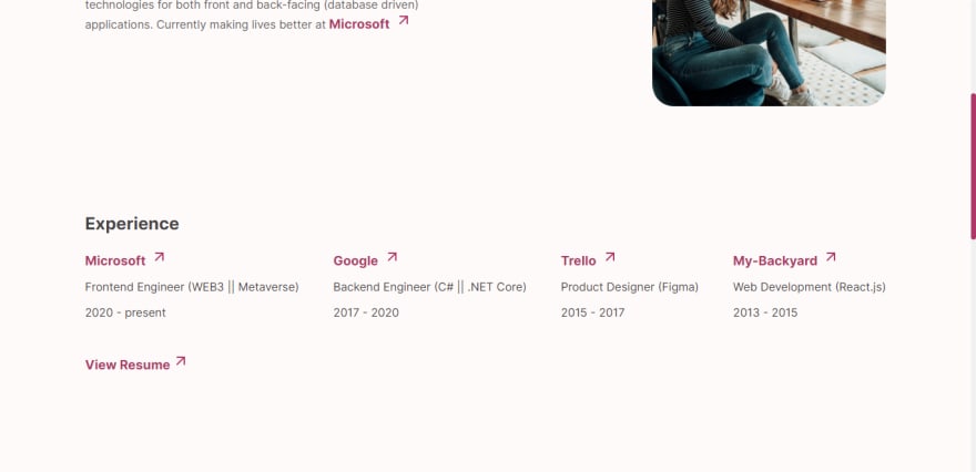
- Visuals 🔎
Portfolio Section
- HTML
There's a duplicateThisTag class in the snippet above. You already know what to do 👍
- CSS
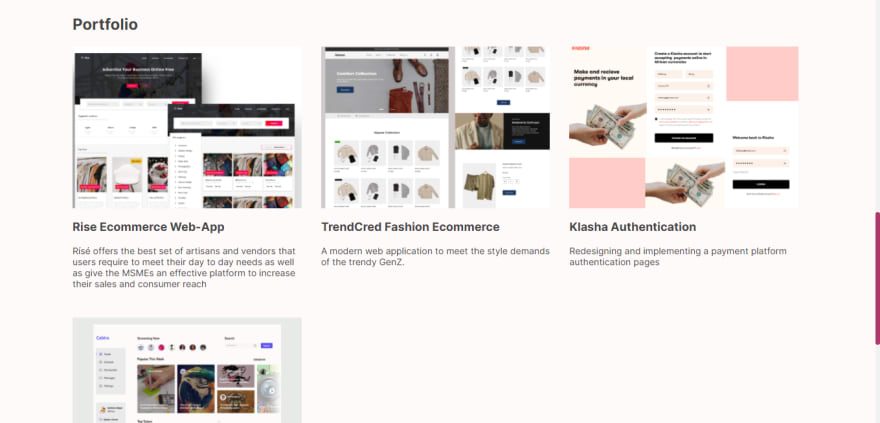
- Visuals 🔎
Lastly
- The Footer
This is just a replica of the Contact section, so just copy/paste it and use it as your footer. Don't forget to replace the <nav> tag with a footer tag in this case.
Full Design 🎨🖌️
My Thoughts 🤔 💭
I've seen people get better opportunities because they have an online portfolio, including myself (and you don't have to own the greatest portfolio on the planet). If you already have solid years of experience, you might not necessarily need one, however, having one has no disadvantage irrespective of your level in the tech world (I understand that you might have a different opinion).
You can look up some reasons why you should consider having one if you're still unsure about the importance of it.
Pro Tips 💡
- Check out AOS to add some life to your website.
- Keep an eye out if you want to learn how to host your website online (I'll be posting in a few days)
For design inspiration (To spark your creativity) look up:
1 Behance
2 Dribbble
3 Awwwards
4 Web Design Inspiration
5 Frontend Mentor etc.
- Use Compress Now to compress your images (save some file space)
- Google fonts For fonts
- GitHub repo for this tutorial
- Live Website
- Website UI Design by Damilare
- Cover Design by me ❣️
Conclusion ✅
It's been great having you read up to this point. I post simple tutorials like this, so don't forget to follow me to get more content.
Do play with the comment/discussion area, like and bookmark this blog if you love it or share with others.
Thank you! 🙏
Socials
Interesting reads 📚
- How to create a Glassmorphic template in pure HTML and CSS
- How to know if an element is visible in viewport
- Integrate a rich text editor in your React.js project
This content originally appeared on DEV Community and was authored by Lucius Emmanuel Emmaccen
Lucius Emmanuel Emmaccen | Sciencx (2022-03-23T08:27:57+00:00) Build Your Professional Portfolio Website In 2 Hours Using HTML & CSS.. Retrieved from https://www.scien.cx/2022/03/23/build-your-professional-portfolio-website-in-2-hours-using-html-css/
Please log in to upload a file.
There are no updates yet.
Click the Upload button above to add an update.

