This content originally appeared on DEV Community and was authored by Stanley Lim
The attack, possible enhancements to the attack, and any attached source code are to be used for educational purposes only. By no means use them for illegal activities such as phishing. You are responsible for your own actions.
Restating the disclaimer mentioned in mr.d0x's repository: Usage of these templates for attacking targets without prior consent is illegal. It's the end user's responsibility to obey all applicable laws. The developer is not responsible for any misuse of these templates.
“Beware the Ides of March”, they say; and we should for good reason.
On March 15th, a security researcher by the name of mr.d0x published an article a nearly undetectable phishing attack that most users would quickly overlook as a legitimate sign-in dialog. This form of phishing, coined as the Browser in the Browser attack, presents a large complication to the web’s growing reliance on SSO and OAuth dialogs to authorize and authenticate users to online services like social media, cloud storage, and other platforms that may store sensitive user information. Common examples of this we see today are signing into other services with our Google Account, Microsoft Account, etc. which we would automatically trust due to reputation.
This attack takes advantage of the trust users built with these sign-in processes to steal credentials by replicating a fake OAuth modal using plain old HTML, CSS and JS.
Origins
While this attack is making headlines today, it is a variation of something that has existed since the late 2000s. Back around when Windows XP still had over 80% market share and Internet Explorer was the most used browser in the world, fake online antivirus scanners started to pop up at every corner of the internet. Since Windows wasn’t known for its stellar security features, selling fake and harmful malware disguised as antiviruses was a very lucrative business, with 3 companies racking up a total of $130 million during their existence.
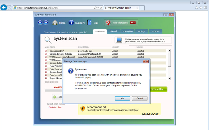
The goal of these fake antivirus scanners was to scare users into purchasing their “antivirus” since their machine was magically infected one day. These phishing sites flooded your screens with Windows XP or 7 looking windows consisting of flashing red text, a large list of viruses, and giant call-to-actions coercing you to register the product to save your computer from certain destruction. For Windows XP, you would see something like this.
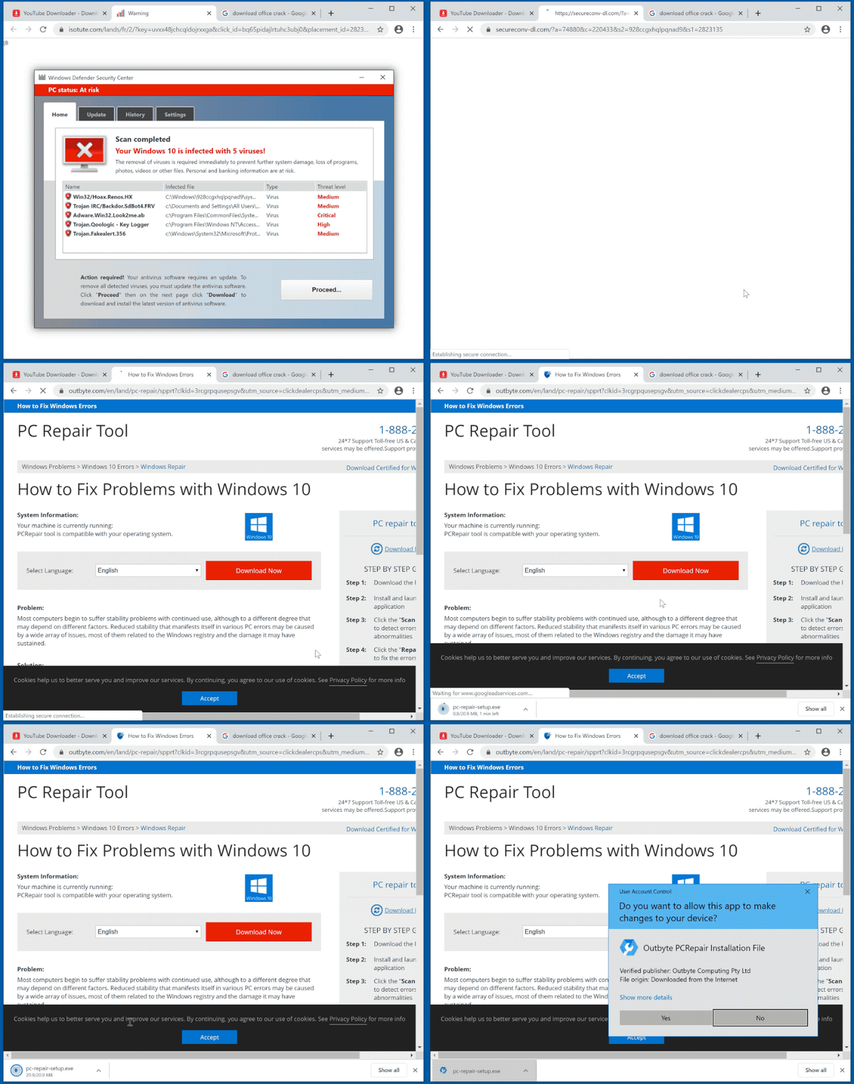
Eventually, attackers became more sophisticated and started emulating window dialogs from your operating system which made it more believable that this was an official product.
A panicked user would obediently follow the prompts to download the scareware which launches the fake antivirus with a “trial” period. After that period ends, it will degrade the performance of the host machine or flood it with more malware to convince the user to purchase an official license to remove all the adware, spyware, and other crap it put on your machine. Once the victim purchases the software, the attacker now has your name, billing address, and credit card information to perform whatever transaction it wants.
Fake antiviruses are a whole other topic that I can dive deep into, but the part of this whole phishing exercise that is still very effective and is presented in mr.d0x’s blog post is the usage of a fake window inside of a webpage.
The Attack
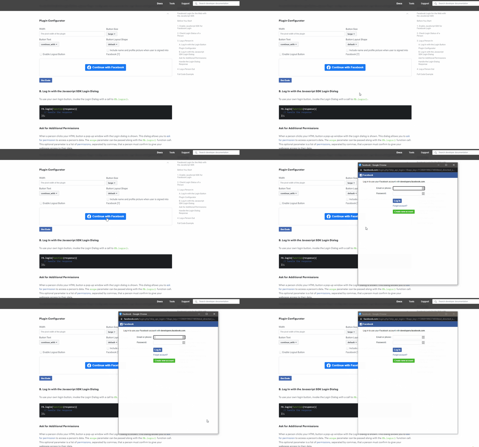
mr.d0x’s proof of concept is an evolution from what we saw with the fake antivirus scan windows. Instead of displaying a scanning page with system-related details, this proof of concept phishes uses a malicious OAuth dialog akin to signing up for an online service using a third-party account. If this doesn’t sound familiar to you, then the GIF below may be more familiar.
Sample OAuth dialog from Facebook’s JavaScript SDK.
The first portion of this attack requires the victim to visit a compromised domain where the attacker set up the trap. This can either be done using IDN Homographs or DNS poisoning/spoofing. This portion of the attack is probably the harder part to implement and convince users to visit the site for reasons explained below. The most convincing approach is to use DNS poisoning, but that in itself is harder to set up.
Assuming that the attacker successfully lures the victims into the phishing site, by cleverly designing the page to look as legitimate as possible to an existing sign-in page today, the attacker should be able to convince users to sign in via some third party service. Once the user clicks the ‘Sign In’ or ‘Sign Up’ option, they will be presented with a fake popup window that loads the attacker’s fake login page. Once the user enters their credentials, the user has been completely compromised.
The Code
The demo mr.d0x created provides templates for creating fake popup windows for several popular operating systems and their variants. Each folder for each OS has these files:
├───Windows-Chrome-LightMode
│       index.html
│       logo.svg
│       script.js
│       ssl.svg
│       style.css
-
index.htmlis just a test page that contains the<iframe>. -
logo.svgis the favicon used by the fake window. -
script.jscontains the logic for dragging the window, animating the buttons, etc. -
ssl.svgis the lock icon you would see in the address bar of the popup window. -
style.csscontains styles used on the page.
The code for the window is quite simple and setup instructions can be found in the README. It should work like what is shown in the GIF below.
A gif from mr.d0x’s BITB repo demonstrating how it works.
Enhancements in the Fork
After seeing the templates provided in the repository, I decided to play around with it to make things more convincing and created a fork here. Currently, the templates are very well designed for each OS which makes it look seamless, however, some interactions with the popup can lead more experienced users to easily tell that this is fake.
Out of curiosity, I wanted to see what other changes we can do to make this more believable. To keep things simple, I mainly focused on enhancing the Windows dark theme in a directory called Windows-Chrome.
I first changed the title and address bars to correspond to a login that existed, such as the Google sign-in page. I then fixed up some of the styling involving the fonts, alignment of text elements, and the overflow of the address bar so the text doesn’t look cut off.
To make the window loading more realistic, I added some random delay when displaying the page and an opacity transition when showing and hiding the window.
The next thing I did was made the window itself resizable. The user should be able to drag the window in all directions just like a real one would. This came with some challenges that were solved with some clever CSS trickery during dragging and not dragging.
The final step was creating a sample phishing page with the SSO sign-in button and creating a modified version of the Google login page that looks similar to what we see today. The only thing I added was a new password field (which is shown when we hit next but that was pretty hard to replicate) and a custom function for when the user hits enter/clicks next. For any seasoned user, they would be able to tell that Google no longer places a password field under the email field in the latest version of the sign-in dialog.
For the phishing page that launches the fake OAuth dialog, we can make things more convincing by setting the href to a real-looking Google sign-in URL and having an onclick function that returns false. By doing so, the browser will ignore the href and run your JavaScript function instead.
<a
    href="https://accounts.google.com/o/oauth2/auth/identifier?response_type=code&client_id=1083004"
    onclick="return loadWindow()"
    class="clickme u-flex text-gray-800 font-normal"
    id="clickme"
>
    <div class="icon">
        <img class="icon-svg" src="https://upload.wikimedia.org/wikipedia/commons/5/53/Google_%22G%22_Logo.svg" />
    </div>
    <p class="btn-text m-0 u-flex u-items-center"><b>Sign in with Google</b></p>
</a>
function loadWindow() {
    setTimeout(() => {
        $('#window').toggleClass('visible');
        $('#content')[0].src = "phish.html";
    }, 100 + Math.floor(Math.random() * 500));
    return false;
}
After these changes, the final result looks like this:
Further Enhancements
What I mentioned prior is not an exhaustive list of enhancements that can be made to the existing phishing template. Some other things that could be added are switching between dark and light themes depending on whether the user has a light-colored or dark-colored operating system. It would still require some refactoring of the existing template to bundle multiple variants of the window there, but it can be done relatively easily.
@media (prefers-color-scheme: dark) {
  /* Dark theme styles go here */
}

@media (prefers-color-scheme: light) {
  /* Light theme styles go here */
}
Another enhancement would be to add window states to simulate when the window is in focus and out of focus.
Why this is effective
This attack wouldn’t be as effective on observant users who are well aware of similar attacks such as this. However, where this phishing attack shines is how it can mimic a legitimate environment so closely that most users wouldn’t think twice about entering their credentials. To the average user, seeing a lock and a trusted domain in the “address bar” is enough verification to trust the login page they are currently seeing.
Browsers won’t be able to effectively tag which popup iframes are malicious and which aren’t making it very difficult to solve. The HTML structure of the page would not be too different from another website that uses iframes and browsers would have to scan for different variations of class names to identify if the page is displaying a fake popup window or not. Therefore from a web browser standup, not much can be done.
One project that aims to tackle this by alerting every iframe (including legitimate content) is odacavo/enhanced-iframe-protection. It’s a good first step towards addressing this issue but proves to be very cumbersome as you would need to allow-list all frames yourself.
Why it is not effective
The major reason why this attack does not work is that it relies on the user landing on a phishing domain, to begin with. Browsers today are baked in with multiple measures to let users know whether a website is a phishing site or not such as:
- Displaying phishing warnings for suspected phishing sites.
- Highlighting the domain in the address bar.
These measures generally help users to be more cognizant of possible attacks, but not all will pay attention to these warnings.
Assuming that the victim is not aware of the phishing page, the next stage of the attack still has plenty of holes that the user can poke to realize that they are being duped. For starters, some of the possible criticisms addressed with my enhanced fork include:
- Missing window behavior such as resizing.
- Weird clipping of the address in the address bar on the right side.
- Instant load of the window (added fake delays).
Even with the enhancements, there are still lots of holes in the phishing attack. The first glaring issue is figuring out how to handle the window frames of all operating systems in existence? Sure, we can use the Windows and Mac OS window design to fool most users, but even these common operating systems also come with different variants and shades. Designing a bunch of Windows to match all these variations is a huge waste of time. Not to mention all the different combinations that come with different Linux distros. I mean, seeing a Windows border frame on Mac OS is just sloppy and embarrassing.
The second issue is that the fake OAuth dialog window cannot be moved outside the browser. You’ll notice that attempting to drag it outside the browser would just cause it to get stuck at the edge of the page. Minimizing the browser would also hide the window with it. There is no trace of it in your taskbar and it won’t be shown on Task View for Windows or Mission Control on Mac OS.
The third big issue is that if you use a password manager (which you should be using, offline or not), your password manager will not fill out the login information because you’re not on a website your password manager trusts. This should be a very clear indication that something is not right and you should migrate away from the page immediately.
Mitigations
To counter this phishing attack, below are a few things you can do:
- Check the popup window and compare it to your OS’s window controls. If it looks different, then you are being phished.
- Try moving the fake popup window outside the browser, checking to see if it shows up as a window in your taskbar, maximize, minimize, etc. If it does not work as expected, then it is a phishing attack.
- If your password manager does not autofill the details, then you are on a phishing site.
- Setup 2FA/MFA on your online services to add extra protection from any compromised credentials.
- Install NoScript. An extreme way to mitigate this issue, but it will 100% work.
- Spoof your user agent. Any possible user-agent detection by the phishing site to show the correct window won’t work correctly.
Conclusion
The new, or old I should say, browser in the browser (BitB) attack may be making a comeback for the 2020s — this time in the form of fraudulent OAuth popups. Although this method of phishing is extremely convincing to most, modern browsers offer a large amount of protection against phishing sites already which stops users before they even land on the phishing site. A plethora of issues already makes this attack less effective than it could’ve been. Its lethality, however, comes from browsers failing to block the phishing site. The sign-in dialog’s appearance gives most users a false sense of security leading the user to input their credentials.
It’s possible that in the future more of the things we are used to on the web, such as accepting cookies on sites, may also be weaponized against us by attackers.
References
- https://mrd0x.com/browser-in-the-browser-phishing-attack/
- https://blog.malwarebytes.com/cybercrime/2017/03/drafta-multi-purpose-fake-online-scanner/
- https://github.com/Spiderpig86/BITB
Thanks for reading!
💎 Thank you for taking the time to check out this post. For more content like this, head over to my actual blog. Feel free to reach out to me on LinkedIn and follow me on Github.
This content originally appeared on DEV Community and was authored by Stanley Lim
Stanley Lim | Sciencx (2022-03-30T16:33:28+00:00) The Browser in the Browser (BITB) Attack: Lies, Deceit, and CSS. Retrieved from https://www.scien.cx/2022/03/30/the-browser-in-the-browser-bitb-attack-lies-deceit-and-css/
Please log in to upload a file.
There are no updates yet.
Click the Upload button above to add an update.


