This content originally appeared on Updates and was authored by Surma
Animating a Blur
Blurring is a great way to redirect a user's focus. Making some visual elements appear blurred while keeping other elements in focus naturally directs the user's focus. Users ignore the blurred content and instead focus on the content they can read. One example would be a list of icons that display details about the individual items when hovered over. During that time, the remaining choices could be blurred to redirect the user to the newly displayed information.
TL;DR:
Animating a blur is not really an option as it is very slow. Instead, pre-compute a series of increasingly blurred versions and cross-fade between them. My colleague Yi Gu wrote a library to take care of everything for you! Take a look at our demo.
However, this technique can be quite jarring when applied without any transitional period. Animating a blur — transitioning from unblurred to blurred — seems like a reasonable choice, but if you've ever tried doing this on the web, you probably found that the animations are anything but smooth, as this demo shows if you don't have a powerful machine. Can we do better?
Note: Always test your web apps on mobile devices. Desktop machines tend to have deceptively powerful GPUs.
The problem

As of now, we can't make animating a blur work efficiently. We can, however,
find a work-around that looks good enough, but is, technically speaking, not
an animated blur. To get started, let's first understand why the animated blur
is slow. To blur elements on the web, there are two techniques: The CSS filter
property and SVG filters. Thanks to increased support and ease of use, CSS
filters are typically used. Unfortunately, if you are required to support Internet
Explorer, you have no choice but to use SVG filters as IE 10 and 11 support
those but not CSS filters. The good news is that our workaround for animating a
blur works with both techniques. So let's try to find the bottleneck by looking
at DevTools.
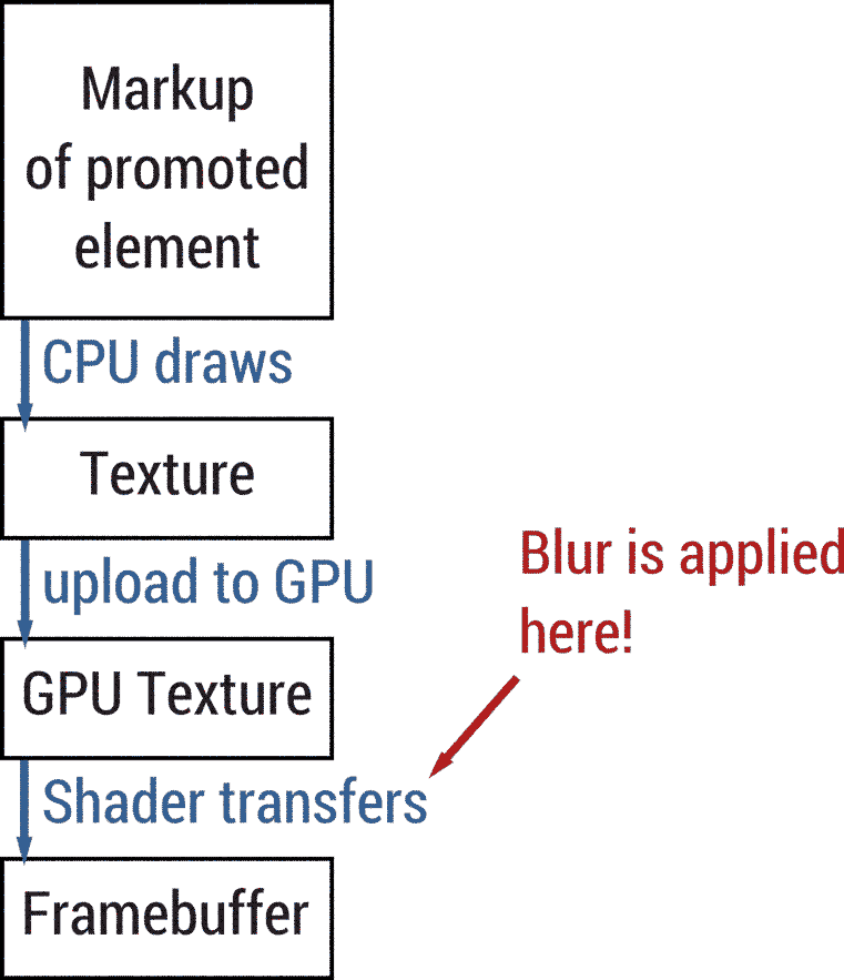
If you enable "Paint Flashing" in DevTools, you won’t see any flashes at all. It looks like no repaints are happening. And that's technically correct as a "repaint" refers to the CPU having to repaint the texture of a promoted element. Whenever an element is both promoted and blurred, the blur is applied by the GPU using a shader.
Both SVG filters and CSS filters use convolution filters) to apply a blur. Convolution filters are fairly expensive as for every output pixel a number of input pixels have to be considered. The bigger the image or the bigger the blur radius, the more costly the effect is.
And that's where the problem lies, we are running a rather expensive GPU operation every frame, blowing our frame budget of 16ms and therefore ending up well below 60fps.
Down the rabbit hole
So what can we do to make this run smoothly? We can use sleight of hand! Instead
of animating the actual blur value (the radius of the blur), we pre-compute a
couple of blurred copies where the blur value increases exponentially, then
cross-fade between them using opacity.
The cross-fade is a series of overlapping opacity fade-ins and fade-outs. If we have four blur stages for example, we fade out the first stage while fading in the second stage at the same time. Once the second stage reaches 100% opacity and the first one has reached 0%, we fade out the second stage while fading in the third stage. Once that is done, we finally fade out the third stage and fade in the fourth and final version. In this scenario, each stage would take ¼ of the total desired duration. Visually, this looks very similar to a real, animated blur.
In our experiments, increasing the blur radius exponentially per stage yielded
the best visual results. Example: If we have four blur stages, we'd apply
filter: blur(2^n) to each stage, i.e. stage 0: 1px, stage 1: 2px, stage 2: 4px
and stage 3: 8px. If we force each of these blurred copies onto their own layer
(called "promoting") using will-change: transform, changing opacity on these
elements should be super-duper fast. In theory, this would allow us to
front-load the expensive work of blurring. Turns out, the logic is flawed. If
you run this
demo,
you'll see that framerate is still below 60fps, and the blurring is actually
worse than before.

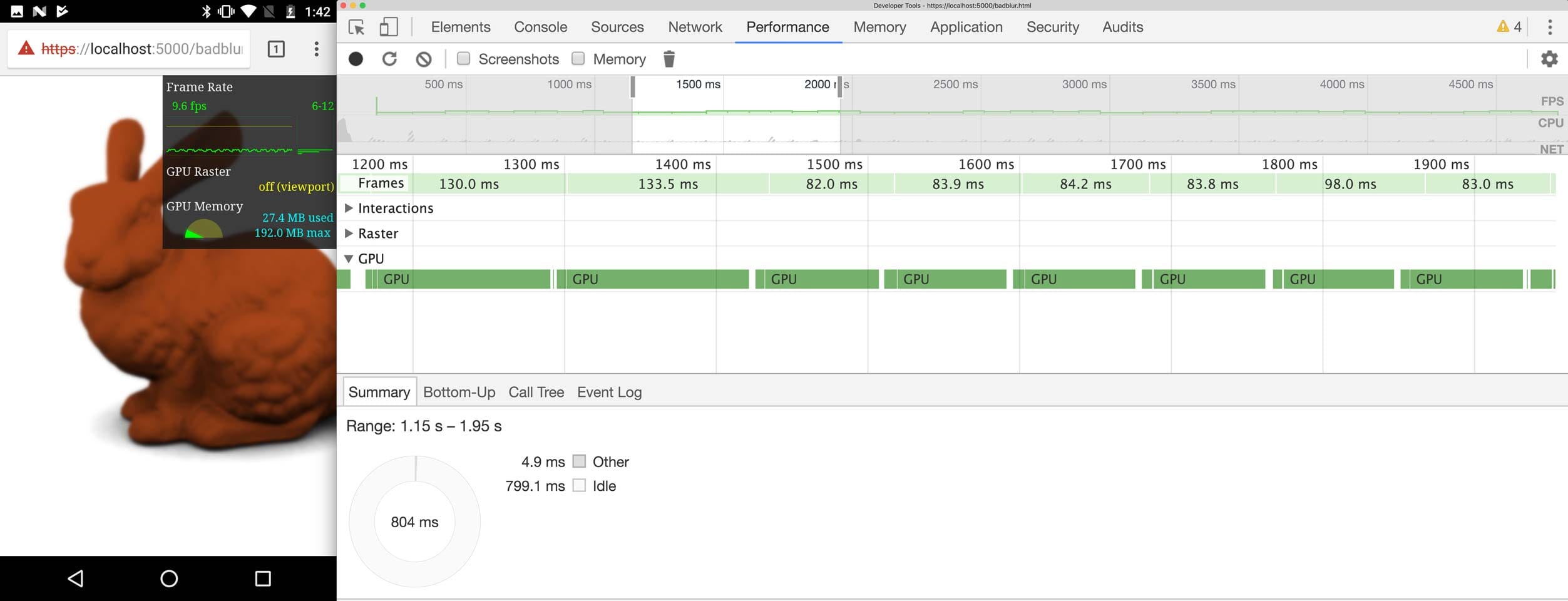
A quick look into DevTools reveals that the GPU is still extremely busy and stretches each frame to ~90ms. But why? We are not changing the blur value anymore, only the opacity, so what's happening? The problem lies, once again, in the nature of the blur effect: As explained before, if the element is both promoted and blurred, the effect is applied by the GPU. So even though we are not animating the blur value anymore, the texture itself is still unblurred and needs to be re-blurred every frame by the GPU. The reason for the frame rate being even worse than before stems from the fact that compared to the naïve implementation, the GPU actually has more work than before, as most of the time two textures are visible that need to be blurred independently.
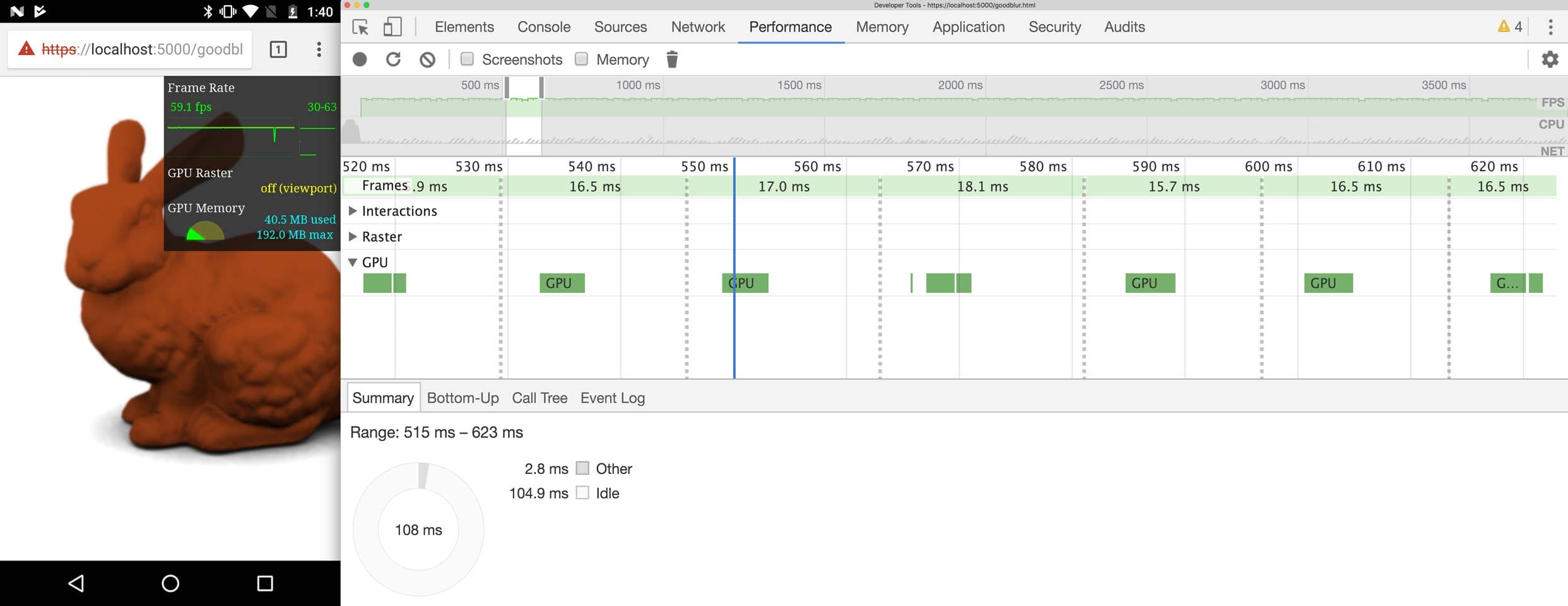
What we came up with is not pretty, but it makes the animation blazingly fast. We go back to not promoting the to-be-blurred element, but instead promote a parent wrapper. If an element is both blurred and promoted, the effect is applied by the GPU. This is what made our demo slow. If the element is blurred but not promoted, the blur is rasterized to the nearest parent texture instead. In our case that's the promoted parent wrapper element. The blurred image is now the texture of the parent element and can be re-used for all future frames. This only works because we know that the blurred elements are not animated and caching them is actually beneficial. Here's a demo that implements this technique. I wonder what the Moto G4 thinks of this approach? Spoiler alert: it thinks it's great:

Now we've got lots of headroom on the GPU and a silky-smooth 60fps. We did it!
Productionizing
In our demo, we duplicated a DOM structure multiple times to have copies of the content to blur at different strengths. You might be wondering how this would work in a production environment as that might have some unintended side-effects with the author's CSS styles or even their JavaScript. You are right. Enter Shadow DOM!
While most people think about Shadow
DOM as a way to attach "internal"
elements to their Custom
Elements, it is also an
isolation and performance primitive! JavaScript and CSS cannot pierce Shadow DOM
boundaries which allows us to duplicate content without interfering with the
developer's styles or application logic. We already have a <div> element for
each copy to rasterize onto and now use these <div>s as shadow hosts. We
create a ShadowRoot using attachShadow({mode: 'closed'}) and attach a copy of
the content to the ShadowRoot instead of the <div> itself. We have to make
sure to also copy all stylesheets into the ShadowRoot to guarantee that our
copies are styled the same way as the original.
Note: In most cases — especially when writing custom elements — we advise
against using closed ShadowRoots. Find out more in Eric's
article.
Some browsers do not support Shadow DOM v1, and for those, we fall back to just duplicating the content and hoping for the best that nothing breaks. We could use the Shadow DOM polyfill with ShadyCSS, but we did not implement this in our library.
And there you go. After our journey down Chrome's rendering pipeline, we figured out how we can animate blurs efficiently across browsers!
Conclusion
This kind of effect is not to be used lightly. Due to the fact that we copy DOM
elements and force them onto their own layer, we can push the limits of lower-end
devices. Copying all stylesheets into each ShadowRoot is a potential
performance risk as well, so you should decide whether you would rather adjust
your logic and styles to not be affected by copies in the LightDOM or use our
ShadowDOM technique. But sometimes our technique might be a worthwhile
investment. Take a look at the code in our GitHub
repository
as well as the
demo and
hit me up on Twitter if you have any questions!
This content originally appeared on Updates and was authored by Surma
Surma | Sciencx (2017-10-11T00:00:00+00:00) Animating a Blur. Retrieved from https://www.scien.cx/2017/10/11/animating-a-blur/
Please log in to upload a file.
There are no updates yet.
Click the Upload button above to add an update.
