This content originally appeared on Level Up Coding - Medium and was authored by George Argyrousis
Improve Accessibility with focus and focus-visible Outline Styling.

While browsing the web you have used your cursor countless times to interact with HTML elements. Keyboard users on the other hand, rely on tab-focus styling to discern intractable components enabling them to effectively navigate.
Designers and Developers are challenged by the creation of focus states that match their design guidelines, meet WCAG 2.1 criteria and behave consistently across browsers. Furthermore, outline: none; is not yet considered to be a problem of the past. Even with the accessibility awareness raised by regulatory agencies accross the globe.
Focus state requirements
In the pursuit of adding focus styles, inevitable issues will become prevalent. Each browser has a different interpretation of focus ring styling that needs to be programmatically unified.
Luckily, most focus state requirements have already been explicitly defined. Some implicit definitions will also be analysed. We can outline the following:
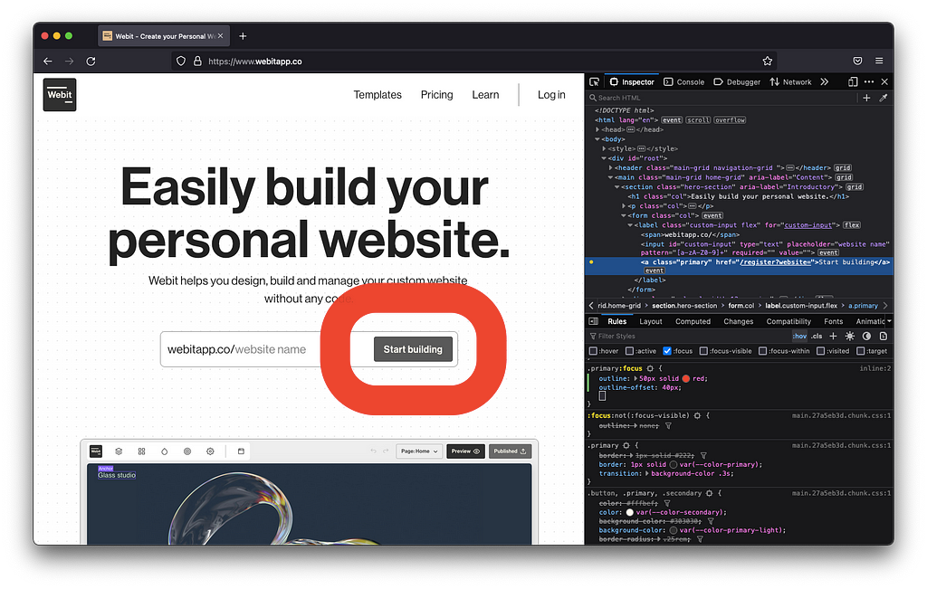
- Focus ring should be meeting a 3:1 contrast ratio between foreground and background content. A visually discerning outline should be drawn to the component having focus. If multiple color modes or themes (dark, light mode) are present, the outline should be adjusted accordingly.
- Custom components need to have focusable states similar to the HTML interactive elements such as inputs, buttons, anchors etc. In addition, custom components will need to be inserted correctly in the tab order using tabindex.
- Refrain from using the same hover interaction styling in focusable states. Cursor users, point to a location on the screen and therefore expect a subtle confirmation of interactivity. Whereas, keyboard users rely on bolder indications of focus.
Implementing focus styles
CSS has an explicit property called outline following the same shorthand convention as border. Unlike border, outline does not alter the box model of its element. As a consequence, the DOM (Document Object Model) structure will not be affected when the focused element is surrounded by the desired graphical outline.

According to our previous specifications we can create the following CSS declaration:
*:focus {
    outline: 0.125rem solid #000000;
    outline-offset: 0.125rem;
}
If we consider strict WCAG 2.1 requirements our aforementioned approach will suffice. However, the outline will persist when using the cursor to interact with inputs, disclosures and buttons (amongst other intractable elements).

In the CSS4 draft, we can find the :focus-visible pseudo class allowing the browser to automatically detect whether the input device is a mouse or keyboard. The default behaviour renders evident focus styles only when the keyboard is in use.
At the time of writing, browser support for :focus-visible needs to improve before we can completely replace :focus. Although, we can enable :focus-visible when the feature is supported. In combination with our previous *:focus declaration, we can add the following:
*:focus:not(:focus-visible) {
    /* Remove focus indication when a mouse is used */
    outline: none;
}
*:focus-visible {
outline: 0.125rem solid #000000;
outline-offset: 0.125rem;
}
Caveats towards different implementations
Focus indicators can also be crafted using border, background-color and box-shadow. Often box-shadow is utilised due to the perceived outline mimicking the border-radius whereas outline may not (depending on the browser used).
This approach should be avoided since it can be overridden depending on color specific modes. If shadow usage is essential, provide outlines with transparent color outline: 0.125rem solid transparent; acting as a fallback for said color modes.
Final thoughts
Focus indicator styling is perhaps the easiest accessibility change that can be implemented on a website, yielding tremendous value.
Please meet accessibility requirements and don’t remove outlines unless you are overriding them with a recommended alternative.
Further reading
- Indicating focus to improve accessibility
- A guide to designing accessible, WCAG-compliant focus indicators
- Never remove CSS outlines
- Tips for Focus Styles - Nic Chan
- Introduction to Focus | Web Fundamentals | Google Developers
If you found this post useful, please share it with others. Some claps 👏🏻 below help a lot!
By clapping, you help others discover this content and motivate the writing of more articles about accessibility, design, React and JavaScript!
Improve Accessibility with focus & focus-visible Outline Styling. was originally published in Level Up Coding on Medium, where people are continuing the conversation by highlighting and responding to this story.
This content originally appeared on Level Up Coding - Medium and was authored by George Argyrousis
George Argyrousis | Sciencx (2022-06-13T22:21:01+00:00) Improve Accessibility with focus & focus-visible Outline Styling.. Retrieved from https://www.scien.cx/2022/06/13/improve-accessibility-with-focus-focus-visible-outline-styling/
Please log in to upload a file.
There are no updates yet.
Click the Upload button above to add an update.
