
This content originally appeared on Level Up Coding - Medium and was authored by Nidhin kumar
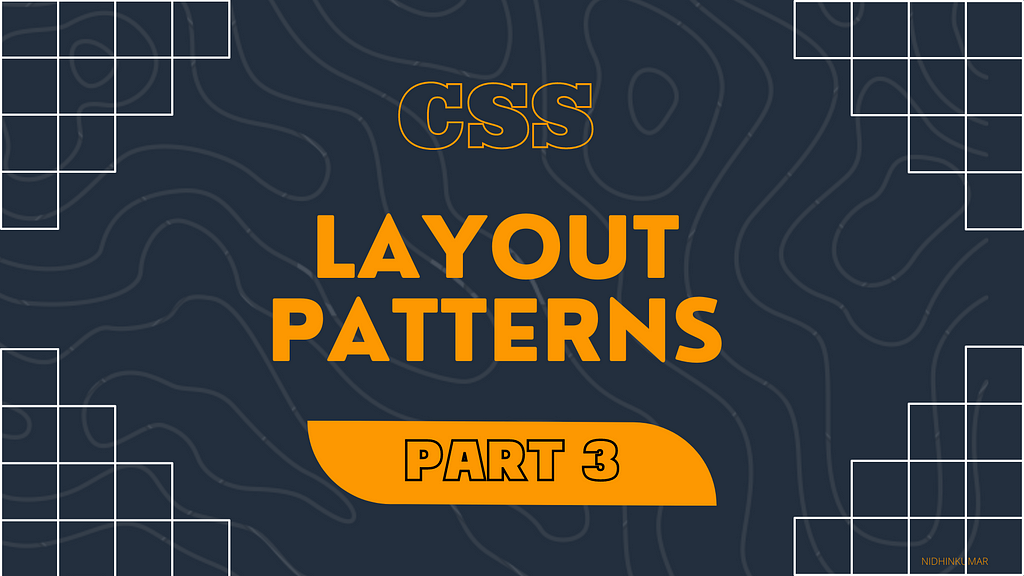
CSS — Layout Patterns #3
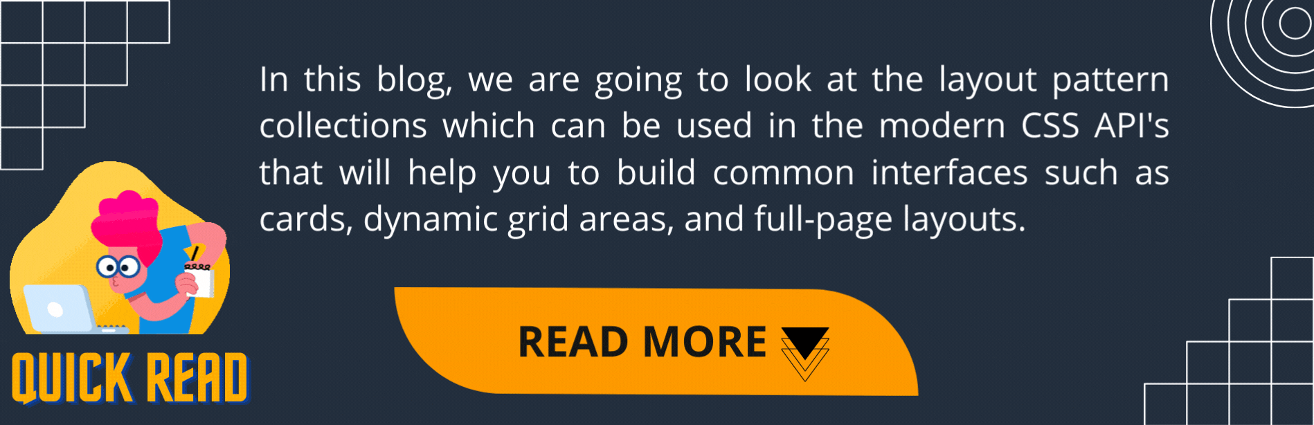
If you don’t have time to read but want to know what’s there in this post. Find the quick read 👇
On this Series
We are going to look at the commonly used CSS layout patterns. Most of the patterns which we are going to see use CSS grid and flexbox to achieve the common UI patterns such as cards, dynamic grid areas, and full-page layouts supported on all modern browsers.
The patterns which we are going to see in this series are
- Aspect ratio Image Card
- Clamping Card
- Deconstructed Pancake
- Holy grail layout
- Line up
- Pancake Stack
- RAM (Repeat, Auto, Minmax)
- Sidebar says something
- Super centered
- 12-span grid
If you are new to this series check out the Part 2👇
On this Post
In this post, we are going to see the following patterns that are
- Line up
- Pancake Stack
1. Line up
A layout where the sidebar is given a minimum and maximum safe area size, and the rest of the content fill the available space.
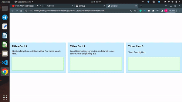
The main point demonstrated here is the use of justify-content: space-between, which places the first and last child elements at the edges of their bounding box, with the remaining space evenly distributed between the elements. For these cards, they are placed in a flexbox display mode, with the direction being set to the column using flex-direction: column.
This places the title, description, and image block in a vertical column inside of the parent card. Then, applying justify-content: space-between anchors the first (title) and last (image block) elements to the edges of the flex container and the descriptive text in between those gets placed with equal spacing to each endpoint.
.container {
  display: flex;
  flex-direction: column;
  justify-content: space-between;
}2. Pancake Stack
Commonly referred to as a sticky footer, this layout is often used for both websites and apps.
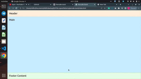
Unlike the deconstructed pancake, this example does not wrap its children when the screen size changes. Commonly referred to as a sticky footer, this layout is used for both websites and apps, across mobile applications (the footer is commonly a toolbar), and websites — in particular single-page applications.
Adding display: grid to the component will give you a single column grid, however, the main area will only be as tall as the content with the footer below it.
To make the footer stick to the bottom, add:
.parent {
  display: grid;
  grid-template-rows: auto 1fr auto;
}
This sets the header and footer content to automatically take the size of their children, and applies the remaining space (1fr) to the main area, while the auto-sized row will take the size of the minimum content of its children, so as that content increases in size, the row itself will grow to adjust.
Congratulations!

CSS — Layout Patterns #3 was originally published in Level Up Coding on Medium, where people are continuing the conversation by highlighting and responding to this story.
This content originally appeared on Level Up Coding - Medium and was authored by Nidhin kumar
Nidhin kumar | Sciencx (2022-07-13T01:42:29+00:00) CSS — Layout Patterns #3. Retrieved from https://www.scien.cx/2022/07/13/css-layout-patterns-3/
Please log in to upload a file.
There are no updates yet.
Click the Upload button above to add an update.