This content originally appeared on Telerik Blogs and was authored by Sam Basu
.NET MAUI enables developers to target both desktop and mobile from a single codebase, but with varying user experiences.
.NET MAUI is the modern .NET cross-platform development framework, allowing developers extensive platform reach from a single codebase. What started as an evolution of Xamarin.Forms with a mobile-first mindset now includes desktop support as a first-class citizen. .NET MAUI is future-facing with solid tooling support for a modern cross-platform development stack and is enabling app modernization with much code sharing across mobile/desktop/web.
However, developers can be a cynical bunch, and most write-once-run-everywhere solutions raise eyebrows. Indeed, while .NET MAUI effortlessly reaches mobile and desktop, the reality of varying form factors demands thinking through app design for optimum user experience. Screen real estate varies widely between mobile and desktop form factors, and good .NET MAUI apps should honor the differences. Thankfully, catering to both mobile and desktop from a single codebase but with slightly different experiences, is not difficult—let’s take a look at a few solutions.
This article is a part of the wonderful .NET MAUI UI July series. Cheers to Matt Goldman for starting up the series and kudos to the developer community for stepping up with content. .NET MAUI UI July provides plenty of inspiration to anyone building modern cross-platform UI with .NET MAUI.
Dual App Mode
The .NET MAUI promise is enticing for .NET developers looking to go cross-platform—a true single project powers apps to run on iOS/Android/Windows/MacOS. However, there is no denying the differences in screen real estate, form factor and user interactions between desktop and mobile devices. For a streamlined User Experience (UX), .NET MAUI apps will do better to recognize the platform/device differences and cater to mobile/desktop separately. However, developers would not want to stray too much from the single codebase promise of .NET MAUI. The key would be to cater to mobile/desktop in a nuanced responsive way, while sharing as much code as possible.
.NET MAUI is also starting to enjoy a rich ecosystem—Telerik UI for .NET MAUI is a comprehensive suite of polished performant UI components for both desktop and mobile. One of the sample apps for Telerik UI for .NET MAUI is the CryptoTracker—a demo app tracking changes in cryptocurrency prices and showcasing some Telerik UI. Conveniently open-sourced for developer inspiration, the CryptoTracker app does a good job of showcasing the dual mode desired for .NET MAUI apps—catering to slightly different UX for mobile and desktop.
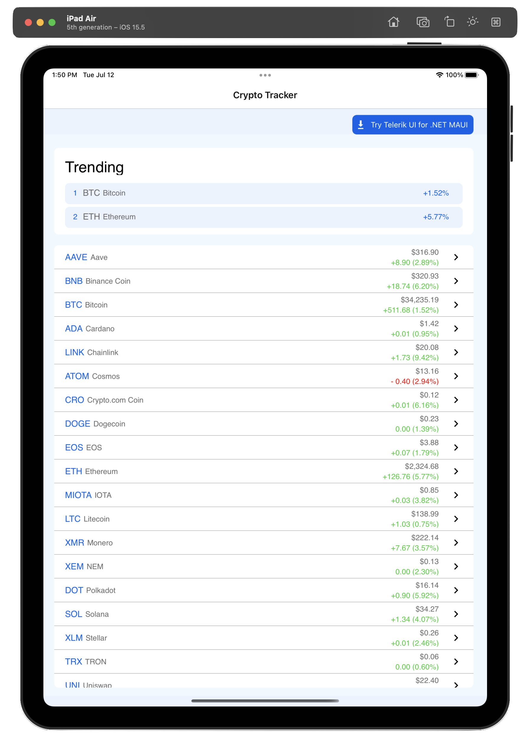
On mobile form factors, like iOS, the CryptoTracker app essentially starts out with a list of cryptocurrencies and their price trends.
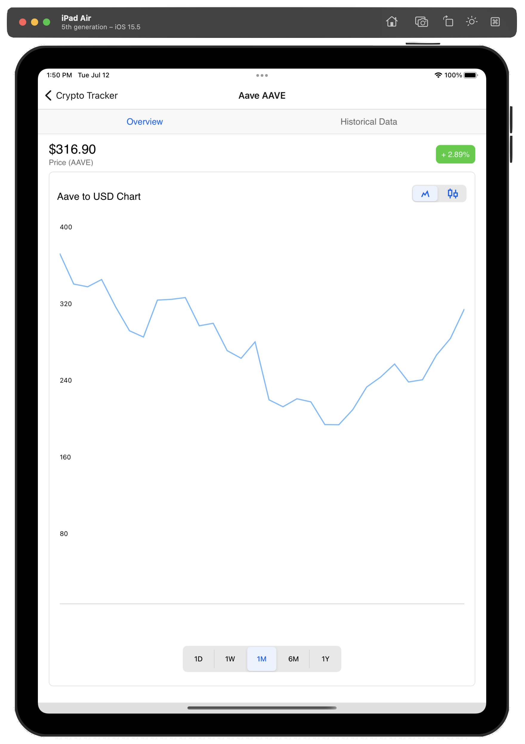
Users can tap on any listed cryptocurrency and navigate to a detail view—one showing historical pricing data with some sharp data visualizations.
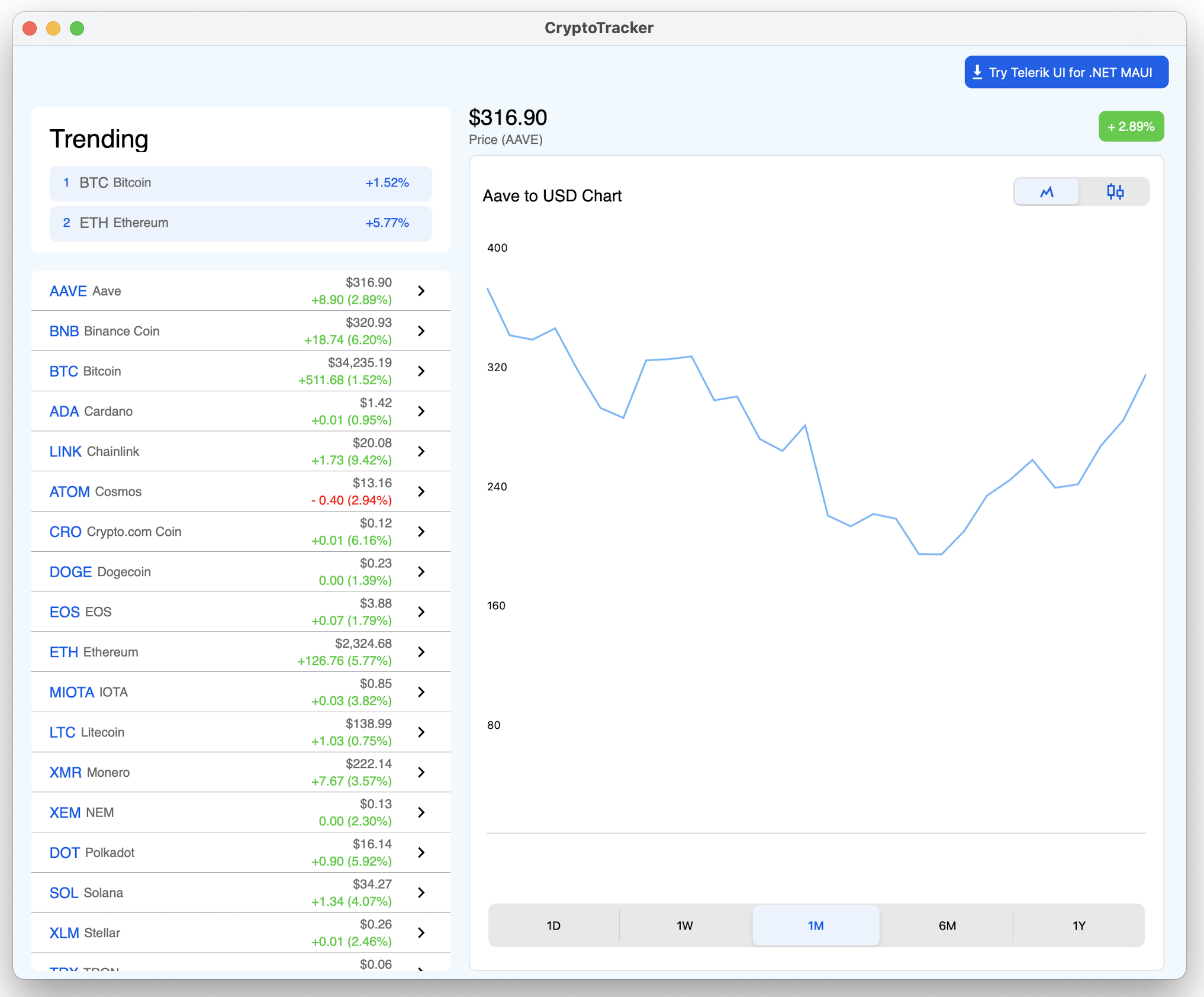
Launch the same CryptoTracker app on desktop, like on MacOS, and the user gets a different starting experience. Desktop screens have more real estate and .NET MAUI apps have the option of capitalizing on this, if desired. For the CryptoTracker app on desktop, the list of cryptocurrencies and the detailed historical view showing trends for the selected cryptocurrency show up together in a consolidated view. Users get to click on a cryptocurrency and see pricing trends to the right—just a better UX for desktop.
Catering to Platforms
Catering a slightly different UX on desktop vs. mobile, while being on the shared codebase from .NET MAUI, is actually not all that difficult. Thanks to conditional compiler directives, .NET MAUI developers have the option to know at any time which platform their code is executing on—and take appropriate actions to differentiate with UX. The trick, however, may be to not go too deep with platform customizations and reuse as much code as possible across desktop/mobile.
Let’s take a look at how the CryptoTracker app caters a different UX for mobile vs. desktop. If we pull down the open-source code for the CryptoTracker app, we see a familiar Model View ViewModel (MVVM) design pattern implementation. A Pages folder houses the handful of pages used in the app—most have to do with crypto coin information/selection, but there is a dedicated page for desktop mode.
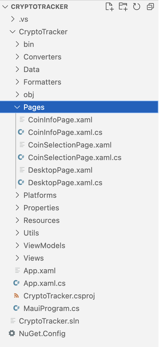
And then there is a Views folder—containing the reusable Views, which make up the core of the UI. The pages host the views—as simple as that.
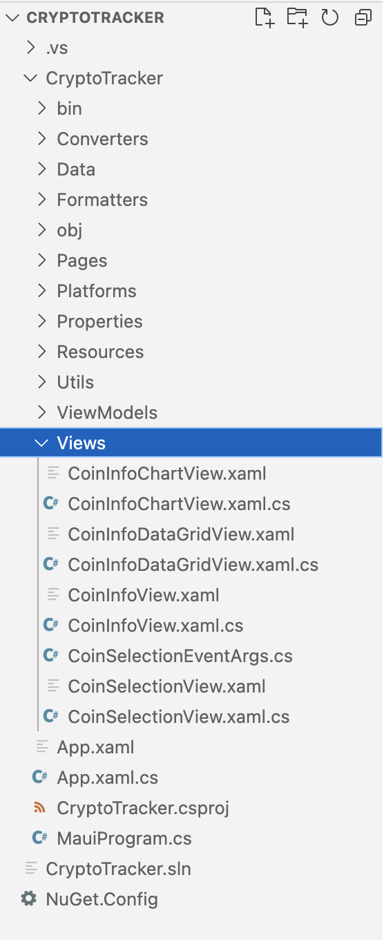
So, how is the UI switched around for desktop vs. mobile? Simple checks on which platform the app is running on—for MacOS/Windows, the DesktopPage is loaded up, while mobile form factors running iOS/Android get the view with list of cryptocurrencies in a NavigationPage.
namespace CryptoTracker
{
    public partial class App : Application
    {
        public App()
        {
            ...

#if MACCATALYST
            MainPage = new DesktopPage();
#elif WINDOWS
            MainPage = new NavigationPage(new DesktopPage())
            {
                BarBackgroundColor = Colors.White,
                BarTextColor = Color.FromArgb("#121212"),
            };
#else
            MainPage = new NavigationPage(new CoinSelectionPage())
            {
#if IOS
            BarBackgroundColor = Colors.White,
            BarTextColor = Color.FromArgb("#121212"),
#else
            BarBackgroundColor = Color.FromArgb("#121212"),
            BarTextColor = Colors.White,
#endif
            };
#endif
        }
    }
}
And the dedicated DesktopPage pulls together couple of views together to better use the extra real estate on desktop form factors. Notice the reusability here—no new UI is created, instead just pulling together two of the views from the mobile UX.
 <Grid RowDefinitions="Auto, *" ColumnDefinitions="500, *, Auto">
        ...
        <Views:CoinSelectionView Grid.Row="1" CoinSelected="OnCoinSelected" Padding="20, 20, 20, 10"/>
        <Views:CoinInfoChartView x:Name="selectedCoinInfo" Padding="0, 20, 25, 10" Grid.Column="1" Grid.ColumnSpan="2" Grid.Row="1">
            <Views:CoinInfoChartView.BindingContext>
                <local:CoinInfoViewModel/>
            </Views:CoinInfoChartView.BindingContext>
        </Views:CoinInfoChartView>
</Grid>
Navigation Patterns
While .NET MAUI apps from a single codebase work seamless across mobile/desktop, there are definitely varying UX expectations based on form factors and user input devices. There are some navigation paradigms that work better on desktop with mouse/keyboard, while others are better suited for mobile with touch interactions—this also has an impact on how app content is organized.
A .NET MAUI UI paradigm that works particularly well for desktop apps is the Menubar—menus have always been popular for desktop navigation.
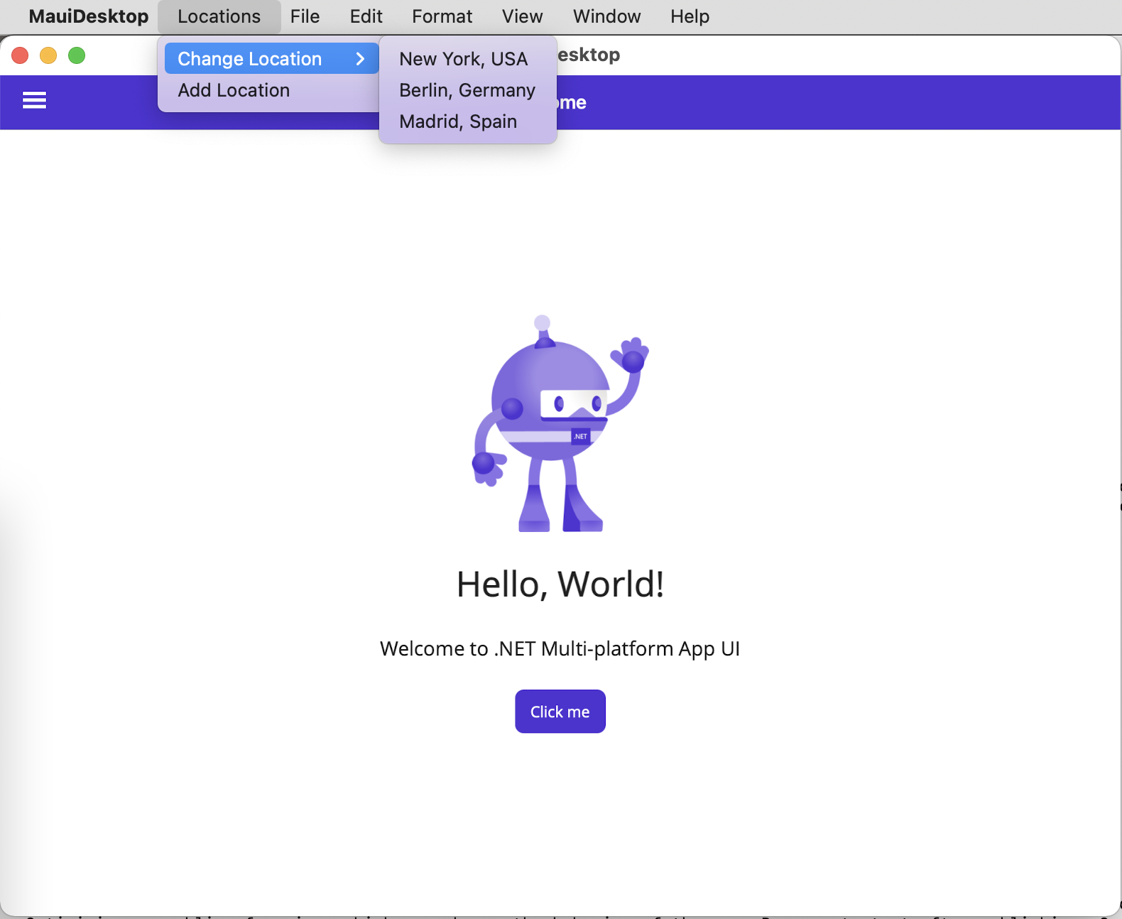
It is quite easy to render a MenuBar for .NET MAUI apps—they support Commands and can be data bound for dynamic options.
<ContentPage.MenuBarItems>

    <MenuBarItem Text="Locations">
        <MenuFlyoutSubItem Text="Change Location">
            <MenuFlyoutItem Text="New York, USA"
                            Command="{Binding ChangeLocationCommand}"
                            CommandParameter="NewYork" />
            <MenuFlyoutItem Text="Berlin, Germany"
                            Command="{Binding ChangeLocationCommand}"
                            CommandParameter="Berlin" />
            <MenuFlyoutItem Text="Madrid, Spain"
                            Command="{Binding ChangeLocationCommand}"
                            CommandParameter="Madrid"/>
        </MenuFlyoutSubItem>
        <MenuFlyoutItem Text="Add Location"
                        Command="{Binding AddLocationCommand}" />
    </MenuBarItem>

</ContentPage.MenuBarItems>
.NET MAUI has also adopted the Shell as a default way to organize content and provide navigation—while not obligated to use the Shell, most developers may find the Shell provides a good starting point. The Shell also provides a common UI paradigm—the Flyout. Modern web/mobile apps have made “hamburger” menus popular, and desktop users may also be open to such organization/navigation.
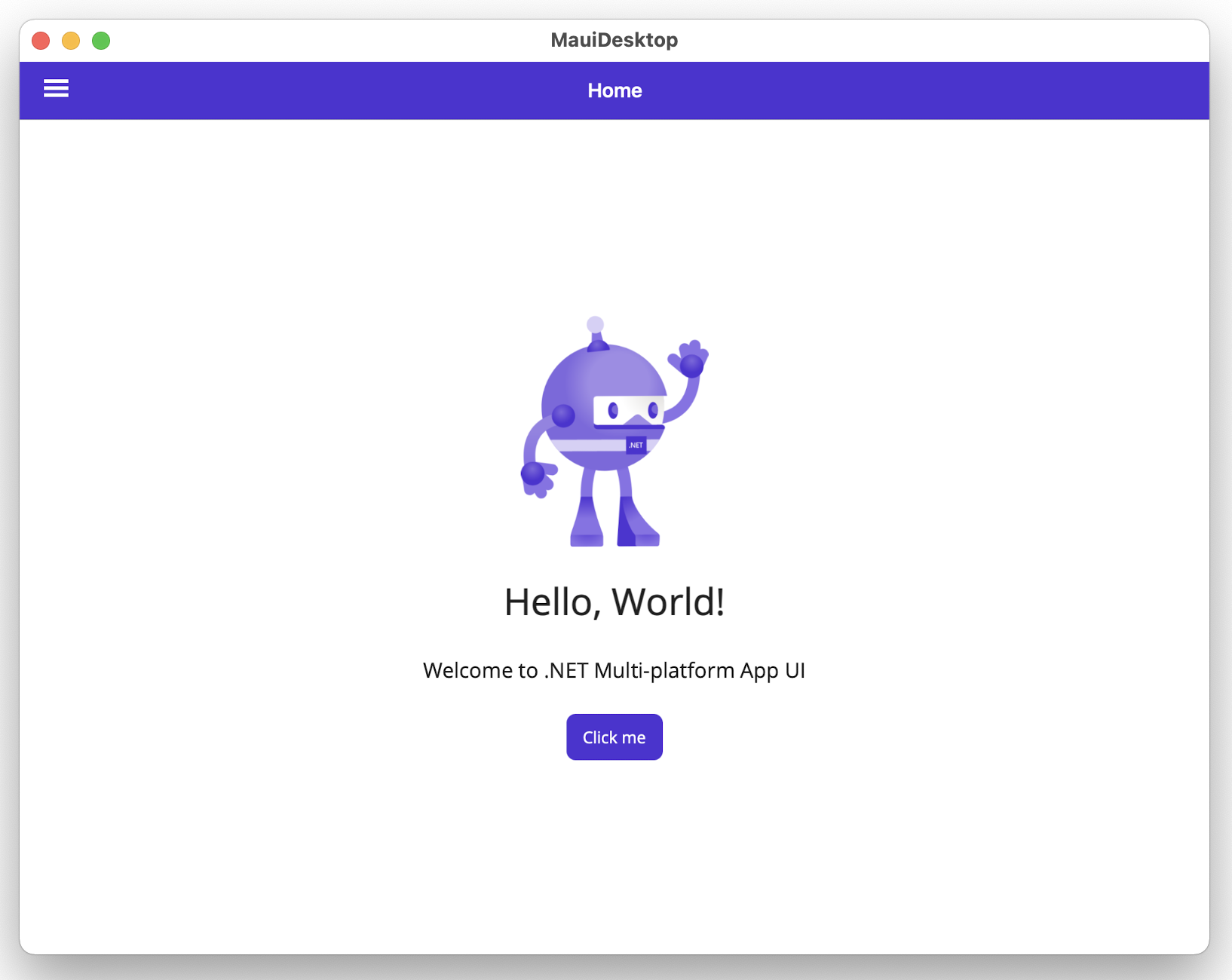
The Flyout menus can be templated/customized to heart’s content and also be data driven.
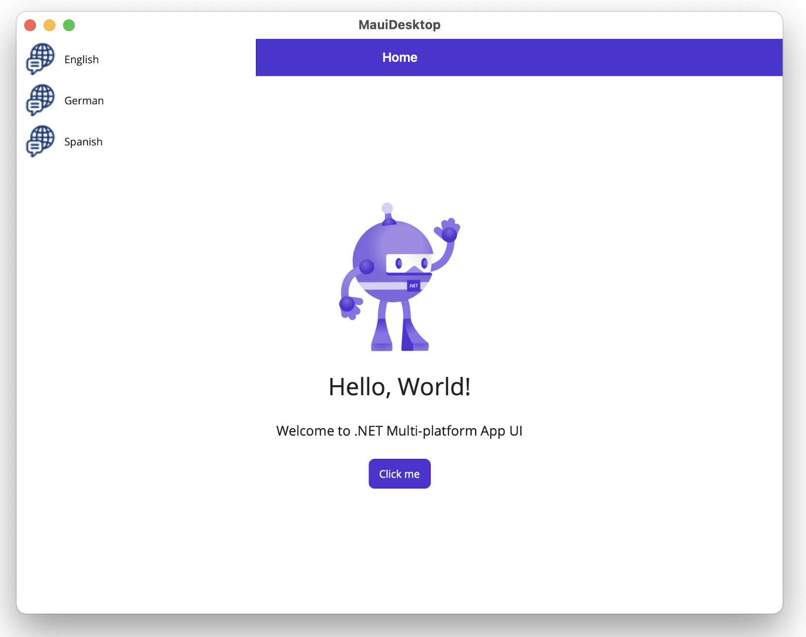
Here is how simple it is to render basic Flyouts from within Shell—they can be templated and can contain header/menu/footer items:
<?xml version="1.0" encoding="UTF-8" ?>
<Shell
    x:Class="MauiDesktop.AppShell"
    xmlns="http://schemas.microsoft.com/dotnet/2021/maui"
    xmlns:x="http://schemas.microsoft.com/winfx/2009/xaml"
    xmlns:local="clr-namespace:MauiDesktop"
    Shell.FlyoutBehavior="Flyout">

    <Shell.ItemTemplate>
        <DataTemplate>
            <Grid ColumnDefinitions="0.2*,0.8*">
                <Image Source="{Binding FlyoutIcon}"
                       Margin="5"
                       HeightRequest="45" />
                <Label Grid.Column="1"
                       Text="{Binding Title}"
                       FontAttributes="Italic"
                       VerticalTextAlignment="Center" />
            </Grid>
        </DataTemplate>
    </Shell.ItemTemplate>

    <FlyoutItem Title="English" Icon="language.png">
        <ShellContent Title="Home"
                            ContentTemplate="{DataTemplate local:MainPage}"
                            Route="MainPage" />
    </FlyoutItem>
    <FlyoutItem Title="German" Icon="language.png">
        <ShellContent Title="Heim"
                            ContentTemplate="{DataTemplate local: GermanPage}"
                            Route="MainPage" />
    </FlyoutItem>
    <FlyoutItem Title="Spanish" Icon="language.png">
        <ShellContent Title="Hogar"
                            ContentTemplate="{DataTemplate local: SpanishPage}"
                            Route="MainPage" />
    </FlyoutItem>

</Shell>
While Flyouts may be popular on the web and desktop apps now, there is a UI paradigm that is particularly well suited for smaller mobile form factors—behold, the Tabbar. Tabs present a nifty way to organize app content within a container and provide UX that is universally well understood.
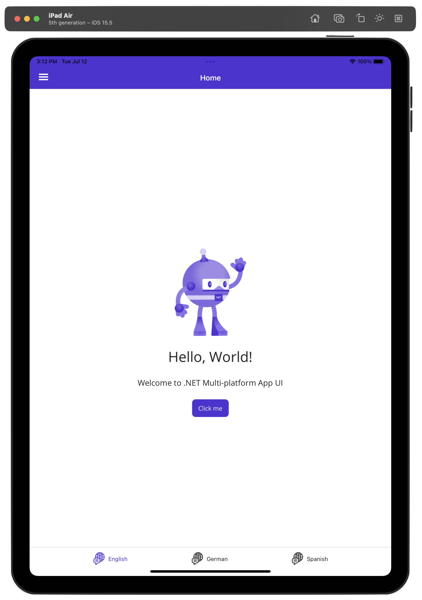
Thankfully, if using the .NET MAUI Shell, rendering Tabs is also built in with the Shell—the conditional logic could be to render Flyouts for desktop and Tabs for mobile.
<?xml version="1.0" encoding="UTF-8" ?>
<Shell
    x:Class="MauiDesktop.AppShell"
    xmlns="http://schemas.microsoft.com/dotnet/2021/maui"
    xmlns:x="http://schemas.microsoft.com/winfx/2009/xaml"
    xmlns:local="clr-namespace:MauiDesktop"
    Shell.FlyoutBehavior="Disabled">

    <TabBar>
        <Tab Title="English" Icon="language.png">
            <ShellContent Title="Home"
                                ContentTemplate="{DataTemplate local:MainPage}"
                                Route="MainPage" />
        </Tab>
        <Tab Title="German" Icon="language.png">
            <ShellContent Title="Heim"
                                ContentTemplate="{DataTemplate local:GermanPage}"
                                Route="MainPage" />

        </Tab>
        <Tab Title="Spanish" Icon="language.png">
            <ShellContent Title="Hogar"
                                ContentTemplate="{DataTemplate local:SpanishPage}"
                                Route="MainPage" />

        </Tab>
    </TabBar>

</Shell>
Conclusion
.NET MAUI makes a big promise—native cross-platform apps for mobile and desktop. Indeed most .NET developers appreciate the beauty of having a true single shared codebase with .NET MAUI and being able to have broad platform support. Between iOS/Android for mobile and Windows/MacOS for desktop, .NET MAUI allows developers to reach a vast majority of users.
However, mobile and desktop are widely varying platforms and corresponding devices are different. .NET MAUI apps will do well honoring differences and catering appropriate UX for mobile/desktop. Thankfully, it is easy for developers to recognize platforms and programmatically switch up the UI, while sharing most code across mobile/desktop. Cheers to lot more common code between mobile/desktop while having nice UX fit for each platform.
This content originally appeared on Telerik Blogs and was authored by Sam Basu
Sam Basu | Sciencx (2022-07-16T09:00:03+00:00) Catering to Desktop & Mobile With .NET MAUI. Retrieved from https://www.scien.cx/2022/07/16/catering-to-desktop-mobile-with-net-maui/
Please log in to upload a file.
There are no updates yet.
Click the Upload button above to add an update.
