This content originally appeared on Bits and Pieces - Medium and was authored by Victor Yakubu
Building A React Datepicker Component With Bit

A Datepicker is a graphical user interface used to select or input dates. It allows for the selection of specific days, months, and years. In this article, I will be walking you through the steps of building your own Datepicker component with React and we will be using Bit to achieve this.
With Bit, you can build all kinds of applications, not just with React but with other component-driven frameworks like Vue and Angular. You can also build utility functions and a lot more complex applications. Learn more about how Bit helps you build anything into a component with the link below.
Bit Cloud: Build together in components
We will be going through all the steps of building the Datepicker component together. To be able to follow along, you should have a basic understanding of React. If you are new to using Bit, you can follow along as I will cover the processes involved in creating, installing, and exporting a component. If you don't have a Bit cloud account, create one now.
Build together in components · Bit
You can get access to all scopes and components used in this article
- React-Datepicker Scope
- Datepicker component
- utility functions (date-format, date-function)
Before we proceed, make sure you have Bit binary installed on your local machine.
npx @teambit/bvm install
If you have it installed but haven’t updated it in a while, run the command below to get the latest version.
npx @teambit/bvm upgrade
We are now well on our way to creating the React Datepicker component.
Creating a Bit workspace
In order to create a component with Bit, you first need to create a Bit workspace. Bit workspace provides all the files required to successfully manage your workspace and create components. How do you do that?
- First, create a folder called react-datepicker
- Open that folder using the code editor of your choice or through the command line and run the command below
Syntax:
bit new react my-react-datepicker --empty --skip-git --default-scope [your-cloud-user-name].[scope-name]
Command:
bit new react my-react-datepicker --empty --skip-git --default-scope aviatorscode2.react-datepicker
After running the command successfully, you should see your workspace files.
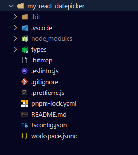
What I normally like to do at this point is to create my remote scope on Bit Cloud. It is not compulsory to do it now, you can create one after building your components, but I'd just like to get it out of the way. So go to Bit cloud, log into your account, and create a scope.
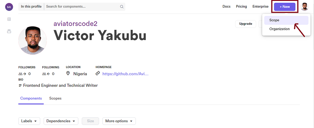
The name of the scope should be the same as the name you used in setting your default scope in the command above, mine was react-date picker
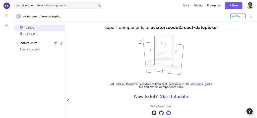
Creating a Bit components
What is a component in Bit? They are standalone, reusable, and independently controlled components. Components are kept in a Bit workspace and saved in a remote scope. Read more here.
Creating the Datepicker utility function components
To create the Datepicker component, you will need to create some other utility components that we will later compose into the Datepicker component.
Date format component
This component will contain the Day and Month format you will be using for the datepicker component. It is a small utility component. However, I chose to create a separate component for it so that it’s easy to maintain.
Then, create a function component using the command below. The command should be run from inside your Bit workspace.
Syntax:
bit create node [Name of component]
Command:
bit create node utils/date-format
If the command runs successfully, it means your date-format component has been created.
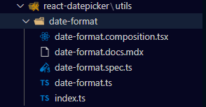
You can proceed to write the date format variables inside the date-format.ts file. You will need an array of days and an array of months.
Lastly, ensure you export dayNames and monthNames in the index.ts file, which is inside the date-format folder.
After this, you can now export your component to your remote scope on Bit Cloud. But before you can export a component in Bit, you will first need to tag the component. When you tag a component, Bit compiles, runs a build test, and versions that component.
Also, I would recommend that before you tag the component, check its status to be sure that there is no issue with your component.
bit status

This means that Bit has given you the ok to tag your component. To tag, run the command below.
bit tag utils/date-format

The date-format component now has a version of 0.0.1. You can now export the component.
bit export

The date-format component is now available in your remote scope. You can go to your Bit cloud account to check.
Creating the date-function component
You will need to create another utility function component. It will contain the functions that will be used to calculate the number of days in a month, the function to get the days in a week as it relates to the year and month, and also a range function. The range function will take in the year and month and give the number of days in that month.
Before you can implement these functions, you will first need to create the date-function component
bit create node utils/date-function
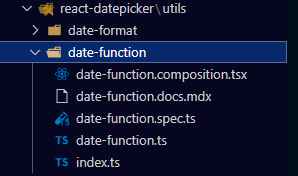
You can proceed to implement the getNumberOfDaysInMonth, getSortedDays, and range functions inside the date-function.ts file.
You will need to import { dayNames } that you created in the date-format component from a node package module. The component package name follows this convention:
"ORG-Name/Scope-name.component-namespace.Component-name"
In my case, it will be
"@aviatorscode2/react-datepicker.utils.date-format";
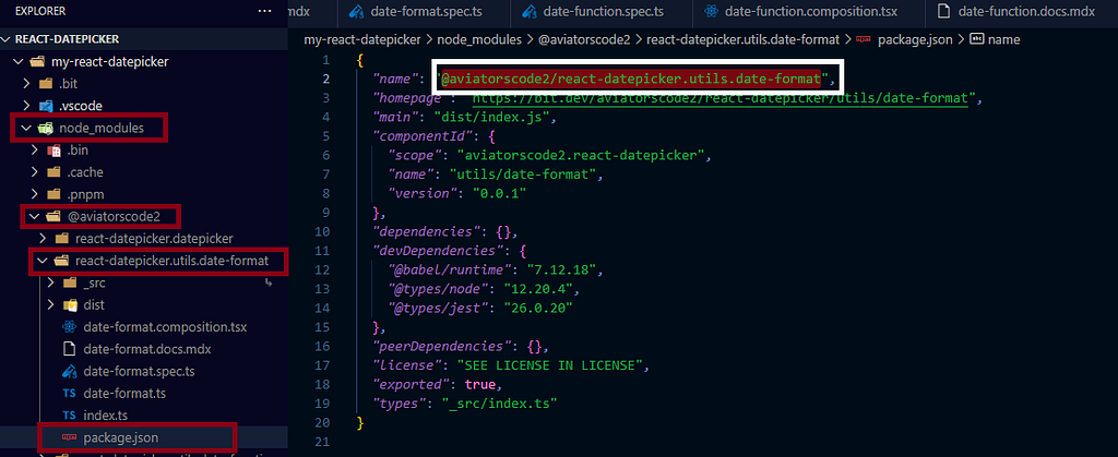
Next, go to the index.ts file inside your date-function component folder to export the functions created, so that they can be imported by other components.
Save your changes. Before going further, run the bit server to see how the components are displayed on your browser on localhost.
bit start
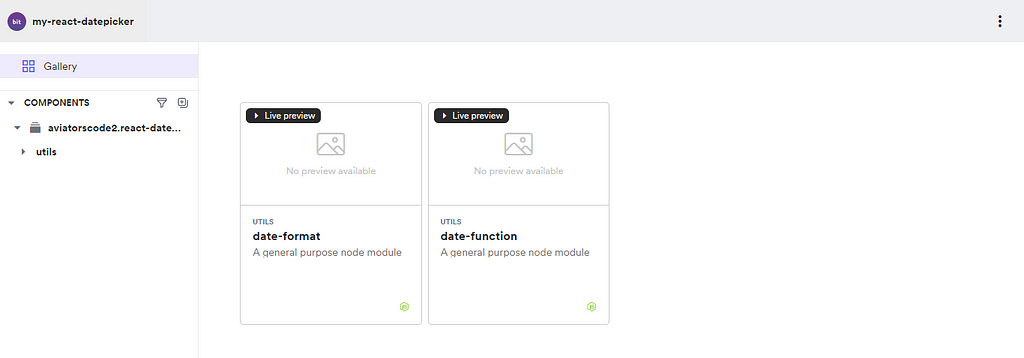
Run the status command to be sure that the component is good to be exported
bit status
After this runs without an error, you can then tag the date-function component
bit tag utils/date-function
When the tagging completes, you can then proceed to export the component
bit export
The Datepicker Component
It’s time to create the main Datepicker component, and you’ll need to compose the utility functions you created earlier. But before you do that, you need to first create the component itself.
You will be using the React template for this component, inside your workspace create a new component using the command below
bit create react datepicker
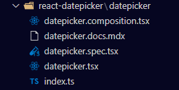
You will also need to install styled-components and the react-icon library because you will need them for this component.
bit install styled-components
When it finishes installing, run this command also.
bit install @types/styled-components
This command instals the styled-component types for Typescript as a dependency.
Lastly, install the react-icons using the command below
bit install react-icons
When that is complete, you will then proceed to compose the date-function and date-format components into the datepicker component.
What is special about how Bit composes a component? In composing a Bit component into another component in Bit, that component composed becomes a dependency of that component.
For example, after you have composed the date-format and date-function components into the datepicker component, anybody will be able to install and use the datepicker component without having to install the date-format and date-function separately. Those components now come with the datepicker component anywhere it is installed.
How to compose one component into another? This is similar to how you import the date-format component into the date-function component. So follow the same process to import the date-format and date-function components. It should be similar to this, but instead, it will carry your Bit cloud username, scope name, and component name. here is mine
import { getNumberOfDaysInMonth, getSortedDays} from '@aviatorscode2/react-datepicker.utils.date-function';import { monthNames } from '@aviatorscode2/react-datepicker.utils.date-format';Also, you will need to import two icons from react-icons
import { TiChevronLeft, TiChevronRight } from "react-icons/ti";You can proceed to implement the Datepicker component. This is how my code looks like
Next is to style the component using styled-components, so inside the datepicker folder, create a file called styled.ts.
In the datepicker.composition.tsx file, create a composition. This will show people that will use this component how to render it and pass in values.
Also, write a simple test for the datepicker component in the datepicker.spec.ts file.
Finally, save all your changes and prepare your components to be exported to your remote scope.
But before you do that, you can see how the datepicker component will render by spinning up your Bit workspace on localhost. To do that, run the command below
bit start
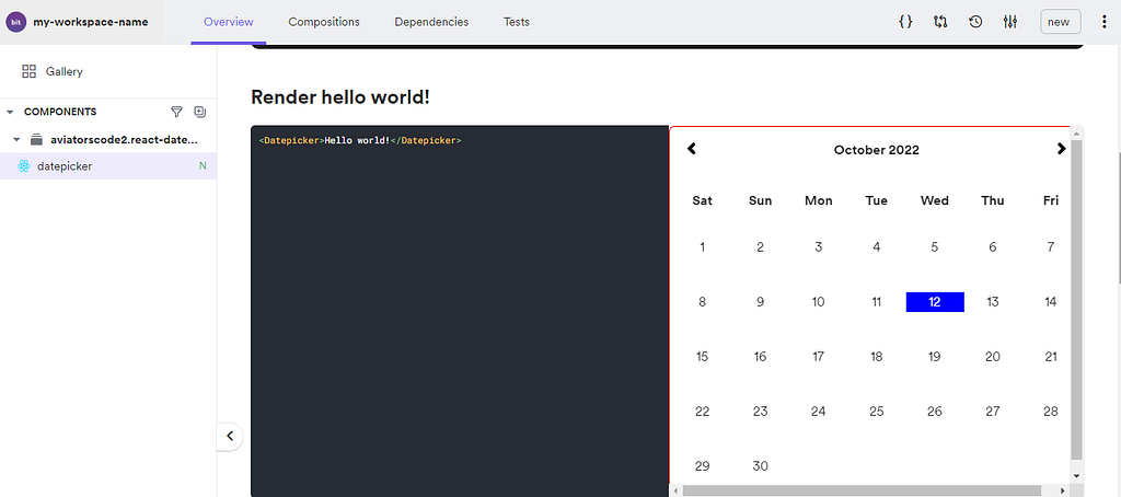
You can also click on dependencies to see the other components composed into the datepicker component
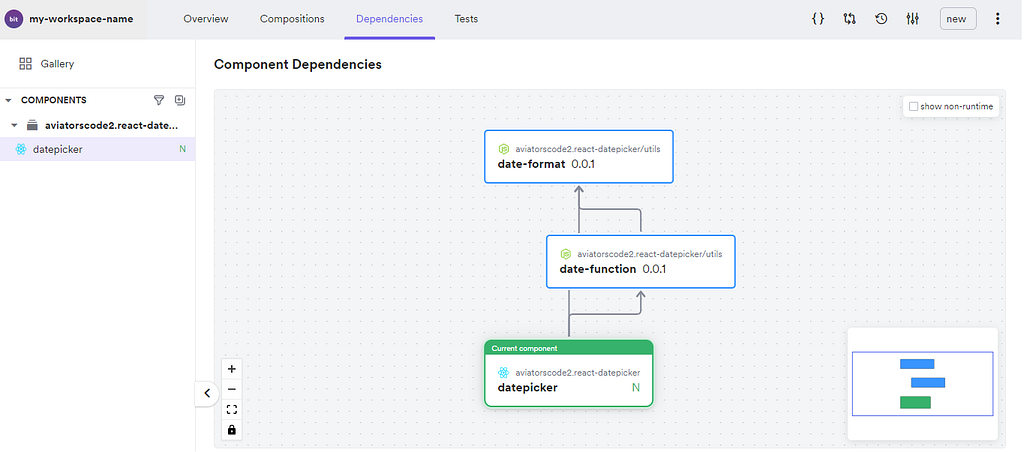
From the dependency graph, you can see that the datepicker component is dependent on both the date-format and date-function components.
Everything looks good. You can now start the process of exporting your component.
bit status

bit tag datepicker
Before the tagging is successful, Bit will first run a test on the component.

When that test is successful and other conditions check out, Bit then tags the component

Now the component is ready to be exported
bit export
Rendering the Datepicker component in a React App component
Now that your datepicker component has been exported to your remote scope, you can import it into any other component. Let me walk you through how that will work.
So in this section, you will be creating a new Bit workspace with the React app template and then importing the Datepicker component.
Setting up a Bit workspace with React App template
Your first point of action is to create a Bit workspace. To do that, you will either create a folder and open that folder using your code editor and run the command below OR run the command on your command line, after which you can open the workspace in your code editor.
This is the command to create a new workspace containing the React app template
Syntax:
bit new react-app [component-name] --default-scope [bit.cloud-username].[scope-name]
Command:
bit new react-app my-react-app --default-scope aviatorscode2.react-app
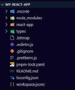
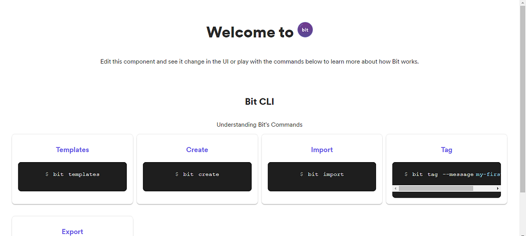
Run bit run my-app to spin up the react app on your browser.
Installing and Rendering the Datepicker component
The next task is to install the Datepicker component into the React app workspace and to do that, you need to follow these steps:
- Go to your remote scope to copy the installation CLI for the datepicker component
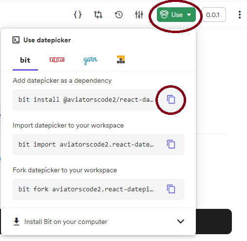
bit install @aviatorscode2/react-datepicker
- Paste the command in your command line and click enter

Notice that when you install the Datepicker component, other components and libraries are also installed as dependencies of the datepicker component.
- The next thing is to import the Datepicker component into app.jsx so that it will be rendered in the React app.
- Render the Datepicker component and pass in the minDate and maxDate properties to the component.
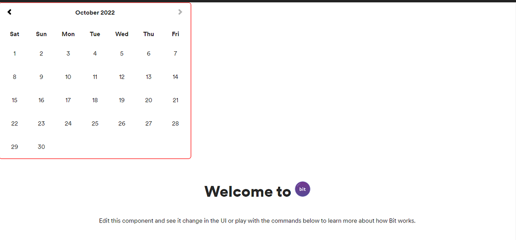
Save your changes and return to the tab where you startedbit run my-app. You will now notice that the Datepicker component has been rendered.
Wrapping up
Through the course of this tutorial, you have been able to cover the process required to build a Datepicker component using Bit and also how that component can be rendered in a React application.
Primarily, you have learnt how to create a workspace, create components, and how to install Bit components and a lot more.
Bit allows you to build anything into components, which you have been able to see for yourself in this article. So if you haven’t been using Bit for your development, I am encouraging you to give Bit a try today.
And as you do, share your experience and any questions you might have. Join the Bit community Slack channel and also head to the Documentation to learn.
Other Related Resources
- How to build a Table component with Bit
- Deploying a composable React App to Netlify
- How to build a composable blog
- How to reuse React components across your projects
Building A React Datepicker Component with Bit was originally published in Bits and Pieces on Medium, where people are continuing the conversation by highlighting and responding to this story.
This content originally appeared on Bits and Pieces - Medium and was authored by Victor Yakubu
Victor Yakubu | Sciencx (2022-10-27T06:31:45+00:00) Building A React Datepicker Component with Bit. Retrieved from https://www.scien.cx/2022/10/27/building-a-react-datepicker-component-with-bit/
Please log in to upload a file.
There are no updates yet.
Click the Upload button above to add an update.
