React Loading Spinner: Building a React Spinner Component with Bit

React Spinner: Building a React Spinner Component with Bit

When building React applications, we often need to make certain requests to a database through an API, whether it is a POST, DELETE, GET, or other kinds of requests. These requests are often delayed, either due to network speed or your application’s general performance.

When this delay occurs, you need a way to notify visitors and users of your application to hold on while the data to be displayed is fetched. It is a poor user experience to keep users guessing whether or not they should wait or leave, so leaving a page blank while data is being fetched is not a good practice. One of the ways you can handle this is by using a spinner.

spinner GIF

In this article, you will learn how to create a React spinner component with Bit and how to use it on a React-App component.

Requirements

For you to follow along, you will need to have the following

  • Node installed on your local machine
  • Bit binary installed
  • Basic knowledge of React and Typescript.

The scope and components used in this article are available on bit.cloud. you can have access to the code, to help you follow along in this article

If you haven’t installed Bit binary, do that now before you proceed.

bit @teambit/bvm install

If you have had it installed for a while now, make sure you’re running version 0.2.1 or higher. You can use the command below to upgrade to the latest version.

npx @teambit/bvm upgrade

You can now proceed to create your spinner component.

https://medium.com/media/4a3edeaba8fa7ad3ac0e1958eda08307/href

Creating a Spinner component with Bit using the React Spinner Library

Creating a Bit Workspace

When working with Bit, the first thing to do is to create a Bit workspace. The workspace provides the files and directories required for managing, maintaining, composing, versioning, and exporting components.

To create a workplace, run the command in your command line

Syntax:

bit new react react-spinner --empty --skip-git --default-scope [your-cloud-username].[scope-name]

Command:

bit new react react-spinner --empty --skip-git --default-scope aviatorscode2.react-spinner

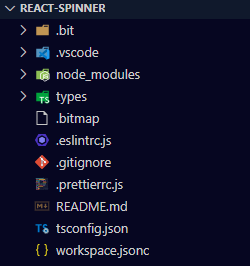
The command above has created a folder called react-spinner, which contains the workspace files and directories. You can then proceed to open the folder using your code editor.

workspace files

Creating the React Spinner Component

Now that you have your Bit workspace ready, you can now create your Bit component.

Creating components | Bit

Every part of your code can be thought of as a component in Bit. Bit components are simply reusable and composable code with their own installable module that can be maintained in a Bit workspace.

Components can be of different types, from client-side to server-side components. But for the React spinner, you will be using the client-side (React template) component. You can either create a React component using a component scaffolder, where you can add what you want and how you want it to your component file and structure (read more about creating a component scaffolder). Another option that will be used in this article is using a template provided by Bit to create your component. To create a React component, run the code below.

Syntax:

bit create react [Name of component]

Command:

bit create react spinner

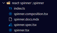
After that runs successfully, a spinner folder will be created

Now that you have your component folder and the necessary files created, you can proceed to implement the code to create the spinner component in the Spinner.tsx file.

import React, { CSSProperties } from 'react'
import classnames from 'classnames'
import styles from './spinner.module.css'

export type SpinnerProps = {
className?: string,
id?: string,
style?: CSSProperties,
width?: string,
}

export function Spinner({
width = '38',
style,
id,
className,
}: SpinnerProps) {
const spinnerClasses = classnames(styles['spinner'])
return (
<svg
className={spinnerClasses}
width={width}
height={width}
viewBox="0 0 38 38"
xmlns="http://www.w3.org/2000/svg"
style={style}
data-testid={`test-${id}`}
>
<g fill="none" fillRule="evenodd">
<g transform="translate(1 1)" strokeWidth="2">
<circle strokeOpacity=".5" cx="18" cy="18" r="18" />
<path d="M36 18c0-9.94-8.06-18-18-18">
<animateTransform
attributeName="transform"
type="rotate"
from="0 18 18"
to="360 18 18"
dur="1s"
repeatCount="indefinite"
/>
</path>
</g>
</g>
</svg>
)
}

The above code requires that you install the classnames package.

bit install classnames

You also need to create a CSS file to style the spinner component. So create a CSS file called spinner.module.css.

.spinner {
stroke: var(--spinner-stroke, #383e44);
position: relative;
}

After creating the CSS file, you might run into a type declaration error, that looks like this

To fix this, create a declaration.d.ts file in your component folder and write the code below.

declare module '*css' {
const content: Record<string, string>;
export default content;
}

In your spinner.composition.tsx file, write a composition for your component. The importance of writing a composition for your component is to stimulate and test the component to ensure that it is working as expected, and it also helps other developers who will want to use your component to visualise how it works.

Here is how the composition should look.

import React from 'react';
import { Spinner } from './spinner';

export const BasicSpinner = () => {
return (
<Spinner id="basicSpinner" />
);
}

export const SpinnerCustomStyles = () => (
<Spinner id="spinnerCustomStyles" style={{ margin: '2rem' }} />
)

Lastly, write a test for your component; all components in Bit should be tested. Here is a simple test for the spinner component.

it('should render with the correct text', () => {
expect(true).toBeTruthy();
});

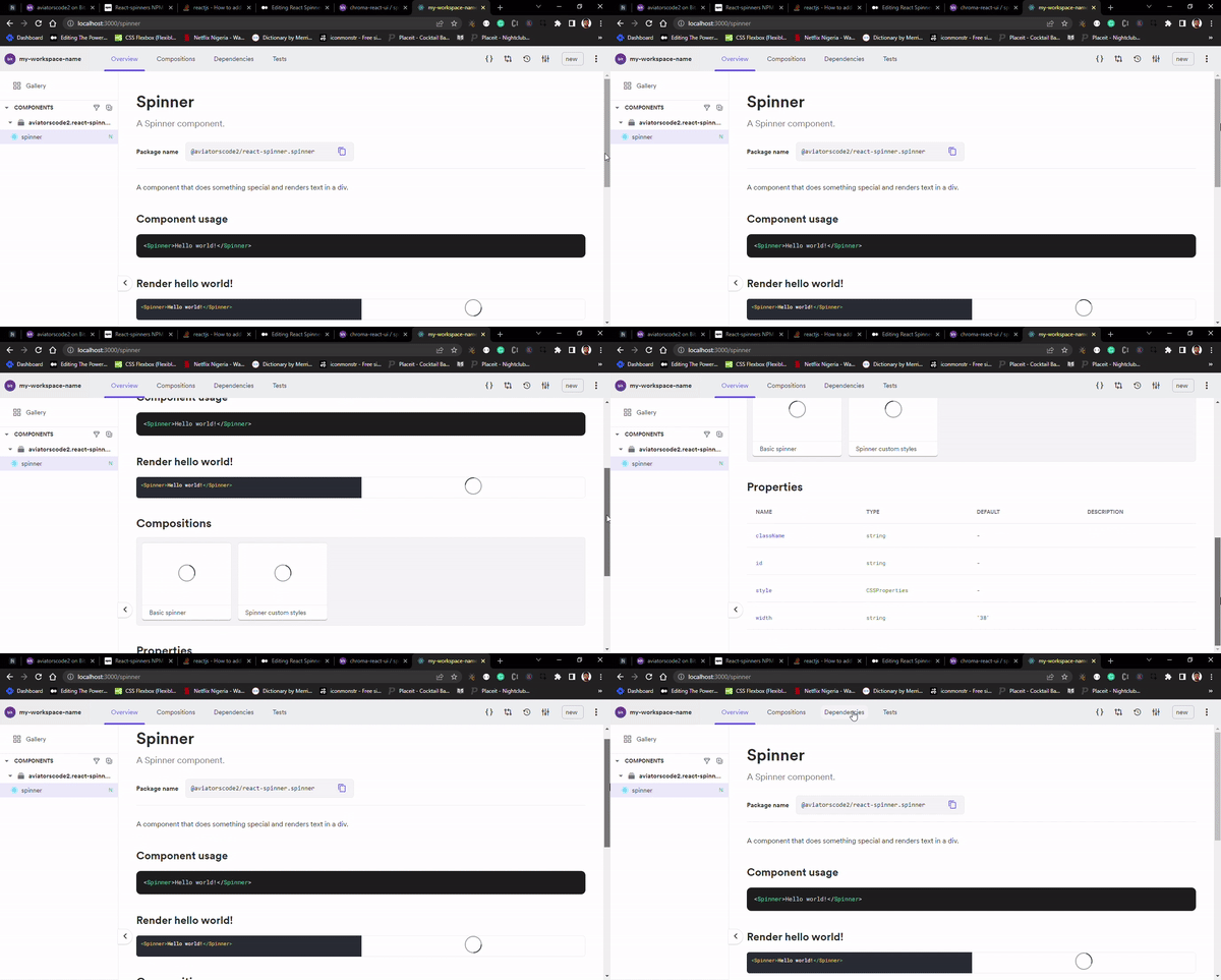
You can now proceed to preview your workspace in the browser to see how your component renders and inspect the UI. Run the code below

bit start

The command will start up the Bit server at http://localhost:3000. When you run the command for the first time, it takes a bit longer to build, but subsequently, it will be faster after the first build.

Everything looks good; the next step is to prepare your component to be exported to bit.cloud.

But before you can do that, you must first create a Bit.Cloud account if you haven’t already.

After that, you will need to create a scope for your component. To do that, head to your account and click on the scope.

An interface will appear where you will need to type out the name of the component scope. Remember you used react-spinner when creating your workspace, so use the same name for your scope

After that, you can click on “create.”

Your remote scope is now ready, so you can proceed to your code editor to export your react-spinner component.

Exporting the React-spinner component

Now head over to your code editor to export your component. Components are exported to make them available for other developers to use or contribute to.

To do that, follow these steps:

  • Run Bit status — This command is used to check the status of your components to be sure that they already to be exported
bit status
  • Run Bit tag — This command is used to add a message and release a version to your component. Every component in Bit has a release version, you can use that in tracking changes made to the component.
bit tag react-spinner/spinner

Your component has been successfully tagged, and it is hot and ready to be exported.

  • Run Bit export — This command is used to export your component from your workspace to your remote scope, making it available for others to use.
bit export

Composing the Spinner component and Rendering it in a React App

In this section, you will learn how to compose a component in Bit using the spinner component in a React application, Bit lane, and Bit snap. So without further ado, let’s dive right in.

Setting a Bit workspace with the React App Template

In order to achieve the tasks for this section, you will need to set up a Bit workspace, for which you will be using the React app template. The React app will be the application on which you will render your Spinner component.

To create a workspace with the React app template, run the command below in your command line in any directory of your choice.

Syntax:

bit new react-app my-react-app --default-scope [bit.cloud-username].[scope.name]

Command:

bit new react-app my-react-app --default-scope aviatorscode2.react-app

NB: Just like in the first section, you will need to create a new scope before exporting the components in this section.

Next, open the workspace in your code editor

Now your workspace is ready. You can run the command below to spin up the React app on your browser at http://localhost:3000/ to see what the UI looks like.

bit run my-app

Composing the Bit Spinner Component

One advantage of creating a Bit component is that once it is available in a remote scope, it can be imported, installed, or even forked by other developers. But in this case, you will be installing the spinner component in the new workspace you just created.

So, go to your remote scope on bit.cloud to get the command you will be using for installing the spinner component.

Copy and run the command inside your workspace. If it runs successfully, it means that the Spinner component has been added as a dependency in your workspace.

You can now proceed to import the spinner component into the app.tsx file, which is located inside the react-app folder.

import { Spinner } from "@aviatorscode2/react-spinner.spinner"

The above component is imported using the component package name, and you can locate yours by following the convention:

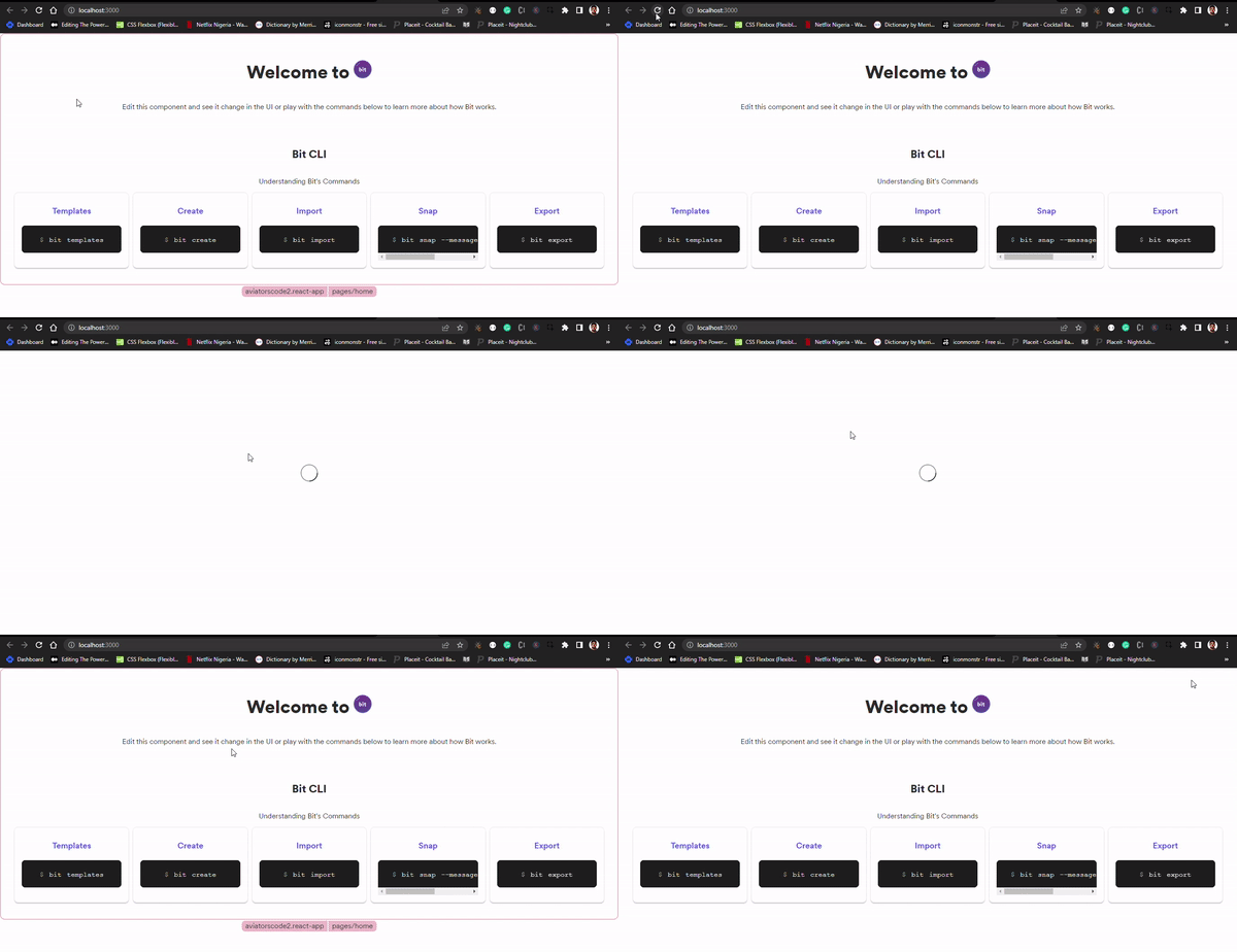
After importing the Spinner component in the app.tsx file, add the loading spinner to the React app, and the spinner will come up while the React app UI is still loading.

SetTimeout will be used to simulate an API call so that there is a brief delay before the user interface (UI) renders in the browser. Here is the implementation.

import React, {useState, useEffect} from "react";
import { BaseTheme } from "@aviatorscode2/react-app.themes.theme";
import { Home } from "@aviatorscode2/react-app.pages.home";
import { ComponentHighlighter } from "@teambit/react.ui.component-highlighter";
import { Routes, Route } from "react-router-dom";
import { Spinner } from "@aviatorscode2/react-spinner.spinner"

export function ReactTemplateApp() {
const [loading, setLoading] = useState(true);

useEffect(() => {
setTimeout(() => {
setLoading(false);
}, 5000);
}, []);

if(loading) {
return (
<div style={{display: "flex", justifyContent: "center", marginTop: "250px"}}>
<Spinner id="basicSpinner"/>
</div>
)
}

return (
<BaseTheme>
<ComponentHighlighter>
{/* header component */}
<Routes>
<Route path="/" element={<Home />} />

<Route
path="/about/*"
element={
{
/* about page component */
}
}
/>
</Routes>
{/* footer component */}
</ComponentHighlighter>
</BaseTheme>
);
}

The useEffect, will be called on every page load, and while that happens, the setTimeout will cause a 5-second delay before the page loads. Save these changes and go to your browser to see how it works.

Bit Lane and Bit Snap

Bit Lane allows you to make changes to a component without affecting the main component. The changes are tracked so that others will know the changes that were made to that component.

Lanes overview | Bit

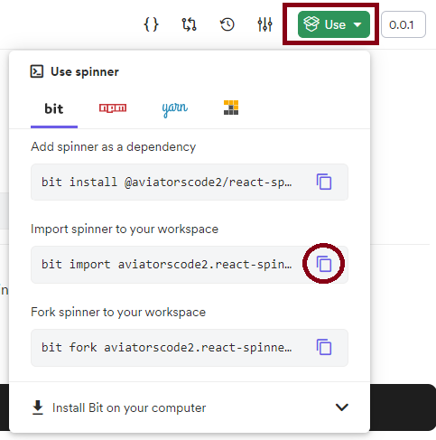
So you will first need to import the Spinner component so that you can make changes to it. So go to the remote scope and copy and run the import command for the spinner component.

NB: To make changes to a component, you will have to import that component into your workspace. When you install a component, that component is only a dependency, so you can’t make changes that will be seen by others.

After importing the spinner component, go to the spinner component and make some changes to it. You can go to spinner.module.css and change the colour to red and also increase the width of the spinner in the spinner.tsx file.

spinner.module.css:

.spinner {
stroke: var(--spinner-stroke, #d62433);
position: relative;
}

spinner.tsx:

import React, { CSSProperties } from 'react'
import classnames from 'classnames'
import styles from './spinner.module.css'

export type SpinnerProps = {
className?: string,
id?: string,
style?: CSSProperties,
width?: string,
}

export function Spinner({
width = '40',
style,
id,
className,
}: SpinnerProps) {
const spinnerClasses = classnames(styles['spinner'])
return (
<svg
className={spinnerClasses}
width={width}
height={width}
viewBox="0 0 38 38"
xmlns="http://www.w3.org/2000/svg"
style={style}
data-testid={`test-${id}`}
>
<g fill="none" fillRule="evenodd">
<g transform="translate(1 1)" strokeWidth="2">
<circle strokeOpacity=".5" cx="18" cy="18" r="18" />
<path d="M36 18c0-9.94-8.06-18-18-18">
<animateTransform
attributeName="transform"
type="rotate"
from="0 18 18"
to="360 18 18"
dur="1s"
repeatCount="indefinite"
/>
</path>
</g>
</g>
</svg>
)
}

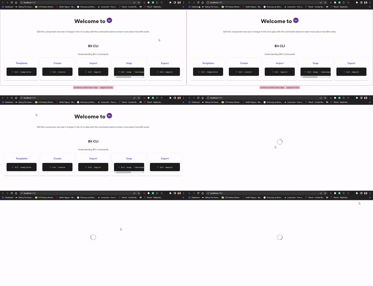
Save these changes and run the React app on your browser to see the changes made on the spinner component.

Everything looks good, you can now create a lane using this command

bit lane create spinner

After this, you can now snap the component.

Snapping changes | Bit

The command below takes a snapshot of the changes made to various components in the workspace. To do that, use the snap command below

bit snap --message "Changed spinner color"

After snapping, you can now export the lane to your remote scope

bit export

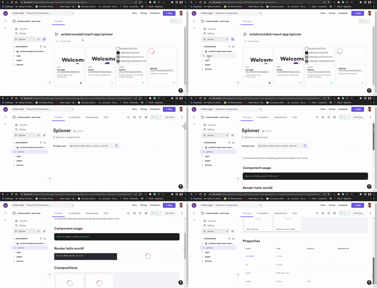
You can now review the updated spinner component in the new remote and scope.

Conclusion

This article taught you how to work in the Bit workspace, create Bit components, and import and export components. You have also touched on bit lanes and snap. All of these are to show you how Bit helps improve your development process for your individual and team projects.

Finally, you can find more amazing tutorials about Bit and how to work with it in the Bit blog, and you can also go through the Bit documentation.

Other Articles about Bit


React Loading Spinner: Building a React Spinner Component with Bit was originally published in Bits and Pieces on Medium, where people are continuing the conversation by highlighting and responding to this story.


This content originally appeared on Bits and Pieces - Medium and was authored by Victor Yakubu

React Spinner: Building a React Spinner Component with Bit
When building React applications, we often need to make certain requests to a database through an API, whether it is a POST, DELETE, GET, or other kinds of requests. These requests are often delayed, either due to network speed or your application's general performance.

When this delay occurs, you need a way to notify visitors and users of your application to hold on while the data to be displayed is fetched. It is a poor user experience to keep users guessing whether or not they should wait or leave, so leaving a page blank while data is being fetched is not a good practice. One of the ways you can handle this is by using a spinner.

spinner GIF

In this article, you will learn how to create a React spinner component with Bit and how to use it on a React-App component.

Requirements

For you to follow along, you will need to have the following

  • Node installed on your local machine
  • Bit binary installed
  • Basic knowledge of React and Typescript.

The scope and components used in this article are available on bit.cloud. you can have access to the code, to help you follow along in this article

If you haven’t installed Bit binary, do that now before you proceed.

bit @teambit/bvm install

If you have had it installed for a while now, make sure you’re running version 0.2.1 or higher. You can use the command below to upgrade to the latest version.

npx @teambit/bvm upgrade

You can now proceed to create your spinner component.

Creating a Spinner component with Bit using the React Spinner Library

Creating a Bit Workspace

When working with Bit, the first thing to do is to create a Bit workspace. The workspace provides the files and directories required for managing, maintaining, composing, versioning, and exporting components.

To create a workplace, run the command in your command line

Syntax:

bit new react react-spinner --empty --skip-git --default-scope [your-cloud-username].[scope-name]

Command:

bit new react react-spinner --empty --skip-git --default-scope aviatorscode2.react-spinner

The command above has created a folder called react-spinner, which contains the workspace files and directories. You can then proceed to open the folder using your code editor.
workspace files

Creating the React Spinner Component

Now that you have your Bit workspace ready, you can now create your Bit component.

Creating components | Bit

Every part of your code can be thought of as a component in Bit. Bit components are simply reusable and composable code with their own installable module that can be maintained in a Bit workspace.

Components can be of different types, from client-side to server-side components. But for the React spinner, you will be using the client-side (React template) component. You can either create a React component using a component scaffolder, where you can add what you want and how you want it to your component file and structure (read more about creating a component scaffolder). Another option that will be used in this article is using a template provided by Bit to create your component. To create a React component, run the code below.

Syntax:

bit create react [Name of component]

Command:

bit create react spinner

After that runs successfully, a spinner folder will be created
Now that you have your component folder and the necessary files created, you can proceed to implement the code to create the spinner component in the Spinner.tsx file.

import React, { CSSProperties } from 'react'
import classnames from 'classnames'
import styles from './spinner.module.css'

export type SpinnerProps = {
className?: string,
id?: string,
style?: CSSProperties,
width?: string,
}

export function Spinner({
width = '38',
style,
id,
className,
}: SpinnerProps) {
const spinnerClasses = classnames(styles['spinner'])
return (
<svg
className={spinnerClasses}
width={width}
height={width}
viewBox="0 0 38 38"
xmlns="http://www.w3.org/2000/svg"
style={style}
data-testid={`test-${id}`}
>
<g fill="none" fillRule="evenodd">
<g transform="translate(1 1)" strokeWidth="2">
<circle strokeOpacity=".5" cx="18" cy="18" r="18" />
<path d="M36 18c0-9.94-8.06-18-18-18">
<animateTransform
attributeName="transform"
type="rotate"
from="0 18 18"
to="360 18 18"
dur="1s"
repeatCount="indefinite"
/>
</path>
</g>
</g>
</svg>
)
}

The above code requires that you install the classnames package.

bit install classnames

You also need to create a CSS file to style the spinner component. So create a CSS file called spinner.module.css.

.spinner {
stroke: var(--spinner-stroke, #383e44);
position: relative;
}

After creating the CSS file, you might run into a type declaration error, that looks like this

To fix this, create a declaration.d.ts file in your component folder and write the code below.

declare module '*css' {
const content: Record<string, string>;
export default content;
}

In your spinner.composition.tsx file, write a composition for your component. The importance of writing a composition for your component is to stimulate and test the component to ensure that it is working as expected, and it also helps other developers who will want to use your component to visualise how it works.

Here is how the composition should look.

import React from 'react';
import { Spinner } from './spinner';

export const BasicSpinner = () => {
return (
<Spinner id="basicSpinner" />
);
}

export const SpinnerCustomStyles = () => (
<Spinner id="spinnerCustomStyles" style={{ margin: '2rem' }} />
)

Lastly, write a test for your component; all components in Bit should be tested. Here is a simple test for the spinner component.

it('should render with the correct text', () => {
expect(true).toBeTruthy();
});

You can now proceed to preview your workspace in the browser to see how your component renders and inspect the UI. Run the code below

bit start

The command will start up the Bit server at http://localhost:3000. When you run the command for the first time, it takes a bit longer to build, but subsequently, it will be faster after the first build.
Everything looks good; the next step is to prepare your component to be exported to bit.cloud.

But before you can do that, you must first create a Bit.Cloud account if you haven't already.

After that, you will need to create a scope for your component. To do that, head to your account and click on the scope.
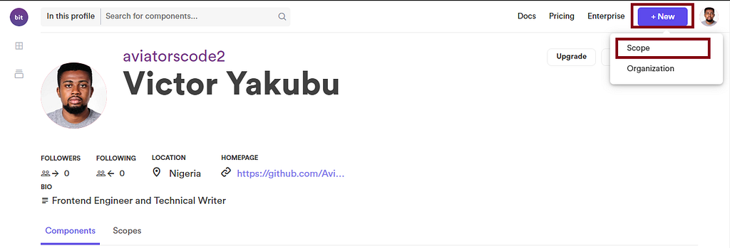
An interface will appear where you will need to type out the name of the component scope. Remember you used react-spinner when creating your workspace, so use the same name for your scope
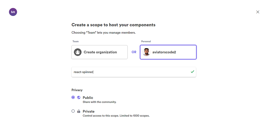
After that, you can click on "create."
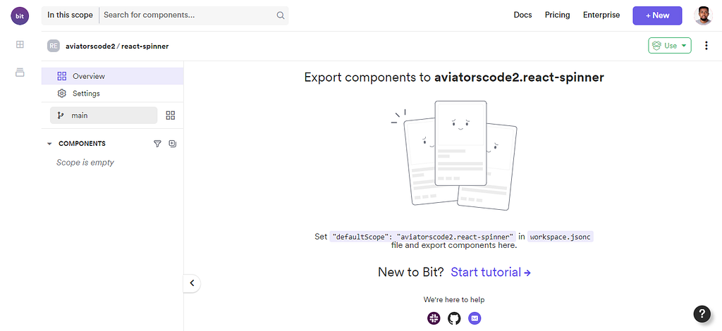
Your remote scope is now ready, so you can proceed to your code editor to export your react-spinner component.

Exporting the React-spinner component

Now head over to your code editor to export your component. Components are exported to make them available for other developers to use or contribute to.

To do that, follow these steps:

  • Run Bit status — This command is used to check the status of your components to be sure that they already to be exported
bit status
  • Run Bit tag — This command is used to add a message and release a version to your component. Every component in Bit has a release version, you can use that in tracking changes made to the component.
bit tag react-spinner/spinner

Your component has been successfully tagged, and it is hot and ready to be exported.

  • Run Bit export — This command is used to export your component from your workspace to your remote scope, making it available for others to use.
bit export

Composing the Spinner component and Rendering it in a React App

In this section, you will learn how to compose a component in Bit using the spinner component in a React application, Bit lane, and Bit snap. So without further ado, let’s dive right in.

Setting a Bit workspace with the React App Template

In order to achieve the tasks for this section, you will need to set up a Bit workspace, for which you will be using the React app template. The React app will be the application on which you will render your Spinner component.

To create a workspace with the React app template, run the command below in your command line in any directory of your choice.

Syntax:

bit new react-app my-react-app --default-scope [bit.cloud-username].[scope.name]

Command:

bit new react-app my-react-app --default-scope aviatorscode2.react-app

NB: Just like in the first section, you will need to create a new scope before exporting the components in this section.
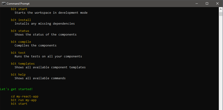
Next, open the workspace in your code editor
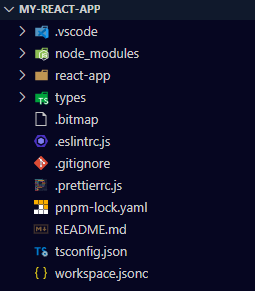
Now your workspace is ready. You can run the command below to spin up the React app on your browser at http://localhost:3000/ to see what the UI looks like.

bit run my-app
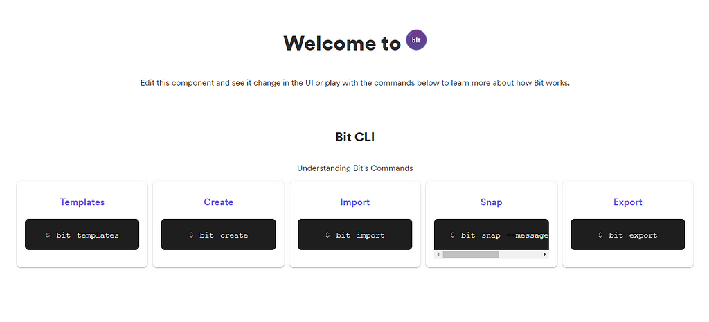
Composing the Bit Spinner Component

One advantage of creating a Bit component is that once it is available in a remote scope, it can be imported, installed, or even forked by other developers. But in this case, you will be installing the spinner component in the new workspace you just created.

So, go to your remote scope on bit.cloud to get the command you will be using for installing the spinner component.
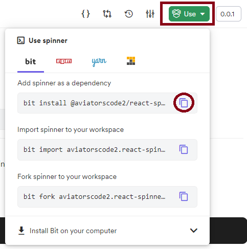
Copy and run the command inside your workspace. If it runs successfully, it means that the Spinner component has been added as a dependency in your workspace.

You can now proceed to import the spinner component into the app.tsx file, which is located inside the react-app folder.

import { Spinner } from "@aviatorscode2/react-spinner.spinner"

The above component is imported using the component package name, and you can locate yours by following the convention:
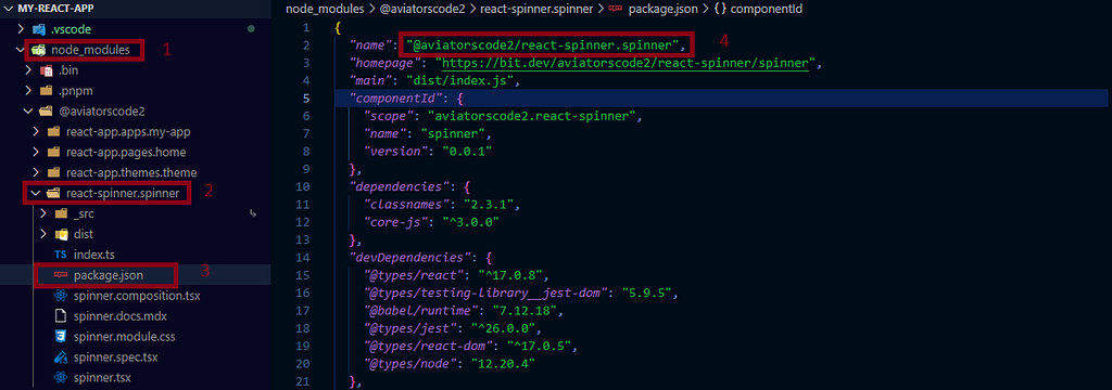
After importing the Spinner component in the app.tsx file, add the loading spinner to the React app, and the spinner will come up while the React app UI is still loading.

SetTimeout will be used to simulate an API call so that there is a brief delay before the user interface (UI) renders in the browser. Here is the implementation.

import React, {useState, useEffect} from "react";
import { BaseTheme } from "@aviatorscode2/react-app.themes.theme";
import { Home } from "@aviatorscode2/react-app.pages.home";
import { ComponentHighlighter } from "@teambit/react.ui.component-highlighter";
import { Routes, Route } from "react-router-dom";
import { Spinner } from "@aviatorscode2/react-spinner.spinner"

export function ReactTemplateApp() {
const [loading, setLoading] = useState(true);

useEffect(() => {
setTimeout(() => {
setLoading(false);
}, 5000);
}, []);

if(loading) {
return (
<div style={{display: "flex", justifyContent: "center", marginTop: "250px"}}>
<Spinner id="basicSpinner"/>
</div>
)
}

return (
<BaseTheme>
<ComponentHighlighter>
{/* header component */}
<Routes>
<Route path="/" element={<Home />} />

<Route
path="/about/*"
element={
{
/* about page component */
}
}
/>
</Routes>
{/* footer component */}
</ComponentHighlighter>
</BaseTheme>
);
}

The useEffect, will be called on every page load, and while that happens, the setTimeout will cause a 5-second delay before the page loads. Save these changes and go to your browser to see how it works.
Bit Lane and Bit Snap

Bit Lane allows you to make changes to a component without affecting the main component. The changes are tracked so that others will know the changes that were made to that component.

Lanes overview | Bit

So you will first need to import the Spinner component so that you can make changes to it. So go to the remote scope and copy and run the import command for the spinner component.

NB: To make changes to a component, you will have to import that component into your workspace. When you install a component, that component is only a dependency, so you can’t make changes that will be seen by others.
After importing the spinner component, go to the spinner component and make some changes to it. You can go to spinner.module.css and change the colour to red and also increase the width of the spinner in the spinner.tsx file.

spinner.module.css:

.spinner {
stroke: var(--spinner-stroke, #d62433);
position: relative;
}

spinner.tsx:

import React, { CSSProperties } from 'react'
import classnames from 'classnames'
import styles from './spinner.module.css'

export type SpinnerProps = {
className?: string,
id?: string,
style?: CSSProperties,
width?: string,
}

export function Spinner({
width = '40',
style,
id,
className,
}: SpinnerProps) {
const spinnerClasses = classnames(styles['spinner'])
return (
<svg
className={spinnerClasses}
width={width}
height={width}
viewBox="0 0 38 38"
xmlns="http://www.w3.org/2000/svg"
style={style}
data-testid={`test-${id}`}
>
<g fill="none" fillRule="evenodd">
<g transform="translate(1 1)" strokeWidth="2">
<circle strokeOpacity=".5" cx="18" cy="18" r="18" />
<path d="M36 18c0-9.94-8.06-18-18-18">
<animateTransform
attributeName="transform"
type="rotate"
from="0 18 18"
to="360 18 18"
dur="1s"
repeatCount="indefinite"
/>
</path>
</g>
</g>
</svg>
)
}

Save these changes and run the React app on your browser to see the changes made on the spinner component.
Everything looks good, you can now create a lane using this command

bit lane create spinner

After this, you can now snap the component.

Snapping changes | Bit

The command below takes a snapshot of the changes made to various components in the workspace. To do that, use the snap command below

bit snap --message "Changed spinner color"

After snapping, you can now export the lane to your remote scope

bit export

You can now review the updated spinner component in the new remote and scope.
Conclusion

This article taught you how to work in the Bit workspace, create Bit components, and import and export components. You have also touched on bit lanes and snap. All of these are to show you how Bit helps improve your development process for your individual and team projects.

Finally, you can find more amazing tutorials about Bit and how to work with it in the Bit blog, and you can also go through the Bit documentation.

Other Articles about Bit


React Loading Spinner: Building a React Spinner Component with Bit was originally published in Bits and Pieces on Medium, where people are continuing the conversation by highlighting and responding to this story.


This content originally appeared on Bits and Pieces - Medium and was authored by Victor Yakubu


Print Share Comment Cite Upload Translate Updates
APA

Victor Yakubu | Sciencx (2022-11-15T11:59:20+00:00) React Loading Spinner: Building a React Spinner Component with Bit. Retrieved from https://www.scien.cx/2022/11/15/react-loading-spinner-building-a-react-spinner-component-with-bit/

MLA
" » React Loading Spinner: Building a React Spinner Component with Bit." Victor Yakubu | Sciencx - Tuesday November 15, 2022, https://www.scien.cx/2022/11/15/react-loading-spinner-building-a-react-spinner-component-with-bit/
HARVARD
Victor Yakubu | Sciencx Tuesday November 15, 2022 » React Loading Spinner: Building a React Spinner Component with Bit., viewed ,<https://www.scien.cx/2022/11/15/react-loading-spinner-building-a-react-spinner-component-with-bit/>
VANCOUVER
Victor Yakubu | Sciencx - » React Loading Spinner: Building a React Spinner Component with Bit. [Internet]. [Accessed ]. Available from: https://www.scien.cx/2022/11/15/react-loading-spinner-building-a-react-spinner-component-with-bit/
CHICAGO
" » React Loading Spinner: Building a React Spinner Component with Bit." Victor Yakubu | Sciencx - Accessed . https://www.scien.cx/2022/11/15/react-loading-spinner-building-a-react-spinner-component-with-bit/
IEEE
" » React Loading Spinner: Building a React Spinner Component with Bit." Victor Yakubu | Sciencx [Online]. Available: https://www.scien.cx/2022/11/15/react-loading-spinner-building-a-react-spinner-component-with-bit/. [Accessed: ]
rf:citation
» React Loading Spinner: Building a React Spinner Component with Bit | Victor Yakubu | Sciencx | https://www.scien.cx/2022/11/15/react-loading-spinner-building-a-react-spinner-component-with-bit/ |

Please log in to upload a file.


There are no updates yet.
Click the Upload button above to add an update.

You must be logged in to translate posts. Please log in or register.