This content originally appeared on Telerik Blogs and was authored by Suzanne Scacca
Just as you might configure a contact form with in-line error messaging, your website should have a custom 404 page ready for users who venture down the wrong path. But what exactly should you include on it? In this post, we’ll look at some effective examples of 404 error pages and tips to help you build your own.
Is it a waste of time to create a custom 404 page for a website? I don’t believe so.
As more and more users flock to the web to get things done, we have to expect that many of them will encounter 404 errors due to broken internal links or misspelled URLs. While we want to do everything we can to minimize those occurrences, sometimes it’s unavoidable.
As such, it’s a good idea to create a custom 404 page so that visitors encounter something interesting and helpful instead of a page that feels cold and mechanical. In this post, we’re going to look at why a custom 404 page is preferable to the system default message along with tips to help you create a 404 page that gets visitors to re-engage instead of bounce.
6 Tips for Designing a Custom 404 Page
A 404 error page appears when a website visitor encounters a non-existent page. This can happen when there’s a broken internal link on the site (because the page was renamed or deleted) or when the user types in the wrong slug.
There are a number of default error pages that may appear if no customization is done to them.
This “server error” message is one of them:
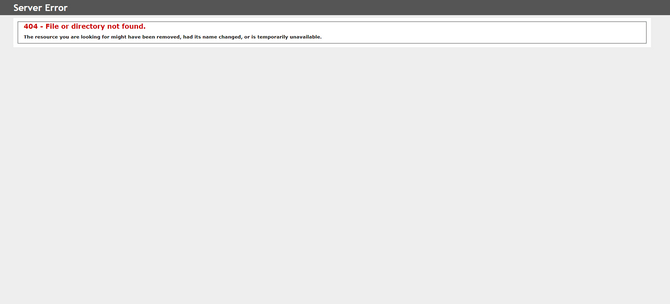
While the user is still technically on the website (as evidenced by the address in their browser bar), the only way to escape from this kind of error page is to use the “Back” button. Neither the message nor the reversal approach is user-friendly.
The “not found” message is another generic way to handle the 404 error:

Again, the website effectively disappears and the user is left with this jarring disruption to their experience. All it is is an all-white page with a simple, technical explanation at the top of how they ended up there.
A custom 404 page is going to be much better for the user experience than these two pages. However, you have to do more with it than just place the 404 notice within the context of the site as Tesla does:
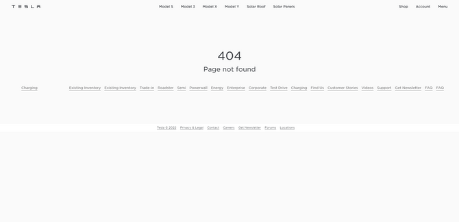
This is a step up from the default pages that hide the header and footer of the website. However, there’s nothing really of value here.
If you can design a custom 404 page that reduces user frustration and provides them with a more memorable or entertaining experience, you’re more likely to see them re-engage than exit the site.
As you go about creating your 404 page, here are some things to keep in mind:
1. Clearly State That an Error Occurred
As I explored 404 error pages today, I discovered an annoying trend. Many websites don’t have a 404 page at all. Instead, when someone encounters an error, they immediately move the user to a designated page (usually the homepage).
While it’s nice to keep users on the site, it’s going to confuse a lot of people when they assume they’re about to see a product page, for example, but end up on the homepage instead. In fact, many of those people will probably try to execute the same steps as before, thinking that maybe something went awry before.
This kind of design will only result in users doing unnecessary work and giving them more reason to be frustrated and fed up with the site.
It’s OK when errors occur, so long as they’re rare. And when they do, you should have a 404 page waiting for them—one that explains that an error did occur, but it’s okay because you’re going to help them get back to the good parts of the site.
Here’s how the Laura Mercier website does it:
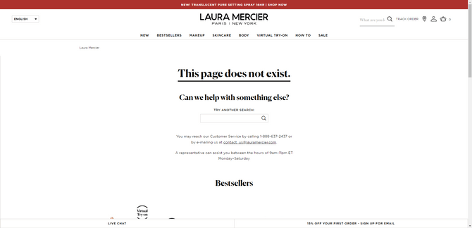
This 404 page skips the mention of the 404 error code altogether and spells it out in basic terms: “This page does not exist.”
That said, there’s nothing wrong with including a reference to the error code. Most people are familiar with what it means. However, if you’re going to do that, consider adding a personalized message alongside it as NFL.com does:
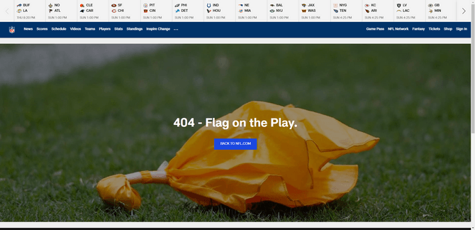
This error page uses football terminology and an accompanying image to refer to the foul that has occurred. Even though website errors are annoying, the cheeky take on the 404 error page will likely bring a smile to many football fans’ faces who encounter it.
2. Keep the Navigation Visible
The only time it’s really acceptable to remove the navigation from view is for sales landing pages. Even then, that’s somewhat questionable as there should at least be a link pointing back to the homepage in case the user decides they made a wrong choice.
While your 404 error message can provide helpful links within it, the website header and navigation should also be in full view on the 404 page.
Here’s what Monzo’s 404 page looks like:
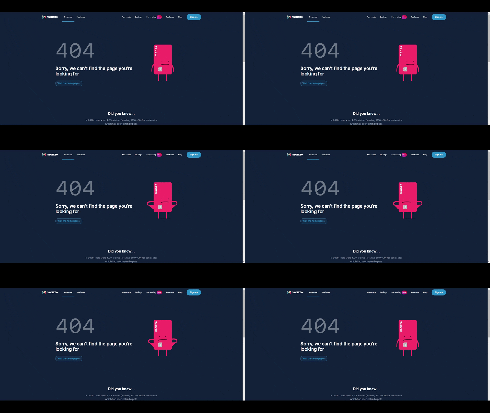
There are a lot of great choices made by the designer of this page. First, they keep it simple. The 404 error message is brief and to the point. Second, they include only one recommended link so as to reduce the number of decisions the user has to make, given the fact they just realized what they’re looking for isn’t there anymore.
What’s more, the overall design—the ample white space, the cute animation and the visible navigation—will help reduce any feelings of claustrophobia or restriction the visitor might feel when encountering an error.
3. Be Mindful of How You Use the Word “You”
You never want your users to feel like they’re being blamed or shamed for any actions they take on your website. So, to keep them feeling positive and confident about the experience, you (or your copywriter) will need to be mindful of how the 404 error message is written.
Let’s look at the 404 page example from Anthropologie:
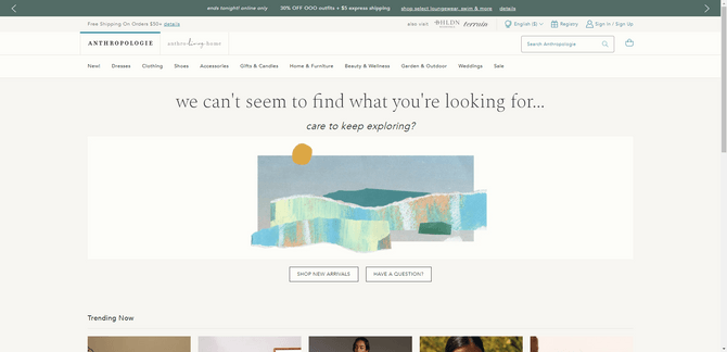
Anthropologie’s error message bears the brunt of the responsibility by saying, “we can’t seem to find what you’re looking for…” By turning it around on the brand, the user is less likely to feel like they were the one that made a mistake.
Another option is to take you out of it altogether as Travel & Leisure does:
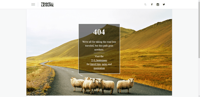
Again, there’s no blaming the user. The message simply states that “this path goes nowhere” and then it directs the visitor to try one of a few different links.
4. Add Some Personality to the Message
It’s disappointing when you encounter an error on a website. You had an expectation of what was to come next and then, ugh, it looks like that’s not going to happen.
But what’s more likely to soften the blow when this happens? A page that mechanically lists out the error code and the technical reasons why it no longer exists? Or a page that adopts the personality of the brand and gets you to smile and maybe even laugh a little?
For example, this is the 404 page for the Skillshare website:
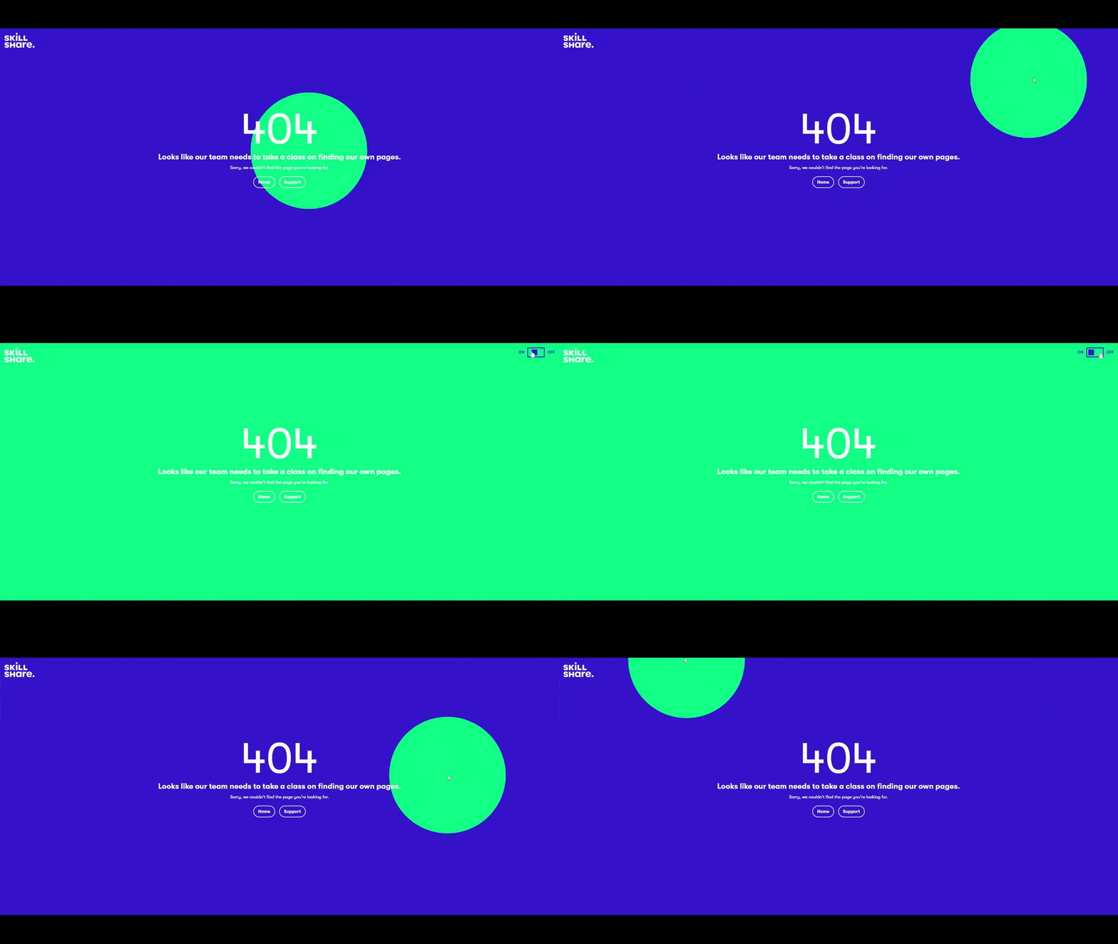
The design of this page is really cool as the green orb moves along with the user’s cursor movements. If they happen to move into the top-right corner, they’ll see a toggle switch that changes the background from blue to green.
That’s not really what we should be focused on though. It’s the cheeky, self-deprecating error message that enables Skillshare to take the blame for the 404 error away from the visitor.
Another website where we find a fun take on the 404 error page is Progressive:
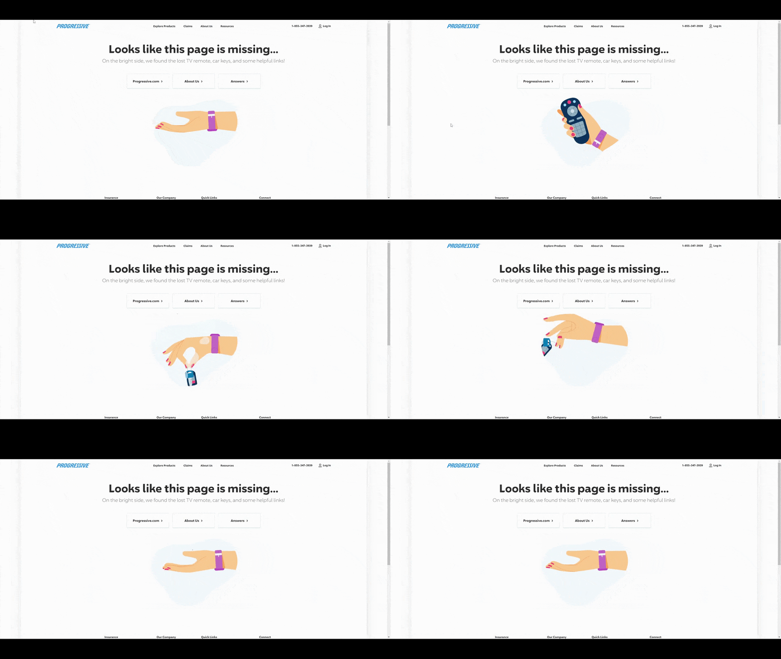
Since this brand is known for its wry sense of humor, I was expecting to find this sort of 404 page on the site. And it didn’t disappoint. It’s just as silly as the ads the company runs for its insurance products.
Of course, you want the personality and sense of humor to align with the rest of the copy on the site, so if jokes and self-deprecation aren’t a natural part of the brand identity, go easy on it. A 404 error message doesn’t need to be funny in order to be effective.
5. Use Branded Imagery
If you’re going to the trouble of creating a 404 page for your website, make sure you use brand-specific imagery in your design. Generic images or illustrations are always a dead giveaway that the page was quickly thrown together from a template. While that kind of imagery is an improvement on the default 404 error page, you’re not going to impress any of your users that way.
The example I want to look at for this one is Marvel.com. Here’s one of the few designs that visitors will encounter if they run into a non-existent link:
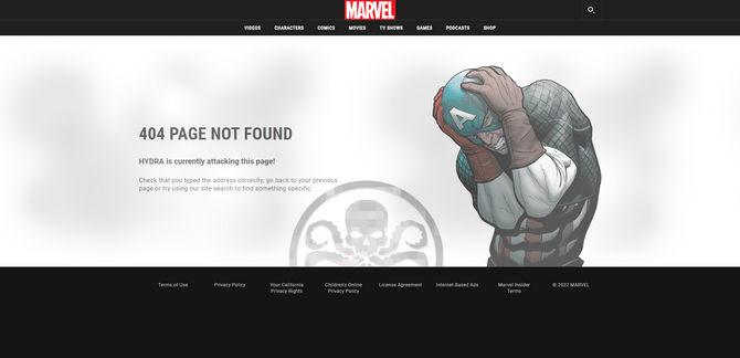
This is a lightly animated 404 error page featuring Captain America and his long-time foe HYDRA. Fans of Marvel will instantly recognize the graphic of the superhero and will be entertained by the HYDRA name-drop.
Another page they might encounter is this one:
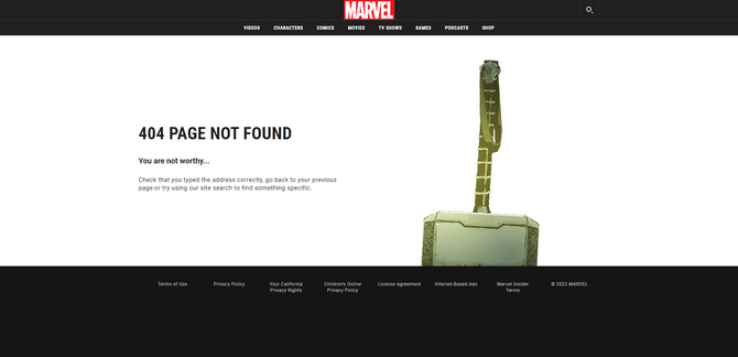
This 404 page features Thor’s hammer, Mjölnir. Just as one must be worthy in order to wield it, apparently one must also be worthy to find the page they want on the Marvel site.
Another 404 alternative is this one featuring Black Widow:
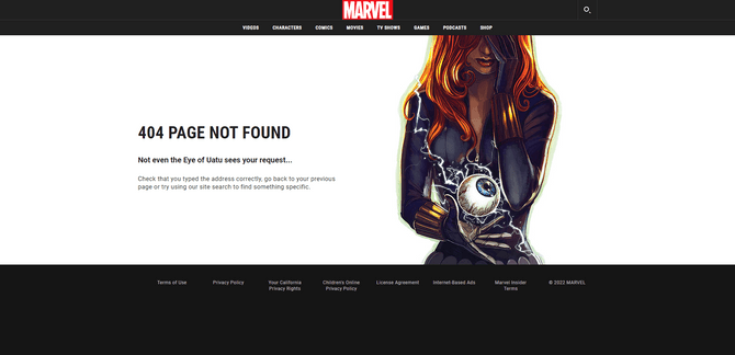
We see Black Widow holding her hand over one eye while looking down at the Eye of Uatu.
The beautifully illustrated (and, in some cases, animated) graphics are perfect for the Marvel website. If the designer had used anything but characters from the pages of the comic books or movies, visitors definitely would’ve felt disappointment on top of their confusion and frustration at encountering a 404 error.
You obviously don’t have to go to the extremes that Marvel does to create this many 404 alternative designs. The point is to show you how relevant, branded imagery can make the page more effective.
6. Provide Helpful Next Steps and/or Links
Imagine you’re at a restaurant and the server asks you what you want to order. But everything you ask for is sold out. Instead of offering comparable alternatives you’d like, the server just stares at you all glassy-eyed, waiting for you to request something else. That’s what it can feel like for some visitors when they run into a 404 page without anything but an error code and “page does not exist” message.
The people who take the time to read through the error message aren’t doing so in order to get a summary of what a 404 error means. By now, most people realize that the 404 error means that the one they wanted doesn’t exist—at least not at the URL they tried to access it through.
What they want is help. While the visible navigation and footer can be of some assistance, the 404 message should be more specific about what they should do next.
The best thing to do is as the Nielsen Norman Group does and provide suggestions based on popularity and usefulness:
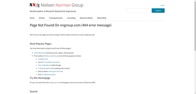
The page is simply designed with well-structured copy and plentiful white space. There are three steps suggested to lost visitors:
- Check out the most popular pages on the site.
- Try the homepage.
- Do a search (they’ll find a search bar if they scroll just a bit more).
Don’t focus too much on the design of the page itself. That’s yours to make of what you want. However, the structure of the recommendations with the clear headings, short sentences and colorful hyperlinks is worth emulating if you’re going to provide steps and tips on where to go next.
Wrap-up
Ideally, your website will be set up to limit how many 404 errors occur. That means frequently monitoring for and repairing broken links. Setting up 301 redirects whenever you change a page’s slug. And also monitoring your Google Analytics and the traffic flow that commonly takes visitors to the 404 page.
Even doing this can’t prevent all 404 errors. And like I said in the beginning, that’s A-OK. So long as you have a custom 404 page waiting for your visitors—one that’s relevant, helpful and on-brand—you’ll encourage most of them to re-engage with the site.
This content originally appeared on Telerik Blogs and was authored by Suzanne Scacca
Suzanne Scacca | Sciencx (2022-12-28T16:11:03+00:00) How To Design an Effective 404 Page for Websites. Retrieved from https://www.scien.cx/2022/12/28/how-to-design-an-effective-404-page-for-websites/
Please log in to upload a file.
There are no updates yet.
Click the Upload button above to add an update.
