This content originally appeared on Zell Liew and was authored by Zell Liew
I chanced upon heydon’s Codepen for creating self-correcting grids with pseudo classes a while ago and that totally blew my mind away. I started to think about how we can use pseudo selectors to create smarter HTML layouts and I have summarised my thoughts on this in this article.
First Off, What Are Smart Layouts?
Smart layouts, in my definition, are layouts that appear correctly without the use of classes to specifically tell an element how it should be presented. I believe that all frontend presentational code and information should be found only in the CSS file, and backend developers should not have to remember the specific class names used in the markup.
That sounds abit vague, so let’s start this with a simple example to see what I really mean by smart layouts. If you are given a layout like this,

and if used either Bootstrap or Foundation to create this layout, your html will end up looking like this:
<div class="wrap">
  <div class="col-md-8">Content</div>
  <div class="col-md-4">Sidebar</div>
</div>
This is not entirely smart, and we have to trouble the backend developers (if you don’t work alone) to remember the classes used for presentation. Ideally, that shouldn’t happen because these poor chaps have too many other complications to deal with. We should try to help them out a little, since we’re the good guys :)
Because I didn’t want the poor backend guys to remember and use presentational classes everywhere, Susy appeared super attractive to me.
I quickly transited to semantic code, and you might have code something similar to what I have done previously:
<div class="wrap">
  <div class="content">Content</div>
  <div class="sidebar">Sidebar</div>
</div>
So much better!
Presentational classes like col-md-8 are now hidden from view and it looks much better. What’s left in its place are now semantic class names .content and .sidebar.
However, if you really think about it, .content and .sidebar ARE presentational classes as well! Its more semantic compared to .col-md-8, but that doesn’t entirely solve the problem of requiring developers to remember specific classes!
A much better way is to abstract out the .content and .sidebar classes and have the items within be targeted with a common HTML element like a <div>. If that’s a little too extreme, you can also use an attribute or class as necessary. The idea is to keep the class or attribute used constant across all layouts, and only change the layout name.
<div class="wrap">
  <div class="content-sidebar">
    <div>Content</div> <!-- If you want a class, replace with -->
    <div>Sidebar</div> <!-- <div class="susy-grid-item"> * </div>-->
  </div>
</div>
In this case, the .content and .sidebar are abstracted one level upwards onto a layout pattern named .content-sidebar. Although this doesn’t entirely remove the need for developers to remember the specific grid classes, I believe it reduces their cognitive overload because they now only have to remember one class instead multiple classes for the layout they are trying to create. Note: I haven’t tested the theory out with developers yet, so I’m really thinking aloud here :)
Writing the HTML code this way also helps to organize my Sass codes better as well. The Sass (with Susy) may look something like:
.content-sidebar {
  > div {
    // content
    &:nth-child(1) {
      @include span(8);
    }

    // Sidebar
    &:nth-child(2) {
      @include span(4 last);
    }
  }
}

// Another Layout Pattern
This methods helps to split layouts patterns out in the CSS files easily without even even using comments between each pattern. You do however, need to provide proper comments within the layouts themselves or these nth-child() selectors may not make sense.
But why is this even needed? Isn’t this complicating things? To answer this question, we can bring in a slightly more complex example that helped me derive this method: Mixpanel’s blog.
Mixpanel’s Blog Layout Pattern
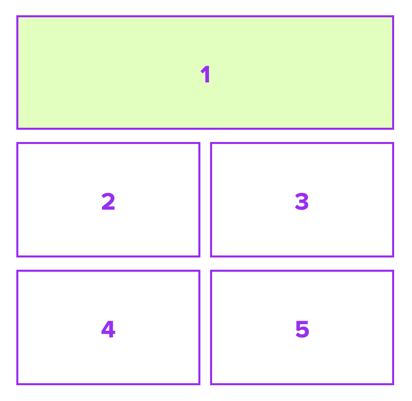
Mixpanel’s blog has a very unique layout that changes depending on the viewport. This is how the layout looks like on a tablet sized viewport:

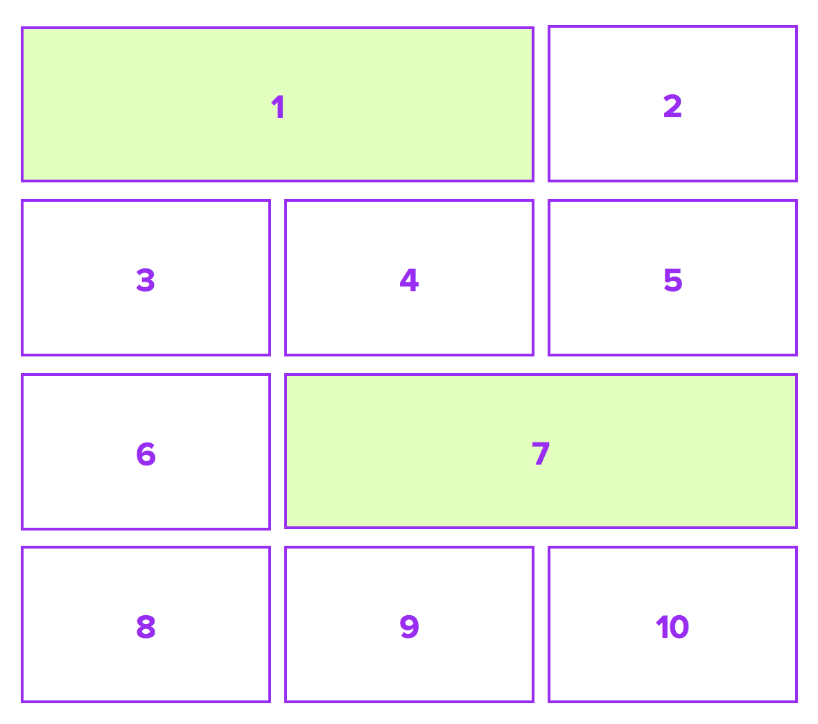
and on a desktop sized viewport:

These patterns repeat over and over if there are more than 5 items or 10 items on the tablet viewport and desktop viewport respectively.
Essentially, you can also say that the tablet sized viewport has a layout pattern that consists of 5-items while the desktop sized viewport has a layout pattern that consists of 10 items.
If we go along with the conventional wisdom of adding classes into the HTML for each different layout, you might add classes like .blog__item and .blog__item--large to help differentiate between the large block (shaded green), and the standard block.
The HTML for the tablet viewport may be
<div class="wrap">
  <ul class="blog-list">
    <li class="blog__item blog__item--large">Large</li>
    <li class="blog__item">Normal</li>
    <li class="blog__item">Normal</li>
    <li class="blog__item">Normal</li>
    <li class="blog__item">Normal</li>
    <!-- ... and the pattern repeats -->
  </ul>
</div>
In this case, the developers who are building the backend for this page will have to create an algorithm to add the .blog__item--large class to every 5th item, starting from the first item.
Thats one extra thing backend developers have to do for us (or one extra thing you have to do if you’re developing the backend yourself).
It gets very complicated on the desktop viewport. You’ll now have to remove .blog__item--large from every fifth item and add it to the every first and seventh item of pattern. (If this sounds confusing, look back up on the desktop layout and you can see that this pattern is made up of ten blocks, and every first and seventh item of the pattern are large blocks).
And you now have your hands on a horrendous Javascript exercise which can be avoided entirely if your layouts was a little smarter.
And here’s what you can potentially do instead.
Making the Smarter Layout
You can target these blog items with pseudo classes instead of using normal classes. In this case, we would remove all class names and are left with:
<div class="wrap">
  <div class="blog-list">
    <div>Item</div> <!-- We can make this large with CSS pseudo classes -->
    <div>Item</div>
    <div>Item</div>
    <div>Item</div>
    <div>Item</div>
  </div>
</div>
The above HTML applies for both the tablet and the desktop views. Are you wondering how it can work?
I mentioned above that you can use pseudo classes to target the correct items for you. Specifically, the pseudo class you can use is the nth-child pseudo class .
We already know that every fifth item, starting from the first, is supposed to be the large block on the tablet. Its now time to stretch your nth-child selector-fu muscles!
.blog-list {
  > div {
    // .. Normal sized properties here

    &:nth-child(5n+1) {
      // Large sized properties here
    }
  }
}
The result of this output is basically the same as adding blog__item--large on every 5th item, starting from the first one in the HTML.
We have to manage the desktop one as well. And we know that every first and seventh item of each repeating pattern of 10 blocks are large blocks. The CSS only for desktop will be very similar to the tablet one, with the exception that the pseudo selectors are changed.
.blog-list {
  > div {
    // .. Normal sized properties here

    &:nth-child(10n+1),
    &:nth-child(10n+7) {
      // Large sized properties here
    }
  }
}
Of course, we want to put both of these together in the same CSS file. The full code (inclusive of media queries) is:
.blog-list {
  > div {
    // .. Mobile styles for the layout here

    @media (min-width: tablet-size) and (max-width: desktop-size){
      // .. Normal sized properties for tablet goes here

      &:nth-child(5n+1) {
        // .. Large sized properties for tablet goes here
      }
    }

    @media (min-width: desktop-sized) {
      // .. Normal sized properties for desktop goes here

      &:nth-child(10n+1),
      &:nth-child(10n+7) {
        // .. Large sized properties for desktop goes here
      }
    }
  }
}
And that’s what you’ll need to create a smart layout like Mixpanel’s blog without any additional Javscript. We are able to do this because we relied on html elements and pseudo classes instead of fully relying on classes. Note: I deliberately placed pseudo codes in there so its much easier to read and understand :)
Building Mixpanel’s layout with Susy
And as you know by now, Susy allows you to use any selector you want to, and it can help us with creating such a layout. You just have to substitute the commented portions with real code.
Say if you used the following global settings:
$susy: (
  columns: 12,
  gutter-position: split,
  )
Which simple means that you’re using a 12 column grid and you changed the gutter-position to split, the Sass for the tablet view would be:
.blog-list {
  > div {
    @media (min-width: 768px) and (max-width: 1024px){
      @include span(6);
      margin-bottom: gutter();

      &:nth-child(5n+1) {
        @include span(12);
      }
    }
  }
}
And the Sass for the desktop view would be:
.blog-list {
  > div {
    @media (min-width: 1025px) {
      @include span(4);
      margin-bottom: gutter();

      &:nth-child(10n+1),
      &:nth-child(10n+7) {
        @include span(8);
      }
    }
  }
}
The eventual Sass is thus:
.blog-list {
  > div {
    // .. Mobile styles for the layout here

    // Tablet Layout Pattern
    @media (min-width: 768px) and (max-width: 1024px){
      @include span(6);
      margin-bottom: gutter();

      &:nth-child(5n+1) {
        @include span(12);
      }
    }

    // Desktop Layout Pattern
    @media (min-width: 1025px) {
      @include span(4);
      margin-bottom: gutter();

      &:nth-child(10n+1),
      &:nth-child(10n+7) {
        @include span(8);
      }
    }
  }
}
you can find the finished sample on Codepen.
See the Pen rufmH by Zell Liew (@zellwk) on CodePen.
This blog post example is just one portion of one of the 20 templates I have created for Learning Susy. The actual template is slightly more difficult to create because there is a need for static grids in Susy. If you liked what you’ve seen here, you’ll definitely want to find out about the others! Hop on over to the full package if you’re interested to grab all the templates and other good stuff :)
Conclusion
HTML and CSS can be quite smart if you allow it to, and that means reducing the dependence on CSS classes which we have all grown accustomed to. It can a hard battle to put down the well crafted habits on CSS classes and I felt very weird initially. However after seeing the results of these experiments, I begin to believe that we can indeed do with lesser classes.
There are more experiments that I want to share with you, but the article is getting long. Let’s take a break tonight.
Do take note that if you have to work with IE8, and you want to use this method, you’ll have to add some polyfills to it. That’ll be covered in the next article.
This content originally appeared on Zell Liew and was authored by Zell Liew
Zell Liew | Sciencx (2014-09-08T00:00:00+00:00) Smarter Layouts with Susy. Retrieved from https://www.scien.cx/2014/09/08/smarter-layouts-with-susy/
Please log in to upload a file.
There are no updates yet.
Click the Upload button above to add an update.
