This content originally appeared on Zell Liew and was authored by Zell Liew
One question that was asked in the Susy survey I created a month ago really stood out to me. The question is “how to remove margins or paddings of the first and last column without using first-child and last-child in the grid system?”.
This one big question is likely one that has caused huge amounts of headaches to beginners who are just starting to learn about Susy. If we go down into the roots of the question, it is quite likely that you have used the inside gutter position instead of after after seeing the many of the tutorials online. To answer this question, you must understand how gutter position affects your layout.
I feel that gutter position is one of the more important settings in Susy because it causes you code things differently when doing your layout. If you have asked this question before, then this blog post about gutter positions is for you.
What is Gutter Position?
Gutter position is one of the settings that Susy allows you to change for your layouts. It specifies where the gutter should be output with reference to the columns. It also specifies whether they should be output as margins or paddings.
It can be found in the global settings within the $susy map. Alternatively, you can also use it within span shorthands. Let’s stick with the $susy map for this tutorial.
Gutter position is set to after by default in Susy, and can be changed to before, split, inside or inside static. Here’s how gutter-position will look like in the $susy map. The items contained within brackets are other possible settings for gutter-position, and we will go through them one by one.
// Scss
$susy: (
  gutter-position: after (before | after | split | inside | inside-static )
  );
Let’s create a very simple layout for this tutorial, and understand how these gutter positions work.

After
after is the default gutter-position setting and it tells Susy to place a gutter after every single column. In this mode, you will need to remove the gutters for the last column in the row. Gutters are output as margins in this mode.

When using after, the default span mixin will produce 3 properties, width, margin-right and float: left.
// Scss
.test {
  @include span(3 of 4);
}
This will result in the follow CSS output:
.test {
  width: 73.68421%;
  float: left;
  margin-right: 5.26316%;
}
margin-right is the gutter that Susy has created for the grid.
You can use the last keyword with after to remove the final margin.
// Scss
.last {
  @include span(1 of 4 last);
}
This sets the margin-right to 0.
.last {
  width: 21.05263%;
  float: right;
  margin-right: 0;
}
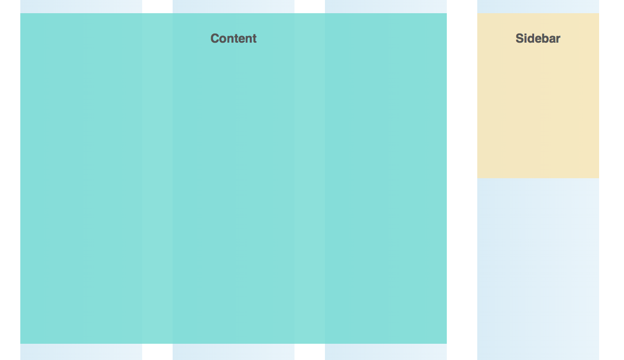
In the layout about, the content area takes up 3 of 4 columns while the sidebar takes up one of 4 columns. Sidebar is also the last item, it translates to this:
// Scss
.content {
  @include span(3 of 4);
}
.sidebar {
  @include span(1 of 4 last);
}
Quick summary for after: after is the most intuitive layout styles that you can start with while using Susy. When using after, you just have to remove the last item in the row with the last keyword.
Before
before is another variation of after and the basic process is the same. Instead of placing a gutter after every column, before places the gutter before every column. In this mode, you will need to remove the gutters for the first column in the row. Gutters are also output as margins in this mode.

When using before, the default span mixin will produce 3 properties, width, margin-left and float: left.
// Scss
.test {
  @include span(3 of 4);
}
This will result in the follow CSS output:
.test {
  width: 73.68421%;
  float: left;
  margin-left: 5.26316%; /* Notice this is margin left, not right */
}
This margin-left property creates the gutter in before.
Since this is a complete opposite switch of gutters, its relatively easier to understand once you get to know after. Instead of placing a last keyword for the last item, we just have to place a first keyword for the first item in the column.
// Scss
.content {
  @include span(3 of 4 first);
}

.sidebar {
  @include span(1 of 4);
}
And we will obtain the same layout.
Quick summary for before: before works exactly the same as after. The only exception is that you will need to remove margins for the first item in row with the first key.
Split
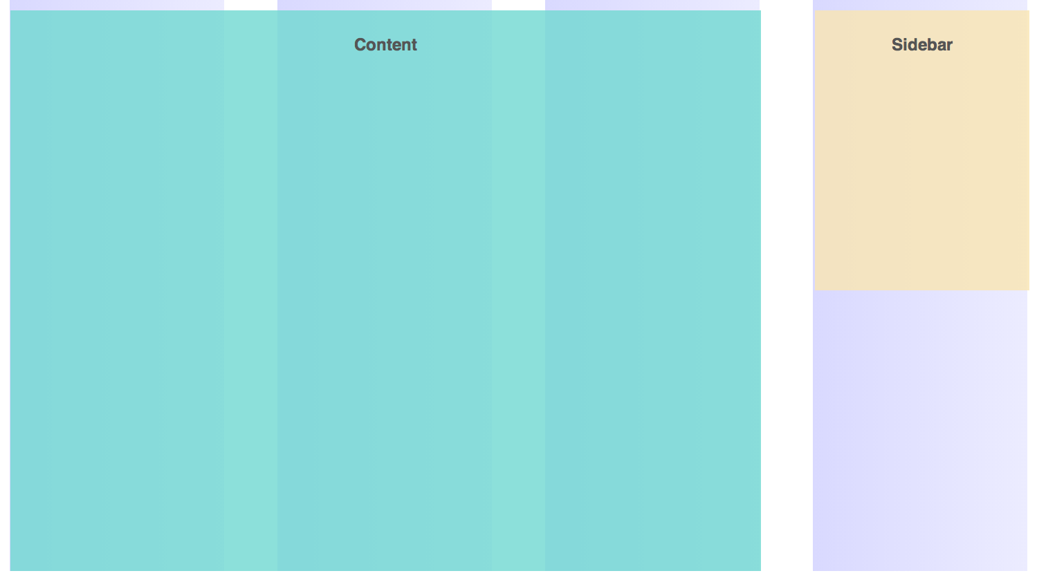
split is a totally different to both before and after. In split, the gutters are divided into two and placed on each side of the column. Gutters are output as margins in this mode, and there is no need to remove gutters for at the edges of the row.

If we only had .content and .sidebar, split gutters are easy. We just need to use the span function as we will normally do.
// Scss
.content {
  @include span(3 of 4);
}

.sidebar {
  @include span(1 of 4);
}

It won’t be as straightforward though, if either .content or .sidebar contains any children elements.
Lets add two children <div> with the class of .child-one and .child-two respectively into .content to help illustrate this.
<div class="content">
  <h2>Content</h2>
  <div class="child-one"><h2>Child One</h2></div>
  <div class="child-two"><h2>Child Two</h2></div>
</div>
And lets try the same method we used previously. .child-one will take up 2 of 3 columns, while .child-two will take up 1 of 3 columns.
// Scss
.content {
  @include span(3 of 4);
}

.child-one {
  @include span(2 of 3);
}

.child-two {
  @include span(1 of 3);
}

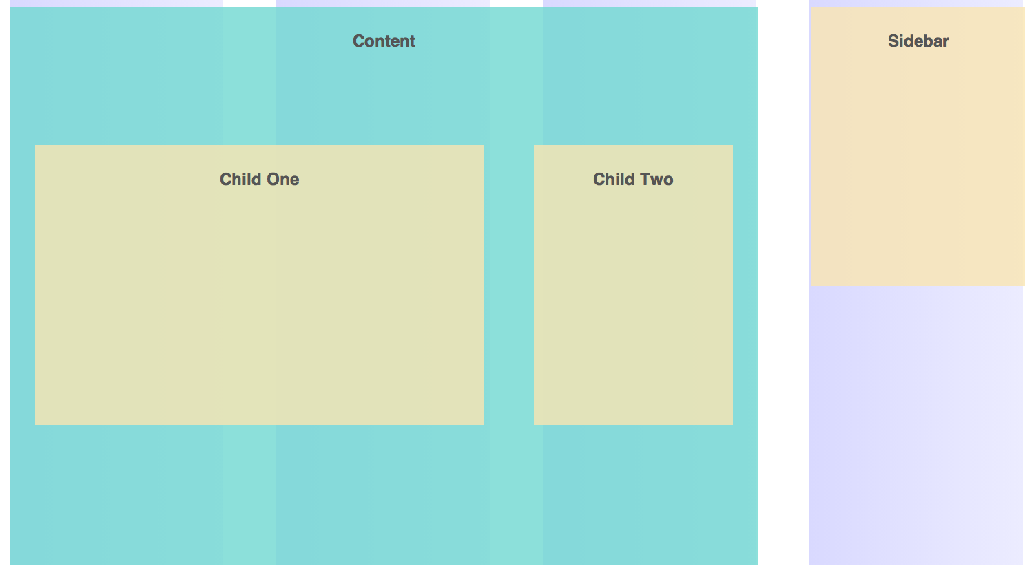
Notice how .child-one and child-two are completely out of alignment with the grid background!
This is because when you’re working with split gutters, you need to be aware of parent and children contexts. The parent in this case is .content while children are .child-one and .child-two.
The way Susy outputs the CSS for these two contexts are very different. We need to tell Susy that .content is the parent with the nest key.
// Scss
.content {
  @include span(3 of 4 nest); // The nest key is needed
}

.child-one {
  @include span(2 of 3);
}

.child-two {
  @include span(1 of 3);
}

Notice how that the background for .content is extending past the columns while the .child-one and .child-two are now nicely fitted into the grids.
It may be a little confusing at first. A way to remember is that you are always trying to fit children elements into the correct grids, and that you’ll need to use the nest key on parent elements.
If you looked deeper into the actual CSS produced, you’ll find that CSS for .content and CSS for .child-one and .child-two are completely different.
/* CSS */
.content {
  width: 75%;
  float: left;
}

.child-one {
  width: 60%;
  float: left;
  margin-left: 3.33333%;
  margin-right: 3.33333%;
}

.child-two {
  width: 26.66667%;
  float: left;
  margin-left: 3.33333%;
  margin-right: 3.33333%;
}
The parent element has a float the represents the percentage width of the span, without taking into account gutters (75% is 3/4).
Children elements are the ones that output all the gutters.
Quick Summary for Split: split works differently from both before and after. When working with split, you have to make sure to add a nest keyword to all parent containers and to use the span mixin for all child containers.
Inside / Inside-static
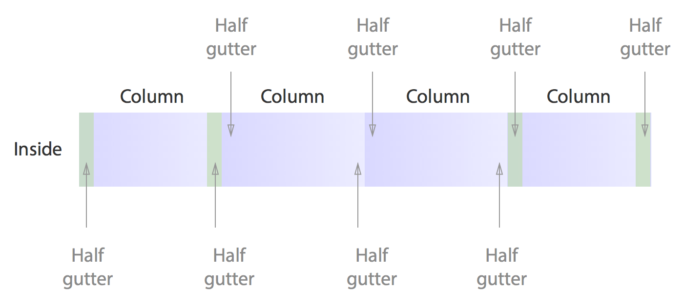
Both inside and inside-static are very similar to split. The gutters are split up into two place placed on each side of the column. These gutters however, are output as paddings instead. There is also no need to remove gutters for at the edges of the row.

Inside gutters have the same mechanism as split. If you didn’t declare a nest keyword on the parent element, the children elements will go out of place.
// Scss
.content {
  @include span(3 of 4);
}

.child-one {
  @include span(2 of 3);
}

.child-two {
  @include span(1 of 3);
}

Just remember to add nest keyword to .content and you’re set.
// Scss
.content {
  @include span(3 of 4 nest); // The nest key is needed
}

.child-one {
  @include span(2 of 3);
}

.child-two {
  @include span(1 of 3);
}

inside-static works exactly the same way as inside. The only exception is that it produces gutters in units instead of percentages, and if you have given a width to column-width setting.
Quick Summary: inside works the same way as split. When working with inside, you have to make sure to add a nest keyword to all parent containers and to use the span mixin for all child containers.
split and inside use the exact same layouts, and you can simply interchange between these two in $susy's gutter-position setting!
Conclusion
Gutter positions affect how you would choose to write your layouts with Susy. Different gutter positions have different quirks and they need to be understood if you want to use it effectively.
There are two major patterns here:
beforeandafteroutputs gutters to one edge and these gutters have to be removed at the extreme edges.split,insideandinside-staticsplits the gutters up into two and outputs them on either side of the columns. These gutters are not removed at all.
This blog post is a small excerpt of what I have in the Learning Susy book regarding gutter position in Chapter 8. In the book, we will discuss more about these positions and actually create a more complicated layout with them. If you enjoyed this, you’ll definitely want to find out more in the book! :)
Let me know what you have learnt today in the comments below!
This content originally appeared on Zell Liew and was authored by Zell Liew
Zell Liew | Sciencx (2014-08-17T00:00:00+00:00) Understanding Gutter Positions in Susy. Retrieved from https://www.scien.cx/2014/08/17/understanding-gutter-positions-in-susy/
Please log in to upload a file.
There are no updates yet.
Click the Upload button above to add an update.
