This content originally appeared on Bits and Pieces - Medium and was authored by Gustavo de Paula
Rebuilding Loggi’s Design System on Top of Material UI
Loggi is a logistics tech company in Brazil. Loggi leverages software and design to connect Brazil by building a better logistics service that is able to deliver anything to anyone anywhere in Brazil fast and for an affordable price.
Three years ago, we made a bet to replace our in-house design system component library with Material UI. This article tells the history of this journey, from the beginning describing what is a design system and why it is useful to why we decided to use Material UI and what we have learned along the way.
What is a design system?
A design system is a set of consistent principles and rules that guide the creation of user experiences inside a product.
Usually, when people talk about design systems, there are two separate parts that usually are bundled together:
- The design system:
— it’s the rules and principles themselves
— dictates how UI elements should look, feel, and behave
— it’s made by designers - The UI library
— implements a set of reusable components
— adheres to a design system
— it’s made by developers
Why have a Design System
During this process, we enumerated the five most important aspects of a design system that we observed throughout this period:
Consistency: We want all parts of our product to feel and behave as a consistent whole. This improves our user experience as it lowers the learning curve of the product, as interactions and visual elements follow consistent patterns that repeat themselves all over their journey.
Scalability: The growth of the design and engineering team should not be a problem, but a solution. The design system is a tool to standardize and organize everyone’s workflow
Agility: The motto here is Reuse. Agility for us in this context is being able to use everyone’s effort in a smart way, by being able to reuse discoveries and breakthroughs in future projects and needs
Communication: The design system serves as the communication common ground between designers, developers, and product managers. The design system here works as a universal language, where terms and concepts are well-defined with no ambiguity.
Long-term low maintenance cost: In a large-scale team, new products and features come up all the time, and maintaining our user experience consistent and coherent across multiple platforms requires a lot of effort. Not having to reinvent the wheel both in terms of design tokens and code components help us make continuous product deliveries.
How we Build a Component Design System
What we had
We started using a design system in mid-2015 (you can read a more complete history about that here).
The UI Library implemented the design specifications as React components. These React components applied CSS classes to HTML elements. These CSS classes were made with SCSS and started as a fork of Bootstrap.
As time went on, more and more components and variants were added to the library, with all development being made in-house.
At some point, support for React Native was added, as we started using React Native (some years after that, we stopped developing mobile apps with React Native).
There was no dedicated team that supported the development of the UI library. Instead, a team of engineers volunteered their “free time” (between one task and another) to improve the library and implement new features.
What worked and what didn’t
This model worked well enough for a long time, especially when our product team was not that big (<50 designers + developers). As the product team grew, and more features were developed concurrently, we started noting some scalability problems with our current all-in-house setup.
What worked well?
- Agility: Reusing already-made components was an easy task.
- Communication: All the components and variants were documented in Sketch files (and later Figma) with the same language used in the code. This made it easy for a developer to reproduce a specific UI.
- Strong consistency: As all the rules were codified in a centralized library, and used everywhere, our applications shared a strong and consistent visual identity.
- Customizability: We owned the codebase and every line of code of the library. Thus, we had the freedom to customize everything as we saw fit.
The big trade-off though is that total freedom and total customizability require total ownership of implementing and maintenance costs.
And maintaining the library was expensive. We didn’t have a dedicated team to do it, so we relied on the goodwill of volunteering engineers to make new components and variants and patch existing ones. As we owned the entire codebase, we had to implement everything from the ground up. Starting from the SCSS classes to the React Components.
New additions were bureaucratic, as there needed to be a committee of designers and developers to approve what should be inside the design system, and then we had to wait for a developer to take on this new task. A lot of times, teams just bypassed this process and created the same component locally in their own applications.
Documentation was subpar to non-existent. We relied on storybook and reading the source code to understand how to use a component. This created a steep learning curve for developers.
What we were looking for
In 2019, the business was in a hyper-growth stage and multiple experiments were being made that would result in the creation of new applications and features. Along with these experiments, the design team also started experimenting with rebranding and changing key aspects of our visual identity.
With these experiments, not only new design principles were being created, but also a lot of new components we wanted to use didn’t exist in our UI Library. We quickly realized our model was not being able to accommodate all the changes we needed as fast as we wanted.
Thus, we created a dedicated task force to explore a hypothesis:
Can we express our Design system on top of a open-source library, without sacrificing our visual identity?
The rationale for this was: If the hypothesis was true, we would be able to solve our major problems concerning maintainability and documentation, while still having all the benefits of our current design system.
The experiment
An experiment was set up to test that hypothesis. A small team of three people, one designer, a front-end engineer (yours truly), and an iOS engineer. (we also considered changing our iOS UI library, but almost all of our applications are now PWAs, so we won’t focus on that here.)
This small team would be in charge of designing a UI with the company’s visual identity and then replicating it with several UI libraries that existed and were popular at the time.
For the UIs that would be replicated, we extracted a simplified version of two features that existed in one of our costumer-facing products:
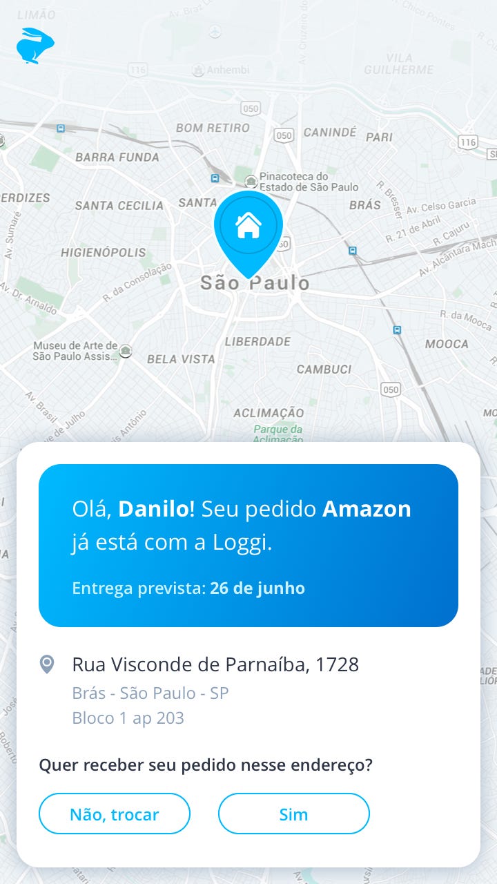
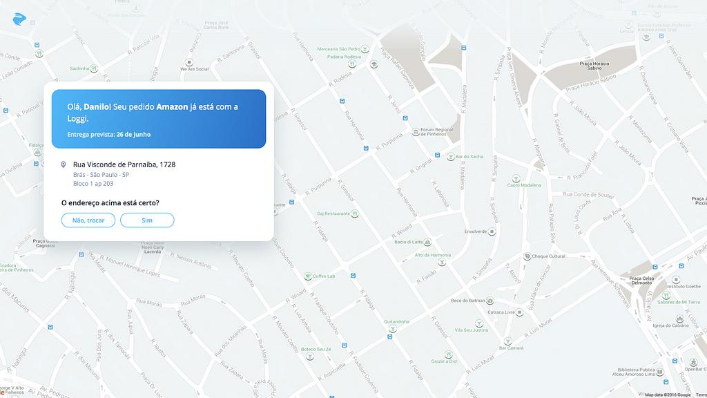
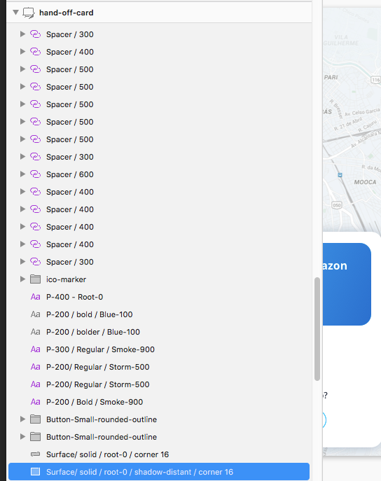

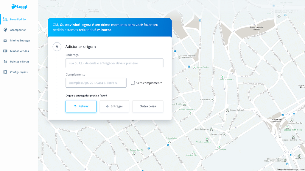
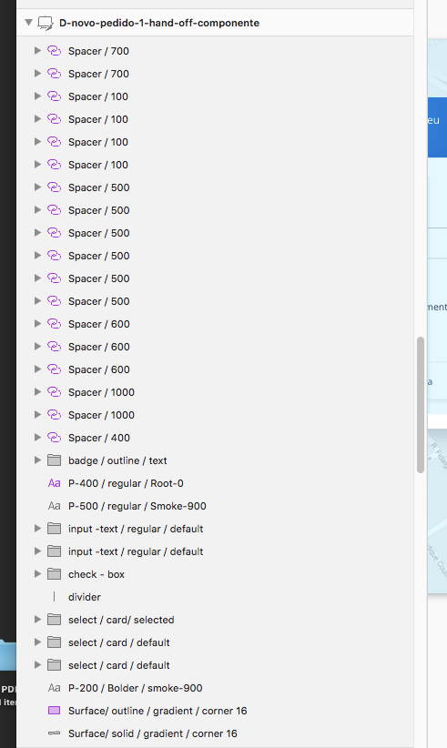
At the time, we identified 5 potential open-source libraries that we would like to test. The main criteria for choosing candidate libraries were popularity, community size, and active development (take a read at this article for our approach to dependency management). These were:
- Ant Design: https://ant.design/
- Material UI: https://material-ui.com/
- Google MDC: https://material.io/develop/web
- Bootstrap (with react-bootstrap): https://react-bootstrap.github.io/
- Fluent: https://www.microsoft.com/design/fluent/
Spoiler alert: Material UI won!
Wait, but why?
First, a quick primer on Material UI. Material UI is the most popular component library in the React ecosystem. It started as a library that implemented Material Design, Google’s Design System (remember our differentiation between Design system and UI library?). Important to notice that Material UI is not in any way affiliated with Google.
As time went on, it evolved into something which fits into what we need pretty well: a component library where the default is Google’s Material Design, but you can bring your own design system to their components.
In Material UI, you build your design system using the all-mighty super-important Theme. The theme is a JavaScript object that declares your design system.
When defining your theme, you should start with the foundations of your design system, universal rules like your palette, typography, spacing, etc… These basic configurations will already make Material UI’s component look and feel closer to your end goal.
Then, it’s possible to get a lot more specific. It’s possible to add customizations for every component present in the library. For each component, you can customize pretty much everything, from styles, default props, and more recently (in v5) add new variants to the components.
Why not {insert your library here}?
The default answer here is: Material UI has solved our pain points and it is working for us.
As a new UI library is launched pretty much every week, let’s try to analyze them more holistically. As I see, we have the following categories:
CSS Replacements/Enhancers
In this category, we have stuff like Sass, Less, Emotion, and most popular recently TailwindCSS.
Tailwind's home page provides the answer to the reason we didn’t choose this category:
Worried about duplication?
Yes! I am a lot!!
Don’t be.
OK, What can I do?
If you’re repeating the same utilities over and over and over again, all you have to do is extract them into a component or template partial and boom — you’ve got a single source of truth so you can make changes in one place.
That… was our first approach. But replace Sass/Scss with Tailwind. It suffers from the same scalability problems we had at our organization. Yes, you get all the power, all the control — and all the responsibility and… poor long-term maintainability, if your goal is to build a consistent design system across products.
With Material UI, we can pretty much have the same final outcome (a beautiful UI/UX with our branding and visual identity), but with the help of a dedicated team and a huge community, thinking every day about new components, their APIs, good documentation — and another thousand unknown unknowns for us.
Behavioral libraries, unstyled components
In this category, we have libraries like Headless, ReachUI, and, perhaps most notably, RadixUI.
These libraries are one level of abstraction up from the last category. They recognize most people will need certain common UI elements, thus, as the Radix homepage says: “Why waste time reinventing UI components?”.
Further down, in Radix homepage also says:
So, you think you can build a dropdown?
We agonise over API design, performance, and accessibility so you don’t need to.
Perfect. I do want someone to agonize over these things so I and my organization don’t need to.
The problem I have though is that I’m greedy. I also want them to agonize over component stylization. You see, the keyword in these libraries is “unstyled”. You must bring a styling solution to create your design system.
Interestingly, the team that created and maintains Radix, also offers another library called Stitches, a styling solution that can be used along with Radix components to provide styles to your components.
Using Radix + Stitches looks like a promising way to create a design system, especially when you compare it to just using a CSS replacement. And a lot of design choices of this library resemble Material UI’s theming and configuration capabilities.
The trade-off, though, is that to build a design system with these tools, you’ll have to do all the manual labor of wrapping every unstyled component provided by Radix and every primitive not-provided by Radix (such as buttons and texts/typography) with your styling solution. This means that, even if using something like Stitches to help you manage your styles, you’ll have to wire manually every single style you have.
In Material UI, this style wiring is already done for you. And sensible defaults are already provided.
For example, probably every application will have a primary color and a button that uses that primary color. In Material UI, this is as simple as changing the primary color of the theme’s palette.
Using an unstyled solution like Radix+Stitches, besides doing that, you’ll have to create your own button component that wraps the browser’s default button element, and not only define that the Button’s background color should refer to your theme’s primary color but define other styles like border-radius, font size, what happens when you hover, etc…
With Material UI, you can also customize all of this, but only when you really need to, as their defaults already provide a good fallback.
And if you really face a Material UI component that is too hard to customize, it is always possible to fall back to the lower primitives the Material UI components are built with: MUI Base and MUI System, the equivalent of Radix+Stitches.
Design systems implementations
In this category, we have libraries like Ant Design, Google MDC, and Microsoft’s Fluent.
These libraries are focused on implementing a certain design system. While they may offer some type of customization, like changing colors, you cannot really build a new design system on top of them, at least not easily. It’s just not a feature they are built to offer.
To build another design system on top of them, you would need to “fight” their design philosophy. Probably, it would need to create wrapper components for everything and use tons of CSS to override the default styles.
If you don’t mind going down this path, the unstyled solutions seem to be a better fit.
Themeable full-styled components
When we adopted Material UI, it was the only popular, widely-used solution we found in this space.
This category is for libraries that:
- provide full-styled components, from the most primitive ones to fairly complex ones
- and allow highly general customization through a centralized theme
The last item is what differentiates it from the simple design system implementations. And it’s of utmost importance that the general customizations are centralized in a theme.
It's possible to customize anything using CSS classes and apply them inline to an element. What we want here is that all general customizations to be stored in one place, so everybody can use them when needed to provide consistency throughout your product.
Ideally, also, you shouldn’t need to create wrapper components as you do with Stitches. The theming solution should be powerful enough so that every customization you need can live inside it.
Right now though, there seem to be other well-maintained and popular libraries in this space: Chakra UI and Mantine.
This begs the question: why don’t use another library in this space? We didn’t adopt them then because they either:
- didn’t exist when we made the switch
- we overlooked them in our research
1. maybe we stumbled upon them, but they did not have a large enough community
2. maybe we just didn’t know they existed
And we are not adopting them now because of Material UI has solved our pain points, and there doesn’t seem to be a good reason to make an effort to replace it with a new solution.
That doesn’t mean that on your own project you need to use Material UI to get the benefits I outlined in this article. Although Material UI is still the most popular library in this space.
What are the trade-offs?
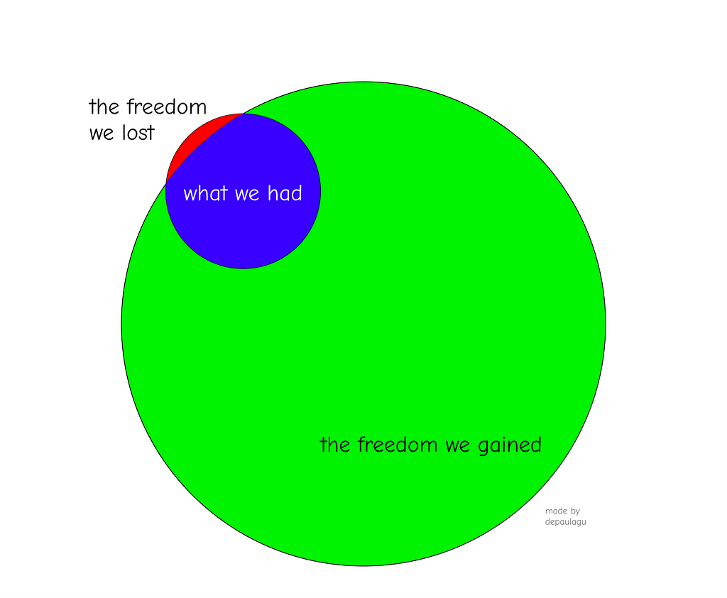
The most notable trade-off was both a limitation and an expansion of what the design team could use for the UI. With an in-house UI library implementation, the main limitation on what can be used is what is implemented by the development team.
Now, the universe of what can be used in the UI is mainly defined by the constraints set up by the Material UI team.
To give an example, before the implementation of the variants in the theme, there could only be a limited number of button colors (primary and secondary) while our in-house library had 7+ button colors. Was this a problem? Not really. There were times when we would have wanted another color, but most of the time, they weren’t needed.
This problem specifically has been addressed by the library on the v5 release by being able to add component variants through the theme.
This case exemplifies pretty well the most important trade-off. Sure, you give up total ownership and customizability. But in return, you’ll get lower maintenance costs, way better documentation, and access to tons of ready-to-be-used components.
Constraints can be a great thing
We usually make the mistake of thinking that more is better. Especially in the programming world, we hear more flexibility, more control, and more customizability as a good thing.
At the same time, we organize our code along the lines of constraining ourselves. Paradigms, patterns, and best practices are all constraints we all cherish and see as vital to long-term code maintainability, software quality, and sustainability.
While it can be argued that Go-To statements can be used in a reasonable way, we as a community have largely agreed that it is not worth the costs. In the name of software quality and maintainability, we constrain ourselves from using this feature.
In the functional programming community, the gospel of pure functions and immutability is preached as a better way to code. These also are constraints we choose in the name of software quality and maintainability.
Consistency leads to predictability. Predictability makes software easier to reason about, driving maintainability costs down. Consistency requires constraints so inconsistencies don’t arise.
The biggest constraint needed to maintain consistency in products that use a design system is to avoid isolated, one-off, local customizations.
The creation of isolated customizations to enable a component to do something it is not “natively” supported (with props) to do or how to look creates a burden on us to maintain that new behavior, look, and feel. And worse, it’s isolated. It’s not a globally applied customization that every new usage of that component will have that customization.
The intent of having a design system is to centralize all style customizations (in the theme, when using Material UI), in a way that the only thing we need to maintain style-wise is the theme itself, and not scattered stylesheets and customizations throughout the codebase.
When we adopted Material UI, it offered a quick and fast way to do these customizations, through the usage of functions called makeStyles/useStyles. Currently, these functions have been deprecated, so it was a great move to avoid these after all.
The price paid for inconsistencies inside the design system ecosystem (aside from how inconsistencies themselves chip away the value of the design system) is that changing the design system becomes harder as well.
For example, if you have a central theme declaring a design system rule and then, in multiple places this rule is overwritten, changing this rule is not more an effort of changing the central theme, but now finding and considering changing all of the local customizations as well.
The source of inconsistencies
Throughout these three years of using Material UI and reviewing code that uses it, I see two main sources of inconsistencies that inject local customizations into the code.
The first source comes from the development team. Here’s how it plays out: a developer receives a design specification, and, instead of looking for a variation that suits the spec’s need, they create a new isolated customization to make the component look like what’s in the original specification.
This is the type of local customization that could have easily been replaced by using Material UI’s components’ own props. Material UI’s components usually are really flexible, and you probably can find a variant that fits your needs.
Ideally, we would have a Material UI documentation that showed the components with our theme, but we don’t. So, the developers have to use their imagination a little. Take the Alert component, for example, you don’t need a makeStyles call to change the icon or the color. You can use the props severity and color to change them. And if in the future we want to change how an info Alert looks like, we’ll just go and change our theme and every application that uses an Alert will be updated. No additional marginal effort is needed.
The second source of inconsistency comes from the design team. Here’s how it plays out: a designer sends a design specification that deviates from what we have in our design system.
Take these images as an example:


Above, is our current Alert with variant info, below, a Design specification. This is a conflict between what’s implemented in the theme and what the design team wants. If we wish all Alerts to look like the version below, we need to change it in the theme. If we don’t, there’s no reason why this one should be different.
If for some reason, Material UI can’t handle this type of customization at the theme level (which it probably does), this is one more of the constraints we pay for using Material UI and having a long-term horizon in our codebase. We can’t sacrifice long-term code maintainability for small differences like this.
Here’s a simple heuristic I recommended when developers couldn’t achieve the desired final state without local customizations:
- First, read the documentation and try different component variants;
- If your component doesn’t have the specific behavior you need, see if the Box component might solve your need. Understanding how the Box component works will help so much in making things with Material UI;
- Ask for help in slack channels;
If upon thorough attempt, you arrive at a solution that deviates lightly and cosmetically from the design specification, discuss the issue with your design team. You’ll probably arrive at one of two conclusions:
- This is an isolated visual feature that doesn’t make much difference, it’s OK to not do it;
- This is a consistent deviation from how we want our visual identity to look with this component (see Alert example). If this happens, there are two things that need to be done:
— Leave the application code as it is;
— Tweak the theme until the component is following the design rules; (OR, wait for someone else to do it 😛)
The pragmatic inconsistent compromise
About two years after Material UI was adopted and we had 5+ applications using it and our centralized theme in our monorepo, one major discussion arrived.
A new customer-facing application was being created and the design team wanted to experiment with new colors, typography rules, and some component customizations. But
- the team didn’t want to/couldn’t bear the costs of changing the design system for everyone
- they wanted to move fast and be able to change frequently these new customizations until the launch, so having to update for everyone without a solid basis wouldn’t be wise
This creates an inconsistency, and the most obvious approach would be to create local customizations using Material UI’s makeStyles everywhere throughout the codebase. But this suffers from all of the problems cited previously.
But we reached a compromise where it’s not so bad, and when done in a tiny number of isolated places, can be one way where new experiments are done:
- That specific application would have a new theme, that inherited all rules from the central theme that everyone uses and then overrides the needed properties
- Local customizations are not used
This makes it easy to see what customizations have been done, as all the differences are centralized in one place. And a future merge with the original theme is straightforward.
Have we reached the promised land?
After three years of having replaced our design system with a Material UI-based one, have we reached the promised land of total consistency, low maintainability costs, and easy changes to the design system?
Kinda, almost.
We’re absolutely in a better spot than when we were.
We almost completely ended time-sinking activities as the design system committee, developers working in the design system, and developers lost without proper documentation.
At every Material UI update that the team and community ship, we get the benefits. And now we have access to way more components than we had to, with way better APIs other people have already obsessed over.
On the other hand, some changes to the design system are still not easy, especially on our scale. For example, we are going through a minor rebranding phase, where we wanted to change the button’s color tone. At our scale, this means touching dozens of applications, hundreds of screens, and thousands of individual interactions.
And we couldn’t do it. In applications that had fewer to no local customizations, everything went mostly well, but in applications that had a lot of local customizations, a lot of interactions just… became unusable: sometimes the button was hard to recognize, sometimes the text inside it was unreadable, or another wild problem appeared.
Thus, we got blocked when doing a simple color change. Yikes. Not ideal.
Therefore, while it certainly was a good decision and we are better because of it, as with everything in Computer Science, there is no silver bullet, but we believe Material UI has been a great regular bullet for our needs, that lowered our accidental complexity and lets us focus on what really matters for us: building great experiences to carry out our mission as a company.
Although each team and company has its own specific needs, I personally believe most product teams would benefit from this three-part advice: Have a design system. Build your engineering implementation on top of Material UI. Avoid local customizations and inconsistencies like the plague.
Wanna know more about Loggi's Design System? We talk about it in two other articles:
- A importância do Design estratégico para a evolução de uma startup.
- E L K E — O início de uma transformação
Build Composable Design Systems with Bit, like Lego
Bit’s open-source tool helps 250,000+ devs to build apps with components.
Turn any UI, feature, or page into a reusable component — and share it across your applications. It’s easier to collaborate and build faster.
Split apps into components to make app development easier, and enjoy the best experience for the workflows you want:
→ Micro-Frontends
→ Design System
→ Code-Sharing and reuse
→ Monorepo
Learn more:
- How We Build Micro Frontends
- How we Build a Component Design System
- How to reuse React components across your projects
- 5 Ways to Build a React Monorepo
- How to Create a Composable React App with Bit
Rebuilding Loggi’s Design System on top of Material UI was originally published in Bits and Pieces on Medium, where people are continuing the conversation by highlighting and responding to this story.
This content originally appeared on Bits and Pieces - Medium and was authored by Gustavo de Paula
Gustavo de Paula | Sciencx (2023-03-02T15:07:11+00:00) Rebuilding Loggi’s Design System on top of Material UI. Retrieved from https://www.scien.cx/2023/03/02/rebuilding-loggis-design-system-on-top-of-material-ui/
Please log in to upload a file.
There are no updates yet.
Click the Upload button above to add an update.
