This content originally appeared on Level Up Coding - Medium and was authored by Artiom Khalilyaev
Learn how to create these useful UI components with ease

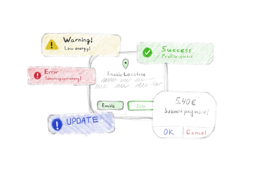
Alerts, banners, pop-ups, dialogs, toasts, call them whatever you want, are very popular and powerful UI components in mobile apps. They can be used to show the result of the action, e.g. success or failure. Confirmation alerts with two buttons are widely used to allow users to confirm an important action like payment or order confirmation. I can continue this list for a very long time.
Apple provides us with a UIAlertController, it’s even a bit customizable. We can add buttons and textfields on it, and that’s pretty much it. If we want to create an alert that follows our brand style, or any other custom alert, we need to create our own UI component. And with alerts it can be pretty hard, cause of we need to set up lots of stuff like presentation, appearance, position, blurred background and so on. And if we are working on a commercial app, the business wants us to deliver an app as fast as possible. The best decision in this case is to use a third-party library.
SwiftEnrtyKit
SwiftEntryKit is a powerful presentation library. Here is the link to its GitHub repo. It provides us with lots of customization options like animations, shadows, borders, custom position, blurred or dimmed background, dismissing by tap/swipe, etc. It also has a set of in-build banners you can customize and use. But you can create your own banners from scratch, in case you need something unique.
All those features I listed above are good, but there is another huge advantage I love about this lib. Banners are displayed inside a separate UIWindow, and to present them you don’t have to do it from UIViewController. You can do it from any part of your app. Let me show you the difference between default alerts and SwiftEntryKit banners presentation flow:
self.present(myAlert, animated: true) // where self is UIViewController

// No need to do it from UIViewController
SwiftEntryKit.display(entry: view1, using: highPriorityAttributes)
It means, if you got an error in one of your services, you don’t have to pass this error through many different layers to the view to present it. You can present it directly in the place where you got an error.
In this article, I’m going to show you how to customize and present banners using SwiftEntryKit. All code from this article you can find in this GitHub repository. Feel free to clone it, do not forget to run pod install, I’m using CocoaPods as a dependency manager for this project. The project is XCode 12.0 compatible and have iOS 13.0 minimum deployment target, so everybody should be able to run it locally.
Default Banners
SwiftEntryKit has two main entities. They are entries (objects we are presenting) and attributes, that we apply to our entries to customize them and a way they are presented. SwiftEntryKit has a set of in-build entries like EKNotificationMessageView, EKNoteMessageView, EKFormMessageView, EKRatingMessageView and many others. Your custom views also can be treated as an entry and be presented by SwiftEntryKit.
EKAttributes has all attributes you need for your entry configuration inside. I won’t list them all, because it will take a lot of time, and all of them are listed here, in the README file. Take a look if you want and we will start creating banners.
Toast Messages
First, let’s create a service, that’s responsible for banners presentation. I’ll name it PresentationService.
We will start from a toast banner. This banner will contain image, title and description. So let’s create a new function inside PresentationService and call it presentToast. And add 3 arguments for the title, description, and image.
class PresentationService {

    func presentToast(title: String, description: String, image: UIImage) {

    }

}
To present a banner, we need to configure its attributes, create an entry, and present this entry using attributes. Sounds easy. Let’s start with attributes. Create attributes variable of type EKAttributes. EKAttributes has a set of default prebuilds we can use. One of them is topFloat, exactly what do we need for the toasts banner. You can use default settings, or in case you want some specific arguments, you can set up them yourself. For now, we will use default topFloat and modify it a bit. I want to show an error toast, so let’s give it a red background color. To set entry background, we need to set a value for attributes.entryBackground. entryBackground type is EKAttributes.BackgroundStyle, this type has a color function, which has a EKColor argument. And EKColor has an initializer, which takes a UIColor as a parameter.
  var attributes: EKAttributes = .topFloat
  attributes.entryBackground = EKAttributes.BackgroundStyle.color(color: EKColor(.red))
SwiftEntryKit has its own data types, but you can easily map default data types into them. Now we need to configure our entry. We will use EKNotificationMessageView for the toast. This banner has a title, subtitle, and an optional image. Now I will show you the code of creating this banner, and then I will explain everything.
  let titleLabel = EKProperty.LabelContent(text: title, style: EKProperty.LabelStyle(font: .systemFont(ofSize: 18, weight: .semibold), color: EKColor(.white)))
  let descriptionLabel = EKProperty.LabelContent(text: description, style: EKProperty.LabelStyle(font: .systemFont(ofSize: 16, weight: .regular), color: EKColor(.white)))
  let image = EKProperty.ImageContent(image: image, size: CGSize(width: 32, height: 32), tint: EKColor(.white), contentMode: .scaleAspectFill)
  let simpleMessage = EKSimpleMessage(image: image, title: titleLabel, description: descriptionLabel)
  let notificationMessage = EKNotificationMessage(simpleMessage: simpleMessage)
  let entry = EKNotificationMessageView(with: notificationMessage)
entry is the banner. As I said before, SwiftEntryKit uses its own data types to give us a huge amount of customization. EKNotificationMessageView takes a EKNotificationMessage as initializer argument. To create a EKNotificationMessage we need a EKSimpleMessage object, which takes EKProperty.ImageContent and two EKProperty.LabelContent as initializer arguments. EKProperty.LabelContent is something similar to default UILabel in the UIKit. EKProperty.ImageContent is an analog of the UIImageView. EKNotificationMessage and is a banner content, and EKNotificationMessageView is a view. To create the banner, we need to create all those components and put them together.
To present the entry, you need to call a static display(entry: , using: ) function of the SwiftEntryKit class and pass your entry and attributes to it. Full code of the function here:
func presentToast() {

    var attributes: EKAttributes = .topFloat

    attributes.entryBackground = EKAttributes.BackgroundStyle.color(color: EKColor(.red))

    let titleLabel = EKProperty.LabelContent(text: title, style: EKProperty.LabelStyle(font: .systemFont(ofSize: 18, weight: .semibold), color: EKColor(.white)))
    let descriptionLabel = EKProperty.LabelContent(text: description, style: EKProperty.LabelStyle(font: .systemFont(ofSize: 16, weight: .regular), color: EKColor(.white)))
    let image = EKProperty.ImageContent(image: image, size: CGSize(width: 32, height: 32), tint: EKColor(.white), contentMode: .scaleAspectFill)
    let simpleMessage = EKSimpleMessage(image: image, title: titleLabel, description: descriptionLabel)
    let notificationMessage = EKNotificationMessage(simpleMessage: simpleMessage)
    let entry = EKNotificationMessageView(with: notificationMessage)

    SwiftEntryKit.display(entry: entry, using: attributes)

}
Now we need to set up presentation login in our ViewController. I will just add buttons for every alert and banner we are going to create in this tutorial. Fell free to copy code below into your project.
class ViewController: UIViewController {

    let presentationService = PresentationService()

    let buttonsStack: UIStackView = {
        let stack = UIStackView()
        stack.alignment = .fill
        stack.distribution = .fill
        stack.axis = .vertical
        stack.translatesAutoresizingMaskIntoConstraints = false
        stack.spacing = 12
        return stack
    }()

    let toastButton: UIButton = {
        let button = UIButton()
        button.translatesAutoresizingMaskIntoConstraints = false
        button.setTitle("Present floating toast", for: .normal)
        button.backgroundColor = .blue
        return button
    }()

    let alertButton: UIButton = {
        let button = UIButton()
        button.translatesAutoresizingMaskIntoConstraints = false
        button.setTitle("Present alert", for: .normal)
        button.backgroundColor = .blue
        return button
    }()

    override func viewDidLoad() {
        super.viewDidLoad()
        view.addSubview(buttonsStack)
        buttonsStack.addArrangedSubview(toastButton)
        buttonsStack.addArrangedSubview(alertButton)
        NSLayoutConstraint.activate([
            buttonsStack.centerYAnchor.constraint(equalTo: view.centerYAnchor),
            buttonsStack.leadingAnchor.constraint(equalTo: view.leadingAnchor, constant: 16),
            buttonsStack.trailingAnchor.constraint(equalTo: view.trailingAnchor, constant: -16),
            toastButton.heightAnchor.constraint(equalToConstant: 56),
            alertButton.heightAnchor.constraint(equalToConstant: 56)
        ])
        toastButton.addTarget(self, action: #selector(presentToast), for: .primaryActionTriggered)
        alertButton.addTarget(self, action: #selector(presentAlert), for: .primaryActionTriggered)
        customBannerButton.addTarget(self, action: #selector(presentCustomBanner), for: .primaryActionTriggered)
    }

    @objc func presentToast() {
        presentationService.presentToast(
          title: "Error",
          description: "Something went wrong",
          image: UIImage(systemName: "exclamationmark.circle.fill")!
        )
    }

    @objc func presentAlert() {
        //TODO: - add logic for alert presentation
    }

}
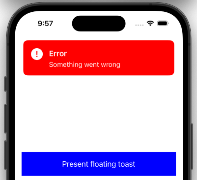
Run your code and present the banner by the tap on button. Here is our banner:

Looks pretty good, considering that it took only 9 lines of code to create it. It dismisses itself after a few seconds. This setting is included into topFloat attributes. If you want to change this behavior, you need to set up those attributes yourself.
To change entry display duration, you need to use displayDuration properties. Set it to .infinity, if you don’t want banner to be dismissed automatically. But, this error toast should not be on the screen forever, so we can set it display duration to 5 seconds and enable dismiss by tap. To enable dismiss, we need to set entryInteraction and screenInteraction to .dismiss. With these settings, the banner will be dismissed by any tap on screen or entry.
attributes.displayDuration = 5
attributes.entryInteraction = .dismiss
attributes.screenInteraction = .dismiss
You can also create toast banners using another default entries like EKNoteMessageView or EKImageNoteMessageView. You should select what entry to use yourself, depending on your needs.
Custom Alerts
Alert is the banner with one or several buttons. They can be used to prompt the user to confirm an action before proceeding. For example, an alert might ask the user if they are sure they want to delete a file or cancel an order.
Create a function presentAlert in PresentationService. This time we need more arguments. Our alert will have a title, description, image, and two buttons. So, this time we need 7 arguments. Five for content and two for actions.
func presentAlert(title: String, description: String, image: UIImage, confirmTitle: String, cancelTitle: String, confirmAction: @escaping () -> Void, cancelAction: @escaping () -> Void)
For an alert, we will use EKAlertMessageView entry. To create this entry, we need to create a EKAlertMessage object first. And this object takes 2 parameters: EKSimpleMessage for a content and EKProperty.ButtonBarContent for buttons. Let’s set up an alert first, and then we will switch to attributes.
For EKSimpleMessage I just copied code from the previous function and changed some parameters. Made fonts a bit larger, changed text color to black, and updated text and icon.
   let titleLabel = EKProperty.LabelContent(text: title, style: EKProperty.LabelStyle(font: .systemFont(ofSize: 18, weight: .semibold), color: EKColor(.black)))
  let descriptionLabel = EKProperty.LabelContent(text: description, style: EKProperty.LabelStyle(font: .systemFont(ofSize: 16, weight: .regular), color: EKColor(.black)))
  let image = EKProperty.ImageContent(image: image, size: CGSize(width: 32, height: 32), tint: EKColor(.black), contentMode: .scaleAspectFill)
  let simpleMessage = EKSimpleMessage(image: image, title: titleLabel, description: descriptionLabel)
To create EKProperty.ButtonBarContent we need at least one parameter of type EKProperty.ButtonContent for the buttons, and we need to specify separator color. EKProperty.ButtonContent initializer takes the following arguments: label, background color, highlighted background color, and an action. Action in that case is a simple escaping () -> () closure.
 let okButton = EKProperty.ButtonContent(
     label: EKProperty.LabelContent(text: confirmTitle, style: EKProperty.LabelStyle(font: .systemFont(ofSize: 20, weight: .bold), color: EKColor(.blue))),
     backgroundColor: EKColor(.white),
     highlightedBackgroundColor: EKColor(.lightGray),
     action: confirmAction
 )

 let cancelButton = EKProperty.ButtonContent(
     label: EKProperty.LabelContent(text: cancelTitle, style: EKProperty.LabelStyle(font: .systemFont(ofSize: 20, weight: .bold), color: EKColor(.red))),
     backgroundColor: EKColor(.white),
     highlightedBackgroundColor: EKColor(.lightGray),
     action: cancelAction
 )
Now we need to put this buttons together to get a EKProperty.ButtonBarContent object.
let buttonBarContent = EKProperty.ButtonBarContent(
    with: okButton, cancelButton,
    separatorColor:  EKColor(.black),
    expandAnimatedly: false
)
Now, when we have a EKSimpleMessage and EKProperty.ButtonBarContent, we can create a EKAlertMessageView object.
 let entry = EKAlertMessageView(
     with: EKAlertMessage(
         simpleMessage: simpleMessage,
         buttonBarContent: buttonBarContent
     )
 )
The last step is to set up attributes we are going to apply to our entry. This time, we won’t use any prebuilds and will configure attributes from scratch.
var attributes: EKAttributes = EKAttributes()
Now, we need to specify properties we are interested in. We want our alert to be in the center, so set its positon to the .center. Also alert should not be dismissed after some period of time, but only after user selects one of the options, so displayDuration should be .infinity.
attributes.position = .center
attributes.displayDuration = .infinity
Next thing we need to specify is size. We need to create a height and width constraints of EKAttributes.PositionConstraints.Edge type. For width constraint, I’m going to use .ratio(value: ) option. It ratio constraint to screen edge. We can achieve a small padding passing 0.9 as a ratio argument. For height, it’s better to use .intrinsic value, in this case alert height depends on its content height.
  let widthConstraint = EKAttributes.PositionConstraints.Edge.ratio(value: 0.9)
  let heightConstraint = EKAttributes.PositionConstraints.Edge.intrinsic
  attributes.positionConstraints.size = EKAttributes.PositionConstraints.Size(width: widthConstraint, height: heightConstraint)
To add some style, we can specify shadow and corner radius using shadow and roundCorners properties. There are much more options more customizing, but we will use only these 2 for that alert.
  attributes.shadow = .active(with: .init(color: .black, opacity: 0.3, radius: 10, offset: .zero))
  attributes.roundCorners = .all(radius: 12)
If we don’t want our alert to be transparent, we need to set its background color. To do so, we need to set value for entryBackground property. Also, we will darken a screen background a bit, so alert can catch more user attention, by setting a value for screenBackground property.
  attributes.entryBackground = .color(color: .white)
  attributes.screenBackground = .color(color: EKColor(UIColor(white: 0.5, alpha: 0.5)))
Let’s present our alert and see how it looks. Add this code to the end of the function.
SwiftEntryKit.display(entry: entry, using: attributes)
Let’s set up presentation logic in ViewController. We already have a presentAlert() function with a TODO comment inside. Replace this comment with the following code:
presentationService.presentAlert(
   title: "Enable push notification",
   description: "Enable push notifications so you won't miss any new orders",
   image: UIImage(systemName: "bell")!,
   confirmTitle: "OK",
   cancelTitle: "Cancel") {
      print("Confirm Action")
   } cancelAction: {
      print("Cancel Action")
   }

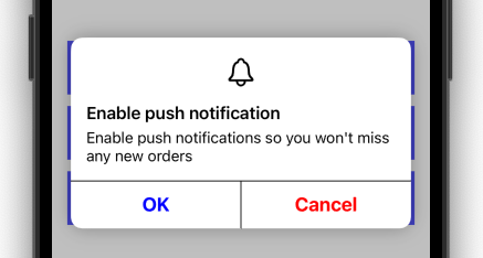
It looks good, it has a shadow, rounded corners, darkened background, but here are two issues. First, buttons actions are not working, if you will check the console, you won’t see any prints. Second issue is that we can move our banner up and down with swipe gestures. We will solve these two issues right now with only two lines of code.
To fix the first issue, we need to set attributes entryInteraction property to .absorbTouches. In order to disable swipes, we need to disable entry scroll. To do so, set the scroll property of the attributes to .disabled.
  attributes.entryInteraction = .absorbTouches
  attributes.scroll = .disabled
Now you can see prints in the console, but… alert is not dismissed. That’s because before we set theentryInteraction property to .absorbTouches, buttons were executing default behavior — dismiss. Now they are executing our actions with prints. To fix that issue, we need to add dismiss yourselves after your actions.
let okButton = EKProperty.ButtonContent(
    label: EKProperty.LabelContent(text: confirmTitle, style: EKProperty.LabelStyle(font: .systemFont(ofSize: 20, weight: .bold), color: EKColor(.blue))),
    backgroundColor: EKColor(.white),
    highlightedBackgroundColor: EKColor(.lightGray),
    action: {
        confirmAction()
        SwiftEntryKit.dismiss()
    }
)

let cancelButton = EKProperty.ButtonContent(
    label: EKProperty.LabelContent(text: cancelTitle, style: EKProperty.LabelStyle(font: .systemFont(ofSize: 20, weight: .bold), color: EKColor(.red))),
    backgroundColor: EKColor(.white),
    highlightedBackgroundColor: EKColor(.lightGray),
    action: {
        cancelAction()
        SwiftEntryKit.dismiss()
    }
)
Run the project now, press any alert button, notice alert being dismissed and text in console. Everything is working!
Conclusion
This article is getting too big, so I decided to split in into two articles. In the next part, I will show you how to set up an action sheet and how to present your custom view using SwiftEntryKit.
I hope you found this article useful. Follow me not to miss the next part.
Resources
SwiftEntryKit GitHub repository
GitHub repository with a source code for this article
The next part is in progress…
Check out my other articles about iOS Development

https://medium.com/@artem.khalilyaev
Level Up Coding
Thanks for being a part of our community! Before you go:
- 👏 Clap for the story and follow the author 👉
- 📰 View more content in the Level Up Coding publication
- 💰 Free coding interview course ⇒ View Course
- 🔔 Follow us: Twitter | LinkedIn | Newsletter
🚀👉 Join the Level Up talent collective and find an amazing job
Custom Alerts And Banners In Swift was originally published in Level Up Coding on Medium, where people are continuing the conversation by highlighting and responding to this story.
This content originally appeared on Level Up Coding - Medium and was authored by Artiom Khalilyaev
Artiom Khalilyaev | Sciencx (2023-03-20T16:14:45+00:00) Custom Alerts And Banners In Swift. Retrieved from https://www.scien.cx/2023/03/20/custom-alerts-and-banners-in-swift/
Please log in to upload a file.
There are no updates yet.
Click the Upload button above to add an update.
