
This content originally appeared on DEV Community and was authored by Chris Jarvis
It's May the Fourth. so I'm repostting some of my Star Wars content.
This is part of my CSS ugly sweater series. A previous version of the sweater is in this post. I won't go into much detail here. Below is what the final image looked like. I just changed the colors.

- Main sweater to blue
- Boxes to blue and white
- Stitching to black.
I added CSS variables in the code this time.
:root {
    --sweaterblue: #558fbf;
}

.imperialCrest {
    background-color: var(--sweaterblue);

}
That's the basic torso. I placed a character div in that torso. Inside the character div is a div for a specific character for this post it has a class of Imperial Crest.
Add the Crest
I started the Crest with a big circle with a background of --sweaterblue and a border of black #000000. The blue matches the blue from the main sweater background. But it sweater has stars as a background image. The inside of the crest is solid blue.

<div class="torso">
   <div class="character">
     <div class="imperialCrest"></div>
   </div character>
</div>
:root {
    --sweaterblue: #558fbf;
}
.imperialCrest {
    background-color: var(--sweaterblue);
    height: 300px;
    width: 300px;
    border-radius: 50%;
    border: 12px solid #000000;
    display: flex;
    justify-content: center;
    align-items: center;
    overflow: hidden;
    flex-direction: column;
}
Add circles
Next I added two circles inside the main ring.

<div class="imperialCrest">
  <div class="bigCircle">
   <div class="centerCircle"></div>
 </div>
</div>
.bigCircle {
    background-color: #000000;
    height: 260px;
    width: 260px;
    border-radius: 50%;
    display: flex;
    justify-content: center;
    align-items: center;
    overflow: hidden;
    flex-direction: column;
}

.centerCircle {
    background-color: var(--sweaterblue);
    height: 100px;
    width: 100px;
    border-radius: 100%;
    position: absolute;
}
Struts and Spokes
Right now it just looks like circles. But after adding some shapes, the logo will appear. The process for the rest of the build follows this pattern; build a shape, get sizes approximately right, duplicate the shape, modify the sizes and shape as the copies are moved around.
First I made some black struts. The first one was vertical. Then used transform: rotate(xxdeg); to change the angle of the right and left struts. Since I'm building around a symmetrical circle, once I have the placement for the left side all I have to do is give the right side the opposite number. Left is 60degress, so right side is -60 degrees.

<div class="struts vertical"></div>
<div class="struts diagonalLeft"></div>
<div class="struts diagonalRight"></div>
.struts {
    background-color: #000000;
    height: 100%;
    width: 16px;
    position: absolute;

}

.diagonalLeft {
  transform: rotate(60deg);
}

.diagonalRight {
  transform: rotate(-60deg);
}
Next I made some trapezoid blocks where the struts meet the black circle. To make a trapezoid with CSS you make a square using borders, give one side a color make the other sides transparent. Add some width or height and background color to the item. It took a while had to adjust margins to get placement right. I used dev tools to select the element and adjust their positions in the browser.
    <div class="block top"></div>
    <div class="block lefttop"></div>
    <div class="block leftbottom"></div>
    <div class="block righttop"></div>
    <div class="block rightbottom"></div>
    <div class="block bottom"></div>
.block {
    height: 20px;
    width: 30px;
    position: absolute;

    border-top: 50px solid black;
    border-left: 30px solid transparent;
    border-right: 30px solid transparent;
    border-top-right-radius: 10%;
    border-top-left-radius: 10%;
}

.top {
    margin-top: -210px;
}

.bottom {
    margin-bottom: -210px;
    transform: rotate(180deg);
}

Next I added blue spokes made of of an hourglass shape. The hourglass is made of two elongated triangles. In CSS triangles are made by building a rectangle with borders but no background. The top and bottom borders have color, the sides are usually transparent. To make it easy to see here, I gave the left and right a color of white and removed the blue circle. In final project the sides will be transparent and not seen. The points will blend into the circle.
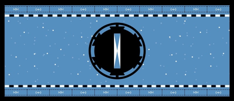
Made one in center then two more using same transform: rotate attributes as the spikes. So they cross like an X in the center of the circle.
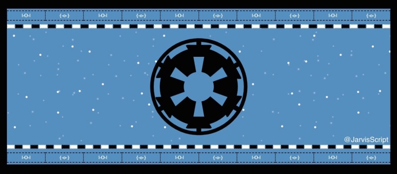
Final Look
Here's the final look with the all the spokes. it now looks like the Imperial Crest from the sweater. I was extremely happy when I refreshed the browser and saw this final image.
More Content
Here's last year's May the fourth post that has links to more Star Wars developer content.
Do you know of other Star Wars posts? Put them in the comments.
May the fourth be with you.
-$JarvisScript git push
This content originally appeared on DEV Community and was authored by Chris Jarvis
Chris Jarvis | Sciencx (2023-05-04T15:10:35+00:00) May The 4th be with you.. Retrieved from https://www.scien.cx/2023/05/04/may-the-4th-be-with-you-2/
Please log in to upload a file.
There are no updates yet.
Click the Upload button above to add an update.