This content originally appeared on DEV Community and was authored by Abbey Perini
You learned to code and want to start applying for jobs, but don't want anyone to look at your portfolio. Your app functions well, but you're pretty sure your buttons need some styling. Here are some practical tips on how to get from your idea to minimum styling without knowing anything about design.
- Goals
- Inspiration
- Layout
- Colors
- Typography
- Buttons
- Links
- Putting It All Together
Goals
1. Looks Like You Thought About It
We're not aiming for professional designer quality. We're not aiming for perfect. All we want is for a user to think "They thought about how their page looks."
2. Reduce Decision Fatigue
There are a ton of decisions that go into making a simple webpage. We don't need to be trying to decide on a design while we're coding the page.
3. Uniformity
You want to repeat yourself in the design, but not in the code. Even if your button design isn't the best ever, using the same styling every time will look a lot cleaner. When you're programming, you don't want to write new styles every time you add a button. This applies to every element and section of content you use multiple times on your page.
4. Minimize Accessibility Issues
Even beyond colors, a simple design can help reduce accessibility issues and a thoughtful design doesn't introduce new ones.
Inspiration
If you have no idea what you want your website to look like, looking at other sites is a good place to start. Don't expect your site to look like professional designs, and stop looking at sites if you start to feel overwhelmed.
Check out sites like dribbble, bestwebsite, webdesign inspiration, awwwards, and siteinspire. Keep in mind some of these websites are for designers to share creative ideas, not working websites.
You can also usually find curated listicles for the type of project you're making. Here are a few lists of inspirational developer portfolios:
- https://www.freecodecamp.org/news/15-web-developer-portfolios-to-inspire-you-137fb1743cae/
- https://alvarotrigo.com/blog/web-developer-portfolio-examples/
- https://www.hostinger.com/tutorials/web-developer-portfolio
Most importantly, make it your own! "I'm not a designer." is an excellent excuse for making whatever page your heart desires. I know I had fun with the "design a 90's page" assignment in Bootcamp. At the end of the day, if you're happy with your website, and people can use it, that's a great site.
Layout
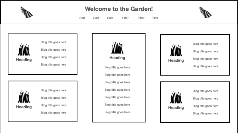
Design your app in black and white in a program you already know how to use. We're not designers. We don't need to create wireframes. Pop open a Google Doc or a Keynote slide and start putting boxes on the page.
The best place to start is with your sectioning HTML. For example, you'll probably need a header, a footer, and an area in the middle for your main content.
Try to break down your content into uniform blocks. Within your main area, think in a grid. That'll be straightforward to translate to CSS grid. Then, use text size, text weight, and spacing to break up your content.
Colors
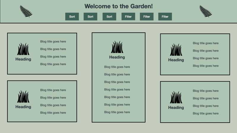
Now take your boxes and put them in greyscale. You'll want three shades of grey - a background color, main content color, and accent color. In my current Keynote design, the darkest grey is my accent color. I'm using it for my buttons, so they're easily found. The second darkest is my background. The lightest is my primary content color, which I'm using for the header and boxes containing my content.
Next, pick three non-grey colors with sufficient contrast. Here are some tools that will help you quickly generate colors with sufficient contrast:
- https://www.learnui.design/tools/accessible-color-generator.html
- https://accessiblepalette.com/
- https://reasonable.work/colors/
If you enjoy picking your own colors, like with coolors, you can use a contrast checker.
If the idea of picking colors sounds painful to you but you like math, here are a couple of ways to pick colors with math:
- https://medium.com/sketch-app-sources/design-cheatsheet-274384775da9#:~:text=3.%20Do%20the%20math%20for%20understanding%20colors
- https://dev.to/madsstoumann/colors-are-math-how-they-match-and-how-to-build-a-color-picker-4ei8
If colors and color math are not your cup of tea, you can keep your greyscale! Just check your contrast.
If your contrast is too low, users won't be able to read your text. If your contrast is too high, like with black (#000000) and white (#FFFFFF), it'll strain your users' eyes. If you do nothing else with the design of your app, use dark grey (like #333333) for your text and off-white (like #F3F3F3) for your background.
Typography
The simpler, the better here. People probably won't notice if you use default fonts, but they will notice if you use five. Using different font weights, sizes, and colors instead of different fonts is usually enough. You'll notice larger, higher-contrast font first.
Give yourself options with a font family that has plenty of styles like italics, bold, and a handful of weights. Google fonts allows you to filter by number of styles.
For accessibility, choose a legible, readable font. Legibility is concerned with uniform stroke weight and good character height and width. The counters, negative space inside the characters, should be fairly open. Readability refers to the spacing of the characters on the page. Don't use all caps or jam all your text into a tight space. Use responsive font sizes instead of pixels, so users can scale up as much as they want. Want to learn more? Check out these articles:
- https://dev.to/laurilllll/how-to-create-responsive-typography-using-css-three-different-methods-explained-50f8
- https://www.joshwcomeau.com/css/surprising-truth-about-pixels-and-accessibility/
- https://creativepro.com/legibility-and-readability-whats-the-difference/
- https://fonts.google.com/knowledge/readability_and_accessibility/introducing_accessibility_in_typography
Finally, we'll need text colors. I usually end up with two. A darker one for light backgrounds, like my main content color, and a lighter one for dark backgrounds, like my accent color. I check both against the three colors I'm using, and take notes on which combinations have sufficient contrast.
Buttons
Buttons are for actions and can be categorized as primary, secondary, and tertiary.
Primary buttons are your call to action buttons - things you really want the user to know they can do. For example, submit for a login form.
Secondary buttons are for less important actions. They're still easily found, but not as noticeable, like a cancel button for a login form.
Tertiary buttons are miscellaneous actions that aren't valuable to most users. They're the least obvious and often styled more like links. A good example is a login button on a signup form.
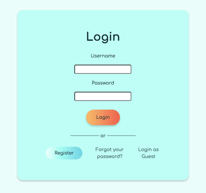
Check out A Trio of Buttons for a Bubbly, Colorful Site for a set of examples.
Links
Where buttons are for actions, links take you to somewhere else on the site. This is another one where you'd be perfectly fine using the default. If you want to mess with the default link styling, make sure whatever you do is still accessible, and apply it to every link on the page.
Remember, in CSS you have 4 link action states.
a:linka:visiteda:hovera:active
Put them in your stylesheet in this order, or they may override each other.
Unlike buttons, you can use a pointer cursor to indicate a link when the user hovers over one.
a:hover {
  cursor: pointer;
}
Putting It All Together
Now that we've thought about how the page looks as a whole, the next step is translating that into bite-sized projects and reusable styling.
Looking at your beautiful document, think about which boxes appear multiple times. You can start as small as a button. I like to start with a box I'll use on every page, like the header. Styling just the Header component is less overwhelming than styling the whole page. Plus, it involves adding my colors, styles for links, a heading, and maybe even buttons.
Use variables and naming conventions that will still be clear and easy to use if you come back to this project months from now. I assign my colors to CSS variables. I'll name my darker text color --dark-text and put my notes on its contrast with other colors in the same file. I use BEM class names, so styles that apply to all my buttons will be in the .button class. I'll use .button--primary for the styles that only apply to primary buttons. For more about organizing your CSS, check out Mozilla Developer Network's guide.
This way, I'm able to reuse that work in the rest of the page, and it'll be easier to maintain and modify for features I haven't thought of yet. For example, in my portfolio, I know I'll want a heading, description, screenshot, and link for each of my projects. I'll be able to use the link styles I made for the Header component. If I come back a year later and want to add a button that opens a modal with a walkthrough video, I'll be able to easily find and add my button styles too.
When my Project component is ready, I can slap a bunch of Projects inside a container and use CSS grid to arrange the projects within it. Then, my main content section is done.
Conclusion
Look, I've just taken a lot of art classes and some college courses for graphic design. I'm the kind of person that adds shiba inu illustrations to her portfolio.
I know from experience that staring at a blank page can be very overwhelming. This advice is here to help you break down the work so you can start building. A website is never finished, so you can always redesign, add stuff in, and blog about it!
If you're interested in learning more about design, check out The Non-Designers Design Book.
This content originally appeared on DEV Community and was authored by Abbey Perini
Abbey Perini | Sciencx (2023-05-16T20:22:07+00:00) From Idea to Design for Non-Designers. Retrieved from https://www.scien.cx/2023/05/16/from-idea-to-design-for-non-designers/
Please log in to upload a file.
There are no updates yet.
Click the Upload button above to add an update.


