This content originally appeared on Level Up Coding - Medium and was authored by Imran Farooq

When I need to visualize data in a web app, my go-to tools are D3.js and React. However, combining them can be tricky because both want to control the DOM.
Let’s start it!
Starting Off with SVG Elements
To display data in the browser, using SVG elements is a common choice — they’re flexible and can be precisely positioned. Let’s begin by rendering a basic <svg> element.
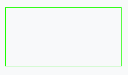
Here’s a simple implementation: SVG Gist

I’ve added a green border so the <svg> is visible. Now, to visualize data, we need shapes to represent data points. Let’s start with a simple shape: a <circle>.
You can see an example here: Circle Gist

Explaining the Circle.jsx Code
- We use a ref to store a reference to our rendered <svg> element.
- D3 code is executed when the component mounts.
- d3.select() turns our ref into a D3 selection object.
- We append a <circle> to the SVG using the D3 selection.
But isn’t this a lot of code just to create one shape? Also, should we really use React refs so often?
Thanks to React 15+, SVG elements are fully supported in JSX, allowing us to directly create a <circle> without much fuss.
See the simplified version: Circle JSX Gist

Benefits of Using JSX for SVGs
- Declarative Code: Instead of telling React how to draw, we describe what to draw.
- Less Code: This JSX version has fewer lines than the D3-powered version.
- Cleaner Approach: React is designed for rendering, so hacking around it with D3 can lead to performance issues. It’s best to keep things simple.
Creating Multiple SVG Elements
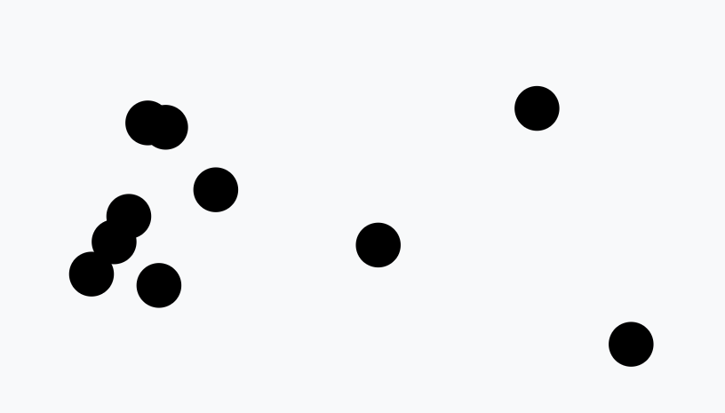
D3’s core concept is data binding — attaching data to DOM elements. For example, let’s generate a dataset of 10 random [x, y] coordinates and render a <circle> at each.
How to generate this dataset
Here’s how we can generate the dataset: Dataset Gist
We can then visualize these points with the following approach: D3 Circles Gist.

Explaining the Code
- We select all <circle> elements and use the .join() method to append one for each data point.
- D3 code reruns whenever the dataset changes.
- We utilize useInterval() to recalculate the dataset every 2 seconds.
Though effective, this approach is still verbose. Let’s simplify it using React for rendering.
Here’s the React alternative: React Circles Gist

Explaining the Simplified Code
- We loop through each data point.
- For each, we render a <circle> at the corresponding [x, y] coordinate.
D3 excels at animations and transitions. Here’s an example that randomly animates circles to appear or disappear: Transition Gist
While the D3 approach is powerful, we can also achieve animations in React with the help of libraries like react-spring. Here’s an implementation that uses React for circle animations: React Animations Gist
Creating Axes with D3 and React
D3 has a handy .axisBottom() method that can generate a chart axis with a single line of code. But if we want to avoid letting D3 create DOM elements, we can manually implement this functionality using React.
Check out the basic axis example: Axis Gist

Explaining the Axis.jsx Code
- We create a scale that maps data values (0–100) to their physical positions (10px–290px).
- Store the <svg> element in a ref and generate a D3 selection.
- Use .axisBottom() to create the axis generator and render it within a <g> element.
If we want a more “React-ish” solution, we can replicate D3’s axis logic ourselves. Here’s how: Manual Axis Gist
While we do not want to use a d3 function that creates DOM elements (.axisBottom()), we might use the d3 methods that d3 uses internally to create axes!
Explanation of the Axis.jsx
- Scale Creation: First, we create a scale that converts data values (ranging from 0 to 100) into corresponding pixel locations (from 10px to 290px). This scale will help us position the axis elements accurately.
- Ticks Generation: Using the .ticks() method from D3’s scale, we generate an array of tick values. These ticks will act as the markers along our axis.
- Mapping Values to Coordinates: We then map over the array of tick values to create objects. Each object contains two properties: the tick value itself and its corresponding xOffset, which is calculated using the xScale we defined.
- Creating the Axis Line: A <path> element is drawn to represent the main axis line. It starts at coordinates [9, 0] and extends horizontally to [290, 0], marking the top of the axis.
- Rendering Tick Marks: For each tick, we create a <g> group element, which is shifted horizontally by the appropriate number of pixels (based on the xOffset value). Inside each group, we add a tick <line> and a <text> element that displays the tick value.
Sure, this is definitely more code. But it makes sense because we’re essentially replicating parts of the D3 library directly in our own codebase. This allows us to maintain more control over the elements while staying within the React framework, even if it results in a bit more verbosity.
The great thing is that the new code is much more readable. Just by looking at the return statement, it’s clear which elements are being rendered. On top of that, we can take all this logic and package it into a single, reusable Axis component. This makes it easy to customize later on without having to revisit or redo the underlying logic.
A more reusable Axis component should be flexible and customizable. It will accept two main props: domain and range.
The domain defines the data values (e.g., from 0 to 100), and the range specifies how these values will be mapped to pixel positions on the screen (e.g., 10px to 290px).
This allows the component to be adapted to various datasets and chart sizes, making it versatile for different visualization needs.
Explanation of the Axis.jsx
- Dynamic Tick Calculation: The component adjusts the number of ticks dynamically based on the range, which is set using the .ticks() function. This ensures the axis is properly scaled to fit the data.
- Recalculating Ticks on Prop Changes: Whenever the domain or range props change, the ticks need to be recalculated. Instead of relying on array references, I convert the domain and range arrays into strings using .join() (e.g., “0–100” instead of [0, 100]). This helps track changes more effectively within the parent component.
- Adding First and Last Tick Marks: I make sure to include duplicate first and last tick marks to ensure the axis fully covers the domain, even if the ticks don’t perfectly align with the data’s boundaries. This improves the visual clarity of the chart.
Currently, my Axis component is designed specifically for axes at the bottom of a chart.
However, this should give you a clear idea of how easy it is to replicate D3’s axis drawing functions. With a bit of tweaking, this approach can be expanded to handle different axis positions as needed.
I use this function to recreate any D3 methods that generate multiple elements.
Along with the typical benefits of using React to render elements (such as being declarative and less hacky), I find that this approach makes the code easier for developers who are less familiar with the D3 API to understand and work with.
I really get the best of both worlds because the D3 API exposes many of its internal functions. This allows me to use D3’s powerful features while still taking advantage of React’s declarative approach, making the code more manageable and flexible.
Sizing & Responsivity
Sizing charts can be challenging! Since we need precise positioning for our data elements, we can’t rely on the typical web development techniques that use responsive sizing for `<div>`s and `<span>`s.
Instead, we must adopt a more structured approach to ensure that every element is correctly placed within the chart.
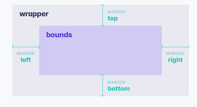
If you’ve read through many d3.js examples, you will know that there is a common way of sizing charts.

Explanation of the Image
The wrapper represents the overall extent of the chart and defines the dimensions of the <svg> element. The bounds encompass the data elements but do not include margins or legends.
Finally, the margins specify the padding around the bounds, providing the necessary spacing for a clean and organized layout.
We need to separate our wrapper and bounds areas to accurately determine their dimensions when constructing a chart using <SVG>.
This distinction allows us to manage layout and spacing effectively, ensuring that data elements are positioned precisely within the chart.
This example may seem a bit complex, so let me clarify what’s happening. The key aspects to focus on are:
Explanation of ChartWithDimensions.jsx
- Use a custom hook to determine the dimensions of both the wrapper and bounds (we’ll discuss this in more detail later).
- Apply the dms object, which contains the calculated dimensions, to create an x scale.
- Leverage the React ref from our custom hook to assign the appropriate size to a non-<svg> wrapping element, ensuring it matches the desired dimensions of the wrapper.
- Adjust the main section of our chart to accommodate the top and left margins, allowing for proper alignment and spacing.
Now that we understand how to work with the wrapper, bounds, and margins, let’s take a closer look at what our custom hook is actually doing.
When we pass a settings object to our custom useChartDimensions hook, it will:
Explanation of the provided useChartDimensions.js:
- It fills in any missing margins by setting default values.
- It uses the given height and width from passedSettings if they are provided.
- A ResizeObserver is used to recalculate dimensions whenever the size of the target element changes.
- The hook stores the height and width of the containing <div> as the wrapper dimensions.
- It calculates the dimensions of the chart’s bounds, referred to as boundedHeight and boundedWidth.
Important thing to remember is that any settings that we don’t set are being filled in automatically.
Hope this provides you with an idea of how to take care of chart dimensions in a responsive, easy way.
Maps
You’ve likely come across impressive examples of people using D3 to create intricate maps and interactive globes you can rotate. And now you’re eager to try it yourself.
Don’t worry! We’ll let D3 handle much of the heavy lifting, and you’ll have a map up and running in no time!
Explanation of the useChartDimensions.js code:
- Create a Projection: This is the function that maps our country shape definitions to how they will appear on a 2D screen. We’ll use .fitWidth() to adjust the map size based on the component’s width.
A pathGenerator will be created using d3.geoPath() to generate path definitions for the Earth and country shapes. - Set SVG Height: Once the projection is set, we’ll calculate the dimensions of the Earth (the sphere) in the projection and assign that to the height of the SVG element to ensure it scales correctly.
- Use a ClipPath: In some projections, certain shapes might extend beyond the edges of the Earth. To avoid rendering these, we’ll use a clipPath to keep everything within the bounds.
- Generate Paths for Shapes: The pathGenerator function will convert GeoJSON shape data into <path> elements. We’ll start by drawing the Earth as a whole with a light gray color.
- Draw Graticule Lines: D3 provides useful geographic functions like d3.geoGraticule10() to create graticule lines, which are reference lines across the globe (like latitude and longitude lines).
- Draw Country Shapes: Finally, we’ll render the country shapes by passing the GeoJSON data through the pathGenerator method, producing individual <path> elements for each country.
Once you know the basics down, this is a quite flexible way to draw geography! The trick is to think of d3 as a series of tools.
Conclusion
We’ve covered the essential basics:
- How to Draw SVG Elements: We learned how to create and manipulate SVG elements like lines, rectangles, and circles.
- How to Draw Many SVG Elements: We saw how to efficiently generate multiple SVG elements using data-driven techniques, often with D3.
- How to Replicate Built-in D3 Methods: We explored how to recreate some of D3’s built-in methods, like drawing axes, in a more customizable and reusable way using React.
- How to Size Our Charts Easily: We covered techniques for making our charts responsive and properly sized, including the use of margins, bounds, and wrappers.
- How to Draw Maps: We touched on geographic visualizations, using D3 to project and draw maps and globes from GeoJSON data.
These basics form a strong foundation for creating advanced, interactive, and scalable data visualizations.
Absolutely! Mastering these fundamentals allows for greater creativity and flexibility in your projects. With a strong foundation in SVG, D3, and React, you can create highly customized and dynamic visualizations that go beyond what standard chart libraries offer.
Plus, you’ll have a deeper understanding of how everything works together, which is invaluable for troubleshooting and optimizing your code. It’s definitely more work upfront, but the payoff is worth it!
Visualization Of Data In React With D3.js was originally published in Level Up Coding on Medium, where people are continuing the conversation by highlighting and responding to this story.
This content originally appeared on Level Up Coding - Medium and was authored by Imran Farooq
Imran Farooq | Sciencx (2024-09-26T23:04:44+00:00) Visualization Of Data In React With D3.js. Retrieved from https://www.scien.cx/2024/09/26/visualization-of-data-in-react-with-d3-js/
Please log in to upload a file.
There are no updates yet.
Click the Upload button above to add an update.
