This content originally appeared on HackerNoon and was authored by Vaibhav
Day 0: Embarking on the Swift & SwiftUI Odyssey
\ Welcome to the first post in my 30-day exploration of SwiftUI!
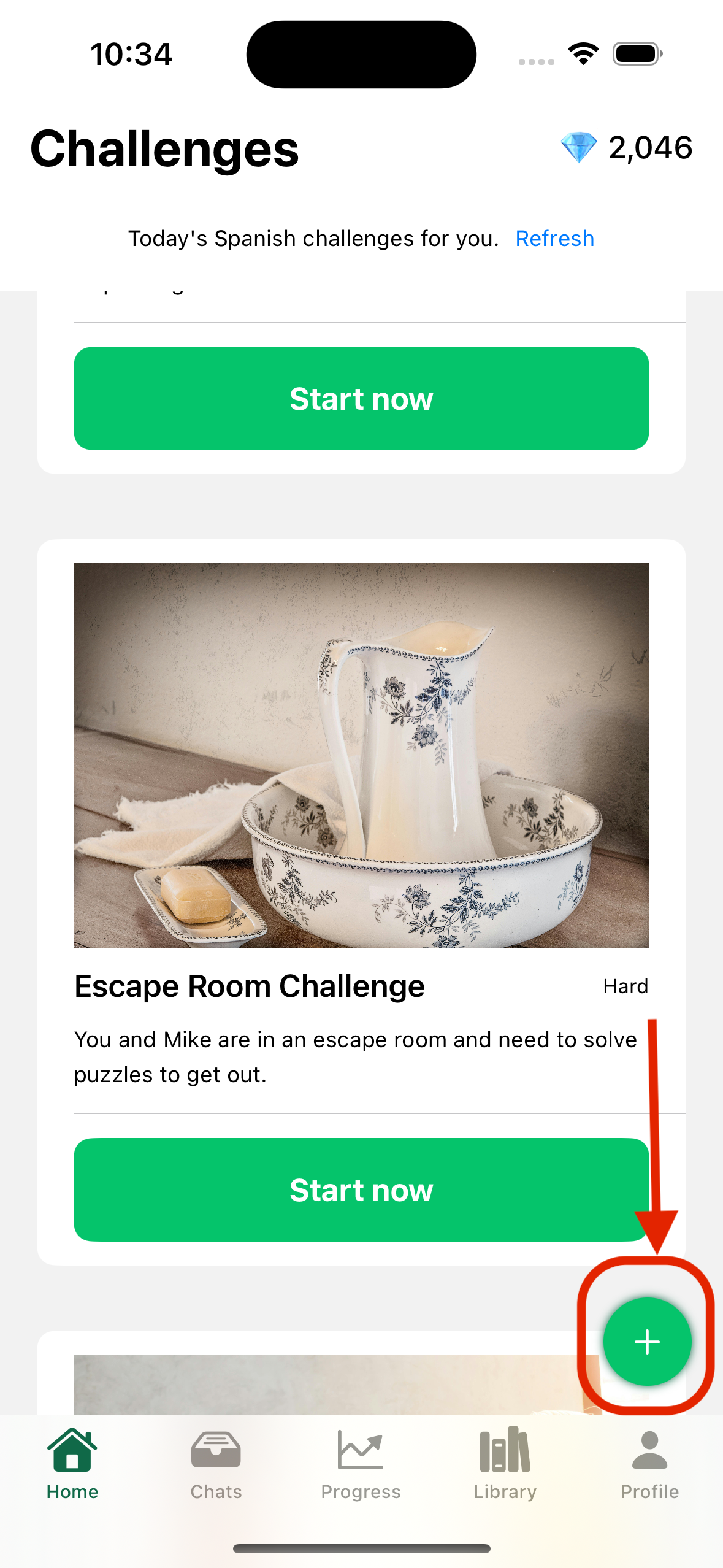
\ Today, we're diving into a fundamental UI element: the Floating Action Button (FAB).
\ Let's create a visually appealing & interactive FAB for your SwiftUI-based iOS app.
\ Placement: Positioned at the bottom right corner for easy accessibility.
Icon: A plus (+) symbol to clearly indicate an "Add" action.
Style: A clean, minimalist design the can blend with your UI.
\ Here's a sneak peek of what we'll achieve:
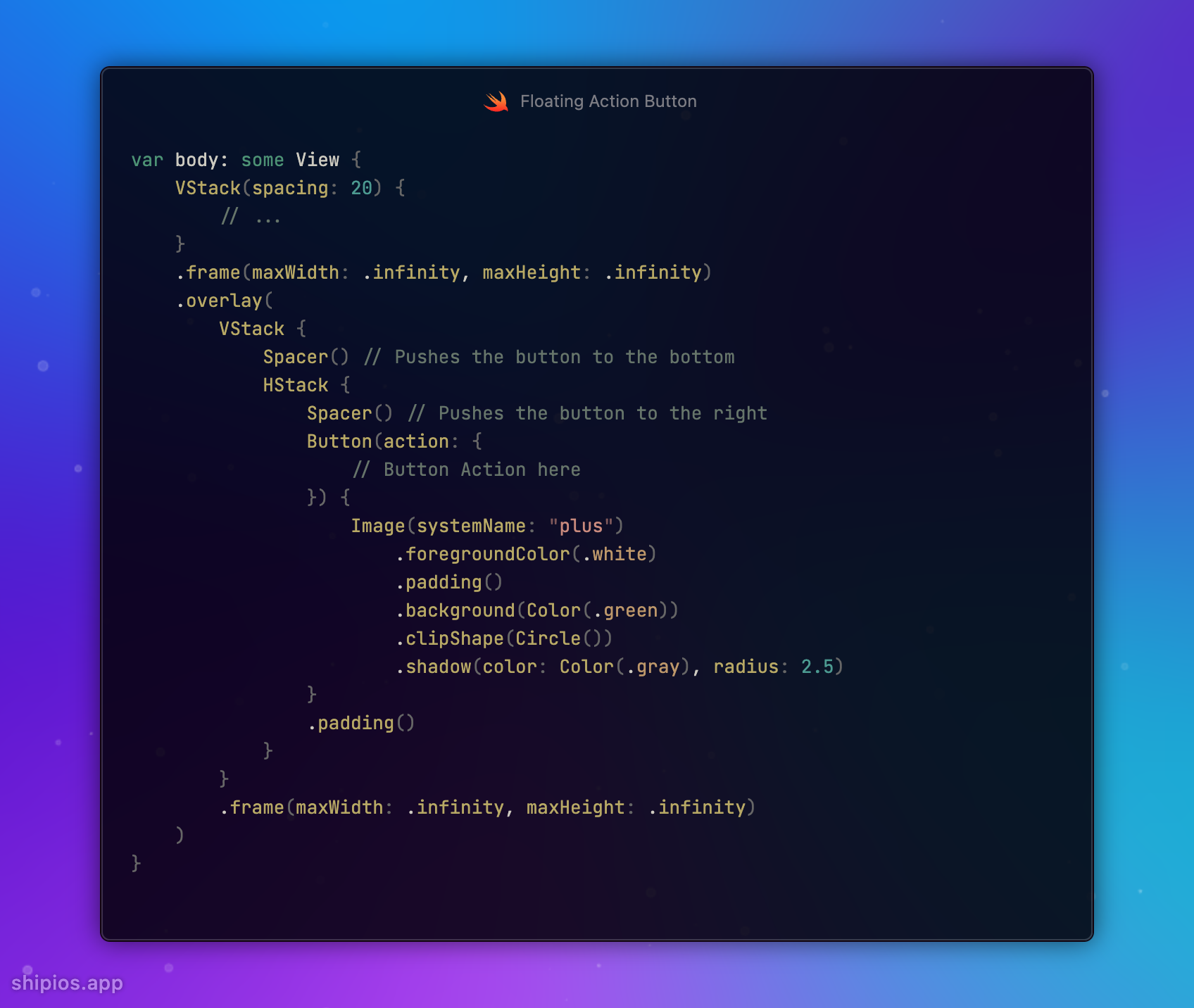
\ Ready to code? Let's dive in:
\
\
var body: some View {
    VStack(spacing: 20) {
        // ...
    }
    .frame(maxWidth: .infinity, maxHeight: .infinity)
    .overlay(
        VStack {
            Spacer() // Pushes the button to the bottom
            HStack {
                Spacer() // Pushes the button to the right
                Button(action: {
                    // Button Action here
                }) {
                    Image(systemName: "plus")
                        .foregroundColor(.white)
                        .padding()
                        .background(Color(.green))
                        .clipShape(Circle())
                        .shadow(color: Color(.gray), radius: 2.5)
                }
                .padding()
            }
        }
        .frame(maxWidth: .infinity, maxHeight: .infinity)
    )
}
\ What do you think of this FAB design? Share your ideas, suggestions, or improvements.
\ Happy coding!
This content originally appeared on HackerNoon and was authored by Vaibhav
Vaibhav | Sciencx (2024-10-03T00:42:35+00:00) How to Build a FAB-ulous Button – #30DaysOfSwift. Retrieved from https://www.scien.cx/2024/10/03/how-to-build-a-fab-ulous-button-30daysofswift/
Please log in to upload a file.
There are no updates yet.
Click the Upload button above to add an update.


