This content originally appeared on
A List Apart: The Full Feed and was authored by The fine folks at A List Apart
As a UX professional in today’s data-driven landscape, it’s increasingly likely that you’ve been asked to design a personalized digital experience, whether it’s a public website, user portal, or native application. Yet while there continues to be no shortage of marketing hype around personalization platforms, we still have very few standardized approaches for implementing personalized UX.
That’s where we come in. After completing dozens of personalization projects over the past few years, we gave ourselves a goal: could you create a holistic personalization framework specifically for UX practitioners? The Personalization Pyramid is a designer-centric model for standing up human-centered personalization programs, spanning data, segmentation, content delivery, and overall goals. By using this approach, you will be able to understand the core components of a contemporary, UX-driven personalization program (or at the very least know enough to get started).
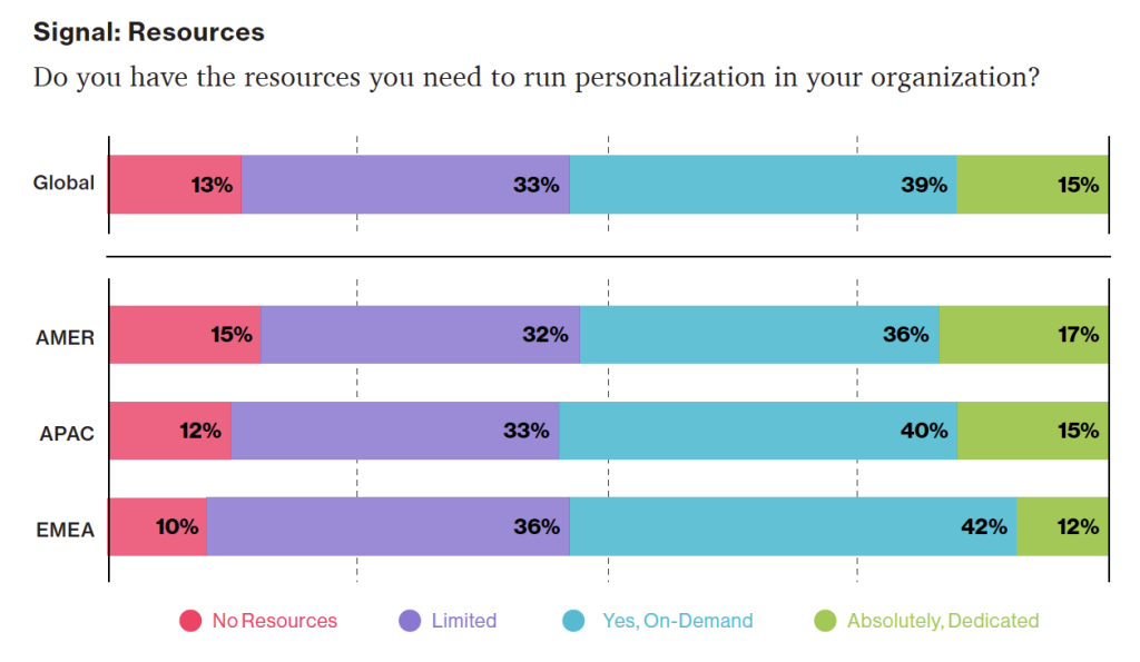
Growing tools for personalization: According to a Dynamic Yield survey, 39% of respondents felt support is available on-demand when a business case is made for it (up 15% from 2020).
Source: “The State of Personalization Maturity – Q4 2021” Dynamic Yield conducted its annual maturity survey across roles and sectors in the Americas (AMER), Europe and the Middle East (EMEA), and the Asia-Pacific (APAC) regions. This marks the fourth consecutive year publishing our research, which includes more than 450 responses from individuals in the C-Suite, Marketing, Merchandising, CX, Product, and IT.
Getting Started
For the sake of this article, we’ll assume you’re already familiar with the basics of digital personalization. A good overview can be found here: Website Personalization Planning. While UX projects in this area can take on many different forms, they often stem from similar starting points.
Common scenarios for starting a personalization project:
- Your organization or client purchased a content management system (CMS) or marketing automation platform (MAP) or related technology that supports personalization
- The CMO, CDO, or CIO has identified personalization as a goal
- Customer data is disjointed or ambiguous
- You are running some isolated targeting campaigns or A/B testing
- Stakeholders disagree on personalization approach
- Mandate of customer privacy rules (e.g. GDPR) requires revisiting existing user targeting practices

Regardless of where you begin, a successful personalization program will require the same core building blocks. We’ve captured these as the “levels” on the pyramid. Whether you are a UX designer, researcher, or strategist, understanding the core components can help make your contribution successful.
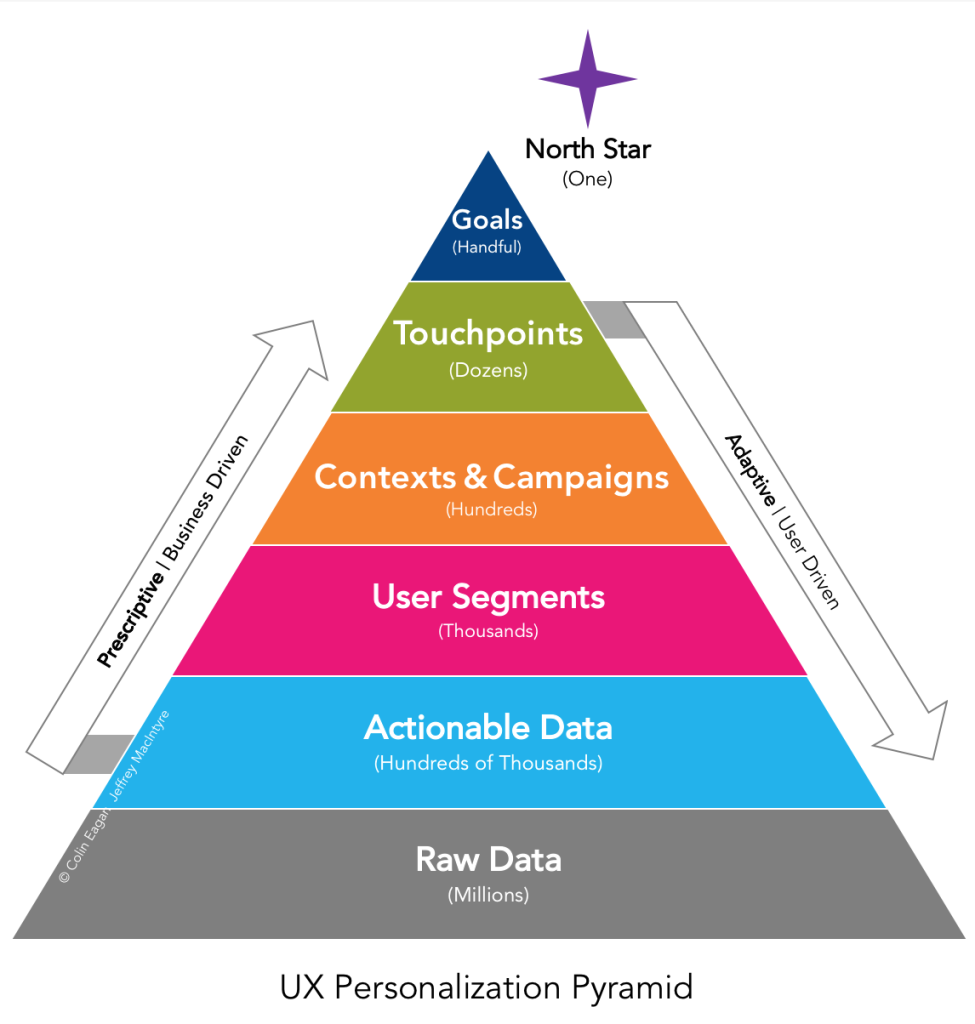
From top to bottom, the levels include:
- North Star: What larger strategic objective is driving the personalization program?
- Goals: What are the specific, measurable outcomes of the program?
- Touchpoints: Where will the personalized experience be served?
- Contexts and Campaigns: What personalization content will the user see?
- User Segments: What constitutes a unique, usable audience?
- Actionable Data: What reliable and authoritative data is captured by our technical platform to drive personalization?
- Raw Data: What wider set of data is conceivably available (already in our setting) allowing you to personalize?
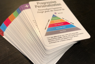
We’ll go through each of these levels in turn. To help make this actionable, we created an accompanying deck of cards to illustrate specific examples from each level. We’ve found them helpful in personalization brainstorming sessions, and will include examples for you here.
Starting at the Top
The components of the pyramid are as follows:
North Star
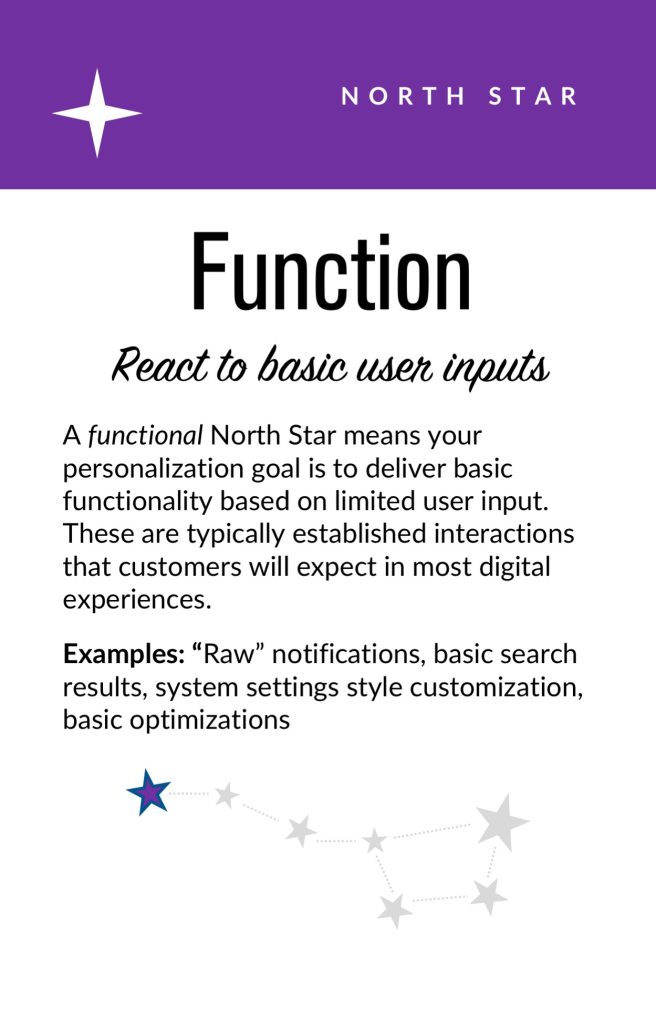
A north star is what you are aiming for overall with your personalization program (big or small). The North Star defines the (one) overall mission of the personalization program. What do you wish to accomplish? North Stars cast a shadow. The bigger the star, the bigger the shadow. Example of North Starts might include:
- Function: Personalize based on basic user inputs. Examples: “Raw” notifications, basic search results, system user settings and configuration options, general customization, basic optimizations
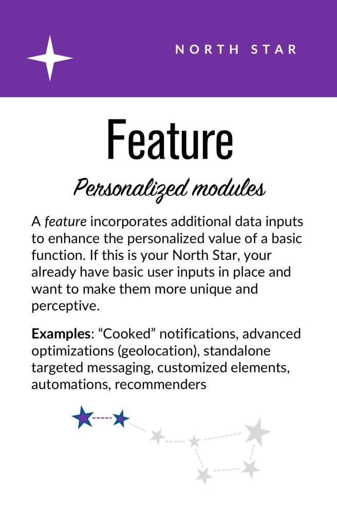
- Feature: Self-contained personalization componentry. Examples: “Cooked” notifications, advanced optimizations (geolocation), basic dynamic messaging, customized modules, automations, recommenders
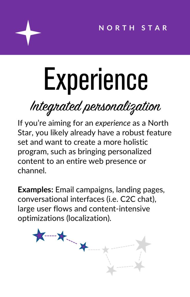
- Experience: Personalized user experiences across multiple interactions and user flows. Examples: Email campaigns, landing pages, advanced messaging (i.e. C2C chat) or conversational interfaces, larger user flows and content-intensive optimizations (localization).
- Product: Highly differentiating personalized product experiences. Examples: Standalone, branded experiences with personalization at their core, like the “algotorial” playlists by Spotify such as Discover Weekly.
Goals
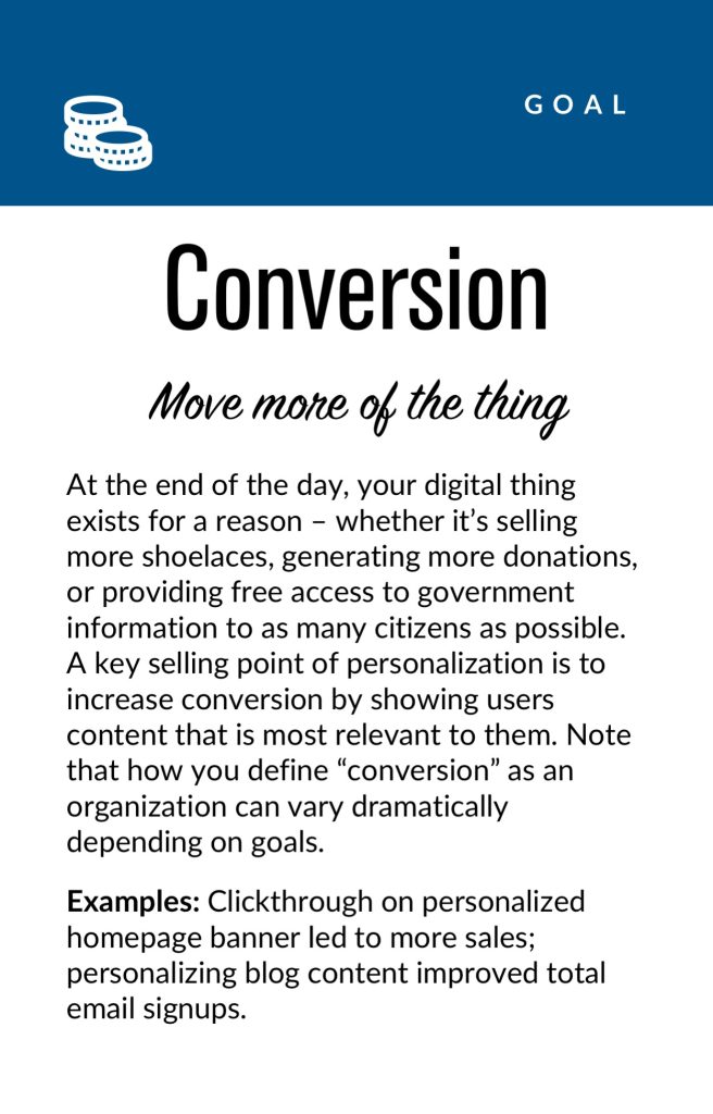
As in any good UX design, personalization can help accelerate designing with customer intentions. Goals are the tactical and measurable metrics that will prove the overall program is successful. A good place to start is with your current analytics and measurement program and metrics you can benchmark against. In some cases, new goals may be appropriate. The key thing to remember is that personalization itself is not a goal, rather it is a means to an end. Common goals include:
- Conversion
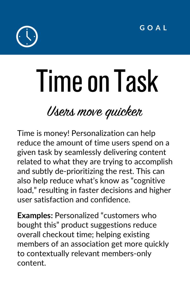
- Time on task
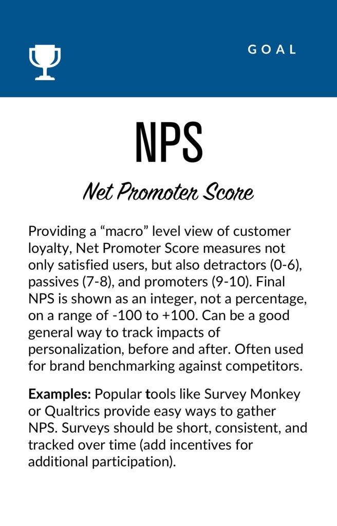
- Net promoter score (NPS)
- Customer satisfaction
Touchpoints
Touchpoints are where the personalization happens. As a UX designer, this will be one of your largest areas of responsibility. The touchpoints available to you will depend on how your personalization and associated technology capabilities are instrumented, and should be rooted in improving a user’s experience at a particular point in the journey. Touchpoints can be multi-device (mobile, in-store, website) but also more granular (web banner, web pop-up etc.). Here are some examples:
Channel-level Touchpoints
- Email: Role
- Email: Time of open
- In-store display (JSON endpoint)
- Native app
- Search
Wireframe-level Touchpoints
- Web overlay
- Web alert bar
- Web banner
- Web content block
- Web menu
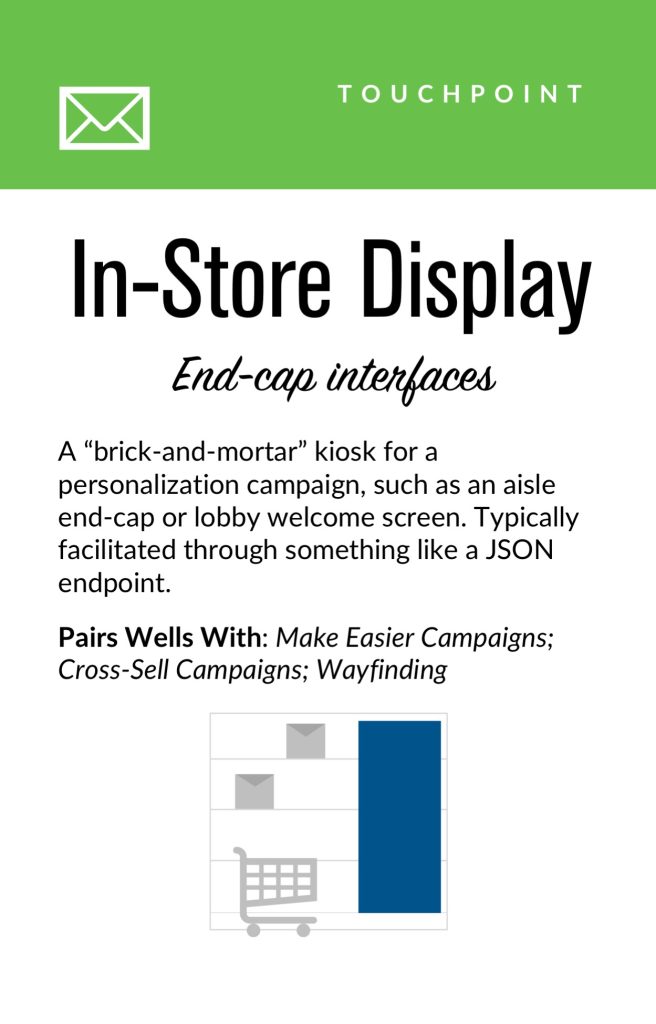
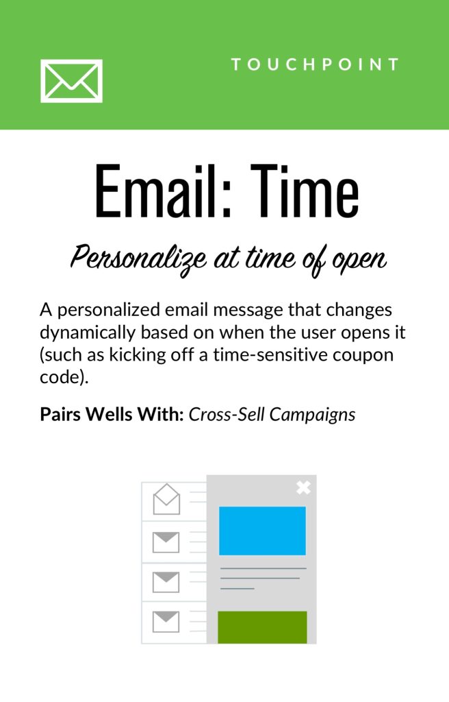
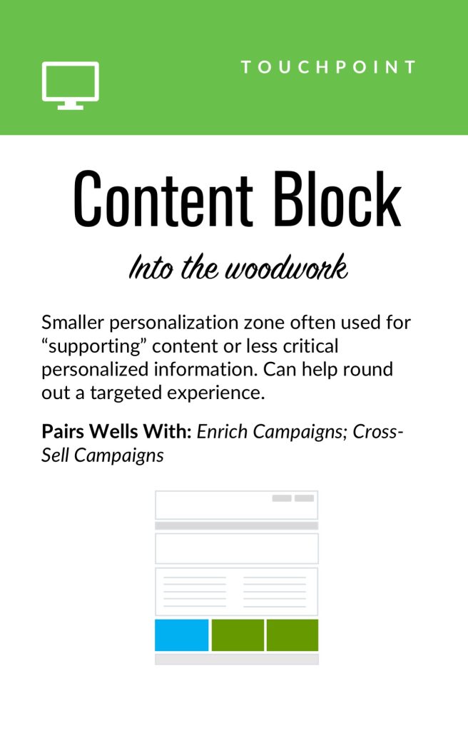
If you’re designing for web interfaces, for example, you will likely need to include personalized “zones” in your wireframes. The content for these can be presented programmatically in touchpoints based on our next step, contexts and campaigns.
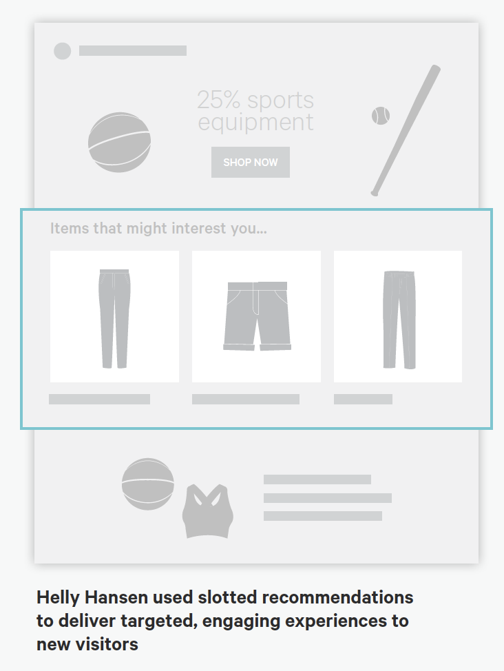
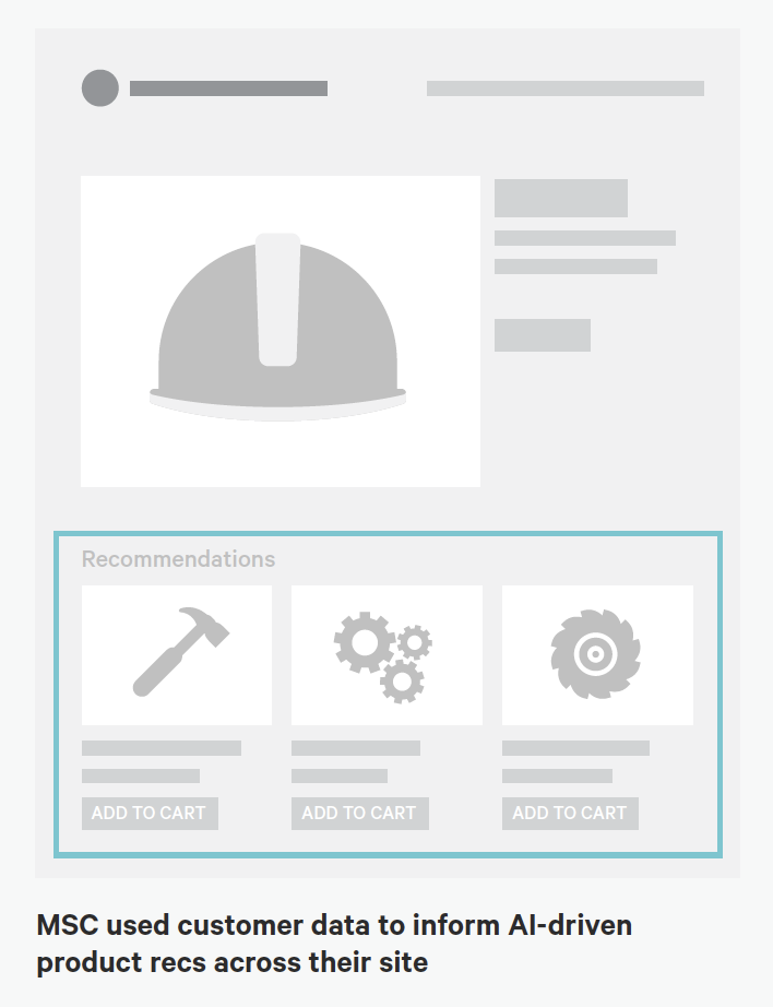
Source: “Essential Guide to End-to-End Personaliztion” by Kibo.
Contexts and Campaigns
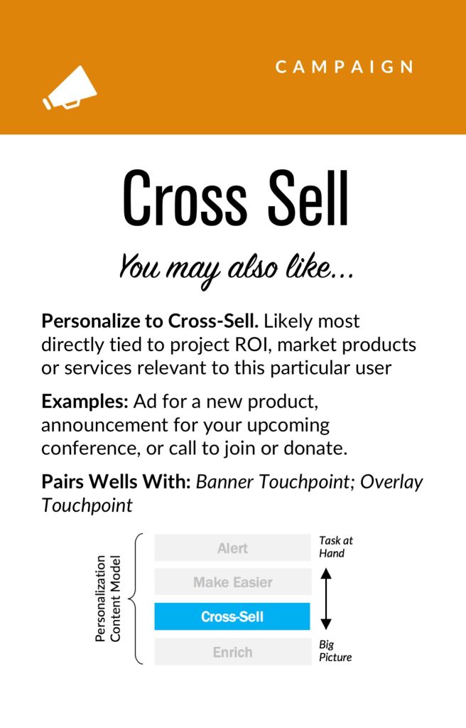
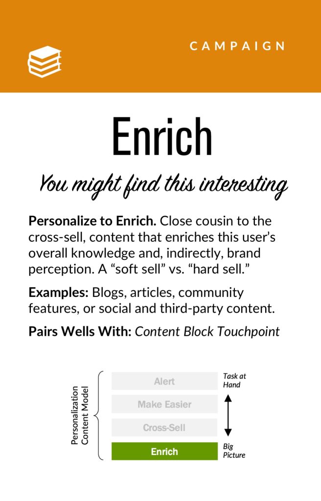
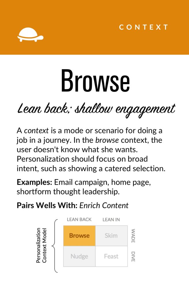
Once you’ve outlined some touchpoints, you can consider the actual personalized content a user will receive. Many personalization tools will refer to these as “campaigns” (so, for example, a campaign on a web banner for new visitors to the website). These will programmatically be shown at certain touchpoints to certain user segments, as defined by user data. At this stage, we find it helpful to consider two separate models: a context model and a content model. The context helps you consider the level of engagement of the user at the personalization moment, for example a user casually browsing information vs. doing a deep-dive. Think of it in terms of information retrieval behaviors. The content model can then help you determine what type of personalization to serve based on the context (for example, an “Enrich” campaign that shows related articles may be a suitable supplement to extant content).
Personalization Context Model:
- Browse
- Skim
- Nudge
- Feast
Personalization Content Model:
- Alert
- Make Easier
- Cross-Sell
- Enrich
We’ve written extensively about each of these models elsewhere, so if you’d like to read more you can check out Colin’s Personalization Content Model and Jeff’s Personalization Context Model.
User Segments
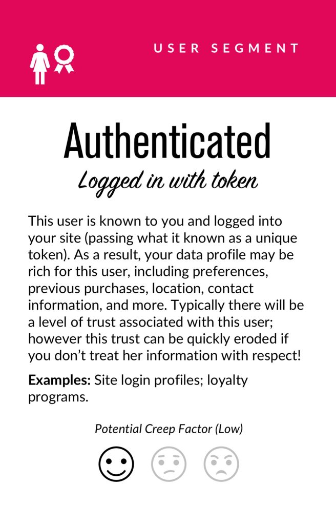
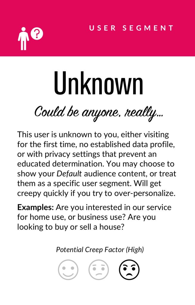
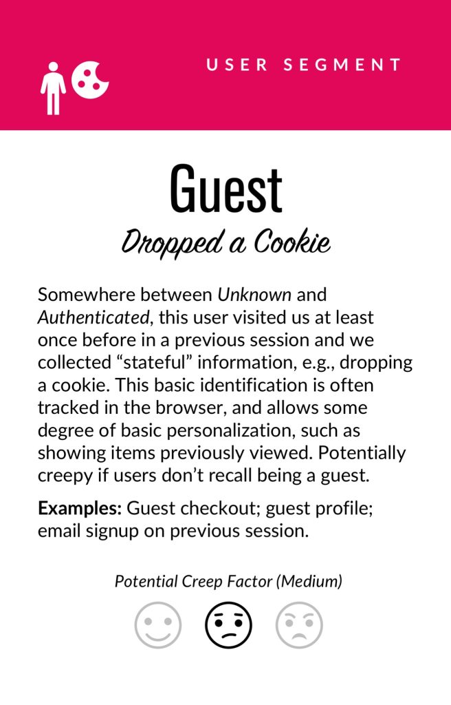
User segments can be created prescriptively or adaptively, based on user research (e.g. via rules and logic tied to set user behaviors or via A/B testing). At a minimum you will likely need to consider how to treat the unknown or first-time visitor, the guest or returning visitor for whom you may have a stateful cookie (or equivalent post-cookie identifier), or the authenticated visitor who is logged in. Here are some examples from the personalization pyramid:
- Unknown
- Guest
- Authenticated
- Default
- Referred
- Role
- Cohort
- Unique ID
Actionable Data
Every organization with any digital presence has data. It’s a matter of asking what data you can ethically collect on users, its inherent reliability and value, as to how can you use it (sometimes known as “data activation.”) Fortunately, the tide is turning to first-party data: a recent study by Twilio estimates some 80% of businesses are using at least some type of first-party data to personalize the customer experience.
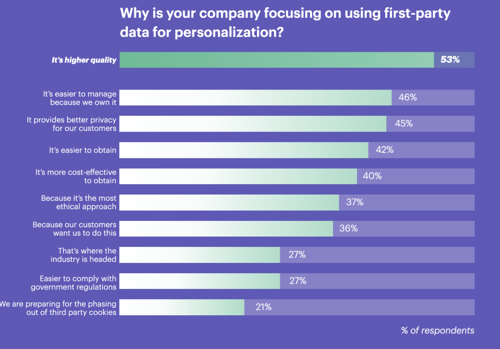
First-party data represents multiple advantages on the UX front, including being relatively simple to collect, more likely to be accurate, and less susceptible to the “creep factor” of third-party data. So a key part of your UX strategy should be to determine what the best form of data collection is on your audiences. Here are some examples:
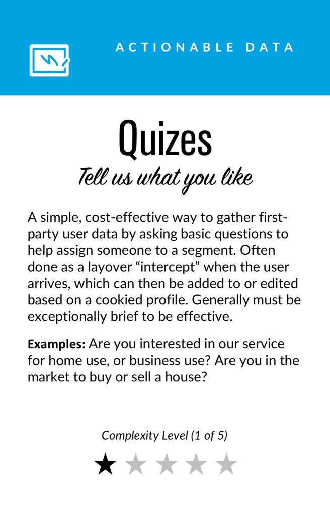
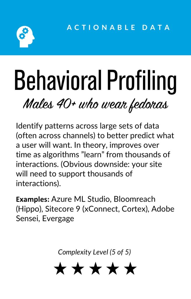
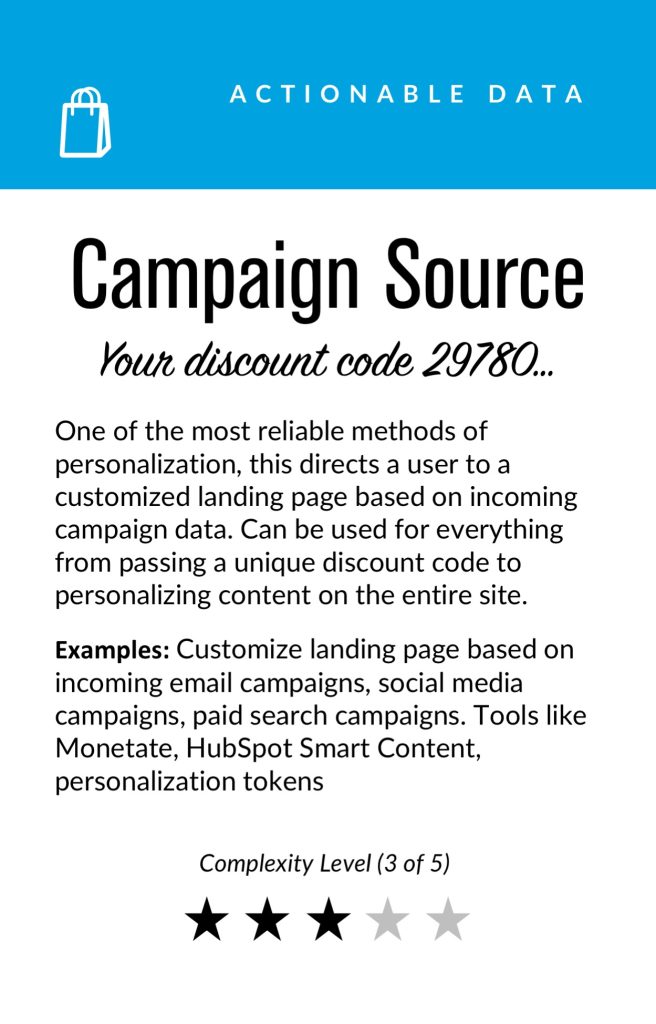
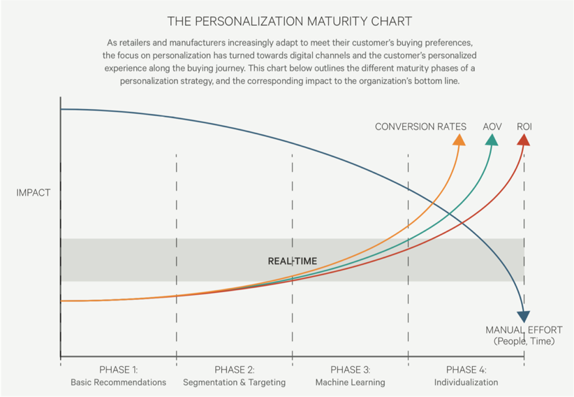
There is a progression of profiling when it comes to recognizing and making decisioning about different audiences and their signals. It tends to move towards more granular constructs about smaller and smaller cohorts of users as time and confidence and data volume grow.
While some combination of implicit / explicit data is generally a prerequisite for any implementation (more commonly referred to as first party and third-party data) ML efforts are typically not cost-effective directly out of the box. This is because a strong data backbone and content repository is a prerequisite for optimization. But these approaches should be considered as part of the larger roadmap and may indeed help accelerate the organization’s overall progress. Typically at this point you will partner with key stakeholders and product owners to design a profiling model. The profiling model includes defining approach to configuring profiles, profile keys, profile cards and pattern cards. A multi-faceted approach to profiling which makes it scalable.
Pulling it Together
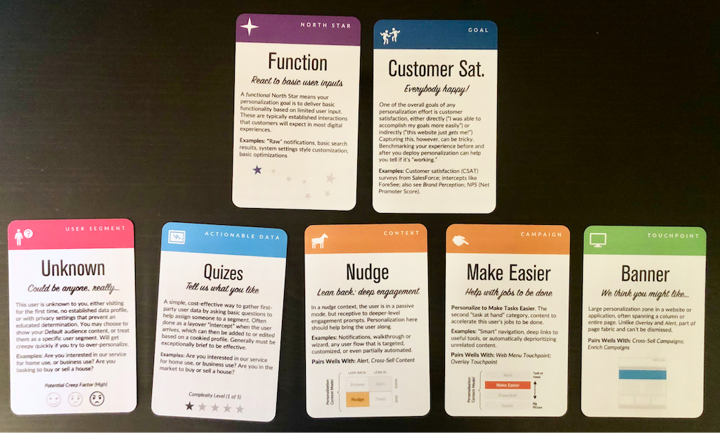
While the cards comprise the starting point to an inventory of sorts (we provide blanks for you to tailor your own), a set of potential levers and motivations for the style of personalization activities you aspire to deliver, they are more valuable when thought of in a grouping.
In assembling a card “hand”, one can begin to trace the entire trajectory from leadership focus down through a strategic and tactical execution. It is also at the heart of the way both co-authors have conducted workshops in assembling a program backlog—which is a fine subject for another article.
In the meantime, what is important to note is that each colored class of card is helpful to survey in understanding the range of choices potentially at your disposal, it is threading through and making concrete decisions about for whom this decisioning will be made: where, when, and how.
Lay Down Your Cards
Any sustainable personalization strategy must consider near, mid and long-term goals. Even with the leading CMS platforms like Sitecore and Adobe or the most exciting composable CMS DXP out there, there is simply no “easy button” wherein a personalization program can be stood up and immediately view meaningful results. That said, there is a common grammar to all personalization activities, just like every sentence has nouns and verbs. These cards attempt to map that territory.
This content originally appeared on
A List Apart: The Full Feed and was authored by The fine folks at A List Apart
The fine folks at A List Apart | Sciencx (2022-12-08T15:00:00+00:00) Personalization Pyramid: A Framework for Designing with User Data. Retrieved from https://www.scien.cx/2022/12/08/personalization-pyramid-a-framework-for-designing-with-user-data-1262/
Please log in to upload a file.
There are no updates yet.
Click the Upload button above to add an update.
