
This content originally appeared on Bits and Pieces - Medium and was authored by Amir Shalev
Bit has changed the way I work as a designer — bridging the gap between design and development with modular components and real-time previews.
As the Senior UX/UI Designer at Bit using Bit’s tools for development, I’ve had the unique opportunity to work in an environment where design and development are seamlessly aligned.
One of the biggest challenges in software development is bridging the gap between technical and non-technical stakeholders. Misunderstandings about features, priorities, and changes can slow down progress and create unnecessary friction. However, Bit has transformed how we collaborate by making development more transparent, modular, and business-aligned.
Breaking Down Silos with a Composable Approach
One of the most impactful aspects of working with Bit is its composable approach to development. Every feature is encapsulated as an independent component, complete with:
- A clear API that defines how it interacts with other components.
- Documentation that describes its purpose, usage, and dependencies.
- Live previews that allow stakeholders to see the component in action without needing to set up a full development environment.
For a designer, this means I no longer have to rely solely on developers to see how my designs translate into code. I can review and interact with components directly, ensuring they match our design specifications and user expectations.
Business-Aligned Naming and Scopes
Traditional development can sometimes feel like an exclusive club where technical jargon creates a barrier, leaving non-technical stakeholders like me feeling a bit lost in translation.
At Bit, we name and organize components to align with business objectives. The component names directly correspond to those used in Figma, ensuring consistency between design and development. This means that when discussing features, we are all speaking the same language, eliminating confusion and misinterpretation.
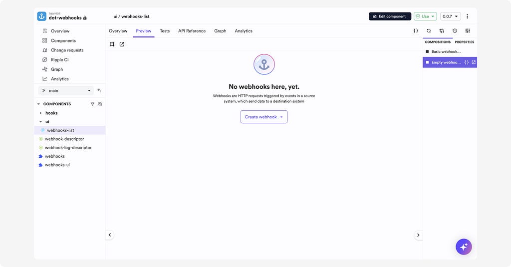
For example, a component named ui/webhook-list in our system is the same as the one labeled in our design files. This alignment enables product managers, designers, and developers to collaborate more effectively without needing to translate technical terminology into business language.
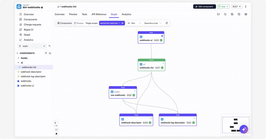
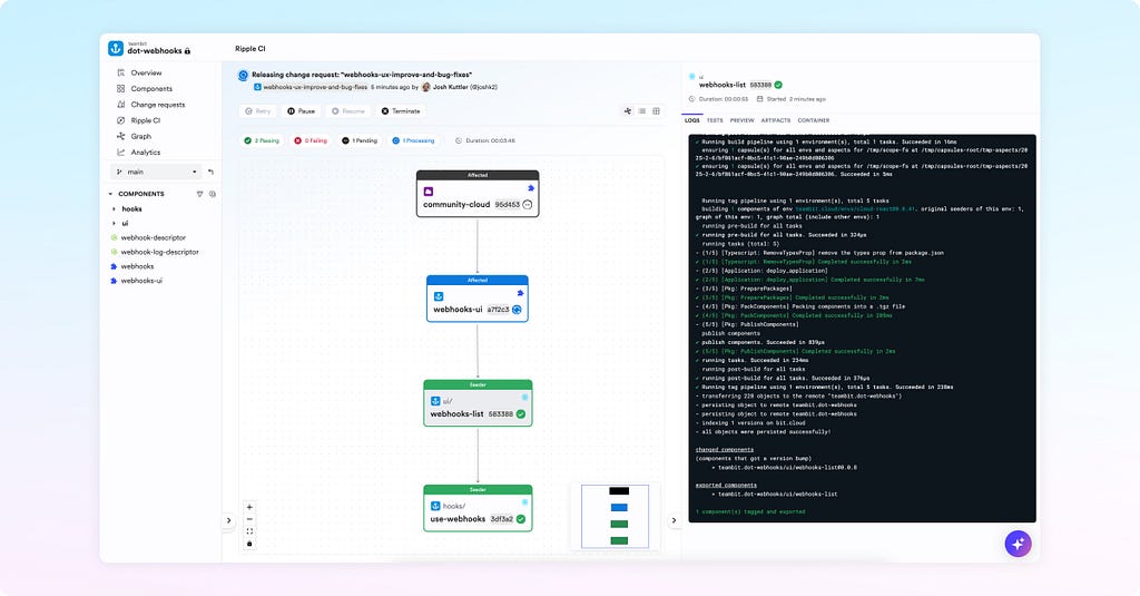
Visualizing Component Relationships
One of my favorite Bit features is the visual dependency graph. This tool gives me a clear, interactive view of how components are connected. It illustrates:
- Each component’s dependencies and dependents.
- How changes to one component might impact the system.
- The overall structure of the application.
This transparency is invaluable for design decisions. When modifying a component, I can immediately see its impact across the system. It eliminates guesswork and ensures that changes are made with a full understanding of their ramifications.
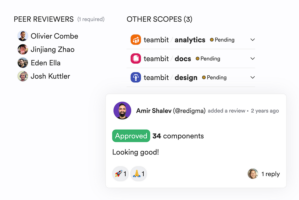
Component-Level Reviews with Visual Previews
Design reviews have always been a critical part of my workflow, but traditional code reviews can be inaccessible to designers. With Bit’s component-level change reviews, I can now participate more meaningfully. Each component update comes with:
- A side-by-side preview comparing the modified version with the previous one.
- Documentation updates reflecting any API or behavior changes.
- A focused scope that isolates the impact of a change.

This means I don’t have to wait for a staging environment to see if my design updates are implemented correctly. I can provide feedback earlier in the process, reducing the risk of last-minute changes and ensuring that the final product aligns with our design and user experience goals.
The Process at Bit
At Bit, the development process follows a well-defined and structured workflow that ensures seamless collaboration among stakeholders:
1. Planning
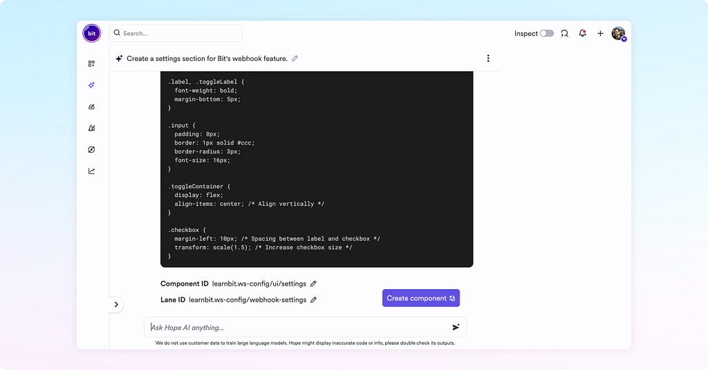
At this stage, the product and design teams collaborate to define the functionality, name, scope, dependencies, and look and feel of the component. We leverage Bit and Figma to initiate the work, ensuring a seamless transition from ideation to execution. Oftentimes, we create an “empty” Bit component with the proper name and scope, and even embed the Figma design in the component documentation for future reference.

2. Development
During this phase, the development team implements the component, creating previews and automated tests. Developers utilize Hope AI and Cloud Workspaces to streamline development and maintain high-quality standards.
Hope AI is aware of our shared collection of components. It can be instructed to use specific components (the ones specified in the planning phase) as the building blocks of its new composition.
3. Review
Product, design, and development teams collaboratively review the component in this stage. They assess its functionality, naming, scope, dependencies, and code quality. This stage allows non-developers to visually review the component as a standalone feature without having to rely on a staging environment where the component is reviewed (only) in a very specific context.
4. Release
Once approved, the development team pushes the component to Bit Platform and publishes it as a Node package. We utilize Ripple CI to ensure smooth release and integration across projects. Ripple ensures the component’s build also triggers the build for dependent components if those exist.
This structured approach ensures that every stakeholder is involved at the right stage, preventing misalignment and enabling faster, more efficient product development.
A New Era of Cross-Functional Collaboration
Bit has fundamentally changed how I, as a designer, collaborate with engineers and other stakeholders. Instead of working in silos, we operate in a shared environment where every feature is visible, understandable, and aligned with business objectives.
By treating every feature as an independent component with clear documentation, live previews, and a visual dependency graph, Bit ensures that all stakeholders — technical and non-technical — can engage in the development process effectively. Component-level reviews with visual previews further bridge the gap, enabling designers like me to contribute valuable insights before deployment.
Conclusion
Bit and the Bit Platform have empowered me to be more involved in the development process than ever before. The alignment between design and development, business-oriented component naming, and the ability to visually explore and review changes have transformed how I work.
If you’re a designer working in a cross-functional team, Bit provides an unparalleled way to collaborate seamlessly with developers and product managers. It’s not just about improving efficiency — it’s about creating a development culture where everyone speaks the same language, works towards the same goals, and builds better products together.
My Experience as a Designer Working at Bit was originally published in Bits and Pieces on Medium, where people are continuing the conversation by highlighting and responding to this story.
This content originally appeared on Bits and Pieces - Medium and was authored by Amir Shalev
Amir Shalev | Sciencx (2025-02-06T17:05:54+00:00) My Experience as a Designer Working at Bit. Retrieved from https://www.scien.cx/2025/02/06/my-experience-as-a-designer-working-at-bit/
Please log in to upload a file.
There are no updates yet.
Click the Upload button above to add an update.