This content originally appeared on @mdo and was authored by Mark Otto

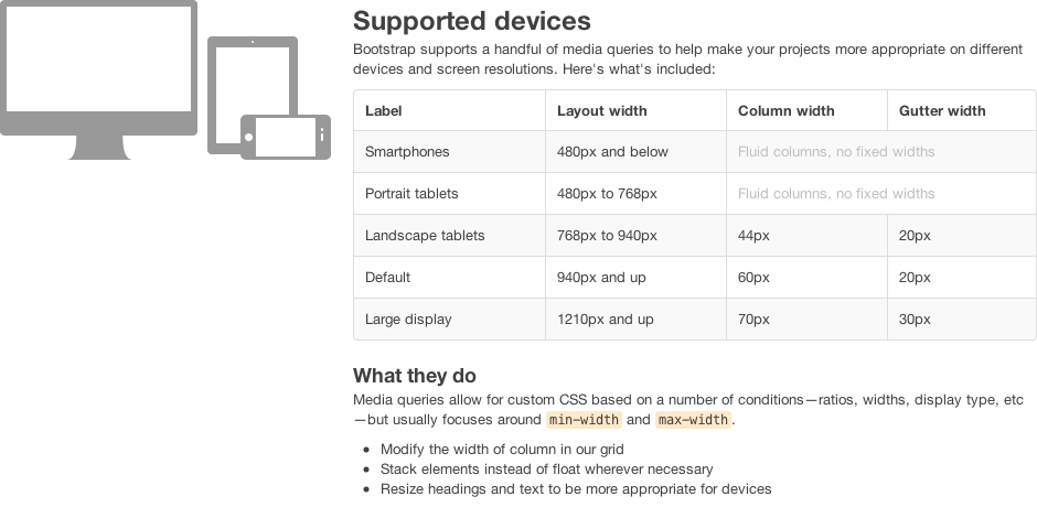
With v2.0 of Bootstrap, we’re going to include some of the core tools developers need to make any project responsive: media queries. As we only just began to implement the responsive features, we’d love some feedback on where we stand thus far and what developers (and designers) expect.
The plan
So, after a bit of thought and experimentation, here’s how we’re approaching responsiveness in Bootstrap:
- Responsive features should be opt-in, not opt-out. Why opt-in? Well, responsive design isn’t necessary for every project, but it should be available for those who want it. For that reason, we’re thinking of making a separate file for all our responsive code for developers to enable.
- Enabling responsiveness should be straightforward and easy for all skill levels. Since we’re considering opt-in for this, we need all skill levels–designers and developers, noobs and pros–to understand how to use it. A separate .less file and compiled stylesheet will both be available.
- The responsive features should work for all major platforms and devices (kind of a given, right?). Translation? iOS and Android wherever possible, but not likely Blackberry or Windows. (For full transparency, I’ve had absolutely zero experience with the latter two.)
The feedback?
Three simple guidelines thus far is just a way to get some ideas in place to align our thinking and communicate our goals with the community. That said, we’d love more feedback and know there are plenty of questions out there to consider, including:
- What resolutions do we support exactly?
- How much functionality should be supported at each level?
- Should Internet Explorer be supported in our media queries?
If you’re a developer actively using Bootstrap, I highly encourage you to check out the 2.0-wip branch on GitHub and share your feedback via GitHub issues or Twitter. We’re always looking for more feedback and welcome it at all levels.
This content originally appeared on @mdo and was authored by Mark Otto
Mark Otto | Sciencx (2011-10-21T00:00:00+00:00) Making Bootstrap responsive. Retrieved from https://www.scien.cx/2011/10/21/making-bootstrap-responsive/
Please log in to upload a file.
There are no updates yet.
Click the Upload button above to add an update.
